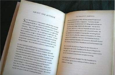
The sentience of reading experience: Kindle vs. iPad, an exploration of dimensionality.
This from GadgetLab: “But some die-hard e-reader fans like Len Edgerly, who hosts the weekly Kindle Chronicles podcast, say pretty e-books aren’t as big a draw as some would think.
“When I am reading, I don’t want to be too distracted,” he says. “It’s about the words, and when I read the Kindle, it seems to bring me closer to the author’s words. That’s essence of reading to me.”
I’d challenge that proposition. The curious positioning represents a kind of sensible split — sensible in the context of sensuality and the construct of sensate impression — the appearance of dimensional presence. I might offer in communicating with a number of airline (and other) travelers as Kindle(rs), that the quality of the book reading experience is the very heart of what is, in fact, disheartening in experience. “I still really value the feeling of reading a book.” I’ve walked around the corner at Amazon, spending time with the team, learning more, even speaking (and I’ll leave it as that) with Jeff Bezos. I laud their innovation. Speaking with a friend, about the potential of Apple’s iPad being a Kindle challenge (not a killer, rather a technological gauntlet), the retort was that Apple’s stock crashed the day of the launch — while Amazon’s soared. Studying that, it might be suggested that actually everyone’s stock crashed — Apple first roaring up, with the pronouncements, then faltering (with all the other players) the following day. But there’s risk — abounding in any technology — in the volatility of the present market. How that relates to brands, stories, emergence of products is an object of continuing study for me. That, ultimately, is the win. Amazon, Apple — up and down.
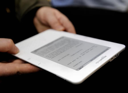
As a book aesthete, if you’ll pardon the phrasing, I’m curious about the idea of interface in the electronic reader space. And as Steve Jobs intoned, the point is that Amazon has laid the foundation of innovation; Apple stands, in a word, on the shoulders of that foundational invention. But the intriguing point that I might offer, is that Apple has the touch of technological / human interface — to form and material language, software and industrial design, usability that’s founded on the best technicians | aesthetic principals (and principles) in the world.
There are some interesting negative remarks, and there might be a positioning that relates to history and the opening brilliance of iPhone. That is “hey, no way am I going for that!”, quoted from some competing tech executives in the smartphone space. And according to Levifig, “Those were the ones that rushed to every single touch smartphone device that was announced after the iPhone. What did most of them do after 1-2 years? They bought an iPhone. And even while they’ll complain about some things on it (as do I and most people that truly love the device), they’ve come to understand the reason behind the subject of most of their complaints. When was the last time you understood the reason behind anything Microsoft did that you disliked? Ya, I thought so. So, anyway, I wasn’t surprised to see them all back in full-force, bashing the iPad.”
David Pogue offers that the launch is, yet again, typical to the opening bloggers and tech reviews of Apple — always the naysayers are the loudest: “Now Phase 2 can begin: the bashing by the bloggers who’ve never even tried it: “No physical keyboard!” “No removable battery!” “Way too expensive!” “Doesn’t multitask!” “No memory-card slot!”
That will last until the iPad actually goes on sale in April. Then, if history is any guide, Phase 3 will begin: positive reviews, people lining up to buy the thing, and the mysterious disappearance of the basher-bloggers.”
The nature of the read: “I love reading on my iPhone, mainly blog posts and articles. I can’t see myself reading a book on it. I bought “Classics” when it came out and I don’t think I got past page 4-5 on any of the books there, and I love its gorgeous interface (so did Apple!). The idea of reading such short blurbs of text per screen is annoying and reading book becomes a daunting task that way. I’m still the guy with a couple of notebooks, one of them for taking notes while I read a book… on paper! I love books: their smell, their touch, the experience of reading them on a coffee shop, etc… But because of my traveling lately, I’ve suffered from having some books in one place, some books with me, some books in other places and it sucks. Not to mention how expensive it becomes when moving to a new country: books are heavy and airlines don’t like that!“
The New York Times offers that “it looks like Apple really has created something new. Criticisms of “Like a laptop” and “a big iPod Touch” don’t really do justice to the possibilities. The iPad as an e-book reader is a no-brainer. It’s just infinitely better-looking and more responsive than the Kindle, not to mention it has color and doesn’t require external illumination — a dream screen for reading and watching–at some loss of convenience in creating. (Book fans should note, however, that the iPad e-bookstore won’t offer bestsellers at $10 each, like Amazon and Barnes & Noble do.”
Extending that theorem: the iPad opens a broad new range of possibility for authors and publishers — now to potentially to include color pictures, videos, graphs, links, etc. right in the new world of their books. How awesome it would be to have an animated sequence at a chapter cover page, or a small screencast on a technical book? Read, and explore, “live links”? Link to webapps, videos or code that can be instantly updated? How about “in-book purchases” — buy a new revised print/edition for a discounted price? The possibilities are now wide open. Web explorations, painting programs, TV + movies, newspapers and magazines all seem like naturals on this 1.5-pound machine, too. The world, like it or not, has changed.
A closing point, to the nature of the book interface, now noted and blogged with frequency, lies here.
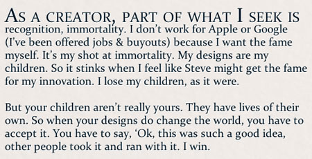
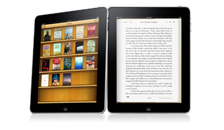
by Wil Shipley, who is the main developer of a Mac app called Delicious Library. Apple’s new iBooks app on the iPad uses many of the same interface design elements as Delicious Library: the wooden shelf books are placed upon.
— Reblogged from Dustin Curtis
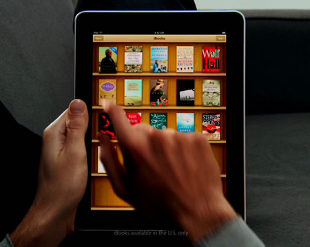
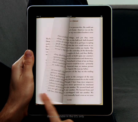
iPad@Apple.com demo | at 4.05min
The question, to any of the discussions observed, and noted above, will be time. Time will tell. But books will last — and the concept and the depth of imaginative content to which “they” are capable, must be improved upon, not lessened in the context of “de-humanizing” them with eInk. Books, indeed, can be felt.
As a sensualist, at the least, I’m all about touch, and the visualization of that sensation.
tsg
….
Cumulation: Massing the principles of cumularity
Tim Girvin | GIRVIN | girvin@girvin.com
c. 206.890.0621
New York City + Seattle | Tokyo
the reels: http://www.youtube.com/user/GIRVIN888
girvin blogs:
http://blog.girvin.com/
https://tim.girvin.com/index.php
girvin profiles and communities:
TED: http://www.ted.com/index.php/profiles/view/id/825
Behance: http://www.behance.net/GIRVIN-Branding
Flickr: http://www.flickr.com/photos/tgirvin/
Google: http://www.google.com/profiles/timgirvin
LinkedIn: http://www.linkedin.com/in/timgirvin
Facebook: http://www.facebook.com/people/Tim-Girvin/644114347
Twitter: http://twitter.com/tgirvin