THE ILLUSTRATION OF THE MIND: FROM THOUGHT TO WORD IN DESIGNED LETTERFORM LINGUISTICS | ALPHABETS AS BRAND VOCABULARIES.
Working on hundreds of logos and corporate identity packages, in decades of design and brand development for clients around the world, over time there are learnings to the hidden code of the alphabet, and how that applies to identity theory.
How do you think about a simple letter,
a piece of type?
What is the impact on design strategy and thinking?
Holism. Integration. Recognizable style. Seamless reflection of a dynamically whole brand presence.
And why not design your own, link identity to a systemic alphabetical formulary?
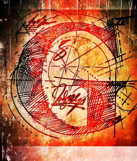
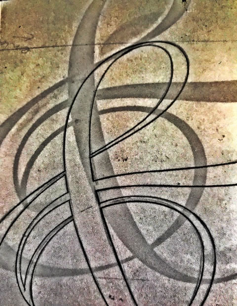
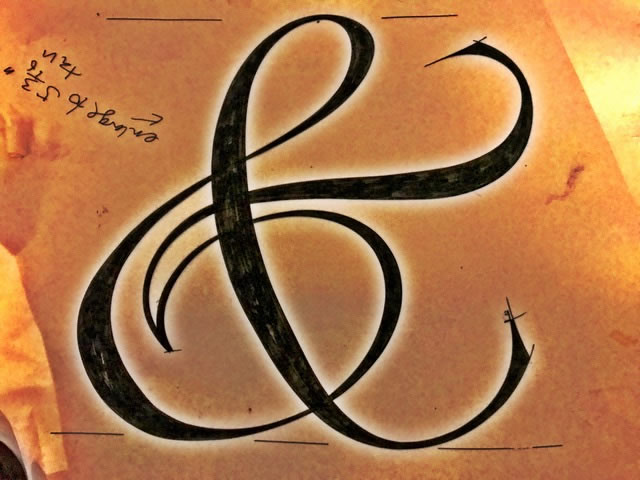
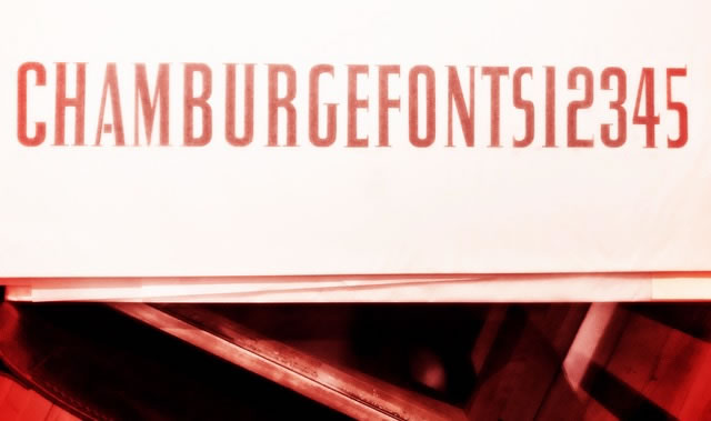
You think about the alphabet as made up of two key elements: as a vertical stroke and a circular rendering — the interface of the I and the O, or the i and the o which set the pace for the entire alphabet, it’s the detailing of the rhythm of geometry.
For years, in designing identity programs, we’ve thought about how that could play out to a campaign, a font system, print graphics, signing and environmental graphics, packaging systems and product naming; it all flows out from
the inspiration of the idea
and the core littera principia of the alphabet:
the
i
&
o.
In our weekly type design and calligraphy classes at Girvin,
we always start out with —
“what’s the I,
and what’s the O —
what are the details of their structuring
and how does that work
for the alphabet as a
rhythmic system of movements?”
Inside those two letters are the fabric,
the brandcode®,
of an entire design language.
Designing a logo, then speaks the question:
“how ownable is this design, how protectable is it?”
Build a customized rendering, and a font that goes along with it,
and yes —
it’s even more registrable.
You own it because it’s yours.
It’s just for you.
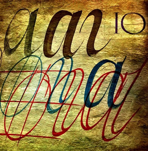
The hand, with mind and meditation, starts that journey.
When you think of a brand, a person, a word — what comes to mind?
Could you just draw it out?
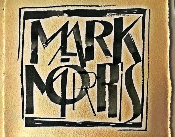
Poster | logotype for Mark Morris
Most of the history of type design at Girvin comes from a legacy of training in biology at NewCollege, working with Lloyd Reynolds at Reed College , working the limits of self-guided education at the Evergreen State College and then what I call Alphabet Odyssey in a adventuresome run to meet with designers in the UK, France, Switzerland, Austria and Germany, finalized in a speech on American Design in Moscow and Tallinn.
That was my beginning,
when I really didn’t know
what I was doing.
Just doing.
It.
So, in rendering typographical concepts, I start with a familiarity in writing by hand — writing with the hand, setting the foundations. That might be on rough, handmade paper with notes.
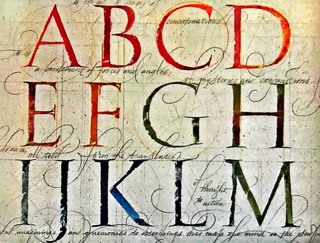
And that might be penciled, or penned renderings, starting as tracings — as in this foundation for a bejeweled font for Jewelry at Tiffanys, later demoted to a catalog font.
With, then CCO|Tiffanys, Susanne Manheimer.
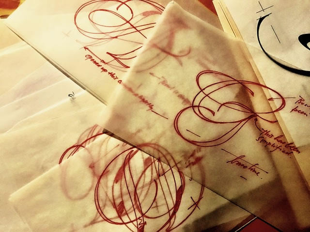
You start, then restart, then tune, then revise.
Any rendering —
from tracing to formalized ideation,
eventually finds ink in its making.
Part of my earlier history was working
with Bob Ciano at Life Magazine.
That working collaboration was calligraphy, custom type, photographic folios, initials and rubrics —
spread by spread, page by page.
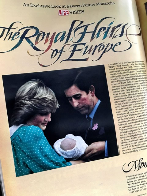
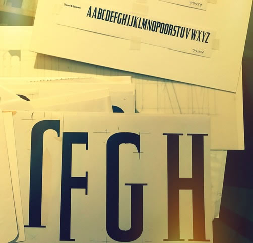
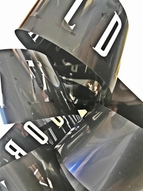
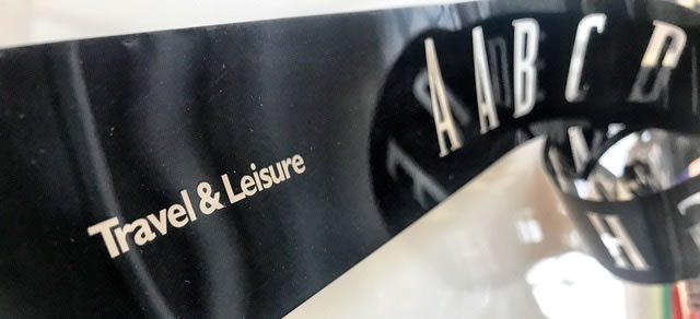
I’d work with him at the HQ of the Time|Life publishing group in NYC and we’d build treatments, design ideas, calligraphy and lettering design for the publications. I worked with him in a string of design developments over many years — and finally, on the design programs for Travel&Leisure.
Again, custom font, font system.
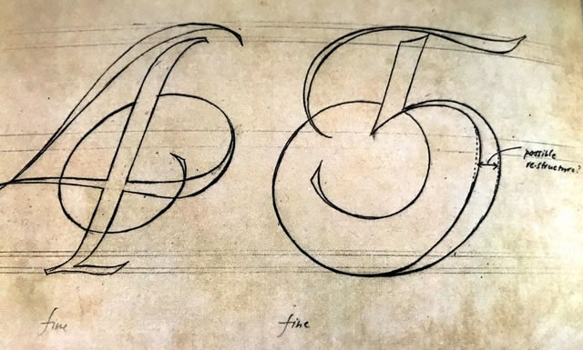
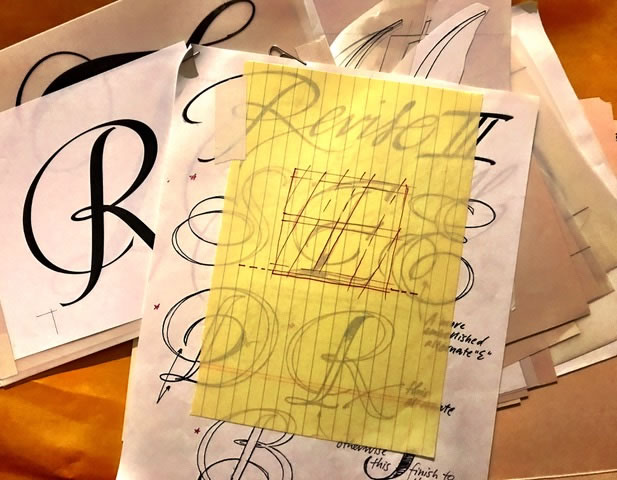
These started as sketches, then typographical kerning studies
and finally converted to film formatting for headline testing.
You can see how it works.
Conceptual sketching and form studies.
 g
g
Kerning breaks.
Larger studies [signing scale]
Film compositing rolls.
That led to a string of studies — building campaigns for Nordstrom —
one of my first retail design relationships —
my pitch to them, working on that brand before designing the Nordstrom logo and font system was about integrative deployment — 360º strategy;
to that, I designed signing and shopping bags.
And fonts.
That led to John Jay and working with him
for nearly a decade on design collaborations in NYC,
the most obstreperous of which would be
the major fortnight campaigns that were
Marvin Traub’s
gift to the city of Manhattan
as gala Bloomingdale’s events.
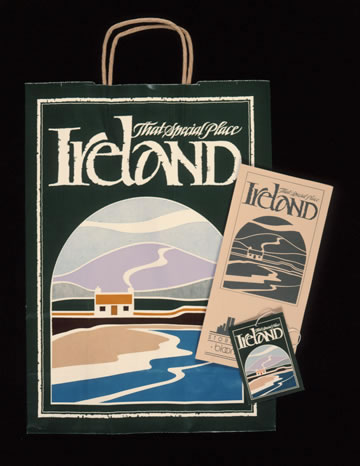
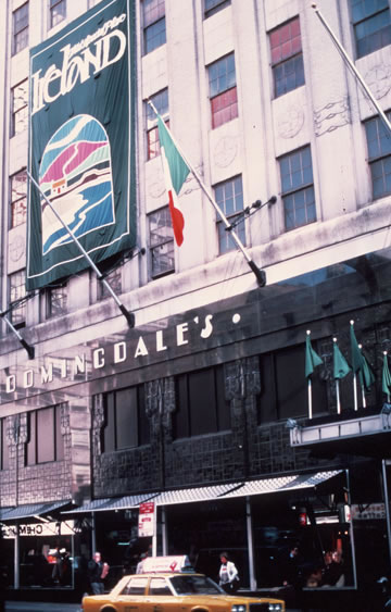
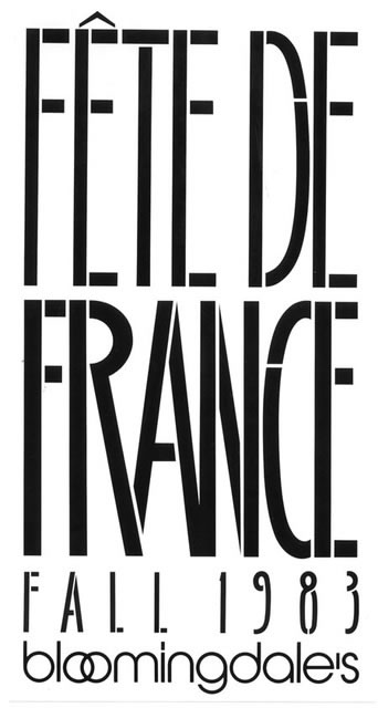
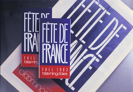
A GALLERY OF CAMPAIGNS | CUSTOMIZED GIRVIN ALPHABETS
AND IDENTITIES FOR BLOOMINGDALE’S
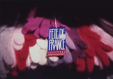
FRANCE | Bloomingdale’s NYC
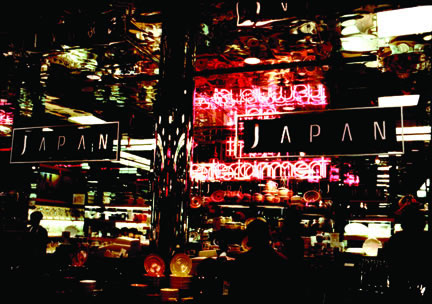
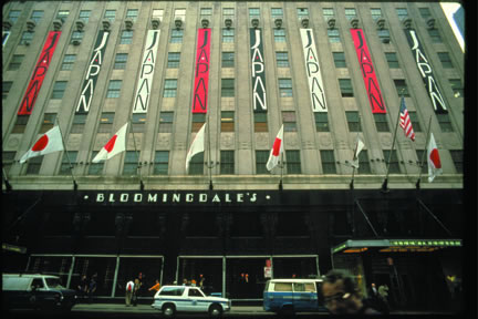
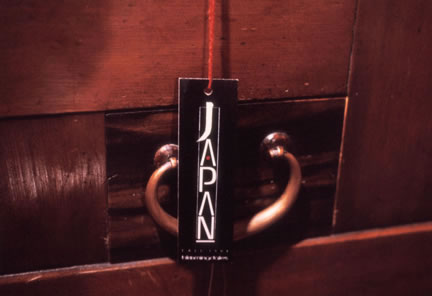
JAPAN | Bloomingdale’s NYC
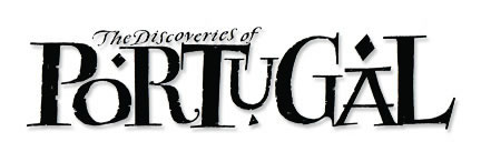
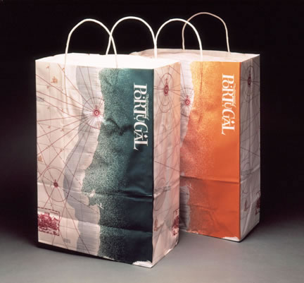
PORTUGAL | Bloomingdale’s NYC
SOUTH CHINA SEAS | Bloomingdale’s NYC
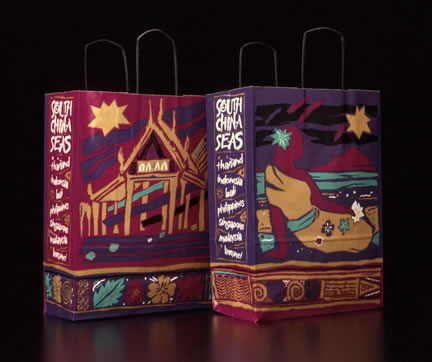
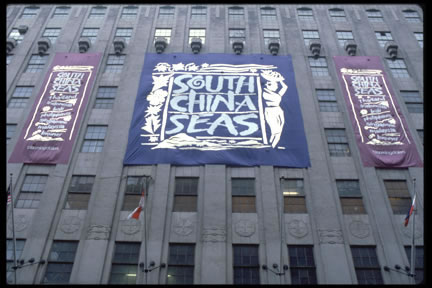
All of these campaigns involved customized fonts,
alphabets for signing, pop-up shops, restaurants, collateral, advertising and video.
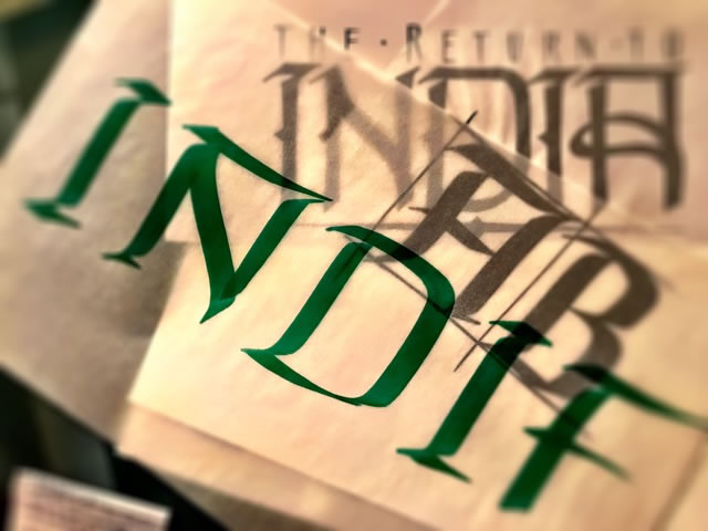
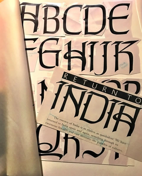
A font system for India — another campaign.
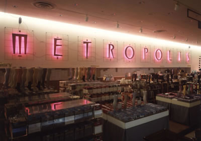
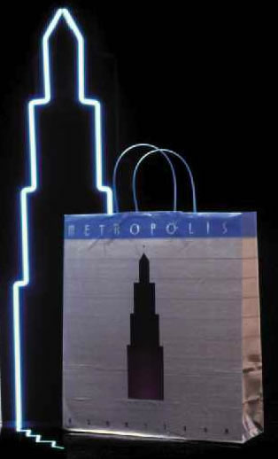
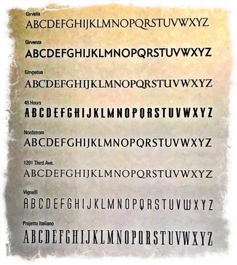
The other point to integration can lie in signing and the systems to support building branding — which is, literally, branding buildings: creating custom fonts that align with the brand, the architecture, etc.
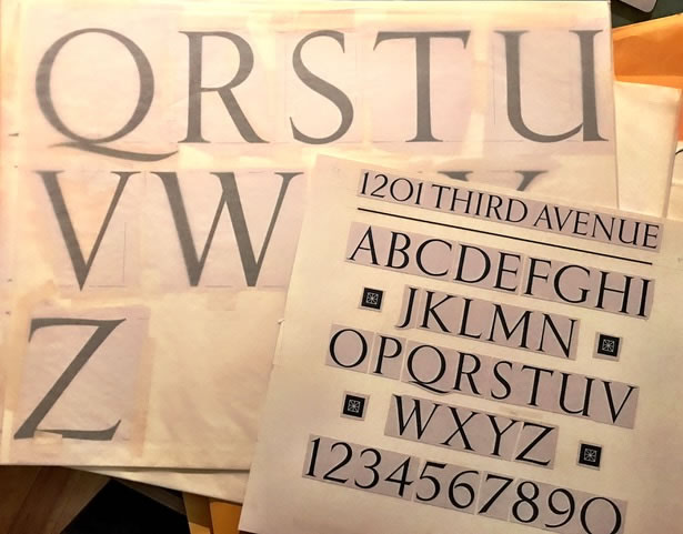
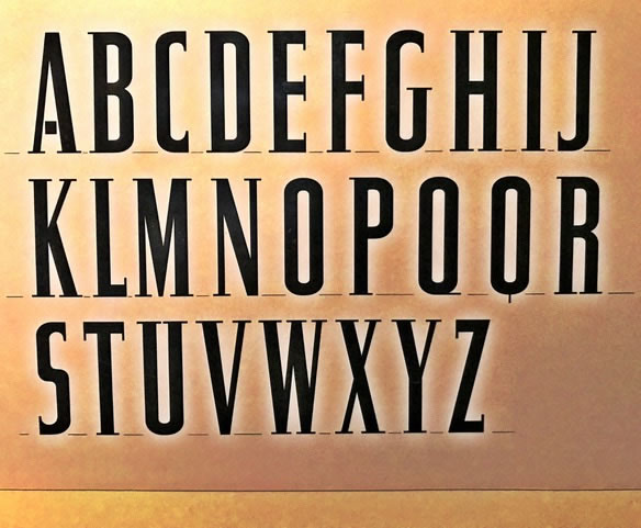
Here’s a rendering of a string of fonts designed by GIRVIN.
These are all project related and unavailable as purchasable fonts. They are — the GIRVIN corporate font; a font for FIFA’s posters, a inscriptional font for stone-cutting [a redraw of Eric Gill’s Perpetua], a titling font for CBS | 48 Hours, Nordstrom’s identity font and signing typography for departmental signage, a typeface for a neo classicist skyscraper in Seattle, a font for Michael Bierut and Massimo Vignelli, and finally, lastly, one of several campaign fonts for windows, shopping bags, merchandising and print advertising at Nordstrom.
It’s my belief that the alphabet is a transformational device, rooted in magical and mystical origins and, well-drawn, has unimaginable power.
Read.
Rejoice.
Wonder.
Weep.
Tim
––––
Crowdweaving innovation >
ideation, charrettes + brand events
Girvin BrandQuest® | goo.gl/yAquKQ
Discover more from Girvin | Strategic Branding & Design
Subscribe to get the latest posts sent to your email.