Exploring brand in context — from the comical imagination to the full screen.

Storyboarding:
There’s been a lot of discussion about the movement in legacy from comical development to full screen adaptation. There are some symbolic moves in that grouping of interpretations that are interesting. And personally relevant.
Last week, I was working in Hollywood, connecting with some clients. One of these was Silver Pictures, meeting with their current COO, co-producer Steve Richards.
Being there reminded me of my past work. In the lobby of the space are dozens of posters — and many of them have work that I’ve been involved with — from the Streets of Fire (the earliest), Lethal Weapon and 48 Hours, The Last Boy Scout — with Tony Scott — to the later franchise, The Matrix (a spectacularly successful run with a $3 billion outcome). It was here, at the Silver Pictures offices that I worked with the Wachowski brothers (now brother and sister, I suppose). Larry (Lana) and Andy were an intriguing pair — and I was set up in the office for a couple of days, exploring the work in development.
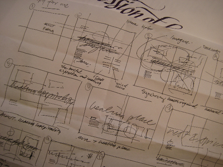
Much of that work was about finding the heart of the story — and the storyboards — in the opening conceptual development. There was an array of intriguing ideas and visuals in play, but it was mostly loose storyboard renderings and art concepts. They’d hired a group of illustrators to play out the development of potentials — nothing, however, was finalized. The three of us, along with the occasional visit from Dan Cracchiolo, producer of the film — coupled with explosive outbursts from Joel Silver, who’d call with obscene accusations of late deliveries (no — the Wachowskis had everything delivered to them), we’d walk, phase by phase through the work in development.
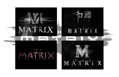
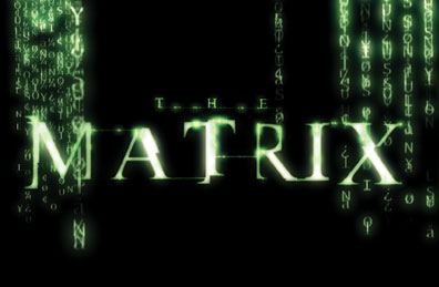
For one, it was about a monogram and a code that formed the shield of the matrix streaming alphabet (as above — and below). We created opening character prototypes, sino/anglo renderings. They are based on the structuring of a pixelated grid with sino / katakana forms, combined with greco-roman structuring. A work in progress. We didn’t create this versioning — a screentop desksaver (I’m actually not sure that it’s from the film) but I found the reference:

The examination of the right path, the perfected solution was relatively meandering — finding some element that the Wachowski’s found compelling. “What would Björk like?”, Andy intoned. “What about incorporating the pod?” Larry suggested. Lots of ideas, pages of concepts and — in a way, the work was all about finding the story thread. And what it could look like.
This is the link, then, to the blog. The concept of the story — and creative framing — in the storyboard. And where, really, does the story board come from? To my sentiments, it’s all about comics. Comic books are essentially storyboards — that is, they are designed to frame story in the context of a grouping of sequenced visuals — with text.
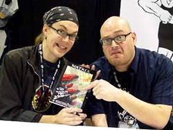
And interestingly enough, this realm is entirely where the Wachowski brothers come from. Creatively, their background is framed as writers of comics — moreso, childhood explorations: “The brothers admit to a love for telling multipart stories. “Because we grew up on comic books and the Tolkien trilogy, one of the things we’re interested in is bringing serial fiction to cinema,” Larry explains. “If you could have a film where you don’t get to the hour-and-a-half mark and know, ‘Okay, here it comes, the big wrap-up,’ but instead you have no idea how the movie’s going to end, I think that would be very exciting.” Andy puts his desire to shake up viewers a bit more bluntly: “We think movies are fairly boring and predictable. We want to screw with audiences’ expectations.”[Filmbug].
Wachowski Burlyman Comics brand:
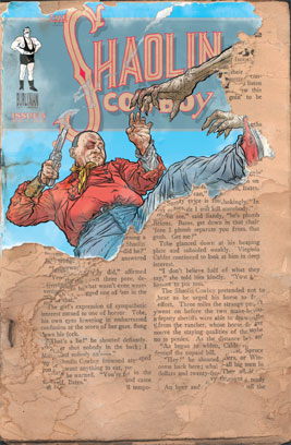
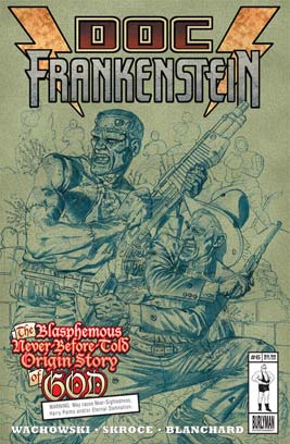
For another, it is about writing in the context of framing telling. “Prior to working in the film industry, the Wachowski brothers wrote comic books for Marvel Comics’ Razorline imprint, namely Ectokid (created by horror novelist Clive Barker) in 1993 as well as writing for EPIC Comics “Clive Barker’s Hellraiser” and “Clive Barker’s Nightbreed” comic series. There’s another story out there (speaking of storytelling) about my connections with Clive Barker (Nightbreed). Another time, another notation. So when I worked with the Wachowski brothers — it was all about the storyboarding, the comic book sketches that sequenced, frame to frame, the entire film. I had the distinct pleasure of partnering at that phasing of development. And, in working on a film, it’s at the heart-filled opening — the seeds of ideas, in exploring. Now I tend to frame everything in story-boarded sequences of ideas. Like this:
What’s the next step, the newer storyboard? Speed Racer. What I note, to the sequencing from the Matrix series to the visualizations of V for Vendetta, is the link between storytelling, the framing of a comic book treatment and, finally, the leap from Japanese Manga — 60s television (a Wachowski influencer, noted above). Here’s a grab from Wikipedia — that pushes further:
“The characters and storylines originated in Japan as the manga and anime series Mach GoGoGo, from the anime studio Tatsunoko Productions.
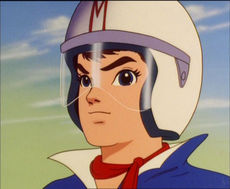
Mach GoGoGo was first created, and designed, by anime pioneer Tatsuo Yoshida (1932–1977) as a manga series in the 1960s and made the jump to TV as an anime series in 1967. The central character in the anime and manga was a young race car driver named Gō Mifune (Mifune Gō). Yoshida selected the names and symbolism in his creation very carefully. The large red M on the hood of the Mach 5, which in North America was assumed to stand for “Mach 5,” is actually the emblem of Mifune Motors, the family business. That is also the origin of the “M” on Gō’s helmet. This was an homage to Japanese film star Toshiro Mifune. His given name, Gō, is also a Japanese homophone for the number 5 (the number on his race car). This is also represented by the yellow letter G embroidered on his short-sleeve blue shirt.
The name of the series, Mach GoGoGo is actually a triple entendre: as mentioned, it stands for the number 5, i.e. it is the name of the car, the Mach 5; it is the name of the main character; and it contains the English word “go.” Taken together, the program’s title thus translates as, “Mach 5, Gō Mifune, Go!” The names themselves constitute a multi-lingual wordplay of the kind that had started to become part of the Japanese popular culture of the time.
Yoshida got his idea for Speed Racer after seeing two films that were very popular in Japan at the time, Viva Las Vegas and Goldfinger. By combining the look of Elvis Presley‘s race-car driving image, complete with neckerchief and black pompadour, and James Bond’s gadget-filled Aston Martin, Yoshida had the inspiration for his creation.
The English rights to Mach GoGoGo were immediately acquired by American syndicator Trans-Lux. The main character Gō Mifune was given the name “Speed Racer” in the English version. A major editing and dubbing effort was undertaken by producer Peter Fernandez, who also provided the voices of many of the characters, most notably Racer X and Speed Racer himself. Fernandez was also responsible for a rearrangement of the theme song’s melody and subsequently wrote its English lyrics.
In a 2008 interview with Chicago Tribune DVD columnist Louis R. Carlozo, Fernandez recalled that he landed the job working on “Speed Racer” after ghost-writing scripts for “Astro-Boy” and “Gigantor.” Simultaneously with “Speed Racer,” Fernandez also voiced the main character and wrote scripts for another anime series, “Marine Boy,” sometimes taping both shows in the same day in New York City. Fernandez also said he could not possibly have predicted “Speed Racer’s” lasting appeal at the time or in the decades that followed. Reflecting on the series’ staying power, he commented: “There was the family relationship. You knew about Speed’s family, you knew them well. They were all involved in each race. And we all play with cars as little kids, we love cars. The Mach 5 was a hot car, and there all sorts of cars throughout all episodes. I still think the Mach Five is ahead of its time.”
What I offer, in characterizing storyboard development, to Wachowski visualizations, and the comic book, are these telling visuals. How comic-bookish, the palette, the engineering, the design:
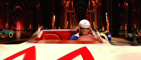

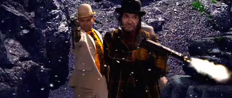
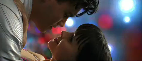
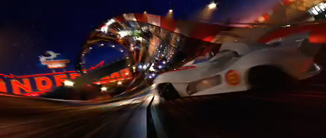
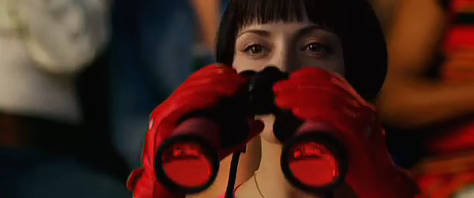
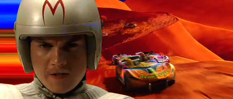
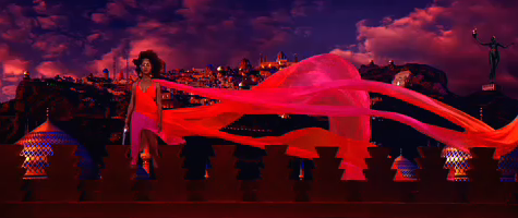
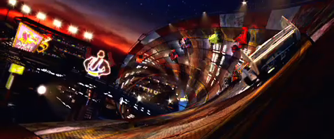
There are some interesting quotes out there on the color. Skittles on drugs. Candy pop. Psychedelia. They’re all right, really. But that’s the point, isn’t it?
Comic book:
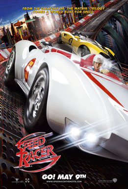
And just for the record — 100% of the visual imagery here, aside from the Wachowski comic books, references the copyright, 2008 — and is owned — by Warner Brothers.
These guys:
What do you storyboard, I wonder?
Tim Girvin | Queen Anne