Luxury Retail design and brand patterning, Jakarta Seibu, Java, Indonesia
I had the opportunity to partner yet again with Callison Architecture, Dawn Clark, AIA LEED and Andy Thaemert, Doug Shaw and team on the development of an expansion of the environmental design package that was part of yet another PT Mitra development complex in Jakarta. The project began in 2006, and fully engaged in 2007, completed roughly half way through the year. Andy Thaemert, a Callison designer, had created an opening pattern language that we’d disassembled into a series of Dutch Indonesian, layered files for the patterning applications in a plethora of surfaces.
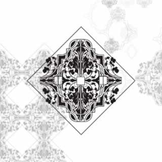
In presenting this to Ibu Nursalim, the scion of the Mitra clan — she said, “but I don’t want a pattern that’s Indonesian for Seibu, I want something that’s Asian, something Japanese.” In a turnaround effort, from there, we worked on taking the design language of the Sogo, Osaka, retail design,
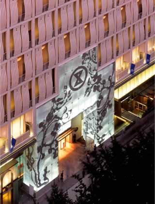
which was want she wanted, and layered that patterned language even more extensively. This pattern, originally based on polarized graphic forms photographed by Dawn Clark, of cherry blossoms and gingko leaves, was then extensively applied, everywhere, in perhaps one of the most comprehensive layered showings of the design in the retail universe — less, as Dawn puts it, to “Disney” retail, and more to intentionally overlaying patterning and beauty elements to create a kind of symbolic language that references the spirit of the asian aesthetic.
In the entry windows you can see the opening applications of the patterning in the formal array of cherry branches, transecting the space of glass.
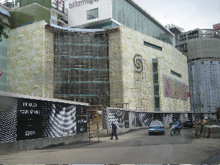
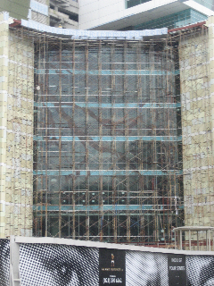
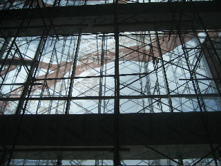
While these photographs are showing the project under construction — and surely in the attached link you can get clarity on the scope of finalizations — there’s a interesting background on the techniques used in building, and applying, this voluminous vocabulary.
From the inside, the large scale treatments looked like this, as laminate skins.
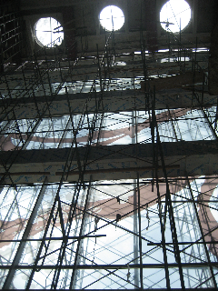
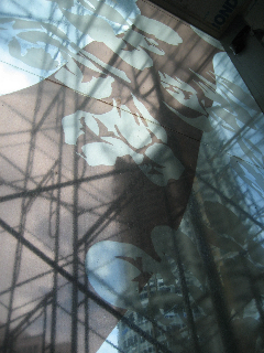
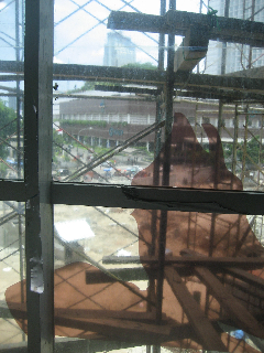
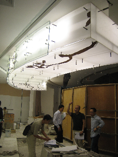
We’d created patterning treatments with the Callison team, for the entry overhangs, here shown in installation experiments.
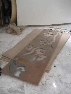
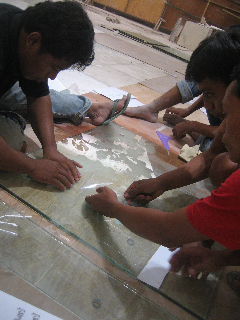
Patterning applications were done, according to coloration expectation, with either cut and incised materials or skins.
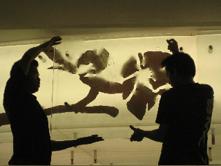
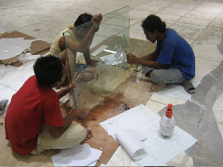
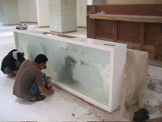
Rather than sandblasted or acid etched applications, this technique was applied to mirrored and reflective surfaces as well.
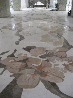
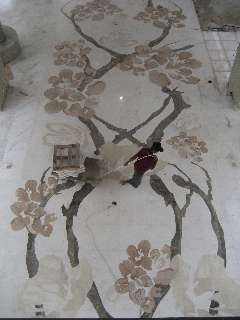
Perhaps uniquely emblematic was the incised applications of dimensional and shaded expression in the use of stone for the floor treatments, with precisely aligned seam cutting and inlaid application.
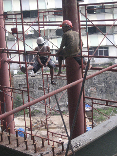
Construction in any part of the world is a revealing insight into exposure and experience — how do people build things; especially if they are building things that are designed in another part of the world.
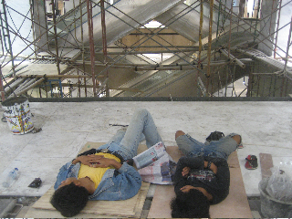
And these images give you a sense of the potential handwrought character. That is, much of what might be, for example, digitally generated in our culture — like the creation of output templated signing treatments, in this culture might be entirely cut by hand. If there’s a break, then how is — to reference — the concept of rest handled.
Here are some perspectives:
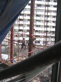
Barefooted scaffolding workers.
Handcut patterning templates
Teams, in contemplative scenery
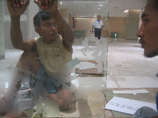
Meditation on the work
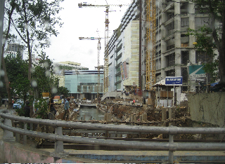
Construction canal and footbridge
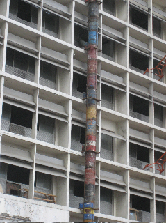
55 Gallon drums as debris chute
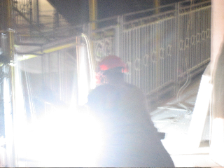
Impromptu welding
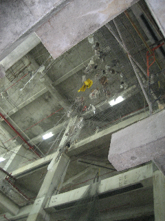
Rebar installation for debris capture
If it’s easier to climb in bare feet, then…
