Exploring the illusory: branding ghosts and the veil of what is beyond…
I’d been fascinated by the concept of the ghost – and the ghostly – for decades, since I was a kid. The magical, the mystical, the mysterious. Actually, my first big book purchase, happened at 10 years of age, I’m guessing. Personally, it was huge – encyclopedic in character – a large tome, covering everything from the darkside: “Magic, Witchcraft & The Supernatural”; it was a clothbound, mystically-stamped, black book. In the 60s, it cost $12.95 – a fortune. And I’d paid for it myself, so there was no interference from the parents.
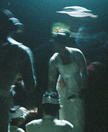
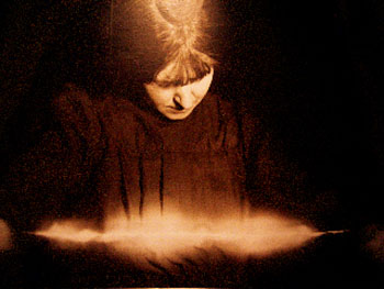
Even today, I’m finding myself still exploring similar spaces and sentiments. I travel to places where the spirit world is still seen as functioning – like Thailand, Bali and the Indonesian archipelago (the image above, with the ghostly flickering above the Priestess in a ritual sanctum, is from a remote Balinese village), Cambodia, Turkey, India, the Himalayas. Spirits abound because they are recognized.
It’s a common theme in my work – at least in the personal sense – the idea of there being expressions of the spiritual realm – that things cross over – with frequency. It’s surely not that I’m alone. The Metropolitan Museum of Art had a show, exploring the idea of how “spirited photography” completely entranced the “vital forces” and those influenced by them in the Victorian Age.
What I savor is that there is always something beneath – that things are never solely as they appear – that there is more to the story, there are layers of content. This imbues my work with a character that speaks to the context of the translucent, the windowed, the shadowed, the floating, the ghosted, the dusted, the “distressed”. And I frequently describe these kinds of expectations in art directing design solutions or strategic perspectives for our clients. Ghosts need to be “ghosted”, I might presume.
And, of course, theatrically, they still have great credence. Ghosts are good movie stuff.
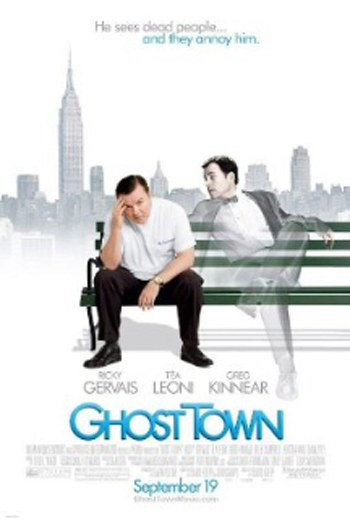
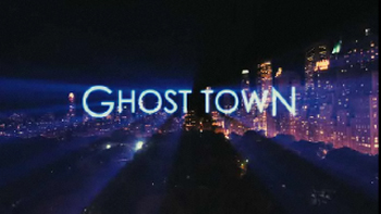
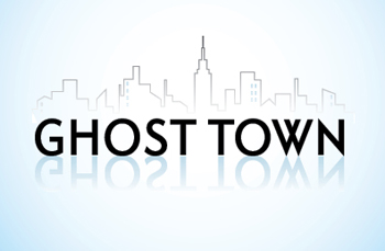
Good project then, for our team to explore the idea creating the branding design language of Ghost Town, the new Gervais vehicle.
You know the story, perhaps. Gervais plays a particularly “in-human” dentist, Bertram Pincus, who’d far rather not have any kind of connection with those things called “people”, living out – largely alone – his disdaining and sarcastically acidic form of existence. Following his check up, mid-life colon testing, he’s informed that, in fact: “he died”. For about 7 minutes. That momentary crossing to the other side not only infects him with the need to be more connected to those people that are alive. But as well, those that are not – ghosts – especially the needful ones that have left behind an entire plentitude of unfinished business. Their attached goal, of course, is to find out how Mr. Gervais can help them.
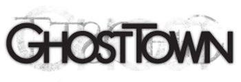
How then, to explore that visualization? First, line up the right team at Girvin | Seattle (in this instance, for this project). However, both offices can get involved, depending where I might be…in leading the team. This time, Creative Director, Chie Masuyama, as well as Senior Designers, Christina Sakura and William Johnson added to the creative fray – building, finally, this ghostly rendering of simple design solutions. I might add that they are, in fact, very much, disarmingly simple, completely hand-drawn and digitally detailed fonts.
Herewith:
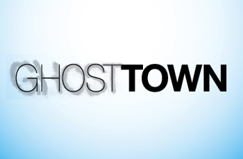
The ghostly scribble, a graffiti in smoke:
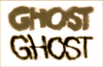
Building typographical illustrations that render that which is seen on the surface, and that which is lies beneath – the ghosted lines of smoke. These were drawn, literally, like that – pigment, a highly absorptive field, and a liquid to break the molecules into colored calligraphic smoke…
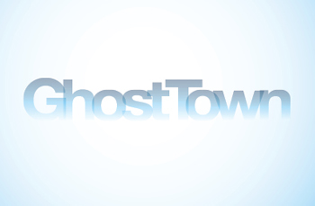
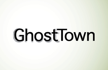
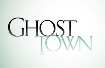
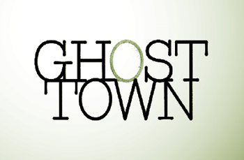
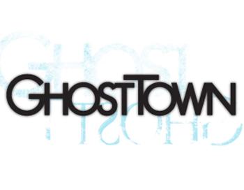
With that idea of “ghosting”, we examined the notion of reflection, or mirroring – that which is below, hidden and that which is clear – on the surface. Every thing has a ghost, does it not?
That would be today.
Let me know what you think.
Tim Girvin | Hollywood, CA