Brand, personality, context and visualization in the community of politics.
If there’s a visioning — and a vision — what does it look like, what does it feel like and what do you care?
What’s the story, anyway?

Over the course of the last number of months, we’ve all been exposed to the visualizations of campaign thematic development. Whether it’s small town or big town, whether it’s statewide or national — or even internationally, the flavor of the candidate is either effectively annunciated, or misaligned, in statement.

2007 French Presidential campaign posting, Paris.
The styling of the campaign presence is something that is — for the most part — thoughtfully engineered. Other times, it would appear that there are poorer, less than thoughtful alliances between personality, brand presence and political stance.

United Russia Poster | Putin’s Silver Plan
And then…
What mix here, for example, the blackened field, the mix of imagery and fonts and the Optima identity, a horizon line capped with a military emblem star. (http://www.thingsyoungerthanmccain.com/?p=6)
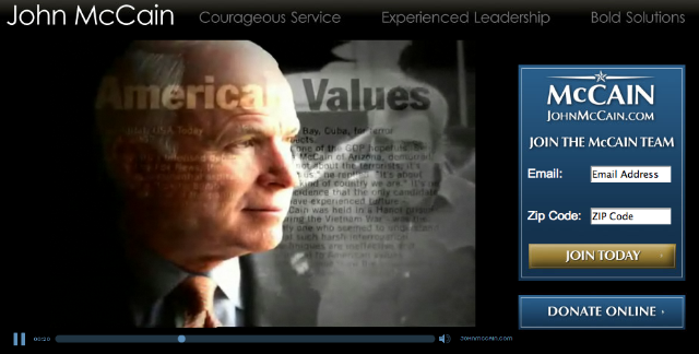
The darker presence of John McCain (analyzed from a typographic perspective here: http://campaignstops.blogs.nytimes.com/2008/04/21/mccains-optimum-look/)
Obviously, there needs to be clearly defined links between philosophy, implications of service to the voters, and the resultant actions that reflect that character. And aside from the sound bites, books, blogs and speeches, there are the campaign branding messages that really empower the potency of articulation.
Brand strategy, typographic renderings and imagery.
Everyone’s got a point of view on that. Steven Heller, a prolific and insightful observer of design — as well as design history — writes a blog column at the New York Times, as well as his Daily Heller @ Print exploring the political vagaries of visualization, oftentimes — calling on other experts and friends from his community to critique his point of view. Maybe not a critique per se, but a variation in thinking. Personally, I related to his take on the character of Adlai Stevenson campaign (1952) — the well worn shoe. And, at the age of 6, his enthusiastic wearing of it:

A particularly elegant and stately piece of jewelry.
As Brian Collins, the designer, points out in a discussion with Steven, in sorting out the brand development for Obama — it’s less about the image, per se, and more about understanding the complexity of one — the management of thousands of items, volunteers and potential experiences that need to be coordinated, along with a barrage of communication media. As Collins notes:
“it is about discipline. Political campaigns are the Brigadoon of branding. There’s a compressed amount of time to tell a candidate’s story before the race is over and the campaign vanishes. During that window, the campaign must make sure that everything it produces — everything it touches — delivers the candidate’s message in a meaningful way. No opportunity to amplify that story should be missed. The Obama people have used design to take that discipline to a whole new level.”
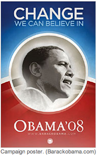
Barack Obama is running the first real transmedia campaign of the 21st century. His people not only understand how media has splintered, but how audiences have splintered, too. But it’s worth noting that the fray has been stepped up — the opposition is exploring, as well, a similar multitude of tactics to advance the connection to community — known, emerging, or touching for the first time.

Brian Collins — “Cell phones, mobile devices, Web sites, e-mail, social networks, iPods, laptops, billboards, print ads and campaign events are now just as important as television…
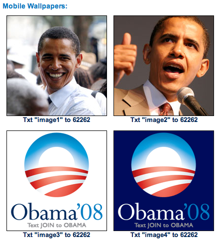
The senator’s design strategy has given these diverse platforms (and their different audiences) a coherence that makes them all work together. I’ve worked with giant, global corporations who don’t do it this well.”
Paul Martin‘s blog (http://critiquewall.com/2006/09/27/brian-collins-experience-information-inspiration) offers a good intonation on that front.
Another link, viewing Brian’s work and thinking — http://www.fastcompany.com/magazine/95/open_design-collins.html.
More here, brand innovations:
http://www.fastcompany.com/magazine/85/brand.html.
His site is in development, it would appear, more to an overview and his insights: http://en.wikipedia.org/wiki/Brian_Collins.
Earlier this year, in exploring the imagery of democratic candidates, this reference appears in the NYTimes, comparing the visualizations and brand styling of Apple’s Macintosh brands and the ubiquitous PC. Author Noam Cohen notes that “The linking of Mr. Obama with Mac and Mrs. Clinton with PCs has already become something of a theme during the primary. Early in the campaign, a popular YouTube parody of Apple’s “1984” Super Bowl ad made Mrs. Clinton the face of oppression. This week on The Huffington Post, Douglas T. Kendall, the founder of the Community Rights Counsel, a public interest law firm, made the connection more explicit.”
There are good insights in the styling references — that is, if one were to compare the Apple in terms of overall sales volume, then the democrats are simply out of the picture. But that’s the point — what’s the story? And who really cares about it?
To the Apple positioning, is it really about the concept of new — “thinking different”? There are big shifts happening in the brand Apple, its story and how people relate to it — there are telling cultural reflections. Beyond that, what’s that mean to campaign theme and brand development? And what about Obama? New, think different? Will everyone buy it?
Looking askance at the other campaign expression, exploring alternate positioning to campaign imagery, in contrast…I’ve noted, above, the dark forces of McCain’s curious visioning — and frankly I’m not sure what’s being said in the brand imagery there. Less depth, to explore, certainly. And that might be relevant to content and positioning.
But Hillary? I first met Hillary flying from NYC to Paris. She sat next to me. This was just after her first book, and she’d looked tired enough that I almost didn’t recognize her. We chatted briefly, connecting idly — but I didn’t have a copy for her book to sign. But there was a presence to the determination of her character, and I was struck by that. And she worked all the way there. OK — my exploration here is about brand, personality and presentation.
Here’s some offerings from her side of the proposition of visual value:

The brand character is solid, but slightly overweight — the heavy Garamond suggests gravity, defining her strength as a player, but it’s rounded and radiused, not crisp. While the weight is heavy, and the characters are locked up, they’re actually not connected. Each letter is slightly spaced, which is an odd strategy, given that linked up the characters builds the power of the mark. Actually — none of the letterforms touches the other. I’d reference that the quality of the flag is poorly resolved in relationship to the typography, three stripes, three stars. And its flow, the rippling, is stilted and arhythmic. It’s an “unsubtle” rendering of concept. Combine that with the over all visual character of her brand components and you’ve got something pretty hard hitting and conventional — there’s no space wasted on aesthetics; it’s all about selling hard, like the editorial styling of USAToday, or merchandising catalogs and bulk mailings. And, interestingly enough, she’s using the same support font system as her competitor in fray, Senator Obama. There’s some variation in thinking as to exactly what that system might be. I’d call it Avenir. Not Gotham.

Why so much about type? People think about it. A lot: http://www.typophile.com/node/40583
Website considerations: the design of her site is functional, but flat, direct, foundational. The color considerations are aligned — the predominant blue palette is an off color rendering — a grey blue. There’s a conservative ethic to that toned-down showing. Expanding on that program, the considerations of Hillary’s brand perspectives, there’s product. I’d mentioned that in the opening, considering the “merchandising” of campaign branding — Adlai’s hole in the shoe.
I’m not sure how this fits in the scheme of her positioning:
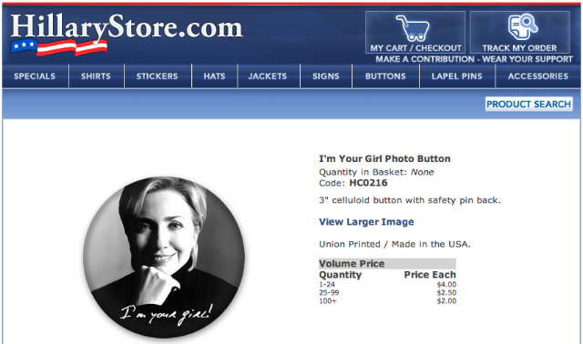
Or this rather added feminine alignment — another signature.

And the outcome, one of them:
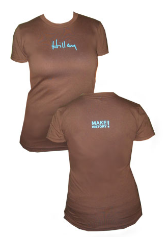
I might offer that this approach (above) actually feels more like the person that I met.
Obama, what is the character of that branding effort?
In just the overall surveillance of the system — the Obama’s brand presentation is much more, what I might call, diaphanous. It’s transparent. It’s layered. There’s a sense of dimension; the blue is sky-like and luminous. And there are suggestions of layers of content that flow through the fields and site fields that are more subtle — but there — than the other players.
Opening commitments:
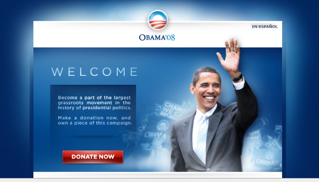
The layered, nearly monetary coded, patterned website involvement reach:

Studying the holistic field — note the luminous sky lit character of the framing. Sky’s the limit, suggested?
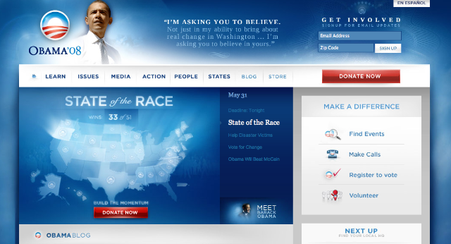
There’s a quick reach to visionary content — the implications of literary intelligence, the quote counts for something, but it’s nearly poetic in intonation:

There’s a delicate tuning in the access menu links — these, very clean, slightly artful, shaded dimensionally — in a technical way:
Brand applications: Avenir treatments, very Apple (Frutiger):
![]()

Still aligned with the familial brand design discipline, emphatic focus on key messages — humanized with a Snell Roundhand, and the delicate gradations and infusions of brighter blue variations:

Corporate mark, blue glow, star field as a signature site application:
![]()
That extends to this added luminous presentation – note the lens flare to the left of the floating mark, as well as the nimbus clouds, right:

Lens flare:

Nimbus:

What I see in the brand character, between the several offerings, whether there’s a positioning to the Democratic or Republican modeling, is about the explication of visioning. Brand is inherently linked to vision — what is the story as it’s currently offered and what lies ahead in the future? Who knows? People will react to what they see and feel — what they sense in coherence, what they experience in the holistic quality of these “brands”, these human brand propositions. Whether it’s the dark solidity of McCain, the conservative foundational look of Clinton, or the airy visionary quality of Obama, the question obviously remains to be answered.
Who looks right, to you? What links are sound, to conception, visualization and offering?
tsg | seattle
—-