
The red seeing eye of the Droid: exploring brand differentiation for telephone hardware
First off, since this blog is about brand messaging and imagery strategy, it would be good to explore that as a opener, so there’s some ground to the accusations.
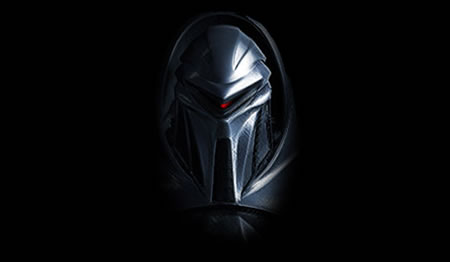
The basic structuring begins with the industrial design. Eye in place.
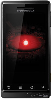
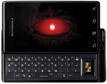
The identity. While this is cute, how does it relate to everything else? I’m not seeing the link ups — brand, industrial design, then interface and marketing. What am I missing?
The Verizon | Google | Android lock up — from the site.
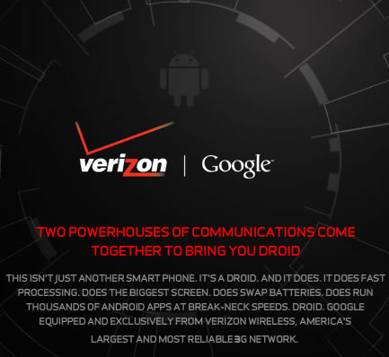
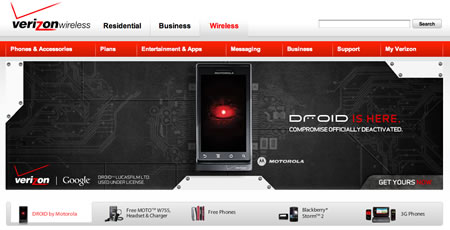
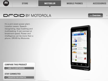
The Droid, presented on Verizon’s corporate product site:
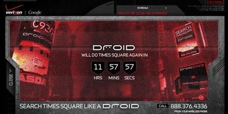
Droid, Times Square. Not sure what that’s about — but the interface looks like a replicant from Terminator.
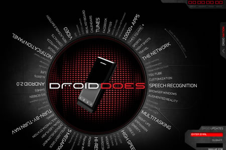
Radiant (spinning) selection interface for the product site.
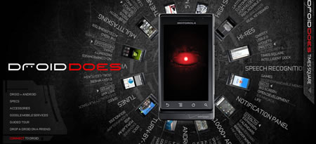
There’s an interesting challenge in brand marketing design — and the storytelling that’s connected with its hardware, interface and positioning. The real challenge is doing something different — that will relate to the single user, as well as millions of other people. What then might be the strategy of Motorola’s new Droid technology for their hardware offering? Cylon? Or Gort, from the days of “The Day the Earth Stood Still”? To marketing presence, that’s a question — who, wherefrom, why?

That’s a big challenge. iPhone, from Apple, has integrated every component of its brand expression. Industrial design, retail strategy, marketing, advertising, apps designed to a standard — they all sing together. There’s a beat that people get, relate to — cult-like, in presence. What about DROID? What will this messaging suggest?
You can’t study brand for the Droid without looking at the company which originated the conception. Motorola: for some time, in recent history — the name has been synonymous with sliding market challenges and disappointment. There was a solid beginning with the hipness of RAZR — after that opening strength, other offerings have had less focus, softer industry design and more confusing marketing. But things might be changing, especially considering the slow but sure strategic evocations of the new CEO. Motorola has been beating its way back into the mainstream markets through a series of smart plays: starting with leveraging Android as a platform, then discarding Windows Mobile and finally bringing some desirable (and high profile) devices to market. And now, with the launch of DROID, Motorola has created its most attractive and intriguing piece of technology yet. Part of that compelling positioning relates to alliances — with both Verizon and Google.
Is this the phone which will ignite the trajectory of Android into the mainstream? Is it the device that will pull Motorola back from the brink of obsolescence? And, finally, is it the keynote Google and Verizon have needed to challenge the leader in mindshare in the smartphone market? That’s Apple at the top of the game. There are plenty of good technological reviews of the tools that are embedded in the device. But what I’m curious about is the positioning of the phone, the brand — imagery, messaging, identity.

First, the concept of the Droid itself, there might be a positioning challenge to the notion of the roving eye — does that resonate, and if so, wherefrom? See this video, to get the point. Would this strategy relate to a completely contrasting design motif, adjacent to the clean friendliness of iPhone? It’s interesting that the opening launch strategy of the site — from Verizon’s side, came with a deep electronic “scanning” sound, like there’s an engine running far into the interior of the site. Actually, working on this blog, and listening to that is starting to drive me nuts. The hardened battle hammered cold dark steel substrate, too, speaks to the darker side.
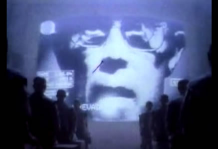
But then, there’s the idea of the eye itself — even as a kind of fearsome presence of 1984 (another curious allegorical glance back to the very elements that Apple was fighting the good fight against for the launch of the Macintosh. The imagery of Apple’s decades back presentation of technology spoke to the very stylings that are suggested in the interface of Droid’s Verizon website marketing presence.
But, I’m curious about why? What’s the strategy that might suggest that this is a resonant space for millions? It’s like: now? It’s like: different? It’s like: the future? It’s like: having your own droid in your pocket?
What I find, to Motorola’s positioning, is that they are pursuing an entirely contrary path for marketing expression. What deep metaphor might be in play, I ponder?
How do you relate to Droid?
tsg
….
Exploring technology and the human brand
the work: https://www.girvin.com
the truth: http://www.tim.girvin.com/
the reels: http://www.youtube.com/user/GIRVIN888
girvin blogs:
http://blog.girvin.com/
https://tim.girvin.com/index.php
girvin profiles and communities:
TED: http://www.ted.com/index.php/profiles/view/id/825
Flickr: http://www.flickr.com/photos/tgirvin/
Google: http://www.google.com/profiles/timgirvin
LinkedIn: http://www.linkedin.com/in/timgirvin
Facebook: http://www.facebook.com/people/Tim-Girvin/644114347
Twitter: http://twitter.com/tgirvin