APPROACHES OF BRANDED
STORYTELLING IN THE CONTEXT OF IDENTITY.
Paramount Studios
Most people know we have
a long history in the study of design and identity for films
it’s been a legacy of decades of work and
participating in hundreds of projects.
It started out, 1979, as a single logo project, a batch of brush-drawn, rolled-up and original, calligraphic art for this director, Francis Ford Coppola, and the film: “Apocalypse Now.” I drew a number of calligraphic signatures on Japanese hand-made paper
and shipped them along,
per his direction.
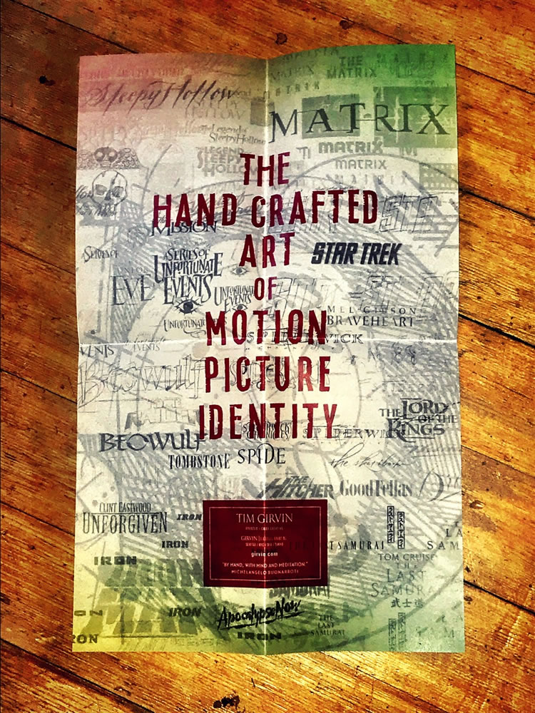
From thenceforth, I was curious about that challenge, somehow finding the perfected rendering of the title of a film, in any manner capable: compressing some spiritual aspect of the storytelling—the spirit of it, the energy of it— in the gestural expression of the treatment of words, always evolving, and crafting as a practice, over time.
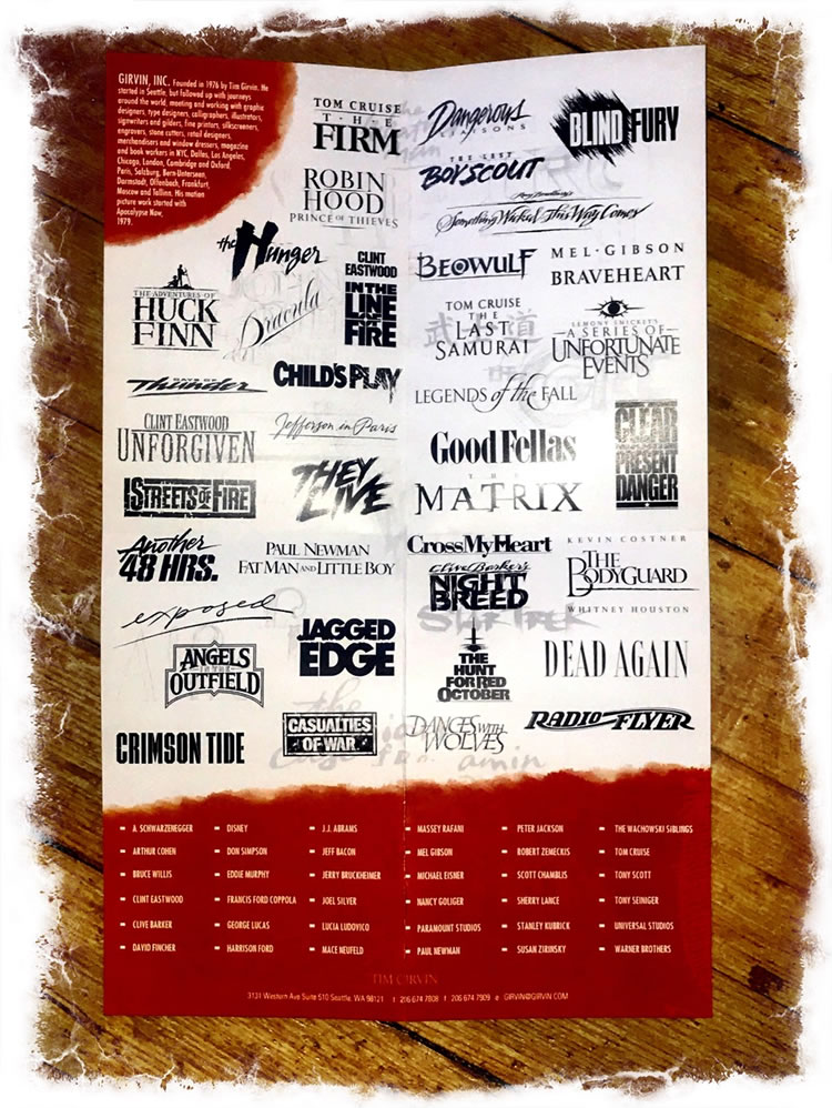
So in that perpetual curiosity about the transitioning requisites of design exploration, I kept at it. I started working with advertising agencies that specialize in theatrical marketing,
then I moved to Directors and Producers,
and I realized it was possible to learn more, get closer to the story,
dig into the archaeology of how film-making works.
It might be said that film-making is a kind of city|world-building.
The storytelling involves the core of the story and its thematic journey, from inception to its plotted arc, denouement and realization, actualization of outcomes, engagements and finalization, a journey of narrative—mythic, archetypal or the work of a conventional raconteur—there is an arc. There is a parabola of beginning to end, and there could be a returning patterning, it cycles back, it recycles forward.
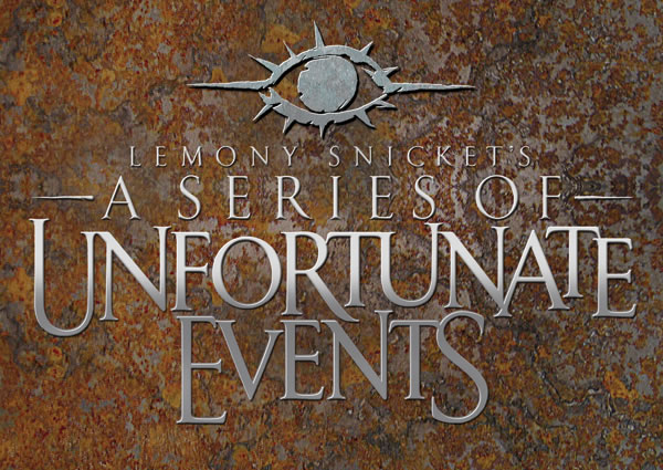
The process of designing movie identities and graphic programs can sign in, as well, to the production design. In our work on “Lemony Snicket’s A Series of Unfortunate Events” we built the brand around Count Olaf’s eye. That came from traveling to the shooting and production site—the set—meeting with the production design team, looking at their work, the sketches, talking to the team, learning about materials and set design planning, that took me somewhere.
Mostly you could say, for me, it’s about meeting with people, talking to them, learning about the story and its depiction, digging into the layering of how the story would be presented and told, and finally, reading the script, talking to actors and directors, motion studio executives and designers attached to the project.
Talking live, being there, helps with engagement and
enthrallment in the conceptual layering of the telling.
The best foundational approach is reading the telling of the story
in the context of the actual script.
For our work on
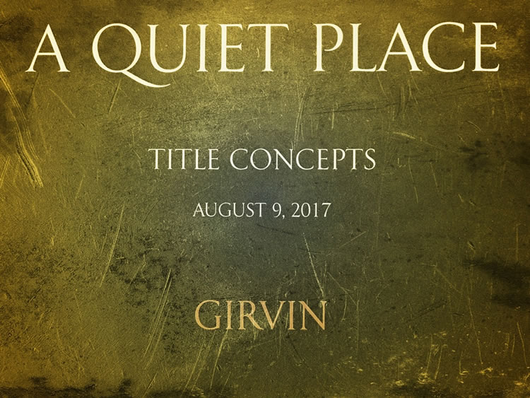
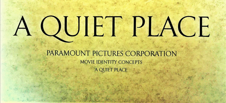
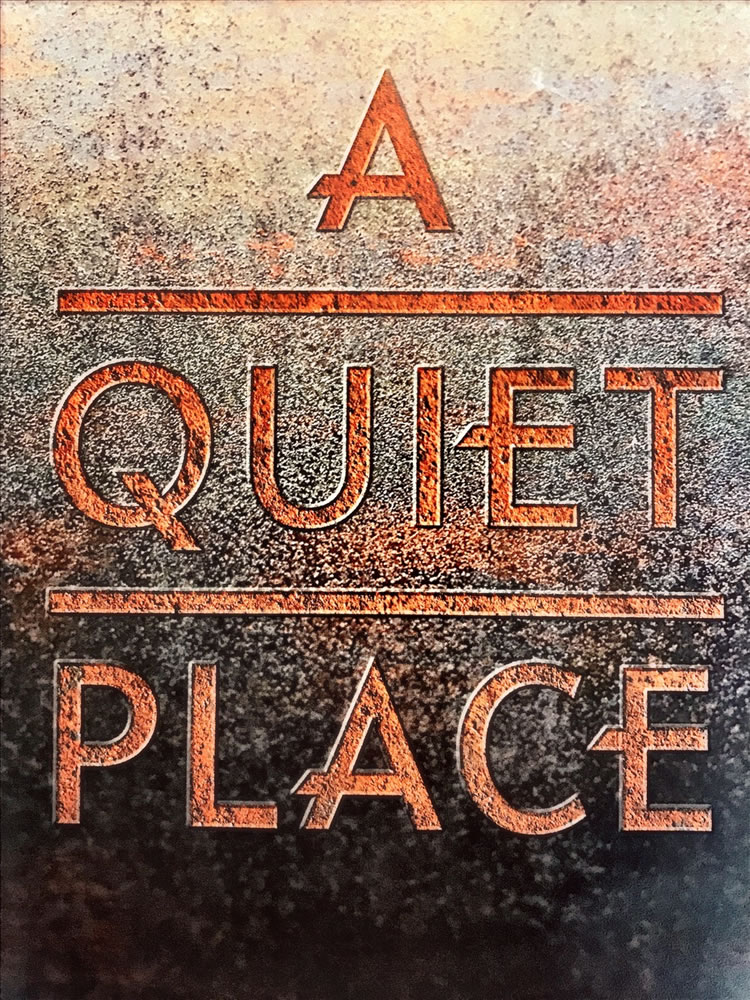
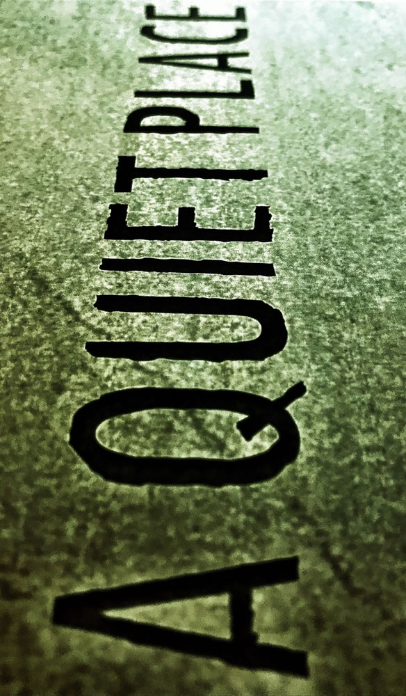
“A Quiet Place,”
I met with the executive team on the project
and read the script is a locked room on the Paramount studio Lot.
That secrecy is hardly unusual.
I did the same with Tom Cruise and Valkyrie [as well as “Top Gun,” “Days of Thunder” or “Mission:Impossible III” with JJAbrams / StarTrek,] or the Wachowski siblings and Joel Silver and Dan Cracchiolo at Silver Pictures as well as Clint Eastwood on “Unforgiven” at Warner Brothers. It’s an easy run to get down there from Seattle.
I’ve done it many times:
meet-up, read scripts, talk strategy,
sketch live and improvise on ideas.
Make it.
But to the impending potency of silence and
absolute quietude, and extreme danger in noise-made.
How do you design for that?
I went down, read the script in a protected and secure spot, on location at the Paramount Studios Lot. I studied what imagery that I could. Studied the preliminary set designs and used my imagination in reading the storytelling.
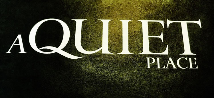
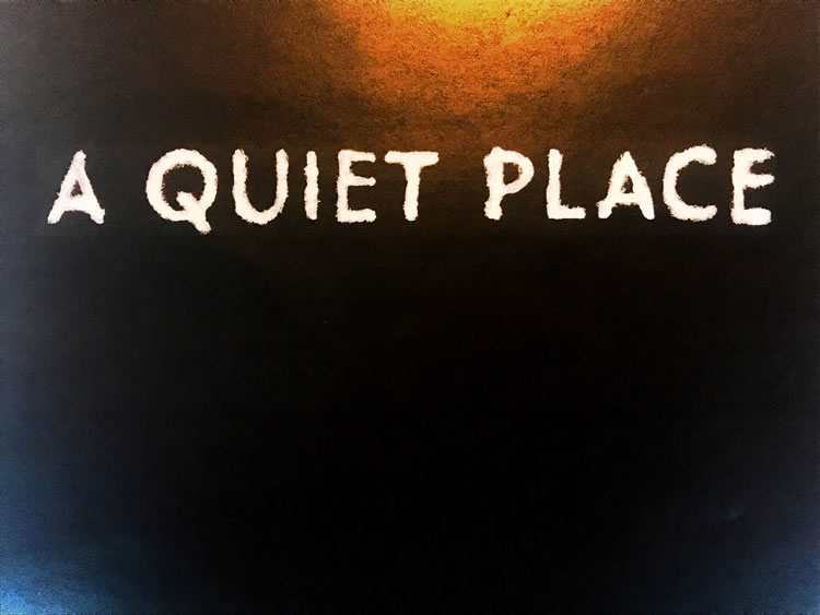
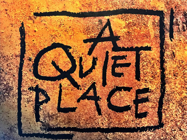
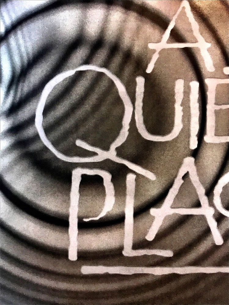
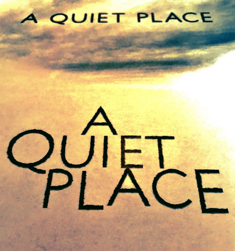
The work of motion picture branding isn’t about variations on a theme but rather a diversity of approaches that range from the most simplistic and classical renderings—the basic renderings of an ancient reach back to Roman epigraphy—to stylings that are dimensionally realized. While there is plenty of testing, much of the actual work is instinctive and emotional—it’s gut aesthetics, what feels right, overall, to the key team that’s running the theatrical marketing. In the work that we’ve done, in thousands of logo studies, it’s more about how diversely you, as designer, settle the challenge in the encapsulation of the emotionality of prospect, the propositions of the layers of narrative in captivating an audience of viewership.
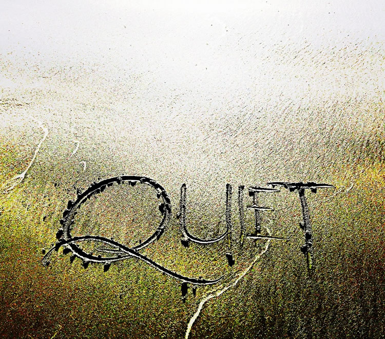
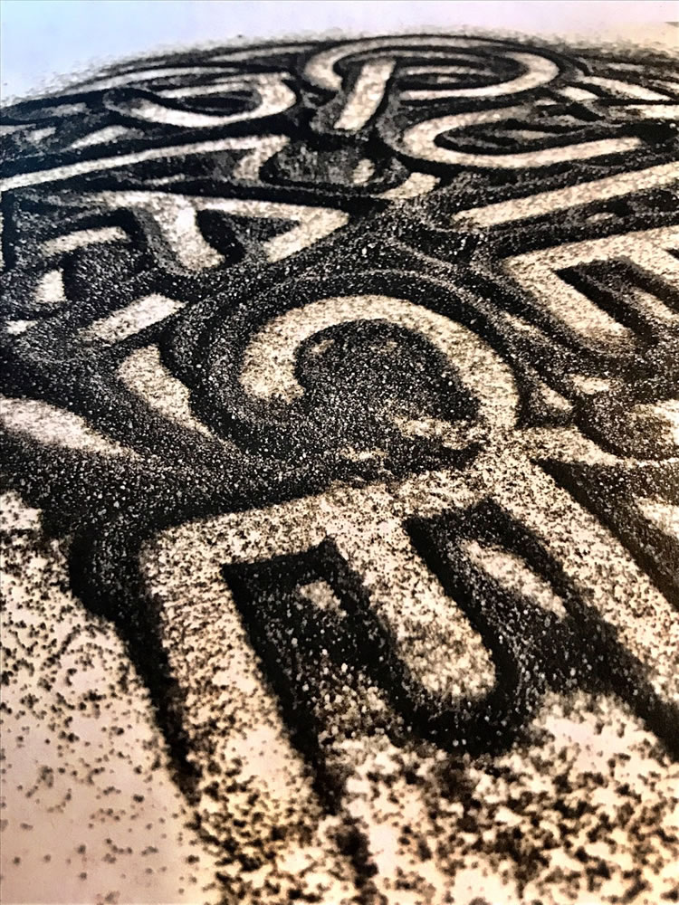
And in this range of studies, you can see the hand work, the rebuilt fonts and the plays on the sand that lies in the very inherence of quietude, the sanded pathways of silence that the protagonists lay as a way around the necessity of taciturnity. We looked at that, and we looked at other allegories of signing, sound waves and rippling.
And literally, drawing in the sand.
Explore and comment as
your timing and willingness allow.
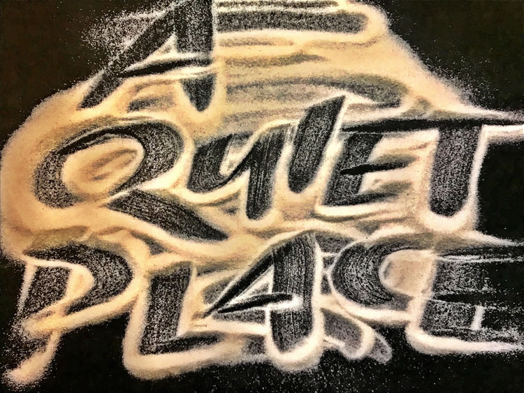
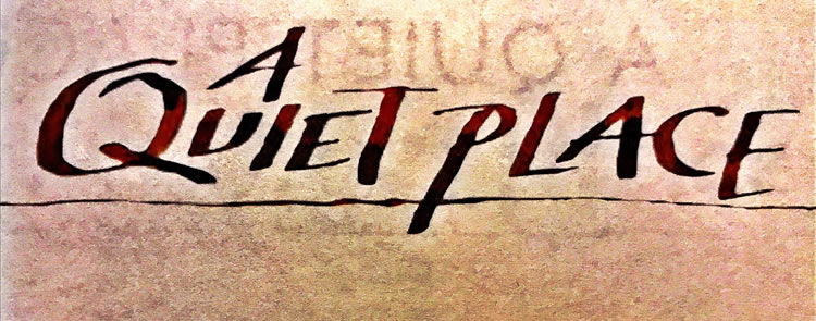
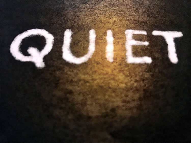
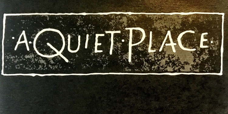
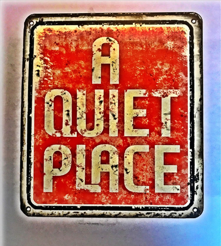
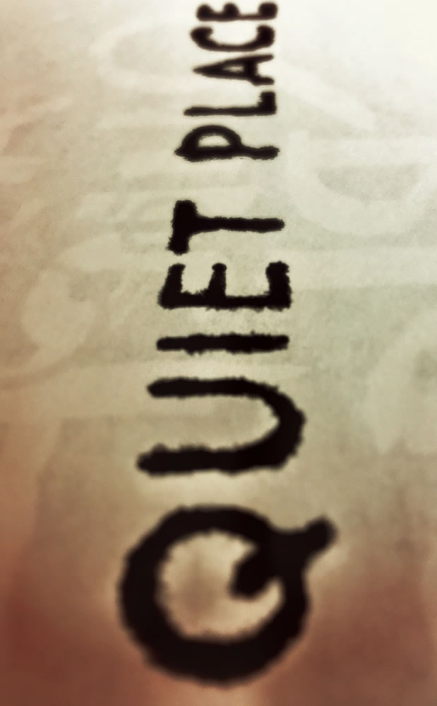
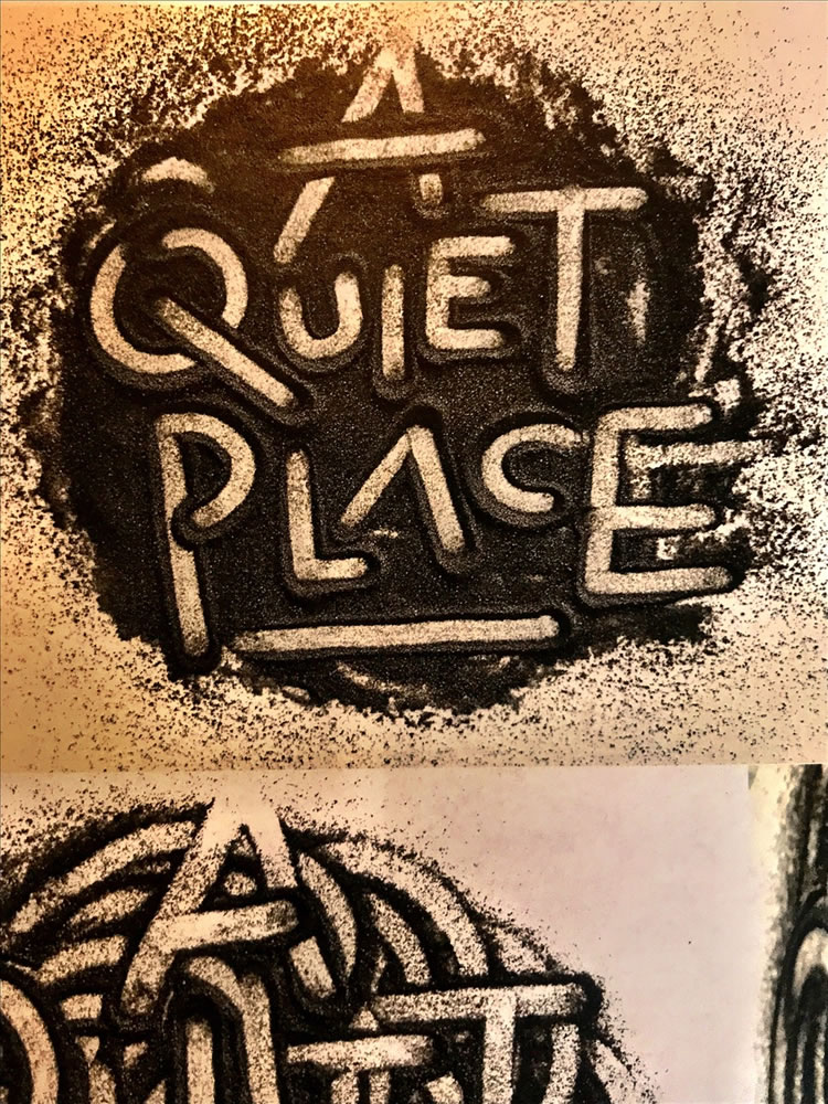
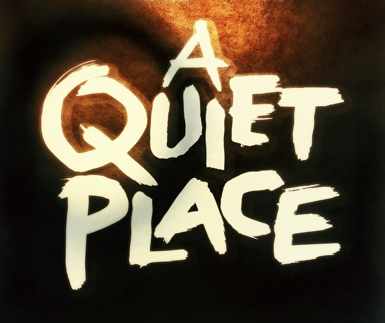
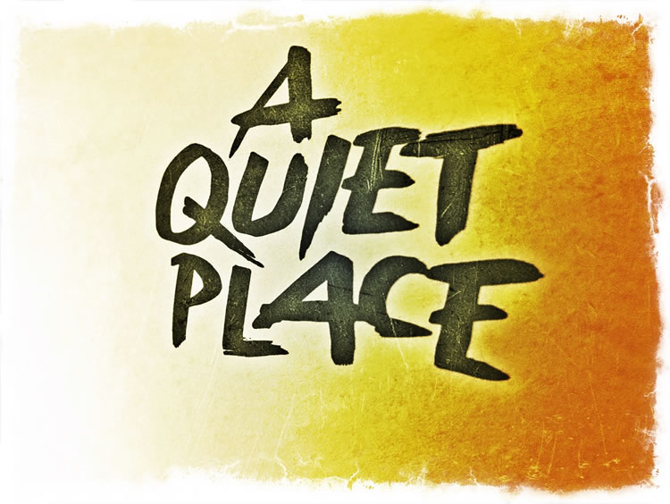
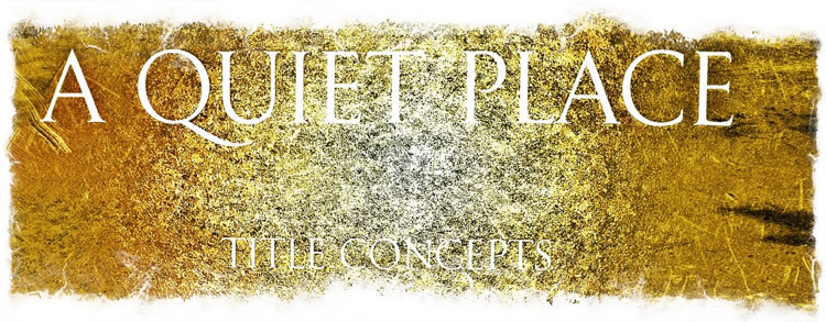
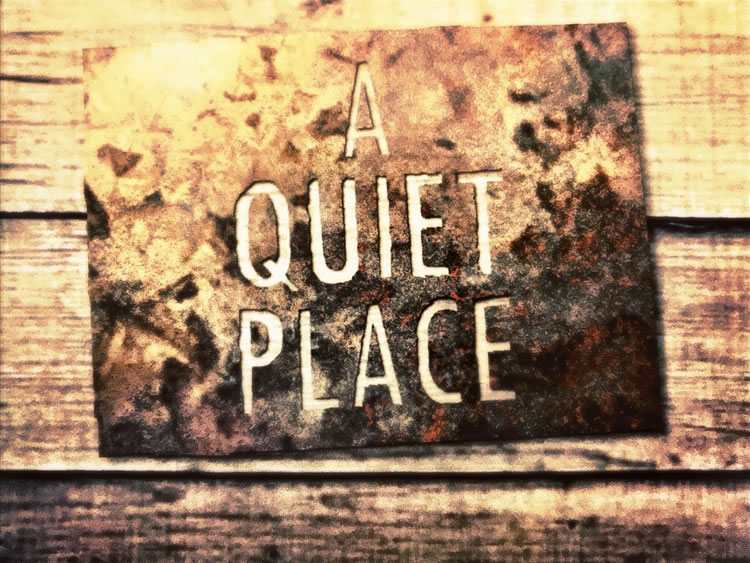
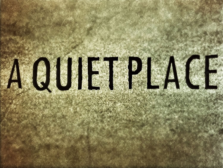
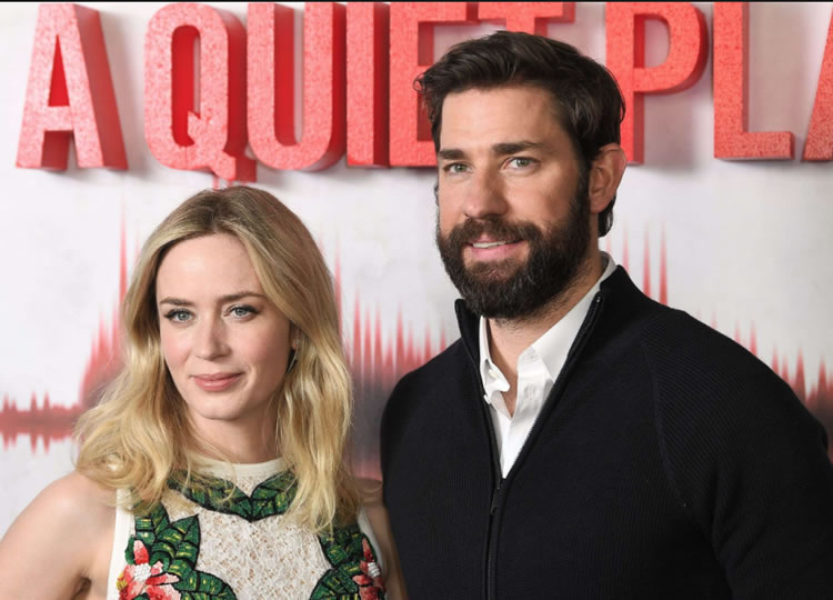
I can recall two things in the contemplation of silence, and both relate to the telling here. One, in a meditation session in a remote temple compound in Japan, a circulating monk knocked students with a long pole — quiet! And at Notre Dame de Paris, in the moments before mass, as a crowd gathered,
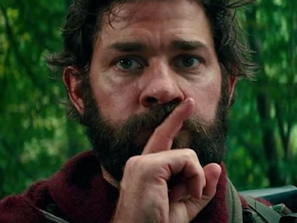
the Abbott shushed the masses with “si-lance,” his finger to his lips.
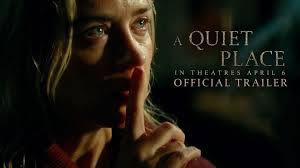
It reminded me of the central character of the film, the raised finger, blocking the lips from sound. And while I was watching the film, I thought about the contemplations of walking silently, foot-placed in meditative care, another practice exemplified in the secretive and silent sanded walkways. Much of the work that we did looked at that notion of expressing the emotionality of the quieted sensation. Silenced.
I found the allegory of the hearing-less in the context of the deaf daughter and in the stridulation of insects and the resonation of her hearing aid.
“Insects, why cry, we all go that way.”
She could hear, they could hear.
And what they could hear, along with her,
in the end, proved the…
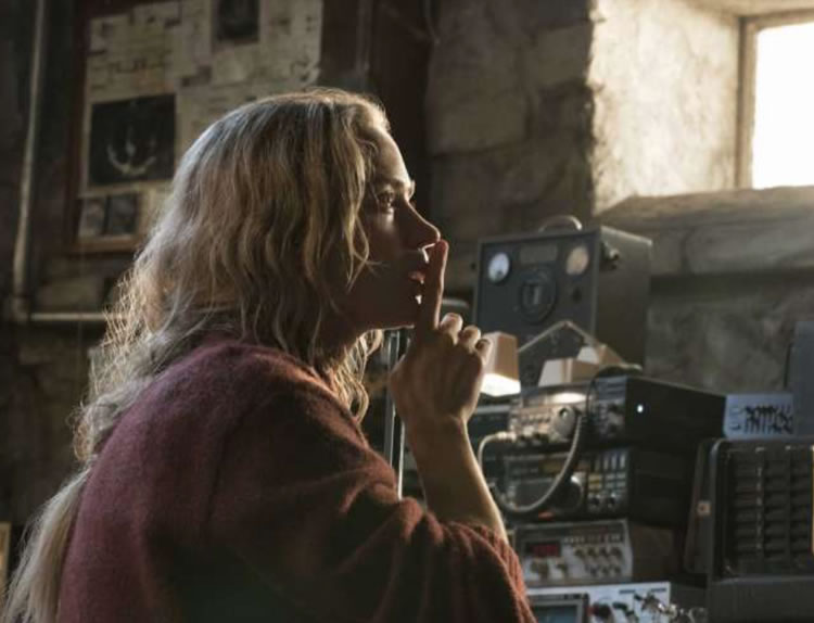
Krasinski’s skill in reaching into the emotionality of familial protectiveness and sacrifice was compelling, the lensing of the storytelling is fraught with beautifully composed cinematography; it’s an intriguing sensitivity, the tensional grip of impending disaster with masterfully sighted lens work and compositions of graphical power.
They all play to each other.
Powerfully interwoven.
T I M | G I R V I N W A T E R F R O N T
…..
G I R V I N | DESIGNING MOVIES
THEATRICAL BRANDING + ENTERTAINMENT
IMAGINATION: AND THE TOOLS TO MAKE IT HAPPEN
goo.gl/BsoZ6y
Movie Storytelling design: goo.gl/XCBQps
Tim Girvin | founder + principal

Thank you Tim for dissecting your team process. Very intriguing to see instincts playing off method ever evolving. I look forward to hearing more and sharing back…