Imagining a new identity for an building icon.
The World Trade Center
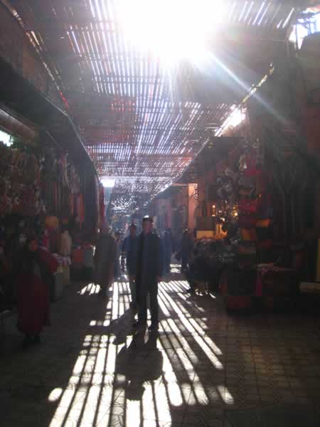
There are layers in play in the experience of the procession of how people connect with buildings. Buildings do, for the most part, one thing. They hold people. Interestingly enough, it’s not (that) often that the concept of relating to buildings — and the design of them — forgets about that connection: buildings are for people. But sometimes, they do. Being in different parts of the world, experiencing places, there are plenty of “places” that I’ve sensed that are wholly designed around the lensing of people’s movement — they might be old, hundreds, even thousands of years old, that speak to the meandering nature of the human stride and embracement of community construct.

And, there are others that are wholly absent of experience strategy — they are, instead, about channeling people — moving them along. Cold, hard. That happens. Sure, there are buildings for storage of other things; but there is a fundamental nature, in the expression of place that is only, really, about people.
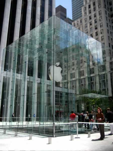
So, in telling people about a building, a place, a logo can be part of that processional experience — seeing the building from a distance, then coming closer, coming into the context of the place, seeing the opening way-finding (what address, which way in, the opening presentation of the building “logo”?) and being drawn into the interiors…and onwards, holistically to the building experience.

To that, then, I watch that — branding buildings, building brands.
And here’s the case study. Just check it out. Branding the World Trade Center. I’ll venture that I’m not overly blown out by any of the solutions, though there’s intelligence (and humor) shown in many.
But I do offer that I applaud the earnest solutions that many have shown…pitching, it’s hard work.
And I’m right there. With them…
Walk on, draw me into, show me, freely, your world.

tsg
—-
E x p l o r i n g b r a n d + s t o r y + h u m a n s
http://blog.girvin.com/index.php?s=experience+design