Exploring brand in the context of experience design and impression: movie picture brand strategy.
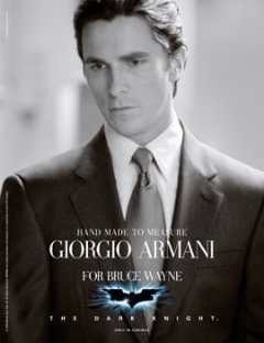
I’ve liked Christian Bale’s impression of Bruce Wayne since the beginning; but I’m anticipating that Christopher Nolan drives a great deal of the visualizations of how this mythic figure is presented. And Bale looks good in Armani.
Bale’s hard, focused attention and intensity as an actor anchors his character — the Bale brand with the Batman brand in a newly meshed virile vitality.
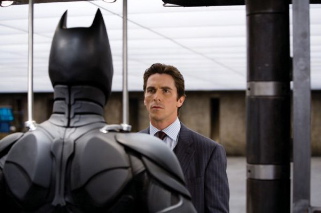
My working exposure to Batman began in the beginning with Warner Brothers, working with an earlier range of art directors in Burbank. That encounter was with Michael Smith (with another Joker, Jack Nicholson), an esteemed and marvelous talent who was pulled from us all at the age of 45. Anton Furst, production designer extraordinaire for Tim Burton‘s version of the Batman telling — was part of that team — and I’d connected with him there, as well as later explorations on design projects in NYC. He, too, was taken early in his career.
The beauty of theatrical advertising is that it’s all about the story — captured in a glimpse. And inherently, there’s a mix between the story, the marketing positioning, and the brand premise. It’s all about the visualization, capturing the scale of spectacle, the message underlined — fast. But merchandising is a very complex affair — from opening teasers, viral sites, campaign posters, and complicated layers of message and delivery. And motion pictures are all about delivering on the premise — magical transformation of textual content into vast cinematic billboards of color and movement and catalyzed emotion.
I was working in NYC and I found this expansion on the marketing thematics for this story — which has been inventively wrapped around the lipstick graffiti of the quasi-terrorist impressions of The Joker:
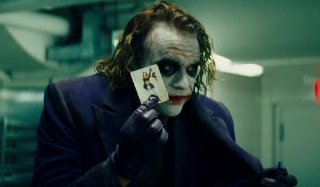
Tightly wound up and loose limbed in the last impressions of Heath Ledger.
Another loss.
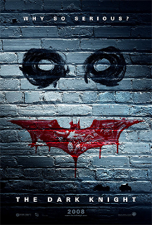
The basic campaign has this feel, expansively arrayed on the premise — and the promise: of more.
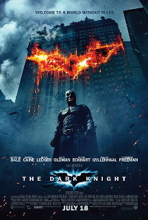


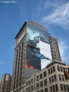
But it’s in this last attribute of campaign visualization that is intriguing — called by some, bizarre. But actually the spin is more surprising, attracting — and alarming. And that’s where it wins.
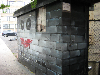
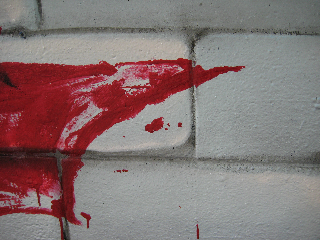
What I find more compelling is the spread of the campaign, literally, to the streets — this presentation was completely “painted”, live, on this structure, just blocks from my hotel. Now that’s a degree of implementation that is really — integrated:

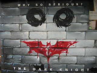

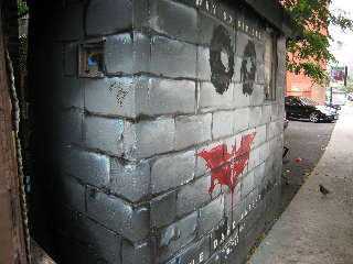
And clearly it has won, big — with globally outrageous opening weekend viewer numbers.
tsg | nyc
All imagery copyright 2008 | Warner Brothers Studios
Other references: http://www.buzzfocus.com/