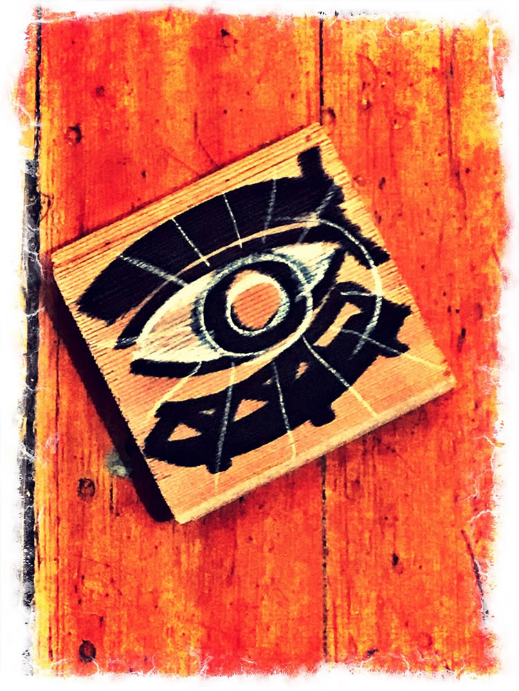
THE STRATEGIC ALIGNMENT BETWEEN PRODUCTION DESIGN, STORYTELLING, PLACE-MAKING AND IDENTITY.
STRATEGY?
SYNCHRONY.
I was reminded about brand alignments and world design in a recent posit at FastCompany, on Skyrim.
I’ve actually been talking about this a lot in other contexts — as in,
“which comes first, the place, or the brand?”
I realize that many wonder, and comment on the why of my missives about varying subjects that, to my take, inherently relate to design.
Everything’s either designed.
Or not.
Just happens, I’d suppose — or, it just happened.
And there was no thought in it.
So if you care about design — as your line of work, it’s worth being wildly open to avenues of how people are exploring design in the context of making stuff.
Like games, movies, products, packaging, signing, interiors, everything. Anything.
To the idea of thinking through the visualization of storytelling — that would require place-making. If you’re thinking about telling a story, how would you design a place for that story to be told, built, explored?
It’s an item of study for me. In fact, pretty much anyplace I go, I’m looking for details, clues, light, path-finding, points of narrative, materiality as a telling element. They’re all clues in design thinking. And the feelingness that goes along with them.
So when I’m looking at a movie, for example,
I’m peculiarly obsessed with
production design.
Just imagine, for instance,
the production design for
Bladerunner
Crimson Peak
Ragnarok
Who comes up with those places?
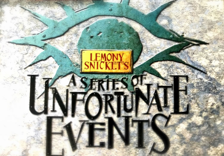
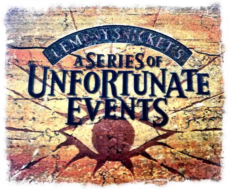
That came to me first working on the Lot at Paramount and talking to the production design team on “A Series of Unfortunate Events.”
What I was curious about, in their early sketching phase, was how could we build our titles in a manner that related to
our studies of production design materiality.
I’ve done the same with many others.
Where is this story, what time, what does it look like?
Could place and type sync?
Yeah.
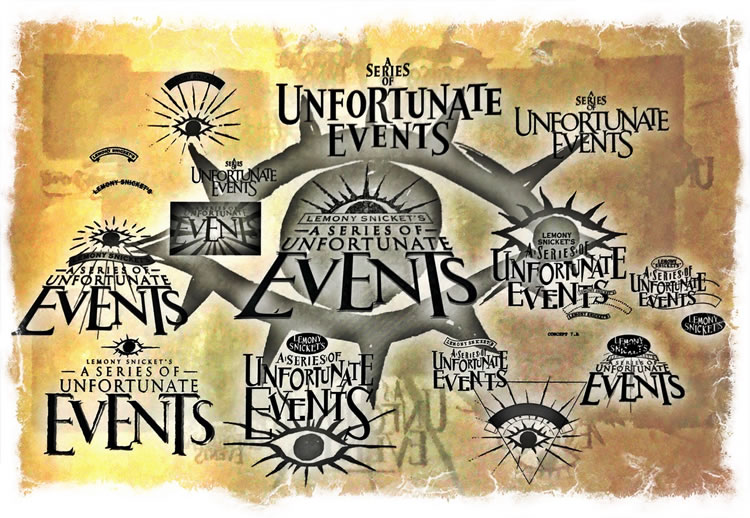
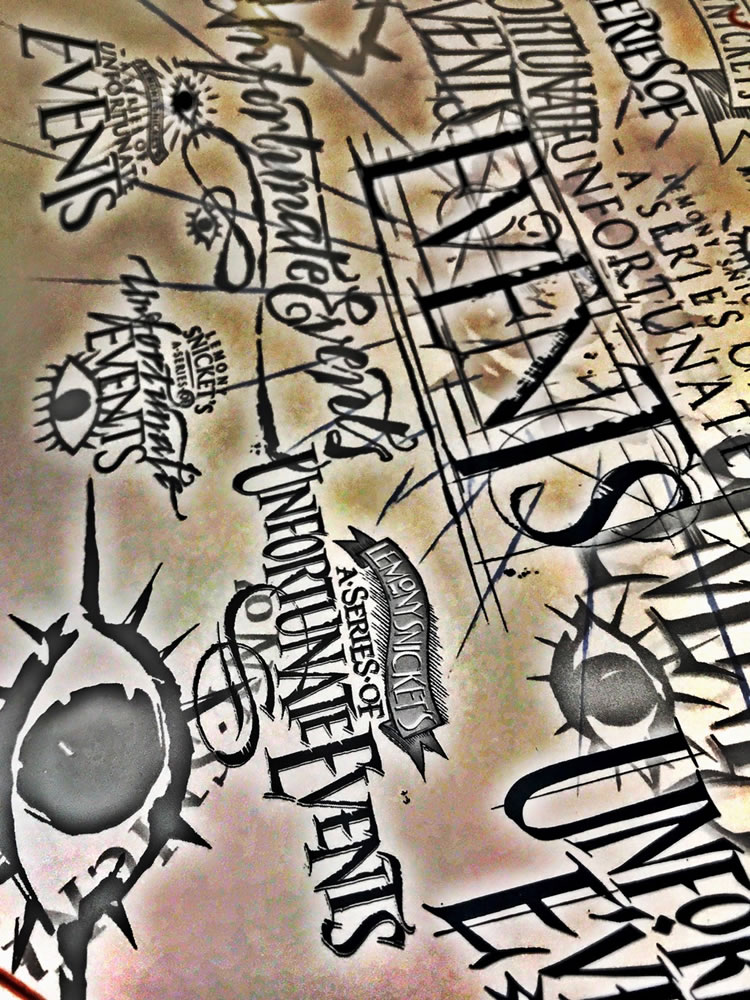
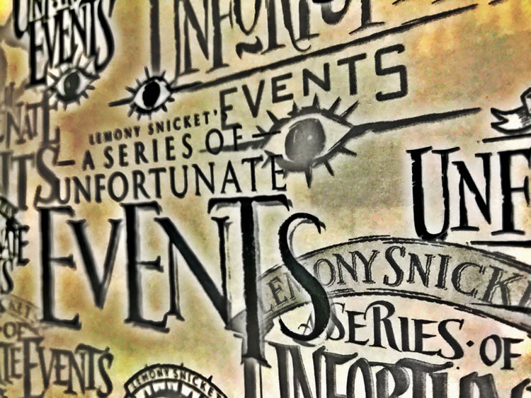
Looking at production sketches,
particularly the “eye” of Count Olaf,
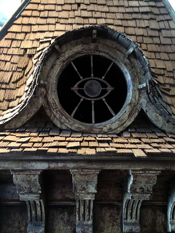
could we build that into the semblance of titling thinking?
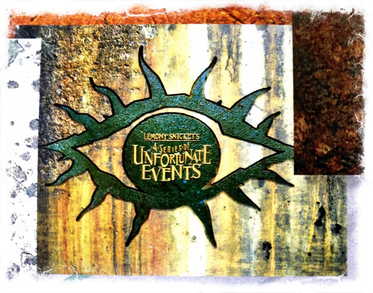
If that eye would be iconic on set,
could we design it, and
the titling,
to align?
But there is more to aligning identity and world design.
That would come to the treatments of the place, which in a manner
we examined in our material studies
of titling context
and place-making.
The materials that built a world. So too in GuildWars2 — design rendering of titling context in the framing of character in place-making.
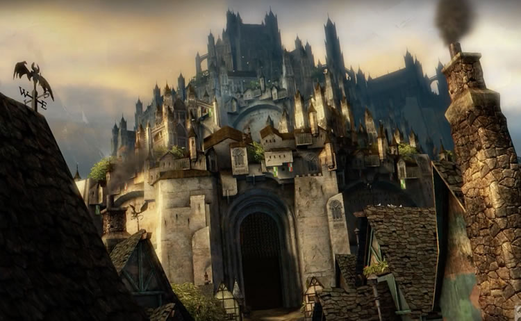
If there is a world, what is it built of and who lives there — how would you find your way into it?
And how could the design of the brand sync into the shard-riven place, the beautiful gaming design of Daniel Dociu [CD@ArenaNet]
and his world-building team-members?
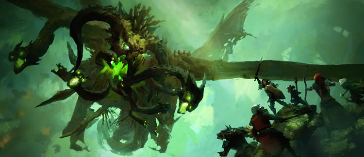
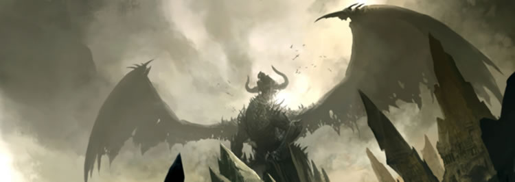
We looked to the creatures of that world—the shifting, cracked and wild instability of that world and its powerful monsters—to evince a titling rendering that spoke to, and through, the realm of the GuildWars2 world.
We were the dragons.
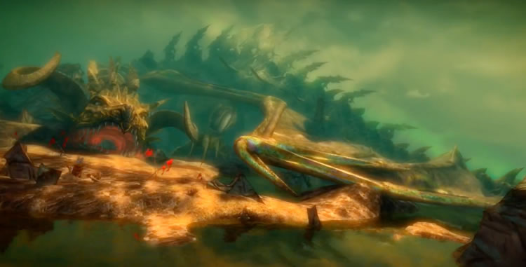
To examining another way-found world, a deeply engineered realm, layered yet again to minuscule detail, in our journeys with ArenaNet, Skyrim’s world-building strategies reminded me of that long pathway, years of work.
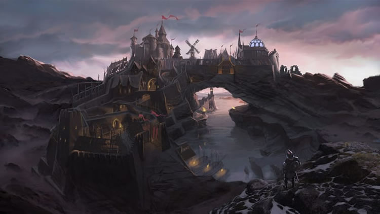
Well made.
When you work on a film, as a brand designer, you’re looking for genetic threads in the story, that could be the way the characters look, the way a building is conceived, a street way, a forested path or a cavern’s craggy crest, the vista of a villainous village.
We weave them, as designer storytellers, looking for bridging, pathways and foot stones to enchantment, embracement and community-building engagement.
T I M
…..
GIRVIN STRATEGIC MAGIC STUDIOS, QA. / DESIGNING MOVIES
THEATRICAL BRANDING + ENTERTAINMENT
IMAGINATION: AND THE TOOLS TO MAKE IT HAPPEN
goo.gl/BsoZ6y
Movie Storytelling design: goo.gl/XCBQps