The sense of place, design,
imagination and spectacle.

The seeing eye, touching place,
designed inspiration of Robert Irwin
Earlier in my life, I was on the COCA team that ideated bringing James Turrell to Seattle — decades before, “seeing the light inside”– his installations at The Henry. It was our idea to consider the renovation of a space — then controlled by the now Tom Kundig partner, architect Jim Olson — a kind of visionary on place-making and art installations. The abandoned building was downtown Seattle, a demolished floor, ringing the edge of 1st Avenue and Pioneer Square. We’ve written on him, Mr. Turrell — a continuing inspiration to our thinking on the notion of spectacle, progression and procession, the ritual of sensing sequences of discovery.
Fountainbleau | Miami | James Turrell
Being in San Diego, I was thinking about him — Robert Irwin, an artist that, like Turrell,
[below, at his Roden Crater project– photo by Florian Holzherr]
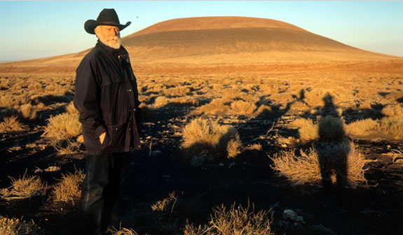
lives in the creative expertise place-making marvelment.
I was studying the modeling for Irwin’s work — his history, and I came across this overview which, with apologies, I offer below. To links and comments, here’s the bridge to following up — it’s so comprehensively detailed that I thought, if you’re interested in studying more about the ideas of Irwin, you can — here. Follow the links above if you’re thinking you’d like add your own comments. I applaud the scrupulous intentionality of this study.
In the nature of thinking about design, place, touch, memory and the implications of experience expression [designing places for people to be startled.]
You can’t escape the nature of surprise and unexpected delight.
That, is spectacle.
Shock.
Startling — is starting — seeing something new.
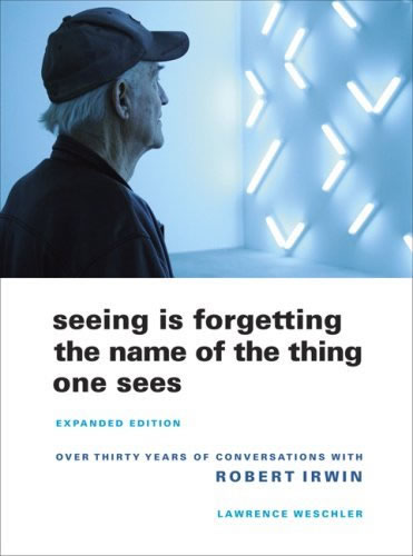
Savor, explore, learn more: “Seeing is forgetting.”
TIM | NYC
….
THE STRATEGY OF IMAGINATION +
HOLISTIC WELLNESS = PLACE
DESIGNING ENVIRONMENTS: HEALING +
WELLNESS PLACES | RETAIL | RESTAURANTS | SPAS
Tim Girvin | G I R V I N |Strategic Branding | NYC Studios
––––––––––––––––––––––––––––––––––––––
The Beyond the Frame article
SATURDAY 11.03.07 « Art Learnin’ | Main | 2007 Rosey Awards »
Beyond the Frame: Robert Irwin’s Primaries and Secondaries at the Museum of Contemporary Art in San Diego
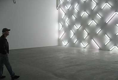
Robert Irwin examining Light and Space a few moments after it was turned on
Photograph by Jeff Jahn
Copyright Robert Irwin/Artists Rights Society, New York
Robert Irwin is walking to the left and then to the right, stepping forward and then back, until finally stopping at a spot where the work fills his entire field of vision. He is trying to understand what this new piece is about and he has always said that looking is as much about the body as the eyes. For the first time, his assistants have just turned on Light and Space, a work designed specifically for his retrospective, Primaries and Secondaries at the Museum of Contemporary Art in San Diego. Light and Space, like the eponymous art movement is about a particular environment or set of conditions to experience. In this case it is a large empty room defined on a one long by a field of fluorescent light fixtures. The lights are installed in a non-repeating modified grid pattern that completely fills a giant wall. There is no focus and is non hierarchical, it is just the experience itself. The experience resonates between the field of light that is created by the fixtures and the way that the light redefines the space of the room. The transformation and reorientation of the space makes the new work a classic Irwin piece.
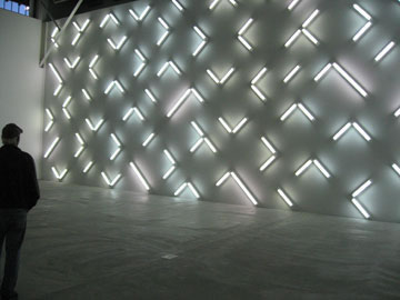
Robert Irwin examining Light and Space
Photograph by Jeff Jahn
Copyright Robert Irwin/Artists Rights Society, New York
At that moment, like the rest of us, Irwin has never seen this particular work before, and we are lucky enough to watch him as experiences it for the first time. It is an event that crystallizes much of Irwin’s approach and reveals as much about the man as the art. In the excellent retrospective of Irwin’s art currently on view at the Museum of Contemporary Art in San Diego we are treated to almost fifty years of his work, most of which is supplied by the Museum’s own collection. Irwin has been a resident of San Diego since 1990 and he was consulted on the design of both museum buildings that contain the installations. The exhibition is divided between a new building designed by Richard Gluckman which opened earlier this year and is adjacent to a train terminal and a smaller, older building across the street that opened in 1990. In the newer building next to the train tracks the exhibition contains only three works: Primaries and Secondaries, Light and Space and Who’s Afraid of Red, Yellow and Blue^3. The smaller building across the street contains his early paintings, some new installations of the scrim pieces, and one of his disc pieces from 1969 that is naturally lit from a skylight above rather than the more traditional installation of four lights, one each corner of the space. Each room is surprising and you are never sure what the next space will contain. You get the sense that Irwin has been thinking about these spaces for a long time. The installation of the work is clean and spare and you can feel Irwin’s eye not only in the work but also in the way the work becomes inseparable for the space in which it is installed.
But first some history, because it changed art:
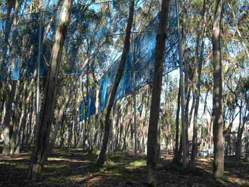
Robert Irwin
Two Running Violet V Forms
Stuart Collection, University of California San Diego
Copyright Robert Irwin/Artists Rights Society, New York
In 1969 Irwin left his studio practice behind to pursue art in a space that he has come to define as within the continuous envelop of individual experience. He had begun to feel that any mark within the rectangular frame of the canvas could only be read a mark as relating to the history of art and not to the larger world that we experience every day. He wanted to interact with the world as a whole, breaking down the spectrum of art history, and engage us on the levels of all of our senses. He felt that if he were to take a painting or a sculpture that he made in his studio and then install it an exhibition space, he was closing off some of the potential between the art and its environment. By installing work he had already made, he was dealing with his own ideas and not responding to the unique conditions and energies inherent in the exhibition space itself. He needed his work to change along with the conditions of the spaces. He needed himself to be present and open to whatever he experienced and to explore the latent potential within any given exhibition space. The painful result was that his studio practice was no longer sustainable; the art would have to be developed and conceived in the space in which it was to be exhibited. By leaving his studio practice behind, he could move beyond the frame and art history and into the world.
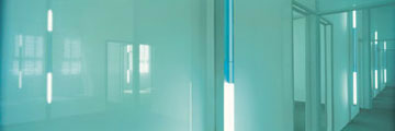
Robert Irwin
Excursus: Homage to the Square 1998
Installed at the Dia Center for the Arts
Copyright Robert Irwin/Artists Rights Society, New York
Like Malevich, his work is based on feeling rather than intellect; it would be experienced rather than understood. On a subtler level, Irwin had realized that his art exists not in the experience of the artist or in the object itself, but in the experience of the viewer. Irwin explains it this way, all of history exists within the frame. It might be the literal frame of a painting or it might a frame of a reference. A mark within that frame is evaluated against everything that has come before it, it is defined within the parameters of the frame of reference, rather than actually seeing the mark for what it is. The mark within the frame gets placed within the spectrum of art history. Every single mark is evaluated against all of the other marks that had come before it. The referencing and cross referencing against all of art history takes you out of the experience of the present moment. Irwin felt that painting within those parameters was a closed system and Irwin became compelled to create a new frame of reference.
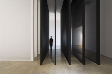
Five x Five (installation view), 2007
Tergal voile, light construction, and framing materials
ten panels: 201 x 176 1/2 x 2 inches (4.3 x 7 x 0.17 m) each
Photography by Philipp Scholz Rittermann
Copyright Robert Irwin/Artists Rights Society, New York
He believes that the experience of a single individual is as important as all of the texts of art history. The art is in the experience of each one us uniquely and individually with an environment or set of conditions provided by an artist. In 1969, as his studio practice was breaking down Irwin was collaborating with James Turrell and Ed Wortz for the Art Technology program at the Los Angeles County Museum of Art. In Turrell’s notes on the discussions for the exhibition, he lays out a series of ideas that would be crucial for understanding the motivation of both Irwin’s and Turrell’s work for the next forty years. Over the course of the program here are a few quotes from Turrell’s notes:
“All art is experience, yet all experience is not art. The artist chooses from experiences that which he defines as art, possibly because it has not been experienced enough, or because it needs to be experienced more.”
“The viewers must assume responsibility, they get into the experience, and they make the art- they are the actuality.”
“Dealing with states of consciousness is like a drug experience: most people hold back from going through -experiencing the new until they have correlated it to something known, whereas the artist may be unique in that he seeks the new experience, and let himself go accepting it as a unique experience.”
“The object of art may be to seek an elimination of the necessity for it.”
“All art world distinctions are meaningless.”
It is in the realm of raw experience, beyond words, that remind us what it is like to be human. The art is in the world and within us not in the frame of the canvas. It is a line of thought in which the question has as much validity as the answer. In a surprising way, Irwin’s art strives to exist without him, or at least the more invisible he was in the final result, the more successful the piece. He sets up the parameters of the installation and the work but the experience is our own.
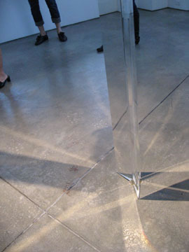
Robert Irwin
Untitled, 1969-70
Cast Acrylic Column
144 x 8 1/2 3 1/2in (365.8 x 21.6 x 8.9 cm)
Museum Purchase in honor of Jackie and Rea Axline
Museum of Contemporary Art San Diego
Photography by Jeff Jahn
Copyright Robert Irwin/Artists Rights Society, New York
One of the many surprising things about walking through Primaries and Secondaries is that the work cannot be separated from the space in which it is installed. In most reviews, I can just talk about the work and only mention the space when it is relevant. That is impossible with Irwin’s work. Since the retrospective does not follow a chronological order and in the spirit of Irwin’s own work, I will discuss the work in the order you experience it, rather than superimposing a narrative or chronological structure.
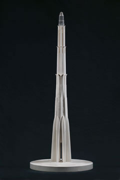
Robert Irwin
Architectural Towers, proposed 1989 (unrealized
Mixed media 55 3/4 x 21 3/8 x 21 3/8 in. (141.6 x 54.3 x 54.3 cm) Museum purchase with Jackie and Rea Axline Funds
Museum of Contemporary Art San Diego
Photography by Pablo Mason
Copyright Robert Irwin/Artists Rights Society, New York
The exhibitin start in the new building on the railroad tracks that contains only three of Irwin’s recent works: Light and Space, Who’s Afraid of Red, Yellow and Blue, and Primaries and Secondaries. There are also two smaller galleries for work that was planned for the Miami Airport and an installation for Donald Judd’s Chinati Foundation in Marfa, Texas. Primaries and Secondaries are made of thirteen painted aluminium aircraft panels. Installed at the end of the lobby, it is a series panels of the primary and secondary colors on the side walls, and black and white panels in the middle. The paint is a high gloss so that you aware of the reflections of the lights and the space of the room. For me, these paintings set the tone of the exhibit, Irwin is not going to ask you to immerse yourself in his painting or his spaces, he is going to come out to meet you. He wants to engage you where you stand, in your world and the way that you perceive it. The lights and the reflections always remind you of where you are. The paintings reach out to you in the way you perceive color and space. The reflections bring you back to where you are and who you are at that moment.
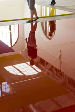
Who’s Afraid of Red, Yellow & Blue (installation view), 2006-07
polyurethane paint over lacquer on aircraft honeycomb aluminum
24 panels: 132 1/2 x 96 1/2 inches (3.4 x 2.4 m) each; 12 panels:
132 1/2 x 48 1/4 inches (3.4 x 1.2 m) each; overall installation dimensions variable
Photography by Philipp Scholz Rittermann
Copyright Robert Irwin/Artists Rights Society, New York
The painting in Irwin’s most recent work reminds me of his early interest in restoring old cars. Irwin was always been known for being meticulous about details, whether it would be seen by somebody else or not. The paint job reminds me of something that might come from looking at the paint jobs of automobiles. The colors are bright and deep, but they extend out into space. Because each panel is a monochrome, the viewer sink into the space of the painting that exist at some indeterminate distance below the surface. The effect is like experiencing a set of Ganzfelds one after another, in a different colors. The colors are strong and without any obvious signs of paint handling. The installation of multiple panels of different colors also prevents any one panel from become a specific field. The field is generated by the interaction of all the panels together, rather than within a single panel.
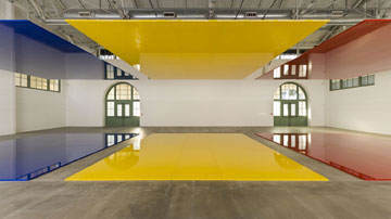
Who’s Afraid of Red, Yellow & Blue (installation view), 2006-07
polyurethane paint over lacquer on aircraft honeycomb aluminum
24 panels: 132 1/2 x 96 1/2 inches (3.4 x 2.4 m) each; 12 panels:
132 1/2 x 48 1/4 inches (3.4 x 1.2 m) each; overall installation dimensions variable
Photography by Philipp Scholz Rittermann
Copyright Robert Irwin/Artists Rights Society, New York
Across the lobby from is the largest work in the show called Who’s Afraid of Red, Yellow and Blue. It is made of six pairs of painted panels, each in one of the primary colors: red, yellow and blue. One set of the panels of each color is mounted on the floor and the other is on the ceiling. The piece is an enlarged version of the installation earlier this year at Pace-Wildenstein’s gallery opposite the old Dia Center in Chelsea. The train terminal is a larger space so there are two additional panels included in each plane of color. Who’s Afraid of Red, Yellow and Blue is the culmination of a line of thought that began with his line paintings of the mid-sixties. The big difference now is that the two lines that sit and interact on the picture plane have become two planes that interact with perspective in the space of the room. It is a good demonstration of how far Irwin’s thinking has evolved in the last forty years.
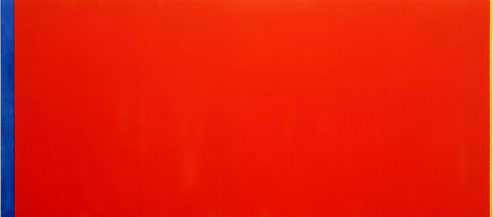
Barnett Newman
Who’s Afraid of Red, Yellow and Blue III, 1966/67
Oil on Linen
245 x 544 cm
Courtesy of Stedelijk Museum Amsterdam
Copyright Barnett Newman/Artists Rights Society, New York
The work shares its title with a series of paintings by Barnett Newman who had in turn dedicated the painting to Jasper Johns. I asked Irwin if he was trying to engage in a dialogue or a response to Newman’s paintings. He said he was more interested in the interrelationship of the primary colors and the title just suggested itself. When I asked him about what he thought of the painters of Newman’s generation he said:
“I still see myself as a second-generation action painter. They left me with a set of questions that I am still trying to work through now. They were all great painters.”
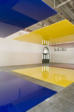
Who’s Afraid of Red, Yellow & Blue (installation view), 2006-07
polyurethane paint over lacquer on aircraft honeycomb aluminum
24 panels: 132 1/2 x 96 1/2 inches (3.4 x 2.4 m) each; 12 panels:
132 1/2 x 48 1/4 inches (3.4 x 1.2 m) each; overall installation dimensions variable
Photography by Philipp Scholz Rittermann
Copyright Robert Irwin/Artists Rights Society, New York
The first thing that strikes you when you walk in to the gallery to look at Who’s Afraid of Red, Yellow and Blue is that although the panels are colored, they are oriented to the floor and ceiling rather than the wall so that shapes of the panels change with your perspective as you walk through the space. It also means that the colors are almost always in your peripheral vision. The match colors of the floor and ceilign panels create discrete volumes of space. We are left to orient ourselves in and around these planes and volumes of color. By mounting the planes parallel to our line of vision another critical transformation occurs. On a wall, a painting will get larger or smaller if you walk closer or further away and only becomes skewed if you if you look at an angle. In a typical Irwin transformation, we know that the planes are rectangular but they are experienced as trapezoids because of perspective. Irwin is highlighting the disjunction between what we know and what we experience.
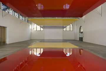
Who’s Afraid of Red, Yellow & Blue (installation view), 2006-07
polyurethane paint over lacquer on aircraft honeycomb aluminum
24 panels: 132 1/2 x 96 1/2 inches (3.4 x 2.4 m) each; 12 panels:
132 1/2 x 48 1/4 inches (3.4 x 1.2 m) each; overall installation dimensions variable
Photography by Philipp Scholz Rittermann
Copyright Robert Irwin/Artists Rights Society, New York
The more you look at the piece, you begin to ask yourself really annoying questions like what is reality? Is it nothing more than just a construct? Is it what we perceive with our senses or is it what we know? How do we know to trust one over the other? How do we really know anything? So down the rabbit hole we go…
It is important to realize though that Irwin is showing us that we create the perspective with our eyes and the way we see which may or not coincide with the actual physical facts of an experience. There is nothing inherent or absolute to perspective, it is just the way we have evolved to see the world. I had found that after walking around the piece, if I stopped, and looked at the upper panel and then turned my gaze to the panel on the floor, I would sink into the panel on the floor. It is like the surface would soften up and I would go through the floor. It was a strange experience. I think that is because the colors on the panel hold the surface differently than the concrete floor and although the panels sit on the floor the actual space of the painting exist somewhat deeper than the floor. The paint on the panels, at least in the way that you perceive them, occupies a space behind the surface of the panel. Irwin is also transforming our perceptions of the room by placing something inherently indeterminate within a space that is already has a clear set of spatial coordinates. Also from some angles, especially at the ends, the light and colors of the panels will reflect into another so that you might see the yellow and blue overlapping the red so there is a mixing of the colors that exists within your body that is very different colors within the panels individually.
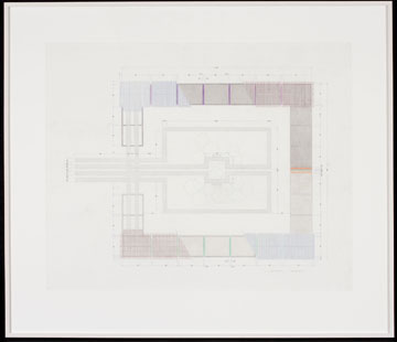
Robert Irwin
Marfa Plan, July
Color Pencil on Mylar
Sheet: 29 x 36 in. (73.7 x 91.4 cm)
Promised Gift of L.J. Cella
Museum of Contemporary Art San Diego
Copyright Robert Irwin/Artists Rights Society, New York
It was interesting to go from Irwin’s installations of his own work to the smaller galleries that contain models and drawings for some of his public projects. Irwin’s work is direct and experiential, but in these drawings we are asked to shift our mindset to look at representations of work that should be direct and experiential. The proposals themselves are great and beautifully presented. They would have been at home in any exhibit by any other artist, but here they just highlight how far Irwin has taken us away from conventional means of depiction and representation, even if it is his own work. To be fair, Irwin has devoted an enormous amount of time to some of these projects that most of the time never come to fruition, like his proposal for the Miami International Airport. Sometimes these drawing and models are all that are left of a process that consumed Irwin’s time and energy for several years. I thought his proposal for the one of the barracks buildings at the Chinati Foundation was really beautiful, which I think will get built. The proposal was about putting plastic films over a row of windows so that as you walked through the room the windows changed from light to dark and back again.
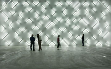
Light and Space (installation view), 2007
115 fluorescent lights
one wall: overall dimensions 271 1/4 x 620 inches (6.9 x 15.7 m)
Photography by Philipp Scholz Rittermann
Copyright Robert Irwin/Artists Rights Society, New York
Across the lobby was one of the most surprising installations of the show, Light and Space from 2007. It is an array of a 115 fluorescent light fixtures (9 four foot lengths, 106 two foot lengths). The overall effect is that it is a unified, non-hierarchical field. There is no focus, just as there neither figure nor ground. It is sometimes tempting to work backward when you look at an Irwin installation to see if you could spot the visual cues that he uses as a starting point for the work. One of the first things that you notice when you walk into the space is that the tips of a two trusses, one on each side of the wall, protrude from the ceiling into the space of the wall. Most likely the architect was trying to maximize the ceiling height, and since the ends of the trusses were not considered a distraction, they were simply painted out to match the wall and the ceiling. To any other artist, the trusses would not have been a problem, and they would have been ignored even if their installation filled the entire wall. I will speculate that Irwin saw those trusses and thought that they were the defining characteristic of the space and whatever he ended up doing would have to take that 45-degree angle into account. The arrangement he chose is a field of angles and lines made by the fluorescent light fixtures all set on an angle. The arrangement of the lights is not that different than Mondrian’s Composition with Lines from 1917 except that it is set at a 45-degree angle to follow the angle of the trusses.
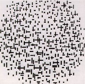
Mondrian
Composition with Lines 1917
Copyright Piet Mondrian/Artists Rights Society, New York
It is important to realize that the work did not exist until the lights were turned on, in the exhibition space, at full scale. There were drawings and plans but they acted only as a guide. Irwin works by feeling, as you are trying to find things in the dark. He works until it feels right. One of the things that strikes you immediately when you see the piece is that the shadows of the fixtures is almost as defining a characteristic as the light. There are basically three levels of illumination to the piece: the light of the bulbs of the fixtures, the soft halo of light reflected off the wall and white boxes of the housing of the fixtures, and the shadows cast by the fixtures themselves. For a relatively simple idea, the effect is very complex. The shadows begin to connect to reveal a lattice structure in and around the lights. The lights are dissolving the shadows and overlaying the black lattice of shadows with streaks of white light. The work looks best when you can stand close enough to the fixtures so that the edges of your peripheral vision coincide with the edges of the wall. Your line of vision can enter and exit anywhere in the field. It is completely non-hierarchical. Irwin mentioned that the difference between his work and the work of Turrell is that “they cannot empty space in the same way.” He felt that Turrell will ask you to take your shoes off, implying that Turrell’s work is more ritualistic, while Irwin’s is more natural. It was surprising that the installation of the raw fluorescent light fixtures avoids comparison to the work of Dan Flavin. Flavin’s work centered on the bulbs of the fixtures, almost as a form of drawing, while Irwin’s pieces takes into account the experience of the space as a whole.
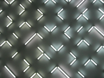
Light and Space (installation view), 2007
115 fluorescent lights
one wall: overall dimensions 271 1/4 x 620 inches (6.9 x 15.7 m)
Photography by Arcy Douglass
Copyright Robert Irwin/Artists Rights Society, New York
We were fortunate to be standing right next to Irwin the first time that Light and Space was turned on. It is important to realize that before the moment that it was turned on it did not exist. It did not exist in his studio or in a basement somewhere, it was worked out full scale in the space. When the lights were finally turned on, he was experiencing it, like ourselves, for the first time in real time. Irwin’s process implies that he would have to make himself remain open to the present possibilities of the moment regardless of the risk. I think that that a lot of artists deal with the risk by planning everything to death, by removing spontaneity and creativity. It is difficult to remain open and present in a situation if there is a possibility that it might not work out. Most people are simply more performance driven, whereas for Irwin the process and the experience is everything. After the lights were turned on, we saw him pace back and forth trying to understand the experience of the space, but as happy as a kid on Christmas morning.
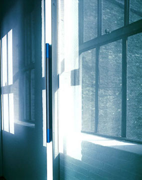
Robert Irwin
Excursus: Homage to the Square^3 1998
Installed at the Dia Center for the Arts
Copyright Robert Irwin/Artists Rights Society, New York
Irwin had used fluorescent lights in an earlier installation at the Dia Center. The lights were mounted in the middle of scrims and covered with various colors of plastic films. The experience of walking through these small rooms that were defined by the scrims and the lights, as well as being able to see across to the other rooms and lights, was simple extraordinary. But true to form, the work is generated by the characteristics of the space. In this case, the space of the museum in San Diego had a different potential than the floor at the Dia Center.
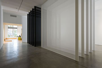
Five x Five (installation view), 2007
Tergal voile, light construction, and framing materials
ten panels: 201 x 176 1/2 x 2 inches (4.3 x 7 x 0.17 m) each
Photography by Philipp Scholz Rittermann
Copyright Robert Irwin/Artists Rights Society, New York
Across the street in a set of older and smaller galleries, Irwin has again installed some work that is surprising. It is a mixture of his oldest as well as most recent work. The installation of the work reminds you that he has been revisiting some of the same themes over and over, but just in different mediums. The first piece we encounter is work from called Five x Five from 2007. It is five black scrims and five with scrims that are set perpendicular to one another. The scrims are set so that there is a two-foot gap between them so that you can feel the way the each scrim changes the way that you see and experience the space.
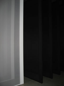
Five x Five (installation view), 2007
Tergal voile, light construction, and framing materials
ten panels: 201 x 176 1/2 x 2 inches (4.3 x 7 x 0.17 m) each
Photography by Jeff Jahn
Copyright Robert Irwin/Artists Rights Society, New York
In the seventies, Irwin was famous for mounting scrims along a wall or in the space in such a way that it changed the way that you experienced the space. In Five by Five, we see that the scrims that use to be light and semi-transparent become almost thick and opaque when it is viewed five layers deep.
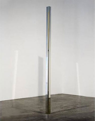
Robert Irwin
Untitled, 1969-70
Cast Acrylic Column
144 x 8 1/2 3 1/2in (365.8 x 21.6 x 8.9 cm)
Museum Purchase in honor of Jackie and Rea Axline
Museum of Contemporary Art San Diego
Copyright Robert Irwin/Artists Rights Society, New York
In a small triangular space at the end of the first floor, Irwin installed one of his clear acrylic towers. I had seen these sculptures in photos before, but I was completely unprepared to experience it first hand. You are never sure if the sculpture is generating the space of the room or if the room is somehow being concentrated back in to a tall clear sculpture. The sculpture itself is practically invisible so that you can only see it by the way it refracts light. It was another one of those moments where the right piece was installed beautifully in the right location. You could not separate the space of the sculpture from the space of the room. The bounds of one became the bounds of the other, and you can’t believe that it is all being created by a tall, clear acrylic sculpture. Unbelievably, the shape of the room is read as a function of the sculpture.
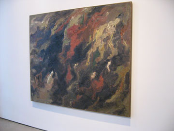
Robert Irwin
Black Raku 1959 (installation view)
Oil on canvas
71 x 83 in. (180.3 x 212.1 x 4.1 cm)
Gift of the Murray and Ruth Gribin Foundation
Museum of Contemporary Art San Diego
Copyright Robert Irwin/Artists Rights Society, New York
As you walk up to the second floor, the first thing you see is a beautiful painting that could have been painted by Clyfford Still, and for a second you think you went in another exhibition. The painting is called Black Raku from 1959. Raku being the Japanese pottery appreciated by Zen masters for its wabi-sabi characteristics. The painting is big, and the colors are swirling upward as the being carried away by a gust of wind that happens just beyond the rectangle of the frame. The colors and the space vibrate like the waves of light on asphalt on a hot day. Nothing is fixed, and you are wondering if it is a mirage. Already, you can see the each color holds its own space, and there is no longer a traditional figure/ground relationship. Each color is a very thickly applied so the painting has a surprising tactile quality. It is a great abstract painting, and you can feel Irwin’s own unique sensibility asserting itself in ways that will eventually lead him away from the picture plane and into the environment.
On the back wall, is a smaller gray painting that was painted a year later. It is a prototypical Twombly, except that in an extraordinary way, Twombly had not developed that part of his language in 1959. In a crucial difference, Twombly will trace a shape, it could be a rectangle or a shell as way of bring the real world into his painting sort a drawing equivalent to the way that Rauschenberg was using photographs in his paintings. Irwin on the other hand, draws the thickly painted rectangle by hand, and it shows. Rather than bringing the real world into his paintings, he is interested bring his paintings into the real world. Every line and every mark is filtered by human experience. There are three smaller paintings that were originally designed to be held in your hand to create an intimate experience between you and the art, but for practical reasons are installed on the wall. Even back then Irwin was already looking for ways of bringing you closer to the art, removing the barriers between you and your experience.
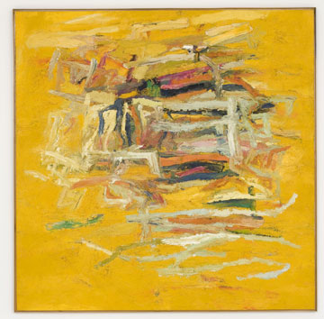
Robert Irwin
Untitled, c. 1960-1961
Oil on canvas
64 7/8 x 64 5/8 in. (164.8 x 164.1 cm)
Gift of Ruth and Murray A. Gribin
Museum of Contemporary Art San Diego
Copyright Robert Irwin/Artists Rights Society, New York
At some level, Irwin felt that his abstract expressionist paintings were not successful because the dynamism of the lines and the way the colors sat in space, separated you from a direct experience of the painting. He realized that the way the lines were interacting with one another were if they were not redundant often contradictory. He needed to simplify, and the best way to do that was with a straight line. He said it best himself on page 62 of Lawrence Weschler’s excellent book on Irwin, Seeing is Forgetting the Name of the Thing that One Sees:
“The simple straight line seemed to me to be my best possible tool, the cleanest element I could find, with the least amount of literal associations, and the greatest amount of power on the other side.”
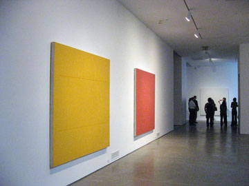
Robert Irwin
Untitled 1964 and Untitled 1962
Installation View Second Floor Museum of Contemporary Art San Diego
Photography Jeff Jahn
Copyright Robert Irwin/Artists Rights Society, New York
The Untitled paintings from 1963-64 would be about how the lines would interact and define the pictorial space of the field of the painting. The paintings would be ultimately simplified until there were only two lines. With a line he could get rid of unwanted associations to representations of other objects, objects outside your experience of standing in front of the painting. The lines were hand drawn because as always, the line was important, but it was even more important that it was filtered through human experience. A line that was taped off or drawn with a ruler had a set of mechanical connotations that was foreign to the way that Irwin thought about his art. The paintings were subjected to minute adjustments until he felt that the lines resonated with the field of the painting. The lines are thin enough that you are never sure if the lines are the figures or the ground. The lines and the field work together and are inseparable, an early precursor to his installation work in the language of painting.
It is worth noting that throughout his early abstract paintings through the line paintings of the early sixties, his lines never cut across the entire plane of the canvas in the way that a line by Agnes Martin or Barnett Newman would. Irwin always leaves his lines open on both ends, floating in an indeterminate space. I think that the ends are left loose because he did not want to superimpose the line over the space of the canvas. He wanted the line to be “in” the field of the canvas. In this way, one could look at Newman and Martin’s canvases as reaching to something beyond ourselves, off the canvas, while Irwin is trying to ground us to what we are experiencing at that moment.
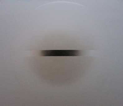
Robert Irwin
Untitled, 1969 (Installation view during Primaries and Secondaries)
Acrylic lacquer on formed acrylic plastic
54 in. (137.2 cm) diameter Museum purchase
Museum Of Contemporary Art San Diego
Copyright Robert Irwin 1969/Artists Rights Society, New York
In a gallery adjacent to the line paintings of the mid sixties is one of the stars of the show. Irwin constructed a new wall under a sky light so that one of his Disc paintings from 1969 could be viewed in reflected natural light. Astounding is not a strong enough word to describe watching the disc slowly dissolve and emerge from the field of the wall. The reflected light just barely highlights the edges of the disc, and so it just floats in this indeterminate space. Usually when the disc pieces are installed they are illuminated with four light fixtures which produce arcs of shadows around the edges of the disc. The shadows provide a way for the disc work its way into the plane of the wall. In natural light, there aren’t any shadows, and so the disc becomes part of the surface of the wall. It is one of the most beautiful installations of contemporary art anywhere.
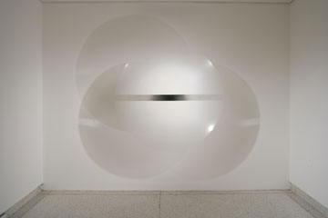
Robert Irwin
Untitled, 1969 (A more traditional installation)
Acrylic lacquer on formed acrylic plastic
54 in. (137.2 cm) diameter Museum purchase
Museum Of Contemporary Art San Diego
Copyright Robert Irwin 1969/Artists Rights Society, New York
Next to the disc, is a scrim wall called Square the Room that Irwin installed to square off what is normally a triangular gallery space. The space is not inhabitable, and I think he did it to simplify the gallery so that paintings could be read perpendicular and parallel to one another rather than on an angle. Since the scrim is white and the space is white, it always looks like one of the walls is slightly out of focus, but it interesting to watch the light and shadows change on the wall beyond the scrim as it moves a way from you.
The show ends with one of Irwin’s dot paintings from 1964-66. Irwin’s dot paintings are all mounted on a wooden lattice to slightly curve the surface of the painting. The curve, although it is barely noticeable, heightens the effect of the floating fields of color created by the dots. The experience is that you are looking at these floating planes of colors that are always emerging and dissolving, depending on where you are looking. The dots are often complementary, for example red and green.
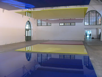
Who’s Afraid of Red, Yellow & Blue^3 (installation view), 2006-07
polyurethane paint over lacquer on aircraft honeycomb aluminum
24 panels: 132 1/2 x 96 1/2 inches (3.4 x 2.4 m) each; 12 panels:
132 1/2 x 48 1/4 inches (3.4 x 1.2 m) each; overall installation dimensions variable
Photography by Jeff Jahn
The curators and the directors turned the spaces of the museum over to Irwin for this exhibition. There is a single-minded focus to the exhibition and its installation that is very rare for a modern institution. They were after one idea expressed as simply and clearly as possible. It is strange to say – it is not often that a museum would trust an artist with their whole museum. Irwin is a genius, literally. He won the MacArthur Fellowship Award in 1984. It was the first time the award had been presented to an artist. The installation in the museum is beautiful. It is the best installation of art this side of Marfa. It is no surprise that Irwin is working on an installation in Marfa as well. There is a part of me that wishes they would leave the buildings installed with Irwin’s work and go buy or build other spaces for future exhibitions.
When I was walking the exhibition, I felt that my own time scale was a little off. These were perfect rooms for meditation. Not for a few hours or even an afternoon. I wanted to spend to weeks looking at one piece and then another. I could watch how I change along with my perceptions of the work. It would be a slow, gradual process of transformation. Irwin reminded the experience of art is still a solitary experience. A one to one exchange between you and the work. Primaries and Secondaries is the opposite of going to a concert or a movie theatre, both communal experiences. Perhaps the reason is that it is hard to find yourself in a room full of people. Irwin always said that the art is about perception, it is not in the objects or installations that he creates. The art is always within us and the way we perceive the world. His installations encourages along a path that ultimately leads us back to ourselves. We are left to discover the spaces that he creates within ourselves as much as in the work itself.
Postscript-
It was a little strange to be writing this review of Robert Irwin’s work while San Diego was burning to the ground. Robert Irwin was extremely kind and generous when I met him at the media preview, but every time I set down to write this review I couldn’t get the fires out of my head. At the time my mom and stepdad had been evacuated from their home in Rancho Bernardo. While they were lucky many of the neighbors were not including houses only a few doors away. What can art do when we are confronted with situations that turn our lives upside down?
Irwin’s work is about opening ourselves to the present moment. That is fine in the controlled environment of a museum but what if try to open ourselves to the outside world and we do not like what we see? I couldn’t help to see the beauty and openness of Irwin’s work on the one hand and the terrible fire on the hand as two sides of the same coin. How could we turn away from one and not the other?
Matisse always believed that art had the power to heal. He thought that if he put his painting in the room of someone sick, they were able to look at something beautiful, they might feel better and in turn get better. There is something that is essential to the experience of art that is always outside of its price in a gallery or auction house. I feel like the people who pay a lot of money for a Rothko are trying to contain and own an experience that is unbounded and completely ephemeral. It is a sensation that is unique, which resides in each person who experiences the painting, but not in the painting itself. They bought the painting, but not the experience that attracted them to Rothko in the first place. They own the work, but you own your experience. The art resides in everyone that sees it, and the painting is the facilitator of that experience.
What is the role of art in a time when so much is taken away from you? It might have been fire but it just could have also been divorce, cancer, car accident, a bad break up, hurricanes, global warming, etc. Unfortunately the list is almost endless.
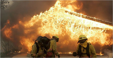
Photo of a burning home 1/2″ mile from my parent’s house.
Image courtesy of the New York Times
Should art be a form of escapism? Should art be a refuge or buffer against the trials and pressures of the world?
Some of the best artists of this century did not think so. Pollock thought that using the inherent qualities of paint itself would be enough to convey a feeling and therefore be art. Most of De Kooning’s paintings are about the body being discovered during the proximity and sensations of sex. Besides, Pollock and De Kooning escaped in alcohol, not art. Agnes Martin wanted her paintings to go all the way to heaven, but it is a heaven that already exists within us, if only in our minds.
Another example would be Warhol’s Death and Disaster series. If we came across a photo of a terrible car accident in a newspaper, we could accept that as a form of documentation, even though it is not a pleasant picture to look at. But Warhol took that same image and repeated it over and over so that the effect was not unlike having a traumatic memory always repeating in your head. It was as a human being that he found the photos disturbing in the first place, and he was trying to deal with it by repeating the image to see if they could be drained of their power. In a way he was trying to experience it so thoroughly he wanted to see if he could be immune to the image, but his art was a way of engaging what was right in front of him.
The best art is different than most entertainment because it is not escapist, it is about the here and now. It is a way of coming back to and engaging the world more intensely than ever, even if the world is sometimes difficult to look at. It is a dull mirror that allows your triumphs and tragedies to be reflected back to you because we are all human. The best art reminds us of what it is like to be human. We look at art to learn about ourselves, and the best art reminds us that we are not alone.
Posted By Arcy Douglass On November 03, 2007 At 9:14
