
Sometimes the best restaurant concepts are the simplest, the most honest, the most direct. They go back to the heart of giving, exchanging and trading enterprise.
Asking the core questions —
Why [do we love this idea — devoting ourselves to it]?
Where [will we be going with this idea — will people that are there, conceptually or otherwise] like our idea; are we going to the right place, for the right people?
What [are we offering, will this be different, do we have a story that’s true, our principles, we stand with them]?
Who [are we, what do we stand for, being this brand, this offering, for these people, our customers]?
The song, the verse of trade
–––
Starting at the end, the beginning:
Sometimes, in the end, it’s better to start at the beginning, to realize that the idea of selling, exchanging, trading or bartering is one of the most ancient conversations.
Primitive — and perhaps the most archetypal principles of — retail [yes, food and beverage making, selling — restaurants are retail] and the most ancient — the marketplace-gathering point of engagement — there is a core story, but in every place, it is tuned to that market, it is appropriate to specific place and context of content and customer. Oftentimes, restaurants enliven and create the pulse beat of the marketplace. Food selling can lie, spiritually, at the heart of the retail tactical positioning — food is the most primal, the most sustaining;
it is basic retail.
–––
They are what they are — designed for the simple and honestly conceived presentation of served food — nothing too complex, in storytelling. The mission of the brand, the coalesced promise of the team is clear. “Here’s what we are, here’s what we stand for — and here is what we offer.”
We love microshops — miniaturized and true retail — the special [and perhaps disappearing] mom & pop micro-retail shops that make up so much of our memory — the past, and right now — discovered at this moment.
Sharing — “I found this cool shop, have you ever been here — I love this place — go, check it out.”
An example to consider:
Brooklyn Taco CO.
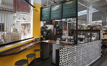
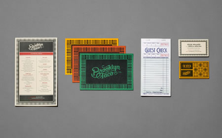
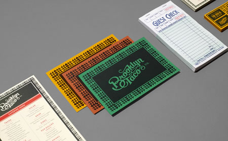
After successfully growing their business through NYC street markets like Hester St. Fair, Brooklyn Taco owners, Jesse and Erica, decided it was time for their brand to grow. We were tasked to not only create a new graphic identity, but also build out their first permanent taqueria in Essex St. Market.
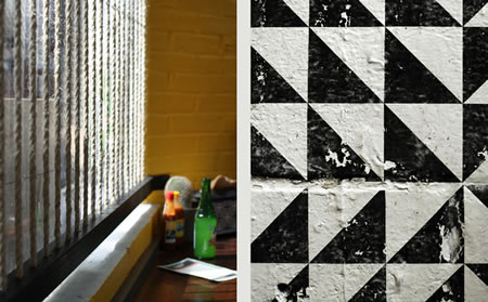
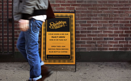
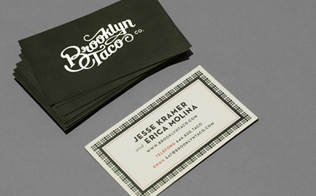
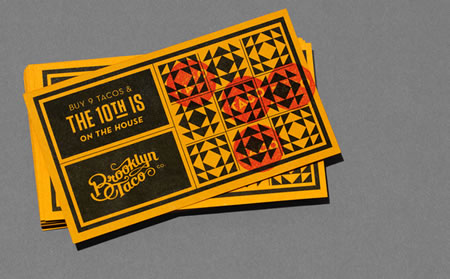
The identity started with a wordmark that speaks to their craft and references hand painted signage seen throughout Brooklyn, this is paired with a Mexican inspired color palette and patterns. From the groundwork created by the graphic identity, the space took shape incorporating a strong graphic pattern, color palette and typography provided by the brand toolkit.
Brooklyn Tacos identity and space now seamlessly connect and tell a story of modern authenticity.
Studio Photography: Finn O’Hara

—
TIM | GIRVIN | Decatur island studios | San Juan County, WA
…..
DEVELOPING STRATEGIES OF IMAGINATION +
EXPERIENCE = PLACE
DESIGNING ENVIRONMENTS:
PLACES | RETAIL | RESTAURANTS
http://bit.ly/i7b7EN