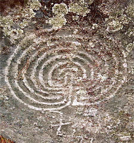
Pathfinder, the centerpoint of knowledge: Labyrinth do Outeiro do Cribo, Galicia
“Sometime, looking for something, somewhere — someday — somebody might be found.”
If you’re hungry, how do you understand the nature of food (information) and find the right path to more speedily grasp the journey?
recipe (Latin: take this) We’re all hungry, looking for information, ideas and insights. How is that organized more quickly?
Absorb the metaphor, but the hunger for information — the forming > in of content and ideals — looking at how context can be grasped is all the rage of design thinking.
That search for someone, something, somewhere, some body — can be, shall be, simpler and faster. Thinking that through, how do you get there?
Now — we’re all looking for a lot.
In searching for ideas — and the implications of interface, better still, searching technology and organization — the results of search, how people understand things — it can come down to the “some.” Not sum. But the finding of “some” in the mythical hay-stacked needle. A current grouping of projects keeps leaning back to:
• “Help us organization our information; and help our audience understand how to access what we’re offering.”
• “Help us redefine how our information is expressed — so people will understand it, and embrace it more deeply.”
• Help us rethink who are are, how we’re telling our story and organize (and visualize) that in a way that’s more interesting — we need to be presented better.
Presentation isn’t just the items of an exhibit — it has layers of meaning:
present (adj.) to be “existing at the time,” “be before” — “present, immediate, prompt.” To be there.
present (v.) “to bring into the presence of — to place before, show, exhibit or gift.”
present (n.) “to offer a thing in this point in time — the present, at present.”
And the idea of being present is not only to the notation of paying attention, but as well placing content in a manner that people are synced to, engaged in, the presentment.
Following the recipe, the audience, the relationship needs to have the “food” — the in-formation — gathered. How to see? Sequentially — the path of the infographical:
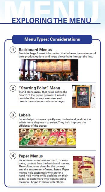
How information (food, the allegory) could be “presented.”
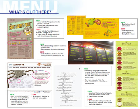
What’s already in play — for the sake of comparison.
And how information can be sequenced in comprehension arrays.
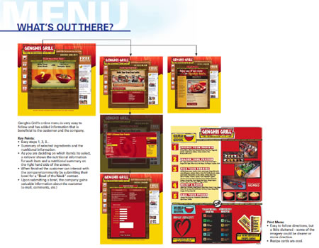
The point to the graphical organization is fluency of comprehension. And interestingly, to the notion of “infographical” the idea of a menu — which is inherently a list — is an interesting model for how people see and comprehend things.
People don’t read, they see — ideas in graphical form. Girvin’s explored the search and deploy modalities in another cross referenced study — explore more.
See Feltron.
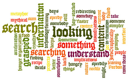
To more study — observe (another blog:)
The 5 Best Free Tools For Making Slick Infographics
April 2011
It’s not enough to simply write about data any longer; the world wants visuals. While there are many professional information designers making a name for themselves, such as Nicholas Felton of Feltron.com, the majority of these digital artists are up to their eyeballs in high-paying work. Where does this leave you? Well, if you want to spruce up your documents, blog posts, and presentations, there are some free tools online that can help.
Many Eyes
This IBM Research tool gives you two choices: an option to browse through existing sets of data, or use your own. The public database includes everything from population density across the U.S. to Internet browsers by popularity. If you have your own data on hand, you can upload it to Many Eyes and craft your own visualization. The best part of this tool is that you have many different options insofar as the final product, from creating a world map to a network diagram.
Google Public Data Explorer
Like IBM, Google has made a public version of one of its research tools. The search-engine company’s version is called Public Data Explorer. It also lets you choose from existing data sets (which are numerous and neatly categorized). For example, if you want to compare the population between different U.S. states, it’s a simple process that involves checking off your locations and choosing the type of chart (data is pulled from U.S. Census Bureau). To input your own data, upload your information (and if you choose to, you can make your dataset public for others to see and use). An added bonus, these charts can be embedded on your website or blog.
Hohli
There are many occasions when a Venn Diagram is the perfect way to describe a concept or compare relationships among a few different things. With Hohli, you can create such a chart and customize its look and feel. Aside from specifying a title, choosing your data points, and altering the background, you can also share the time on multiple social media sites. Hohli also allows you to create other charts, including scatter plots and other line charts.
Wordle
Although this tool describes itself as a “toy” for generating word clouds, it can be an effective service to spruce up your work. For example, if you’re creating a presentation for a client that is looking to rebrand online, you can submit the company’s URL into Wordle so it spits out a colorful design of the most popular words used on their website. You can also create your own word clouds, just add text or keywords that you want to use.
Visual.ly
This is a new tool, currently in private beta, that will allow you to create and share infographics. From a first look on YouTube, this new service will be a great resource to create a compelling storytelling visualization. In other words, the above tools are fairly standard in terms of outputting sets of data, but Visual.ly will make it easier to create more robust infographics that are less scientific and more user friendly. To get on the invite list to give Visual.ly a try, visit their website. Touch information: seek, contact, gather, visualize:
Watch more Work Smart:
Viz Wiz Nicholas Felton Guides Us Through Worlds Of Data
Touch information: seek, contact, gather, visualize:
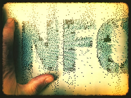
tim | new york city, girvin @ 26th + b’way
—-
INNOVATION TEAM STRATEGIES
Girvin Cloudmind | http://bit.ly/eToSYp
the reels:http://www.youtube.com/user/GIRVIN888
girvin blogs:
http://blog.girvin.com/
https://tim.girvin.com/index.php
girvin profiles and communities:
TED: http://www.ted.com/index.php/profiles/view/id/825
Behance: http://www.behance.net/GIRVIN-Branding
Flickr: http://www.flickr.com/photos/tgirvin/
Alltop network: http://my.alltop.com/TGirvin
Google: http://www.google.com/profiles/timgirvin
LinkedIn: http://www.linkedin.com/in/timgirvin
Facebook: http://www.facebook.com/tim.girvin
Facebook Page: http://www.facebook.com/girvindesign