Search and Data visualizations: hunt, gather, search and recognition. WikiLeaks and the storm of misuse of content — and how they look.
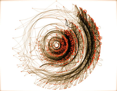
The visualization of search, the quest for answers and gathered content — are you happy now?
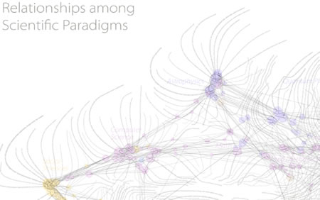
WBPaley.com The Map of Science (see the site for the enlarged versioning)
Is the arrangement BEAUTIFUL? Questing for beautiful search resolutions:
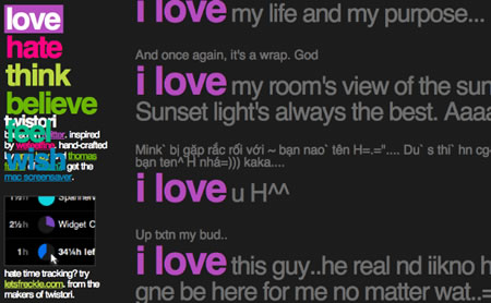
Twistori.com’s thematic, channeled twitterflow
No, actually, I’m not satisfied.
I think it could be better.
And so do some of our clients.
In exploring the idea of examining the organization of search content, I gathered up some friends, talked to them, (searched them for ideas) found more friends, was introduced to more friends — and crowdsearched the content. Interesting answers, below.
But this is just the beginning — more people are dropping me search and gathered content visualizations — so it keeps coming. I’m sure you’ve got ideas, too.
More links — I’ll pop them them on this comment link. This will dynamically expand to Facebook, Linked in and tweet, in dual formats, speaking of spreading the exploration. But I am interested in gathering, and exploring more — and looking at the innovations of the display of ideas — how, in searching, content is gathered in compelling registrations of information.
First, what is search visualization? Bear in mind that I’m not looking to emulate the notion of UX fundamentals — nor could I hope to offer a sense of expertise on that front. But what I’m seeking, in search, is the unconventional gathering or inventive visualization of the contents of that outcome — so it’s less about conventionality to “informational systemic presentation” but something more imaginative. To my thinking, the concept of conventional visualization — especially to recent Girvin | UX work is about creating new approaches to how to think about searching and creating new models for how people do that and what they see in the outcomes of those searches.
First off, two forms of history in the exploration of search and organization – and these two are conjoined. One — what does it mean? Where I always begin: meaning…A quick run to Douglas Harper offers:
search (v.)
early 14c., from Old French cerchier “to search,” from Latin circare “go about, wander, traverse,” from circus “circle” (see circus-). The noun is first recorded c.1400. Phrase search me as a verbal shrug of ignorance first recorded 1901. Search warrant first attested 1739. Search engine attested from 1988. Search and destroy as a modifier is 1966, Amer.Eng., from the Vietnam War. Search and rescue is from 1944.
Combine the search and the tools to do so, and you’ve got:
searchlight also Search-light, 1883, from search + light (n.).
The second feature of that examination might be: information.
But even that construct bodes some interesting revelations. The clue lies in the base — inform. Going backwards to the forward review of the word history — late 14th century, “act of informing,” from Old French informacion, from the Latin informationem (nom. informatio) “outline, concept, idea,” noun of action from informare. Meaning “knowledge communicated” is from the mid-15th century Information technology attested from 1958 (that’s interesting!) More to the examination: (and let’s go back further, to see inform) There the link to the nature of the forming of content is made more clear — the distinctions attach to the concept of content and visualization being aligned, as in: “early 14th century, “to train or instruct in some specific subject,” from the Latin informare “to shape, form, train, instruct, educate,” from in- “into” + forma “form.” Sense of “report facts or news” first recorded late 14c. Informer “one who gives information against another” (especially in reference to law-breaking) is from circa 1500.
The link between the concept of learning and grasping content and having it shaped in some manner — the form of it — is at the heart of this exploratory. How to search – gather, then what does it look like?
It would be appropriate to note, of course, that I’m no expert on the specific skills of designing search UX or the organizational outcomes of that process. But I do search incessantly — from the dictionary to Google — online and papered — and so the idea of examining how this looks and feels falls right into line with our work as sensualist designers — looking into look and feel and designing emotionally responsive outcomes. I can’t say now who we’re working for — or if I ever could, since the work is already emerging online and is constantly changing. The ideas are considered (by our client) as so simplistically elegant (excuse the immodesty) that “anyone could pick them up and use them, damaging the legacy of what we’re trying to do.” Okay, so like many of the things that we do, we can’t talk about them, show them or share them. Ever.
But there are things that we can share and explore. Like: the investigative work that we’re studying. What I’m hoping is that you will contribute as well, in the meandering field of looking for new ideas.
Back to the story, there are two openings, that lead to one of the new organizers of search (and destroy) contexts — Wikileaks.
First off, studying the display of beautiful information has to be led by Edward Tuftes. Hearing him speak, connecting with him during his lecture series, the potential of looking for the right, the most beautiful and the most simplistic way of visualizing that content is a fascinating grouping of studies. In all likelihood, you’re familiar.

Here’s a gather, for example, on his point of view on Powerpoint. A sampling of his analyses. Or, visit his site (and gallery). The coincidental strike of working in NYC lead me to this offering, at Christie’s.
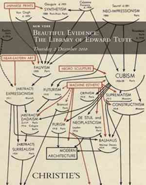
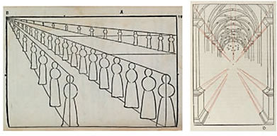
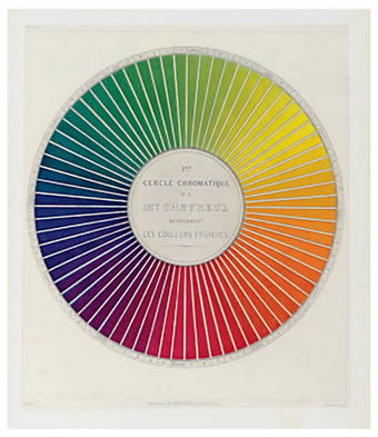
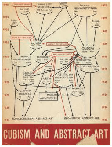
The collection, and the auction, which just occurred at Christie’s NYC galleries represents a sampling of the spectacular quest for knowledge – the knowing of how to organize content in powerfully emblematic ways — from tabulations to mapping, from overviews on perspective to studies of the sky — it does all come back to the search for information — and how that can be organized. Some imagery below (pardon my failure to precisely identify each, but more can be had — as well as the specific bibliographic data, here — the eCatalogue. Some examples of Tufte’s collection:
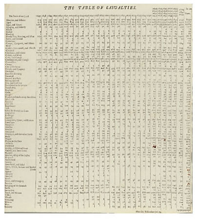
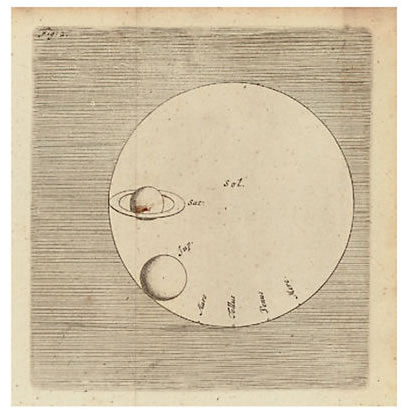
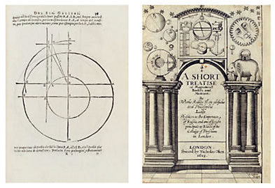
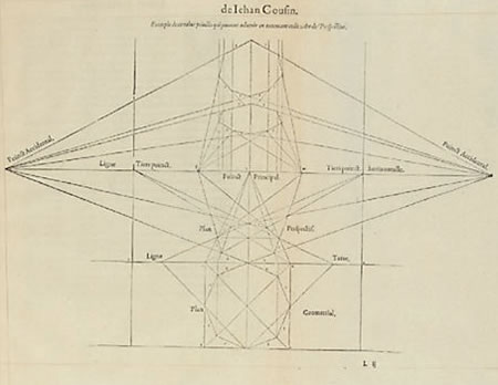

Another part of the story, emerging here:

Interestingly, this leads me to the next link — speaking with the CEO of a new technology for sorting information in a Excel killer, Tableau software. Christian Chabot is energetic and passionate — a great presenter of the precepts of the Tableau strategy and now, on the road for 6.0. And at our interview (for the job of working with them) one of the key kickers to the move to hire Girvin was the fleet of books by Tufte on the shelves at our offices. We’ve supported Tableau from the beginning (after their formative years, building their brand, identity, interface, writing and evolutionary product offerings.

That bridging comes to the latest announcement (Klint Finley, a fellow alum of the Evergreen State College) by Tableau in regard to Wikileaks:

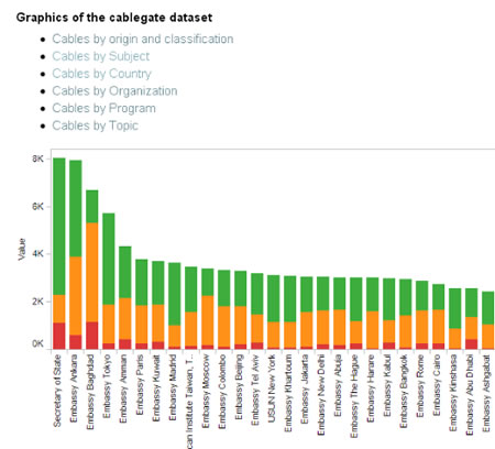
Facing indirect pressure from the U.S. Government, Tableau Software has dropped Wikileaks’ data from its site for people to use for data visualization. According to an announcement posted on Tableau’s blog, the company decided to drop Wikileaks’ content after reading Sen. Joe Lieberman’s public request that companies hosting Wikileaks’ data remove it. According to the announcement: “Our terms of service require that people using Tableau Public do not upload, post, email, transmit or otherwise make available any content that they do not have the right to make available.” It does not appear that Tableau was contacted by the senator directly, nor that it received a cease-and-desist order or any other official request to remove the visualizations. The reasons Tableau cites are strikingly similar to the ones cited by Amazon.com, which just announced its own reasons for dropping Wikileaks’ main site from its servers. Wikileaks was using Tableau Public to create means of browsing the cables by subject, location and other criteria. The visualizations were well received by data visualization experts, such as the blog Infosthetics.
There is, of course, a lot of discussion about the validity of refereeing the content use of the visualization, including, as noted in the article, ACLU’s positioning against persecution of Wikileaks: “We’re deeply skeptical that prosecuting WikiLeaks would be constitutional, or a good idea. The courts have made clear that the First Amendment protects independent third parties who publish classified information. Prosecuting WikiLeaks would be no different from prosecuting the media outlets that also published classified documents. If newspapers could be held criminally liable for publishing leaked information about government practices, we might never have found out about the CIA’s secret prisons or the government spying on innocent Americans. Prosecuting publishers of classified information threatens investigative journalism that is necessary to an informed public debate about government conduct, and that is an unthinkable outcome.”
I don’t presume to add to the debate here — there’s been plenty of that (and more to come, surely) — but it does lend itself to another tier of the idea of looking for ways to re-search, see and comprehend the power of the content through the framing of the imagery of it.
First off, to the openings of seeing the Wikileaks utilization of Tableau — that’s one tier of imagery.
Then there are others, that organize the content of the Wikileaks outcomes — which step up the character of the complexity of that content, and how it might be visualized. Here, some classic Jason Bourne read outs of the Wikileaks challenge:
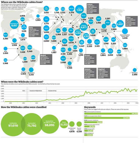
Cliff Kuang, Fast Company’s Co.Design editor — and writer for Good and Wired, notes “Perhaps the most sexy of the various offerings is from The Guardian, which gives you a map-based interface for browsing key cables.” Clicking on a country brings up the relevant documents, which you can then read in greater depth:
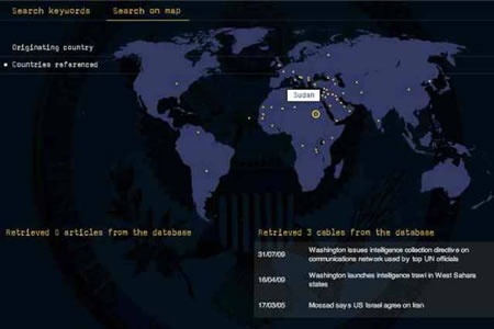
As he also notes, the key player in the interactive display of quantitative information comes from a long-time personal favorite, the New York Times, one of the early recipients of the “leak.”

UPDATED Dec. 3, 2010
A Selection From the Cache of Diplomatic Dispatches
Below are a selection of the documents from a cache of a quarter-million confidential American diplomatic cables that WikiLeaks intends to make public starting on Nov. 28. A small number of names and passages in some of the cables have been removed by The New York Times to protect diplomats’ confidential sources, to keep from compromising American intelligence efforts or to protect the privacy of ordinary citizens.
LATEST CABLES:
Americans Arrested in Yemen for Militant Ties …Yemeni President on U.S. Missile Strikes …Yemeni President Gives U.S. Free Reign …Hunting for Dangerous Weapons in Yemen …Yemeni President on Guantánamo Prisoners …A Standoff Over Uranium in Libya …Libyan Uranium Finally Leaves for Russia …Department of Energy Team Inspects Uranium …Qaddafi’s Son Complains about U.S.
|
Candid and Frank Assessments SEPT. 29, 2009 Profile of the Libyan Leader AUG. 31, 2006 A Wild Wedding in Dagestan, Russia JULY 13, 2007 Ambassador Reports on Zimbabwe’s Leader FEB. 6, 2007 U.S. Warns Germany on Bungled Rendition OCT. 3, 2009 2009 Meeting with Ahmed Wali Karzai FEB. 25, 2010 2010 Meeting with Ahmed Wali Karzai JULY 24, 2009 Analyzing a Coup in Honduras AUG. 13, 1979 Message From a Soon-to-Be Hostage in Iran DEC. 13, 1989 From Panama Before the U.S. Invasion JAN. 17, 1990 On the Eve of Nelson Mandela’s Release Iran’s Nuclear Ambition Diplomats or Spies? North Korea Guantánamo Detainees Pakistan Blackwater Nicolas Sarkozy Russia Georgia Canada Afghan Corruption Assessing Karzai Yemen Libya |
DATE 2009-09-29 17:21:00
SOURCE Embassy Tripoli CLASSIFICATION SECRET//NOFORN S E C R E T SECTION 01 OF 02 TRIPOLI 000771 NOFORN STATE FOR NEA/MAG AND INR. E.O. 12958: DECL: 9/29/2019 CLASSIFIED BY: Gene A. Cretz, Ambassador, U.S. Embassy Tripoli, 1. (S/NF) Summary: Recent first-hand experiences with Libyan QADHAFI’S PERSONALITY REFLECTED IN HIS PHOBIAS 2. (S/NF) Muammar al-Qadhafi has been described as both [Not the entire WikiLeaks entry] |
Yes, at this point, you might offer — “wait, this isn’t search visualization, these are infographics!” And you’re right — but I’m mixing the metaphor – intentionally – of the concept of search and how that information is gathered for viewing. The story extends to other, perhaps more credible search conceptions — and how that information can be, as Edward Tufte puts it, be beautiful.
The concept of exploring the idea of data visualization is hardly unique to my curiosity, countless others have examined that potential as well — here’s an excellent search / organizational set that is founded on unique interpretations of search functionality and interface attractiveness and innovation. Bear in mind that I’m examining the idea of search — the quest for information, and how it’s organized in a manner that might be deemed accessible, interesting and hopefully — amazing, as well.
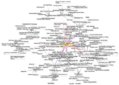
Scan below, the search:
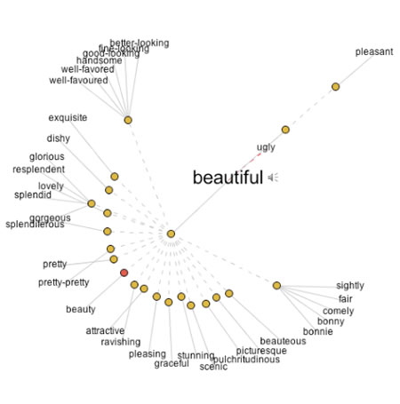
One gathering might be the examination of the word. That examination of searching and looking for links in verbal expression can be found in Visuwords. This is a visual interface that moves, each node being the link to others.
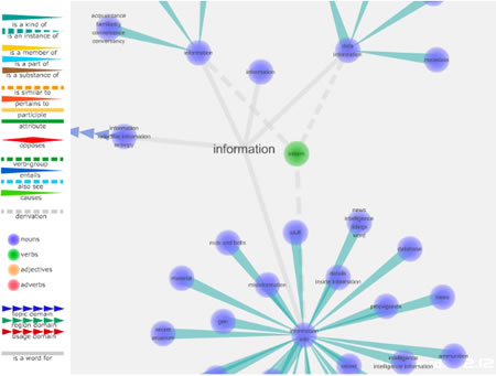
Expanding on that, you’ll find ThinkMap’s Visual Thesaurus — which also operates on a spinal / nodal and expansive visual modeling — it’s alive, as well. Explore some words, and play with them.

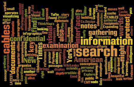
Play some more, here — Wordle‘s search, find and organize formatting is another reference to gathering content, for example — all the words in the last grouping of paragraphs and building them into a visualizing cloud of comprehension in weighting and scale. Sure, you might know all of these.
Check out Adam Ostrow’s notes here. He overviews 16, including some of the above, with some sterling additives like: Fidg’t, and some DiggLabs technology. Interestingly — some of them have vanished over the course of speed in the last several years — searches show nothing.
Like:
“Visualize Your Network with Fidg’t
Fidg’t is a desktop application that aims to let you visualize your network and its predisposition for different types of things like music and photos.” Attractive interface — but where is it? Can’t seem to find this one, yet I like the artfulness of the arrangements.
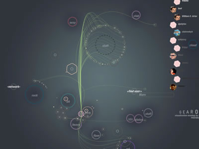
These are functioning, however, in the list that he’s built:
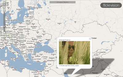
See Where Flickr Photos are Coming From
Flickrvision combines Google Maps and Flickr to provide a real-time view of where in the world Flickr photos are being uploaded from.
“See Where Twitters are Coming From
From the maker of Flickrvision (David Troy) comes Twittervision, which, you guessed it, shows where in the world the most recent Twitters are coming from.”
He also notes Quintura — See & Find, acting as a kind of reverse Wordle — enter, and it clouds the content.
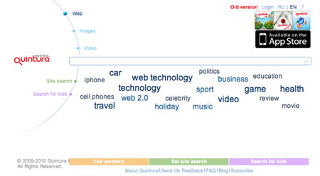
But still others, like KartoO and walk2web are under guard of dead façades. QuickSprout’s Crazy Egg (Seattle’s Neil Patel, blogged here) offers insights into touch strikes — if people are coming, then what are they clicking on — by list, buttons, heat maps (shown below).

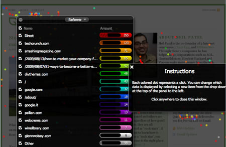
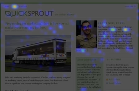
It’s a pay-per-view-site — speaking of Neil Patel’s search modeling.
The Pacific Northwest’s Zillow and Trulia are on the list — for trend measurement, house cost “movement” coupled with Google mapping relationships for real estate insights and decision making.

Digg Radar (above) seemed quiet, but an interesting concept to “allow you to use a radar map to visualize Digg data. The radar map is organized by placing users with the oldest Digg accounts in the center.”
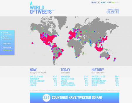
FrogDesign explores, “The World of Tweets” in their overview of heat-mapping the search for twitter movements:

Gathering in on the notion of other exploring the space of search, and visualizations, I’d offer the teams that center around UX in community — search and gather in groups like LinkedIn. UXPond is such a gatherer — and where I found some of the most pertinent links. Some added listings from their examinations – acute search, wandering out in the networks.
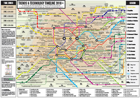
Trendmap gathers tweet, and visualizes them geographically.
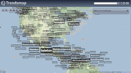
Information Architects (jp), from Tokyo, has been creating increasingly intriguing maps of the networks of search — their most recent modeling. Look under poster, for their latest “web trend map” — a perfect gift for geeks, and purchasable on their site. This reduced rendering doesn’t even begin to do it justice.
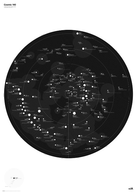
Newsmap searches – and visualizes new content. According to Marumushi’s overview, “Newsmap is an application that visually reflects the constantly changing landscape of the Google News news aggregator. A treemap visualization algorithm helps display the enormous amount of information gathered by the aggregator. Treemaps are traditionally space-constrained visualizations of information. Newsmap’s objective takes that goal a step further and provides a tool to divide information into quickly recognizable bands which, when presented together, reveal underlying patterns in news reporting across cultures and within news segments in constant change around the globe. Newsmap’s objective is to simply demonstrate visually the relationships between data and the unseen patterns in news media. See Newseum‘s front page modeling, combining mapping and sequences of cover imagery from around the country — or the world.
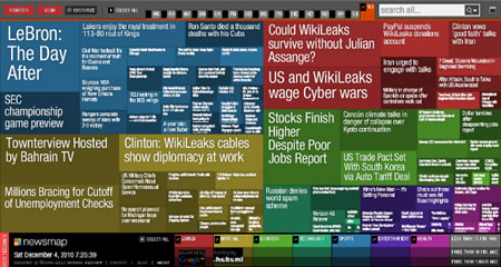
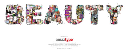
Amaztypeis another modeling of search gathering — exploring the idea of searching a “word,” in the form of books or related products, and building a visualization that literally assembles the products — in that word’s visualization. Hence: beauty.
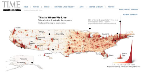
See Time’s multimedia overview of population for a spikier treatment of the conical graduations of searched content and visualizations.
Hans Rosling’s compelling rethinking of analysis – and the search of explanation – lends itself to striking results in his Trendalyzer tools, found at Gapminder.
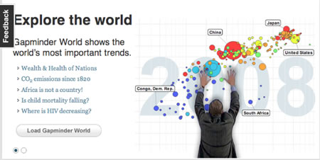
But perhaps the most compelling attribute of his thinking can be found at TED — here, the vitality of the searching inquiry reviews astounding insights in the way he looks at content, trend and evolution.

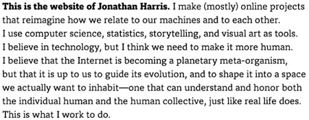
To the engagement with TED, as well, I’d met Jonathan Harris there — an extremely interesting person, exploring the nature of the hunt, gather and visualize — emotions and stories. I found his positioning to be captivating, and stayed in touch, over the course of the last several years. There are several options to chose from, here, studying his investigations of live coalescence of content online, in blogs and news, and how that feeds into some striking visual search and storytelling outcomes. He describes his work in this manner:
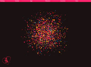
Jonathan Harris | We feel fine
Loading your preferences, We Feel Fine goes out and gathers the content that relates to the query — dots represent emotional states that are articulated, clicking them — reveals, in this search, what’s “beautiful.”
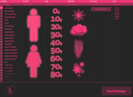
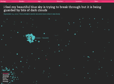
I Want You To Want Me is an interactive installation about online dating, commissioned by and installed at New York’s MoMA on Valentine’s Day 2008, as part of their Design and the Elastic Mind show.
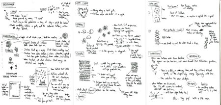
The site overview offers: “I Want You To Want Me chronicles the world’s long-term relationship with romance, across all ages, genders, and sexualities, gathering new data from a variety of online dating sites every few hours. The system searches these sites for certain phrases, which it then collects and stores in a database. These phrases, taken out of context, provide partial glimpses into people’s private lives.” Interestingly, the modeling for how the conception came to be — speaking of searching for ideas and how they could be visualized is shown below.
Sputnik (also Harris) offers another gathering — here, collected over ten years, but newly searchable, bringing together nodes of content in unique ways. He notes —
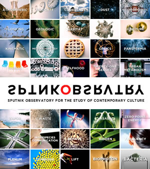
“Sputnik Observatory is a collaboration with New York based Sputnik, Inc., an organization that documents contemporary culture through intimate video interviews with hundreds of leading thinkers in the arts, sciences and technology, covering a wide range of topics.
The central premise of Sputnik Observatory is that everything is connected to everything else, and that topics and ideas that may seem fringe and even heretical to the mainstream world are in fact being investigated by leading thinkers working in fields as diverse as quantum physics, mathematics, neuroscience, biology, economics, architecture, digital art, video games, computer science and music. Sputnik is dedicated to bringing these crucial ideas from the fringes of thought out into the limelight, so that the world can begin to understand them.”
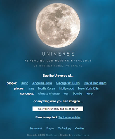
I’ll close with Universe — please explore some of the other thinking in his examinations — and search assemblage. “Universe attempts to create new constellations for today’s night sky by continually analyzing the contents of over 20,000 international news sources, suggesting a modern mythology based on global media coverage.
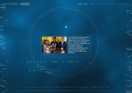
Universe portrays all information as being interconnected. Any word, quote, person, photo, topic or story can become the “center of the universe”, causing all other items to rearrange themselves in relation to the selected item. This treatment of information is reminiscent of the way we, as humans, experience reality — each of us from our own individual perspective. Universe gives data this same privilege.”
Searching Barack Obama, live:
More, to the nature of aggregation of personal content, there’s another interface that aligns your “hometown” with location, feeding Google Earth and Chrome.

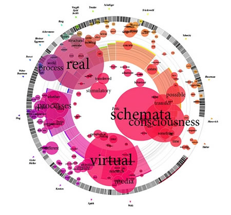
To the nature of building contextual links, there’s Munterbund, which “showcases the results of research graphical visualization of text similarities in essays in a book. “The challenge is to find forms of graphical and/or typographical representation of the essays that are both appealing and informative. We have attempted create a system which automatically generates graphics according to predefined rules.”
And if there’s a reading connection, what of listening? Pandora offers the interface that’s founded on a sliding sequence of genetically coded selections, based on their algorithms of style and content.
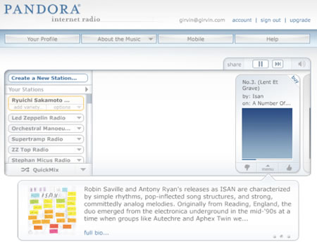
That imagining is accepted genius.
But what of other visualizations of searched gatherings — music seen, in scene — The Shape of Song.

Chopin, Mazurka in F# Minor
The image illustrates the complex, nested structure of the piece.
Their site offers, “What does music look like? The Shape of Song is an attempt to answer this seemingly paradoxical question. The custom software in this work draws musical patterns in the form of translucent arches, allowing viewers to see–literally–the shape of any composition available on the Web. The resulting images reflect the full range of musical forms, from the deep structure of Bach to the crystalline beauty of Philip Glass.”
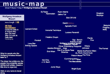
Mapping musical connections – see MusicMap.
Note that the search here is for Wolfgang Amadeus Mozart – and study the links. Interesting connections, I might suggest…the closer to the center, the more realistic the alignments. And further out — influenced, but less obvious.
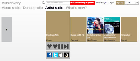
At Musicovery, that same search reveals a string of potentials to listen to, yet expresses a much flatter landscape of exploration.
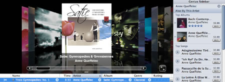
iTunes? The scrolling, page-turning search interface of the Apple “cards” is a compelling additive — it’s so well known, that it might not even be seen as a searching tool; but to my take, it is. Search, find, beauty sound. Your sound.
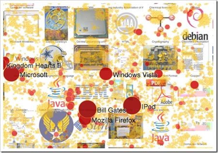
Who’s asking what, and what does it look like? What’s the search? The heat of search on Wikipedia — more, to the overview, here.
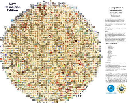
A closer study shows the heat of search strikes and gathers, layered in a pebbled dot mosaic.
The mapping of content can take on a striking naturalistic bent, in the spinal and nodal treatments shown in this analyses.
Websites as nodal graphs: “Everyday, we look at dozens of websites. The structure of these websites is defined in HTML, the lingua franca for publishing information on the web. Your browser’s job is to render the HTML according to the specs (most of the time, at least). You can look at the code behind any website by selecting the “View source” tab somewhere in your browser’s menu.”
blue: for links (the A tag)
red: for tables (TABLE, TR and TD tags)
green: for the DIV tag
violet: for images (the IMG tag)
yellow: for forms (FORM, INPUT, TEXTAREA, SELECT and OPTION tags)
orange: for linebreaks and blockquotes (BR, P, and BLOCKQUOTE tags)
black: the HTML tag, the root node
gray: all other tags
CNN.com
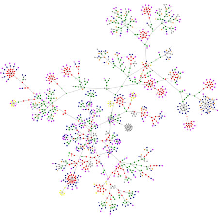
The blog, BoingBoing.net
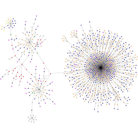
And the clarion simplicity of Apple:
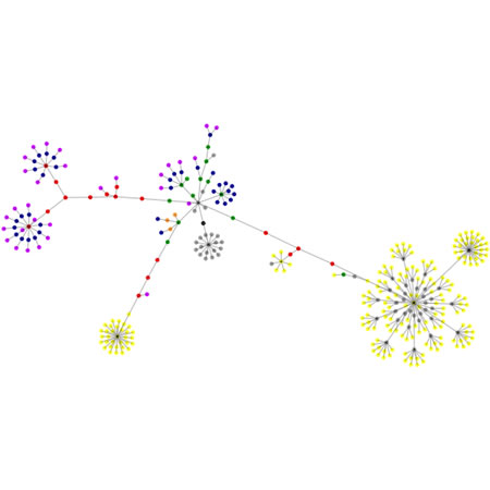
And by way of comparison, the mapping genetics of Wired.com:
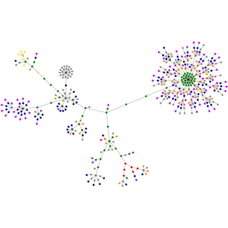
I wondered — what about Girvin’s site?
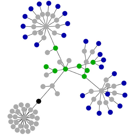
And what about Girvin’s blog?
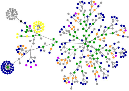
The applet developer (and applet tool) can be found here (try it out on your site) — interestingly, a student of infectious disease, Marcel Salathé.
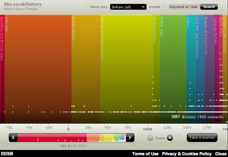
To the conceptions of time, and the movement from the past to the present, searching for more insight and depth — there are hundreds of time lines — from sliding rules, massive tiles and clickable fields, to zippered treatments. Tom Ford and Gap share the sliding panels of clickable content, along with Burberry, blogged and noted. But what about a new modeling? BBC’s history timeline is one of the most remarkable. Check the link, to go live with it.
I started out exploring this for a client, with the GIRVIN | NYC team – and things kept rolling — adding; one idea for a blog ended up lasting weeks of time — past the actual delivery dates (gone and done — onwards to the next phasing.) That was weeks back, the earlier run in the city. Then I kept at it.
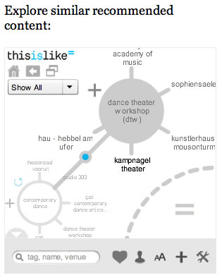
I started with simple and obvious little scrapes of content organization. And then increasingly complex organizational and searching challenges — now, at the end, some conclusions for expanding this search on your own.
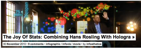
First off, the best blog that I’ve found — that’s wholly focused on search and data visualization — a wealth of things to explore: infosthetics.com.
Explore more science and art, IBM’s “many eyes” here:
http://datajournalism.stanford.edu/
The Periodic Table of DataViz (worth keeping in your bookmark bar)
A depot of visualized interpretations
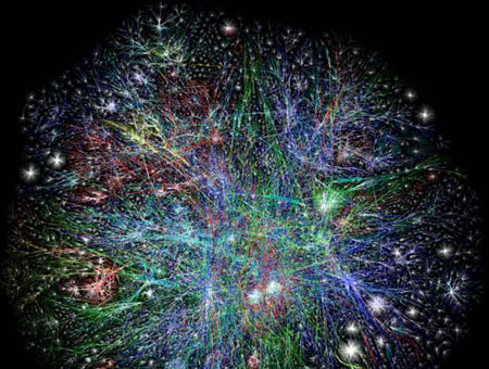
The Opte web universe modeling
As a searcher — I am interested in beauty in experience. I realize the gamut of functioning databases of live content for purchasing power — a form of search, organization of response, alignment in selection, but to the notion of attraction, and attention, the live focus on organizations of searchable content that are exquisitely designed – this is the beginning.
And I’m sure that you’ve got more ideas. Please share them and comment. I’d love to hear your thinking, and spread them out to the community.
Tim | NYC
–––––
H U M A N B R A N D | S t r a t e g i e s
https://www.girvin.com/subsites/humanbrands/
the reels:http://www.youtube.com/user/GIRVIN888
girvin blogs:
http://blog.girvin.com/
https://tim.girvin.com/index.php
girvin profiles and communities:
TED: http://www.ted.com/index.php/profiles/view/id/825
Behance: http://www.behance.net/GIRVIN-Branding
Flickr: http://www.flickr.com/photos/tgirvin/
Google: http://www.google.com/profiles/timgirvin
LinkedIn: http://www.linkedin.com/in/timgirvin
Facebook: http://www.facebook.com/people/Tim-Girvin/644114347
Facebook Page: http://www.facebook.com/pages/Seattle-WA/GIRVIN/91069489624
Twitter: http://twitter.com/tgirvin
