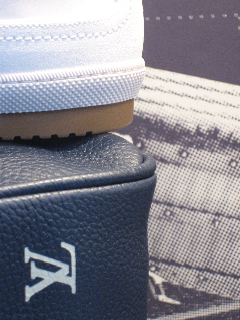
Perhaps you know the classic rendition of “A Pattern Language”? The premise of this fine theoretical explication by Christopher Alexander is that there are a series of movements, patterns, that relate to how space, volume and presence can be reflected in human experience. How to design space and the patterning with which people interact in built and programmed environment.
But a pattern language extends to how problems are solved — how situations are organized for study, how programming can be planned, how information architecture can be framed. But it started with Alexander. He coined the phrase and evolved the depth of the idea. Here’s another extension on that line of strategy.
To the notions of luxury branding, similar refrains exist. There’s a tradition that reaches to the heart of brand messaging in space and visualization. It is, of course, tied to storytelling — and the idea is that in luxury branding, there’s history, legacy and heritage. Surely, it’s not always so — that a luxury brand has a legacy that’s linked to generations of creative development and artisanal outcomes. Luxury can be new (Leviev) or relatively new, David Yurman). But there are creative precedents, in engaging context to the expressions in environment and visualization. What I’m speaking about is the concept of the inner psychic (kindly indulge me) visual language of the brand, that reaches back to the roots of its making — it’s the luxury brand archetype of pattern; at the heart, in the beginning of a brand, are ideas that exemplify experience. They are the opening makings — the germination of hand and idea, of craft and vision, of beauty and utility. I believe that sometimes these marks are truly archetypal — speaking to the psychic — that by their very simplicity and directness of intention, they just might symbolize fundamental, mimetic space that reaches to a kind of primal context. Not proven, just intuited by me. What is sense is what I know.
What patterning then, does that? Reaches that far, says something that is perhaps that deep? A circle circled? A square on square? The pointed rhythm of the triangle?
Packaging a brand is not only about shopping bags and gift boxes, but more so to the nature of holistic containment — it’s everything, (including, yes, the shopping bag) — and everything in the retail environment. Before the implementation of online commerce, brandspace was built — and in the luxury context — this meant lavishly designed interiors that speak to the rarity that is emblematic credo of the luxuriant context. The experience, the service, should be hyper-specialized and carefully rendered — every detail exquisitely framed.
There are obvious allusions to this premise in the work of various historied designers ( — and, by reference, in the implications of Louis Vuitton. While Vuitton is a legacy brand, now controlled by the luxury group LVMH, it still holds some framing to the links of time and the patterning of ideas that are at the heart and beginnings of it. Those strategies are intentional — and they might have contributed to the enormous leadership LV has as the pinnacle of LVMH success, garnering 60% of the group’s growth and profits.
Louis Vuitton, a luggage maker from the late 1800s, created specially light-weight, durable crates for travel; using laminated layers of canvas and special materials, not only were they ruggedly manufactured, but they were far lighter than the heavy retinues of bags and shipping valets that many sophisticated early travelers required. Travel was slower, the transients more needful of a full voyage garniture. And, in making them attractive and durable, patterns were created. In holding to the early seminal patterning language of brand, there’s the potential to establish those links, those threads that take you back to the beginnings — and that, then, bring you to the present, the new presence of the brand. You are taken back in time; and you are brought forward in time to the present. You capture something of that experience, that legacy.
In the wisdom of the brand strategists and visual management at Vuitton, various design elements from the legacy of the story have been retained and absorbed as part of the brand retail vocabulary. This patterning has been carefully implemented and incorporated in the fixturing and shopfront skins of many of their stores. Examples abound, globally.
What’s the point of that, anyone might ask? One, that there is legacy — that which lies in the past creates a sense of value. In buying into a luxury brand, buying into the premise of the brand, you are presuming that there is something there that makes it more valuable. The story, the history, the expertise, the rendering of great and beautiful things, over time. Yes, surely, there are lots of marketing expressions that speak to that luscious positioning: ads, visuals, catalogs, models, celebrities.
But a brand has to start with something — and that is, more often than not, truth. Luxury brands have to be truthful, in the beginning. They have to start some place — real. That’s the start, and the heart, of the story. And truth often leads you back to the beginning of the story, the origination — that time when the innovations were at the point of germination.
It’s my belief, it’s been my experience, that luxury brands that hold to their story, that retain a sense of the thread back to their beginnings — the brand DNA as Bernard Arnault refers to his management of luxury assets — (article)
The patterning, then, is finding that inherent language, that brandcode, and see it implemented in a way that it reaches to the heart of the guest, magnetizes memory and deepens the impressions of the brand experience. Here are some referential examples from the Louis Vuitton flagship.
—-
Luggage patterning becomes merchandising substrates. This double image references wall glass checkerboard with a collage wall paper.
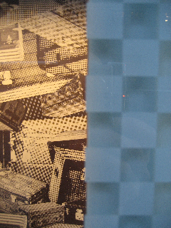
Merchandising of product and patterning — one language becomes another.
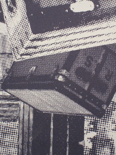
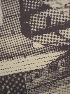
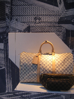
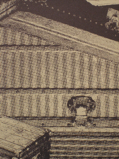
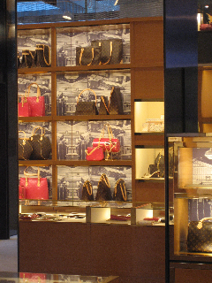
The geometry of wall treatments becomes a diffusion of the brand language.
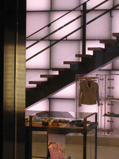
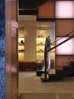
Merchandising design rhythms — brandcode becomes patterning visual display.
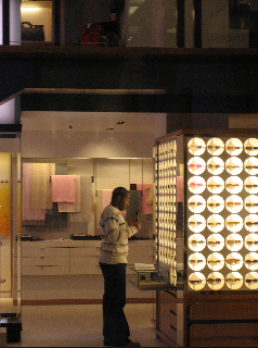
The layering of the skin — glass-blasted checkerboarding is offset with shadowed patterning for the retail exteriors.
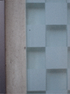

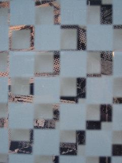
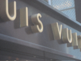
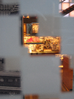
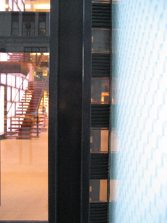
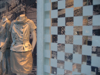
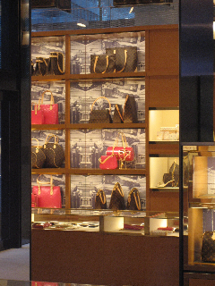
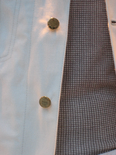
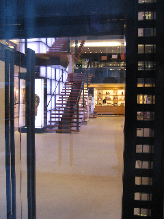
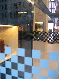
The language of the patterning code, as simplistic as the lining for product casements in the early 20th century, find an enduring added character in the layering of messages that reach back to the heart of the brand, its history and the original craft and care that set it apart. And continue to do so, today — the brand DNA and character continuously advancing the vision, from then to now.
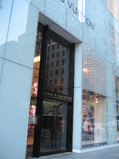
The lesson? Never forget where you started:
A return to classic brand elements – such as this early 20th century signature.
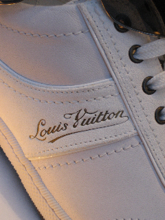
Product details, the monogram and patterning applications — the rhythm of the wall to shoe seaming.
