ACE HOTEL | NYC: MARTIAL DESIGN BRAND STRATEGIES – Story, visuals, environmental graphics, tactical executions. Military graphic for a hotel (just blocks from GIRVIN | NYC.)
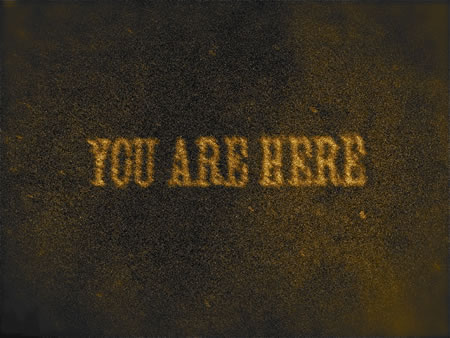
And coincidentally, ACE began in Seattle (just blocks away from GIRVIN | Seattle.)
Good enough, there’s a story to explore. And it starts with a larger sentiment of design and event production. Thinking about the human brand, you might too think about the human brand magnet; that is, really great leaders absorb and build on the style of their teams — and what they see, traveling the world. To each, their own — you think that you’ve got a really good idea, then you realize that you’ve missed the point — that the idea was never really your own. Working with leaders, around the world, I find (myself) that many of them are “the people out in the front, literally — leading the pack, but they rely heavily on having the right talent in play. The founder of Ace references that, in his examination of history — in this instance, an interview with “The Malcolm,” a hotel blog.
Offered: “Alex Calderwood and vision — the need to bridge the gap between the service found in luxury hotels and a room rate that won’t break the bank. The Ace Hotel concept was born. With 4 locations in the US (and subsequent plans to expand) – Calderwood’s vision has taken him from a young guy with a vision to a global influential tastemaker.” It might be suggested as well, that it’s Alex’s international exposures, in his Neverstop event management brand that has taken him out in the field to see and learn more. And he’s described his passion about creating hotels as being aligned with loving hotels — and getting to them: travel. The real gig is that a well run hotel is a kind of consistent party, a roving daily event that rolls from one day, to the evening, to another. And the principle of hospitality reaches to the conceptions of catering — making that event superlatively pleasurable. Great event hotels, in terms of flash management — the scene is always glittering and active, surely lies in the camp of W — as a concept grouping; the Standard — as having that magnetic vibe; and Schrager’s offerings, which might be quieter but still have the swagger of something happening, all the time. What’s curious about Calderwood’s visioning is that he sets his sights on one “site” — for example his opening entrepreneurial thinking about the “concept of the barbershop” — and stays with it.
There have been others that have tried to build on the principles of classic barbering — but Calderwood’s approach is more thematically off-beat. While others have moved to the upscale — men’s shop — Calderwood’s venture has gone funkier, and surely more millennial, but something that still speaks to a kind of historical American positioning. Rudy’s is nothing like any other approach to barbering, within the American borders; and you’d surely never find anything similar to it outside of the US. With the Malcolm, he talks about it. The Alex Calderwood | Wade Weigel revolution of “Sig’s.
“Alongside partner Wade Weigel, you launched Rudy’s Barbershop in Seattle in 1993. What was your original motivation to start Rudy’s? How has it changed/expanded since?
Back then; I used to walk by Sig’s barbershop in Seattle. I always thought the look of it was cool, but thought t would be more interesting with younger stylists. I fantasized about buying that shop. At the same time my (now) business partner, Wade, would travel often to London for work, and loved seeing the barbers at the Camden Market, with just a chair + scissors. He loved the spontaneity of it. So one day, we shared our stories with one another and Wade had the brilliant idea of setting up own shop. We scraped together our pennies and built the first Rudy’s for about $15,000. I wish we could build them that cheaply again!”
The thematic evolutions there are telling — if you’ve ever seen Sig’s, then Rudy’s, in what it’s become today. Frankly, looking at the brand, I’m not sure how they do — given seat vacancies. But I never really pay for a haircut. I could be missing something.
A review of Sig’s from Metropolis Magazine
“You then went on to form NeverStop with Nasir Rasheed?
Around the same time we started Rudy’s, I used to throw warehouse parities, and earned a rep for this. My partners and I moved on to produce concerts. Then we started getting asked to events for local companies…which was more profitable. As we worked more closely with these companies, we got asked to do events outside Seattle, packaging design, graphic design, marketing initiatives, etc. We always said yes + figured it out as we went along. The talent we accumulated from these endeavors, turned into Neverstop. Now we do much more sophisticated projects all over the word.”
The real point to both of these is the turn of experience, environment, storytelling and the buy-in proposition from the guest (in either instance).
“The Ace Hotel New York. How would you describe the interior aesthetic of this hotel?
Our intention was to create an instant classic. We stripped back to the bones of this 1904 building. Our decisions were born of a sort of spare classicism…A mixture of custom design furniture + unique “found” pieces. A type of modern bohemia.”
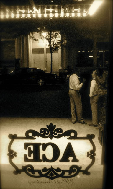
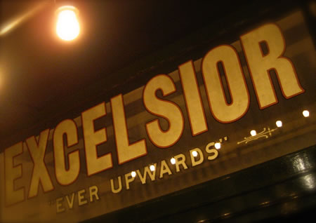
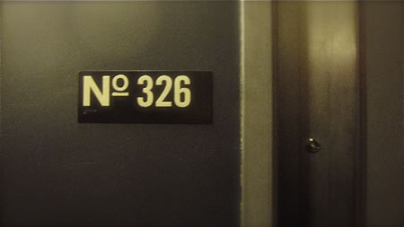
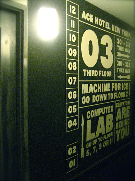
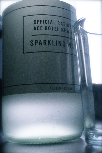
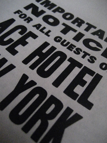
Is this a classic? It’s hard to say, it’s a fascinating amalgam of characters that range from the strictly utilitarian, to a sweet selection of finishes and materials, as well as a defined brand enclosure in the complexly verbal graphic design program that permeates everything — in all, with a utilitarian sense of humor.
As a designer, exploring the concepts of procession and sequencing, I found some components of the experience slightly off-putting. The service staff, dressing in a millennial /Y stance, can be a little hard to perceive in the crowd — moreover, the attitude is one that is slightly aloof. Like: “can I ask this person to help me, or he preoccupied with something else?” From the street entrance to the steps in, the reception service there was a kind of tired, been there utility of curt query that was less than freshly open. I was kind of surprised. Traveling the world — I’ve experienced both extremes, service at the Aman being so complexly engaging that you’re wondering when you’ll be left alone, to other circumstances that are more to the completely bereft — like: “where is everyone?” Actually, “where is anyone?” Calderwood defines good service as good instinct — and perhaps that was the scenario — my greeting crew forgot their instinctual sense of hospitality. That character might simply be cooler than me.
But the interest in building this story out was the exploration of the hospitality graphics packaging — the whole skin of the design program, coupled with their amusing sense of linguistic flavor. It has an attitude.
One is — just do it, will ya.
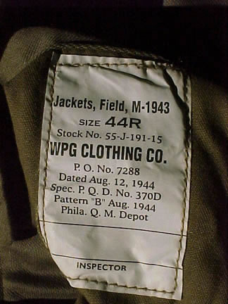
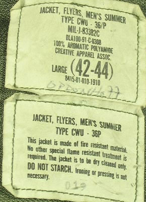
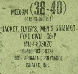
I’d reference that the graphics program for the Ace might be derived from Calderwood’s fascination with “basics” — like Sig’s, with its barbering chairs from the 30s. There’s a presumption of utility — it’s just solid gear. It worked then and it’s worked now. In a way, the idea of this direct form of design ethos could reach there — to the styling of amenities; “we’ve got a job, let’s do it.” To reference, I immediately recalled another form of utilitarian approaches to design, whose function might be directed here:
Suppliers to the DoD are under mandate to comply with MIL-STD-129 and MIL-STD-130 for tracking items, cases and pallets throughout the defense contractor supply chain.
That’s the ruling specifications of the Department of Defense, and it can surely inform cut-to-the-minimum approaches to design and brand. What that comes out to being is something that suggests simple type, oftentimes slightly condensed, that’s founded on a san-serif styling that might reflect the Franklin Gothic family of fonts that are severely limited in their sense of personality. What that feels like, labeled or stenciled, is something along the lines of these captures:

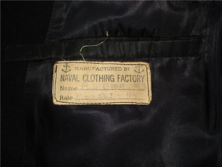
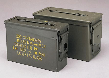
Or to the sense of warning, a signing treatment that focuses on danger:

To the Ace applications, one might find the Army / Navy chic design ethic in their first installation, in Seattle — with this military bedding labeling:
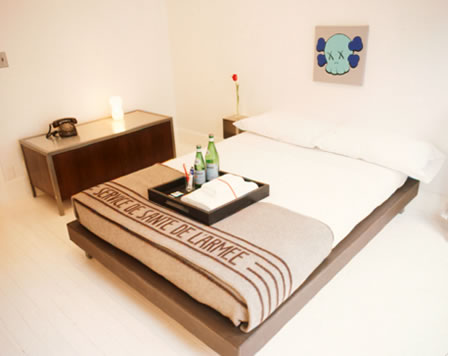
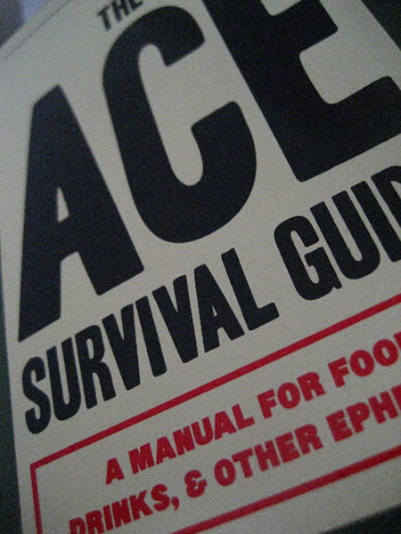
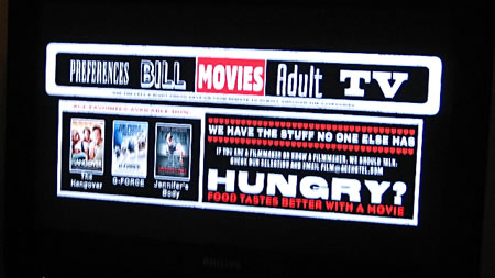
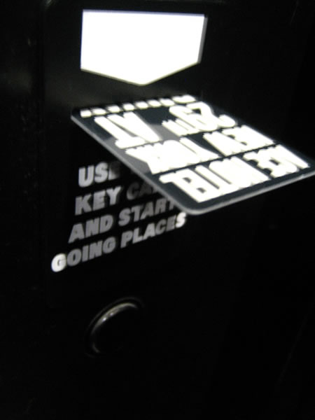
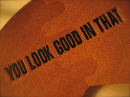
This positioning gathers pacing in the visualizations of a holistic “event” design program for the Ace Hotel, NYC. What I find fascinating is the mix between this martial approach to design, coupled with the humor of more tongue in cheek messaging. It’s serious design, but the messages are amusingly attractive.
A journey, imagery by me and Dawn Clark.
Entry, lobby, the lower grounds:
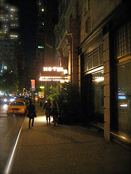
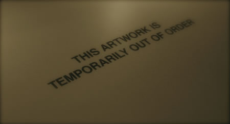
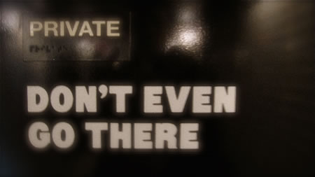
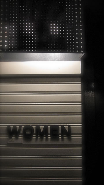
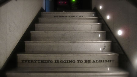
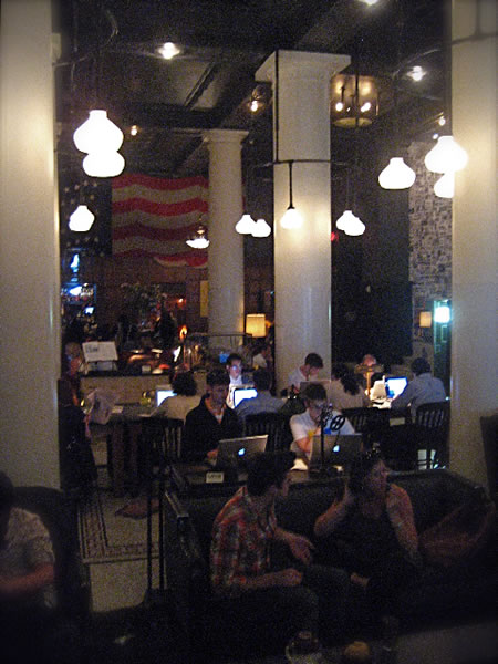
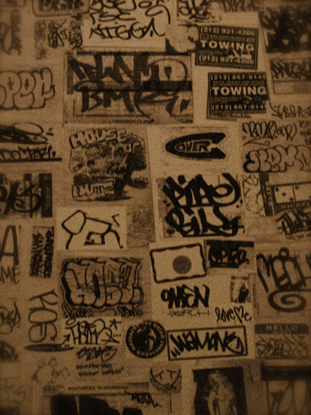
Upper floors, rooms and amenities:
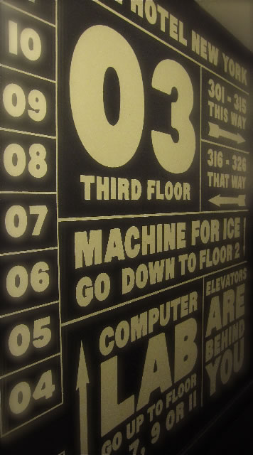
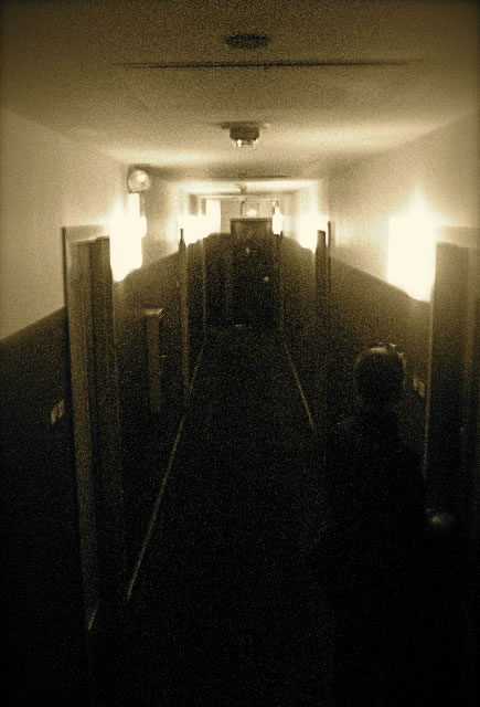

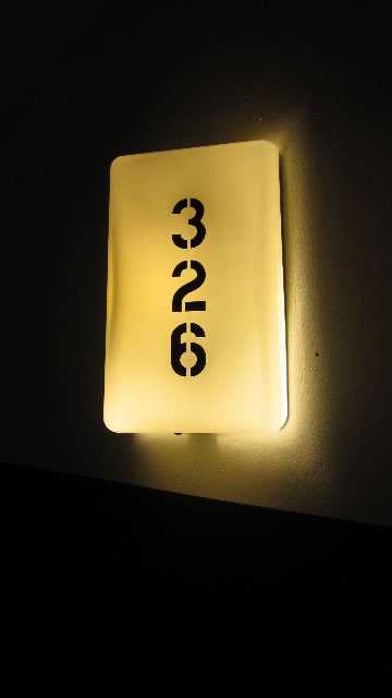
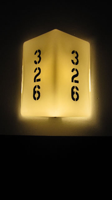



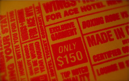
And all of this figures well in the genY figuring of personality and audience / guest relevance.
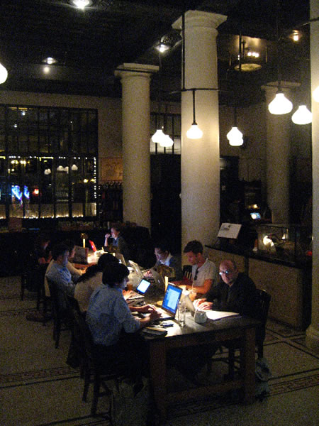
All out there, working away, jacked into the wi-fi, like students of the digital library, the schoolroom of the now.
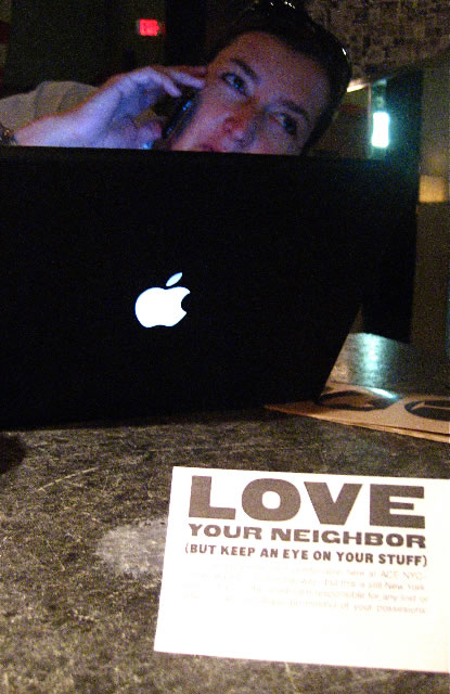
Still, watch your stuff — the world’s not all that free from worry.
All of this speaks to holistic brand strategy, a spherical approach to design thinking about developing place for experiencers.
And we write about it. Extensively.
T I M
–––––
G I R V I N B L O G S O N E X P E R I E N C E D E S I G N S T R A T E G I E S
Ron Soethe
Sig’s Barber Shop
Seattle
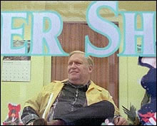
From his perch atop a seafoam green 1920s barber chair, Ron Soethe has had a front row seat to the action in the streets. “Barber Red,” as he’s called, has snipped and styled at Sig’s Barber Shop on Third Avenue for two years and has full view of the street. The closet-sized shop with canary-yellow walls and artificial palm trees has some features of yesteryear, like barbers in smocks and a jar of mysterious green liquid labeled “herbicide” to sterilize combs. No piercing or tattoos in sight. Business has been slow at Sig’s this week, but yesterday Soethe said the customers were starting to return. “They didn’t want to be around anything that’s going to hurt them,” he said. Two chairs down, 91-year-old Elton Jergens was getting a quick trim. Despite a couple of days of quiet clippers, Soethe holds no grudge against the WTO and the protesters who followed it into town. He thinks something constructive could come from it all. “It was like a breath of fresh air,” he said of the activity. “Now . . . we need to sit down and come together like a family and support each other.” Soethe is opposed to the trade negotiations that benefit only wealthy corporations. He would like to see money dispersed more evenly. “The more spread around, the better.”
—-
the reels: http://www.youtube.com/user/GIRVIN888
girvin blogs:
http://blog.girvin.com/
https://tim.girvin.com/index.php
girvin profiles and communities:
TED: http://www.ted.com/index.php/profiles/view/id/825
Behance: http://www.behance.net/GIRVIN-Branding
Flickr: http://www.flickr.com/photos/tgirvin/
Google: http://www.google.com/profiles/timgirvin
LinkedIn: http://www.linkedin.com/in/timgirvin
Facebook: http://www.facebook.com/people/Tim-Girvin/644114347
Facebook Page: http://www.facebook.com/pages/Seattle-WA/GIRVIN/91069489624
Twitter: http://twitter.com/tgirvin