The code of the brand, designing experiences with layers of brand expression — if you’re there, do you know that you are?
In working on dozens of retail design programs for more than three decades of experience, or in other environments where the context of brand storytelling is a level of order in environment, the concept of seeking code that can be used in the context of experience design is an element of continuing evolution. For me, for others in the trade of linking brand story and environmental design in the context of comprehension. Comprehend — that means: people get it — they know where they are and they like being there. They are “held” by the environment — the place — they remember it, feel good being in there. Seems relatively fundamental, yet how intriguing, the challenge in actually making it happen. Literally, the origin of the word is that, the grasping of — and with — the mind, from comprehendere “to take together, to unite; include, seize — to take in the mind.” The notion of prehensile is swiftly aligned to experience — the reflective, grasping character of prehensile – to “catch hold of.”
Another level is the actual layering of how this process might be manifested — color, sound, texture, imagery, graphical patterns and expressions, identity codes, visualizations of identifiable brand genetics. Simple, it would appear; but actually the artfulness is not the obvious solution but rather the more less than immediately and obviously perceivable positioning of elements. Done here, well: Anthropologie.
The whole concept of patterning brands in place-making is an object of obsessive review, by me.
And when it comes to Starbucks, even more so. To my reference, the idea of striving the advancement of the brand was to go backwards, evinced in messages of nearly two years back – returning to the home of the market, the Pike Place Market, store one – the place of beginnings. This idea was pitched in a earlier missive, along with the accompaniment of Tim Lauren, a scent trader with a fragrance and flavor firm based in Europe. We were talking sense, and scents, and truth. Truth in the construct of the authentic, the true soul of things. What’s the heart, what’s the truth?

And in place-making, especially in retail, this is a profoundly difficult measure. Starbucks is trying. Given my connection with the design team, fine people, friends they are — Tim Pfeiffer’s global merchandising design strategy, Liz Muller’s retail design direction, Arthur Rubenfeld’s conceptual leadership and innovation of retail reinvention. My only work for Starbucks, interestingly, has been working on other brands that have a relationship to Starbucks — secretive enough, that I can’t even mention them. As well, I’d worked on the concept of a new retail conception, Joe — a retelling of the retail story — as a diner service proposition; this too, a guarded development that I reference abstractly. But, given these conceptions,
I’m studying the very — conceptual — patterning of the brand language and what is it, and where is it? Right now, I’d venture that it’s a coding element that is founded on a reach to the green, the clean, the re-used, the core of coffee-making art, and the art of community coming together, playing and experiencing their sense of place made — literally, together.

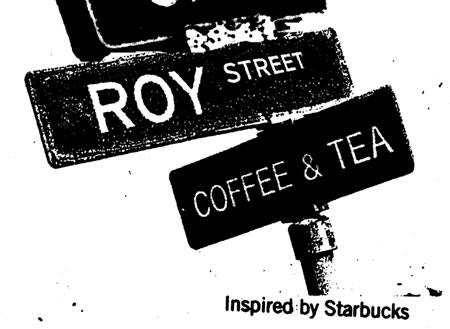
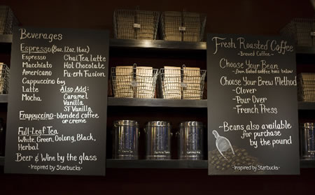
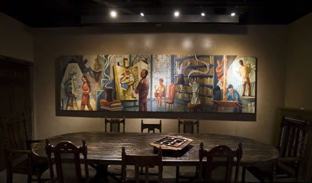
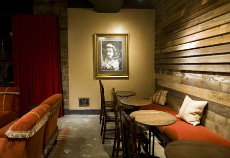
Their newest iteration, Roy Street, herewith, the Starbucks official imagery, for your reference and review. Community, place, made. But at what price, to extensibility? Is there? Perhaps even that question is unnecessary distraction — here shown, some reflections:
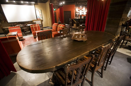
A dear friend, Susi Johnston, and I’ve been bantering about the notion of retail authenticity in the Starbucks modeling for, well, years. I keep looking for truth, and so does she. Susi — formerly of Seattle — now lives full time in Bali. There, her telling, to the nature of retail, is about the sacral art and architecture of experience in Indonesia. Generously, we spent time together in Bali. That opening sweet pageant led to others; and we’re still looking at, and exploring, art, place, architecture and the sensual — and the sacred — impressions of the experiencer.
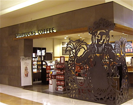
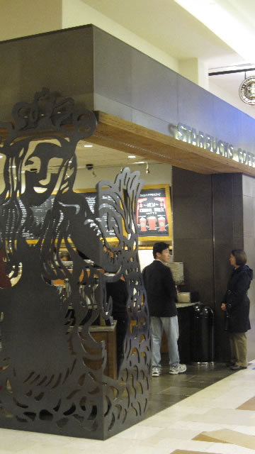
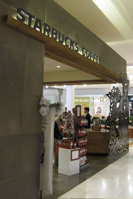
Beautiful. There are other explorations of coding, in the Girvin examination of brand, patterning, story in place making; Starbucks still holds to another evocation of character, in the slicing of the Terry Heckler, Doug Fast Starbucks siren — in this brand latticework. Brand, becomes shadow.
Bellevue Square, shot by Dawn Clark.
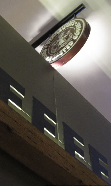
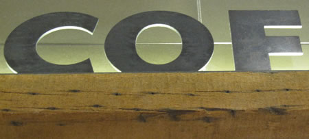
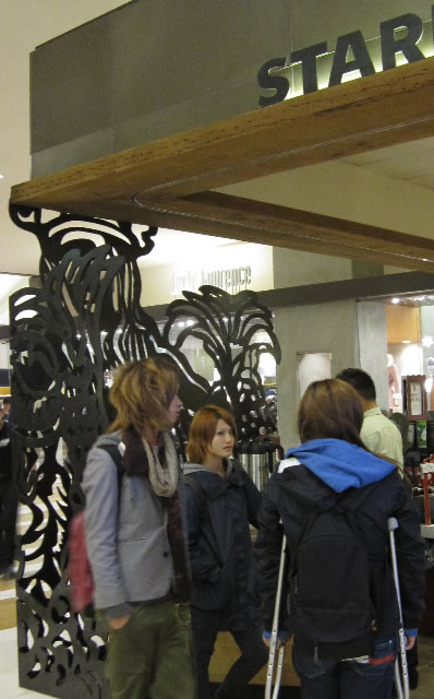
I extend that idea of strategy and patterning — storytelling — to other examples. More on that exploration, later.
Something to look at, feel — what’s the story that can be touched, kinesthetically, synaesthetically mixed in how you merge into your place of happiness.
tsg
….
Exploring the storytelling of the human brand:
https://www.girvin.com/subsites/humanbrands/
the reels: http://www.youtube.com/user/GIRVIN888
girvin blogs:
http://blog.girvin.com/
https://tim.girvin.com/index.php
girvin profiles and communities:
TED: http://www.ted.com/index.php/profiles/view/id/825
Behance: http://www.behance.net/GIRVIN-Branding
Flickr: http://www.flickr.com/photos/tgirvin/
Google: http://www.google.com/profiles/timgirvin
LinkedIn: http://www.linkedin.com/in/timgirvin
Facebook: http://www.facebook.com/people/Tim-Girvin/644114347
Twitter: http://twitter.com/tgirvin