Brand scent, experience design, attention and distraction.
The Hollister Retail Blast | Soho, NYC.
I am perpetually curious about the scent of place. Walking into any environment, I find myself scenting it — then calculating what layers of fragrance might I be experiencing. Communicating with a colleague, about the idea of scent in the context of experience design, it’s the scent itself that can be an overwhelmingly powerful vessel for recollection. A good general sense of scent in place — and it’s recalled that way.
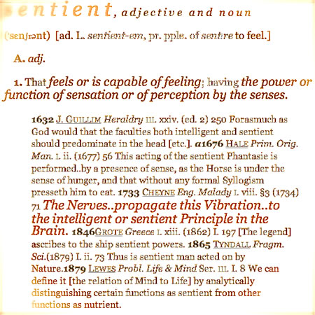
Interestingly enough, most people don’t specifically track their sentience of fragrance experience “in a place”. That is, it’s unlikely that you could say — “hey, you were in there, minutes ago, and what did it smell like?” — and there would be: “it had a kind of sandy, hot beach sort of note opening, with a follow-on series of rubber, cocoa and finally, metal layers of scent sequences…I can still scent it now.” And describe it too.
People are ill-equipped to describe the specific character of the layering of fragrance. The mastery of the art of perfume is a formidable undertaking. There are literally hundreds of defined, essential scents — captured — and surely thousands more that haven’t been “qualified”. Scents are never merely a single expression, but rather the aggregate — diaphanous, wafting tissues transparently drifting in the atmosphere — of many levels that the mind (and nose) perceive. Even still, there are scents in nature that are — have been — literally repurposed into a format that allows them to be newly experienced. Raw, they are too much to be endured — reformulated — they are accessible. As explored elsewhere, the idea of scent forums examining the layering and impressions of scent are legion.
The concept of scenting environments, might be something that is either extremely well done, or to contrast, and more commonly, exaggerated. Enter an environment and either there will be a sequencing of softened tinges of fume, or rather there is one blast that consistently hammers you. The challenge is — balance; and fragrance “noting” an environment with sheathing of scents, rather than blasting monster explosions of fume.
Working in other cities, I’m frequently out exploring environments; restaurants, clubs, museums; this past week: a retail tour in NYC, over the course of several days, I had a chance to study store experience design. One of the stores was the new Hollister | Soho, that opened during the summer, in July.
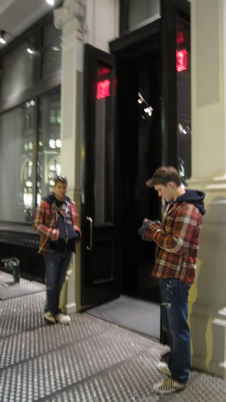
Back then, the presence of “lifeguards” marked the entrance.
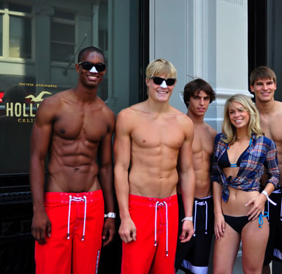
Now it’s a little different, and the modeling opener “guards” are two epic dudes, engaging everyone in coming in, “wassup?” and sending everyone out with a chipper, surfer run out: “have a good one, dude…”
That sense of thoughtful conversation continues inside, with everyone asking, “wassup?” and the freshly classic improvisation, “hey, I like your glasses — are they real, or are you just wearing them?”
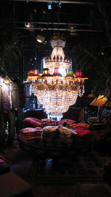
Dark, it is. Loud, it is.
Aside from the wandering stylist sales staff, the merchandising presentations are complex, piled up everywhere, and nearly “library-like” in character — stacked in bookcases and piled on spaces that are contained like shop-in-shop “lounging environments”. And indeed, to the retail staying power, guests do lounge. There were gaggles of families, European shoppers, Russians and American kids, Hollister emulators, spread out, here and there.
Laden with ripped boys and nearly naked girls, every presenter has pulled their pants, swimsuits, surfer shorts down to an impossibly close revelation of their physical gender — along with flapping soft-plaid, flannel-like opened shirts, top to bottom. Every one is a prop — all consistent, all current, all coordinated. Dawn Clark, AIA LEED AP® retail designer, architect and shopping strategy theorist commented, “this idea of coordinating entire collections — a seasonal offering — as a form of unified presentation is relatively unique; and it’s a surprisingly under-utilized sales venture. The idea of linking the employees to merchandise is smart — Hollister is either giving the merchandise to their employees, or settling them as true exemplars of their brand. This is seemingly one of the simplest and most powerful ways to connect with customers, building relationships, as soon as they enter the store.” Literally, every one. Every person, a model, personally staging, for the Hollister expression. And, to my estimation, there were maybe about 50 “models” in the store.
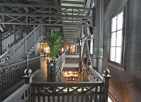
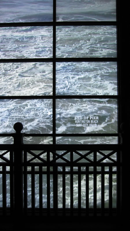
It’s 4 stories plus, settling as a production set design of a darkened, but very clean Huntington beach pier (so-called “live” wave cams running multiple walls — telling the story as a living, visual merchandising of surfing consciousness. Mind you, I’m not suggesting that this living presentation was some inspired sales and lifestyle innovation — staff members being models is ancient — but the real implication is the thoroughness of the integration — and the maximal expression of the current season, in lifestyle visualization. The visitor gets the story told repetitively. And it’s very clear that the story is being consistently recalled — there’s no question about what the story is.
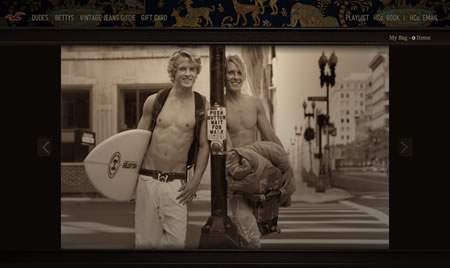
Like the legacy to the A&F heritage, the story holds true — in presentation — even though the brand invention, Wikipedia relates the story — to a town and family that isn’t in the beginning at least, a coastal surfing center, let alone anything less than sheer invention. There are other impressions that come to that opening phrasing of sentient experience. Scent: with a hammer.
But that’s not all true — hammering fragrance — for all people. Just for me, perhaps. And I find talking to people about scent to be interesting — even the sales people — inside the shop-in-shop fragrance. Most of them have barely a clue about what they’re selling — it’s just “nice” — like this slightly more articulate review: “i love this perfume! it was 20 bucks i think for like 1 oz. it lasts a good 3-4 hrs. and smells amazingg. whenever i wear it people are always like “what smells so good? it smells like hollister!” (btw, the hollister store smells really good inside) at first there are some really sharp floral notes and a few woody notes. as it fades, it turns into a softer, fruiter scent. i can pick up some melon notes and maybe a little vanilla. whenever i wear it i cant stop smelling myself (:” Actually, one might consider that this is inherently the nature of scent in place — she’s relating to how it affects her, and she closely identifies with the concept of how this works on, and for, her — and to that, happy experiences at Hollister. The brand — this one fragrance — is expressed in the construct of this selfsame girl, “Malaia is the natural beauty of a sundrenched Hollister girl. The essence of crisp water, sheer florals, and soft woody tones. The allure of the ocean and the California sun.”
The concept of the surf borne scent taxonomic place isn’t unique and represents a trend in the modernist androgynous conception of fragrance. To me, it’s got a kind of false and synthetic quality — and Hollister — the store, is awash in it. Standing in the foyer of the shop-in-shop, “gallery library” environments, I noted smoke, curling on upper lamps — either incensed “fumes”, or electrical fires smoldering — and speaking to the sales HollisterGirl (who was actually from India) she mentioned that there were misters, constantly blowing out the scent. There are notes that qualify as “pelagic“, so-called aquatic, oceanic, or ozonic: the newest category in perfume history, appearing in 1991 with Christian Dior’s Dune. A very clean, modern smell leading to many of the modern unisexual perfumes. This group contains calone, a synthetic scent discovered in 1966.
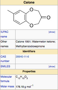
Calone, curiously enough, is a ketone derived from watermelon — and, as I’d mentioned earlier — the idea of scent coming from one extract, to formulate the sensation of another, is part of the magic of the perfuming art — it is, indeed, the splay of a false hand: watermelon implying the hint of a seashore impression, ozonic maritime scenting. As a balancing constituent it is also used to accent floral, oriental, and woody fragrances. The bulk of Hollister’s scents live in the place of this oceanic odorant — my take, being one that has grown up near the sea — that it doesn’t even come close.
Why?
Because the sea, as a scenting register, is incredibly complex and the “cleaned-out, cleared-out” fragrance of the “ocean essence” loses that complexity and focuses only on smaller and more obvious components. While the nature of the merchandising character of Hollister is richly styled and complexly strategized (but still offering clearly recognizable “Hollister Boy+Girl” accouterments), their scent strategy is flat and lackluster. Given the density of the design strategy for their retail presentation, the concept of their “urban oceanic” impressions are boring and slamming by comparison.
What I might offer is that the concept of sentience in experience development — the alignment of all the senses — is one of building the channels so that they are conceptually linked; the concept of the clothes, the interiors, the living modeling — of the sales bettys and dudes — all layering in identity.
Identity, the body of the brand, the makeup of the enterprise. Feel it, sentience.
TSG
Exploring Girvin brand conceptions of scent design and experience integration
blogs on scent:
Tim Girvin and Sniffapalooza community
Chanel as icon
Brandscent legends
Monasterial
The scent of blood
Scent explorations perfume
the reels: http://www.youtube.com/user/GIRVIN888
girvin blogs:
http://blog.girvin.com/
https://tim.girvin.com/index.php
girvin profiles and communities:
TED: http://www.ted.com/index.php/profiles/view/id/825
Behance: http://www.behance.net/GIRVIN-Branding
Flickr: http://www.flickr.com/photos/tgirvin/
Google: http://www.google.com/profiles/timgirvin
LinkedIn: http://www.linkedin.com/in/timgirvin
Facebook: http://www.facebook.com/people/Tim-Girvin/644114347
Twitter: http://twitter.com/tgirvin
