Motion picture design, identity and historical context: visual propaganda.
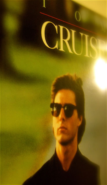
I first met Mr. Cruise, working with him, and the Paramount Studio marketing leadership team — with Jerry Bruckheimer — for Top Gun. Then, after that, Days of Thunder, working more closely with Jerry Bruckheimer, as Producer, and Director, Tony Scott, and building out the imagery for that theatrical advertising campaign.
That was the beginning of a long connection, as a designer for Cruise, starting way back then, moving to the now. We’ve worked on all the Mission: Impossible visualizations; and we’ve built out design programs and explorations for other collaborations — from the Last Samurai to War of the Worlds.
And in each, Tom has had an influence (driving his own impetus), or defining his renewed legacy, as a kind of adjunct creative director, supporting the envisioning of the marketing of any of his films in a manner that purports his sense of direction. There are risks, in taking that stance. And it’s for that reason that I was first called in to UnitedArtists, to connect with the leadership, in 2007, in exploring the marketing for Valkyrie.
A film about “good Nazis” is an immediate challenge — an impossibility, one might surmise. And there have been a number of other films, recently in the marketing frenzy of the last quarter in 2008, that gesture to the horrors of the WWII with an especially hardened positioning on the evils of that Third empire: “Defiance” and
“The Reader”, among them.
My opening role was to read the script and initiate the dialogue with some marketing brainstorming with Dennis Rice. Dennis, at that time, came in on the ground floor, to innovate a new mode of movie-making at MGM | UA.
According to Mr. Rice. “What Tom and Paula are doing at UA is nothing less than pioneering a new approach to moviemaking that will build on a 90-year tradition that began with Chaplin, Fairbanks, Pickford, and Griffith to create a new kind of studio for the 21st century.”
And it’s true. Finding this book in the lobby of their offices, reminded me of the profound historical intention of United Artists, a film group that was inherently trying to define and build an artistic cooperative — a parlaying team of organized talent — decades ago. Cruise and Wagner hoped to newly vitalize this premise. Not without challenges, of course.
In exploring the script, secretly, onsite at the UA offices, I learned more about the premise of the film, and the spectacularly looming challenges of its origination. You’d have to admire Mr. Cruise’s continuing sense of ambitious exposure. As Director John Woo says of Tom (working with him in M:i:III), he’s “willing to take the risk to make the shot, create the scene — he pushes himself to get to the edge, to make it happen”. But, like many properties (and the talent associated with it) there is enormous secrecy surrounding the story. So, as in the past, working on Star Trek (all of them), or the premise of James Bond and the proprietary secrecy of the next installation of 007, we sometimes go to the set, the studios, the director’s home — to read the script in situ. No script leaves the grounds — except those that are numbered, signed for, catalogued and bound by the sign of the skull and crossbones.
The ultimate visual positioning for the film, a kind of plan-view, drawn-map work of the planned assassination pathway is likely a compromise. Early on, the positioning — at least in the range of our discussions — was to be modernist and distinctly “non-Nazi”. So my reach during that time, connecting with Dennis and the team, was looking at what paths, visually, might there be. My recommendation to Dennis was to speak to the latter propagandist styling, the Weimar / Bauhaus neo-modernism of 1920-40s Germany. What is the story there?
Even considering this as a form of discussion, related to a sense of veracity that drew from the directorial definition of Tom Cruise, who examined for months, the nature of the story and his potential role in the structure of the film’s portrayal. The actor prepared for the role for eight months by hiring a researcher, studying history books, and speaking with some of von Stauffenberg’s family. Since von Stauffenberg lost his left eye, right hand and two fingers on his left hand in an Allied attack in Tunisia, Cruise affected the same disabilities to practice dressing, moving items and writing. Cruise initially found the eyepatch difficult to work with — off balancing and distorting — but acknowledged that von Stauffenberg had to live with this discomfort and assimilated the characteristics.
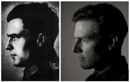
von Stauffenberg and Cruise, in profile
The story is centered, during World War II, around German Colonel Claus Schenk Graf von Stauffenberg, who is severely wounded in Africa and returns home to Nazi Germany. von Stauffenberg helps conceive Operation Valkyrie, a plan approved by Adolf Hitler which, in order to manage turmoil within Germany, would implement a shadow government in the event of the Nazi Führer’s death.
With an increasing realization of what’s really happening in Germany, under the guise of leadership in his homeland, the Colonel eventually joins the German Resistance and became part of the July 20 plot, a conspiracy to assassinate Hitler and execute the shadow implementation: Valkyrie, planning to take control of the country and make peace with the Allies.
Von Stauffenberg finds himself taking on not only the responsibility of leading the coup, but also the task to assassinate Hitler himself. According to the press materials, and interviews: “Tom Cruise, as Colonel Claus Schenk Graf von Stauffenberg, is a German World War II colonel who leads the plot to assassinate Adolf Hitler. There was a distinct positioning in interpretation, for the role: Bryan Singer, the Director, saw von Stauffenberg as “very much a humanist”, saying, “He understood his role as a colonel, but he also understood that the Nazis were doing terrible, terrible, terrible things.”
Cruise wanted to work with Singer, and the actor was enticed by the script’s authentic background, the truth of which struck him as a surprise. The actor described von Stauffenberg’s heroism, “I thought of it in terms of what von Stauffenberg represents. He was someone who realized that he had to take the steps that ultimately cost him his life… He recognized what was at stake.” Cruise felt von Stauffenberg did not think of himself as a hero.
Given the thinking here, my representation to Dennis was to understand the visual links — and the paleographical character — of the time; that is asking and defining the answer to this query: like any good production designer, what did the graphics of the period actually represent? This is a hallmark for our design strategy — how we think about motion picture design and its relationship to production — is siting the film look and feel in a manner that is easily absorbed to the time period. For the now (Benjamin Button):http://blog.girvin.com/?p=2009 and the then (Beowulf): http://blog.girvin.com/?p=496.
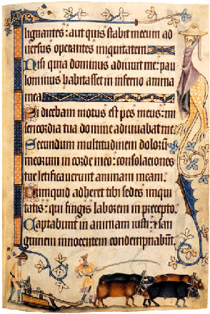
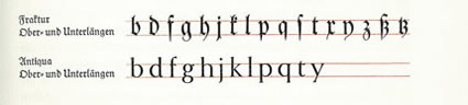
Studying that, the timing of visualizations in the first half of the 20th century, we learn more about the psyche of Germany, the homeland and a sense of national ethos. While the Kaiser, pre-Hilter leadership spoke of its national zeitgeist in sturdy Germanic fonts that were born in the Middle Ages, cramped textura quadrata — or textualis, based on the concept of a quadrate, vertically compressed type font — like this 14th century hand-lettered manuscript treatment:
The interpretations of this styling, over time — both to typography and the 15th century Western openings of press work — and moveable type printing — continued to evolve and shift in structure and detail. There are books simply exploring that, the history of the Gothic alphabets, alone:
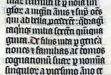
The quality and rhythm of this form of writing actually derives from the need to preserve space in manuscripts, drawn in the aftermath of the Plague, in the 14th century, even the calf skins were in delicate supply — hence the constrained, compacted structure. Something of this design ethos survived — until the beginnings of the 20th century. So intertwined was the design consciousness of the quadrate typography — whether hand drawn or born in metal — and the German principles of culture, that there were actual arguments about the “national font”, even at the very beginning of the century. That sequencing is framed here:
1800-1941 The so-called Fraktur-Streit (Fraktur debate) continues. Both Fraktur and Antiqua (Latin) type are used in German publications, but Fraktur continues to be the main German typeface—even after a Nazi ban in 1941.
1908-1929 New “modern” versions of Fraktur (Mars- and Koch-Fraktur) designed by German typographer Rudolf Koch (1876-1934).
1911 In a close vote the German Reichstag (parliament) rejects an effort to switch to Antiqua as the official German script/typeface; the proposal was defeated by only three votes, 85 to 82.
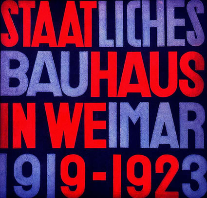
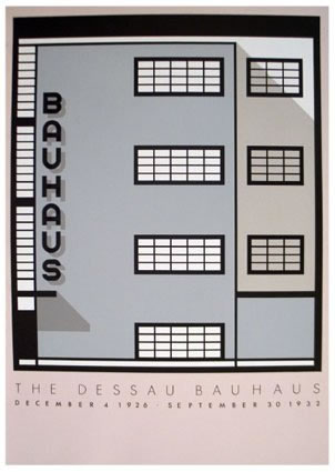
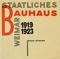
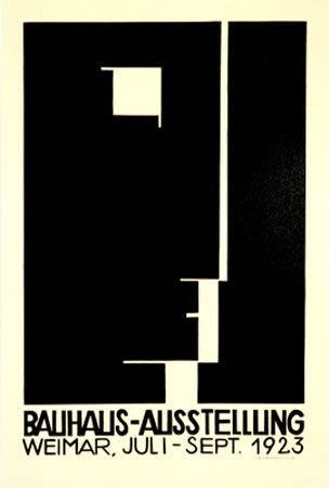
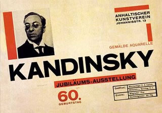
1926-1932 Designers influenced by the Hungarian László Moholy-Nagy at the Bauhaus in Dessau create modern non-Fraktur typefaces intended to be “an instrument of communication” that is as practical and functional as the Bauhaus architectural and industrial designs. The Nazis will later close down the Bauhaus as “un-German” in 1932.
1928 Pioneering German typographer Paul Renner (1878-1956) designs the modern-looking Latin typeface known as “Futura.” Renner considered Roman type to be more “German” than Fraktur, tracing Antiqua back to Charlemagne (Karl der Große). In 1933 Renner is arrested by the Gestapo.
1934 In a speech at a Nazi cultural conference in 1934 Adolf Hitler argues against the use of Fraktur, but his government does not act to eliminate its use.
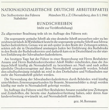
1941 On Jan. 3 Martin Bormann issues a secret Schrifterlass (below) memo banning the use of Fraktur type in German books and periodicals.
1945 The Allies use Fraktur type on stamps, money, and in post-war publications in occupied Germany.
And it’s in 1941 that the shift reveals itself, in the noted “Script” note of Bormann — shown, here:
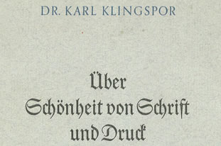
This reference I found in a book from a classic foundry in Offenbach, Germany: the Klingspor (where I studied in the 70s) — and the tenor is about beauty; “About the Beauty of Calligraphy and Type”. The cover treatment is here:
In a bizarrely striking juxtaposition of visible, nationalistic “brand” identity, Bormann’s edict points out that the national font of German culture (“die sogenannte gotishe Schrift”) — Schwabacher — was, in fact, a “Jew’s writing”, or ” Juden-lettern”. Schwabacher, the designer from centuries earlier, was a member of the Jewish community. So, all along, the national font represented the height of the contrary, to the core of the then prevalent power and profound racist character of the Nationalsozialistische Deutsche Arbeiterpartei, was driven, illustrated, by a Jewish type designer. A curious puzzlement for them, the Nazi leadership; and one quickly quashed in yet another circular edict, along the lines of the many memoranda, dispelling this positioning or inciting that newly defined pogrom or incursion on humanity.
There’s a string, to the design — but the real point is about the relevance of design and marketing strategy to the visualization of a film about this time period. I explored that conception, these ideas, with Dennis Rice, in an opening strategic expression. Roman, san serif and gothic fonts of the mid-20th century. Beginning with Grotesk, first off, (1) below:
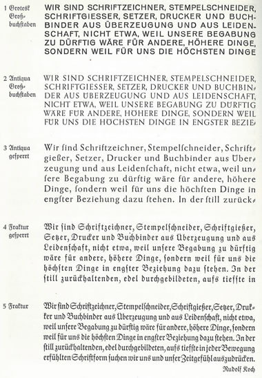
I’d suggested two approaches, one, to the classical — the Antique font family, the other, to the emerging “futurism” that was exemplified in the discipline of Paul Renner’s font:
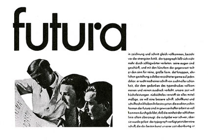
Futura.
Above, the concept of “Grotesk” is the beginnings of that san serif movement. As noted above, in the timeline, Renner was heretical in his type designs.
Quoting from German Modern, by Steven Heller and Louise Fili: “After the Nazi’s rise to power in 1933, however, when the Dessau Bauhaus was closed (the school had moved from its original home in Weimar in 1925),
it was forbidden to use modern design or sans-serif typefaces such as Futura, which Goebbels called a “Jewish invention.” Rigid, central balanced composition returned and traditional (and often illegible) Fraktur type was touted as symbolic of the glories of the nation.” And, as we’ve seen, the power of state run propaganda found its bearing in continuing design expressions in the art of the Third Reich. “The poster became an important medium for propaganda during this period. Combining text and bold graphics, posters were extensively deployed both in Germany and in the areas occupied.
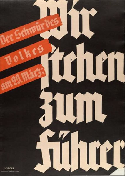
Their typography reflected the Nazis’ preference for Fraktur over modern sans-serif typefaces, which were condemned as cultural Bolshevism (although Futura continued to be used owing to its practicality). The use of Fraktur was prevalent in advertising—which was a state monopoly—and books published during the Third Reich.”
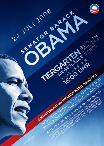
John Holbo has gathered up a grouping of sentiments, exploring this at the online consortium Crooked Timber mostly because there’s been a influence of exploration of typography in politics — even to the branding of Barack Obama and the synchronism of times then, and times now. There are real connections to the advancement of truth, and a renewal of new direction that are captured in the Obama- spirited branding — and perhaps, the Nazis attempts to quell change in modernist design. One moves forward, the other moves back — to the antiquated and the darkly gothic twists of medieval forests and scrollery.
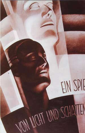
German (modernist) takes on design. Above — a classical Bauhaus treatment for the persona of the times, the 30s, 20th century, and below, decades later, another German interpretation of the persona, politically empowered — yesterday, Summer 2008.
My thinking, to direction for the design marketing of Valkyrie, was to focus on typographic enlightenment — to create a dimensional mark that spoke of the darkening evil shadows beneath — the Reich — and the new visioning forward in the “adventure” of von Stauffenberg’s attempts to roll over the regime in a newly enlightened coup.
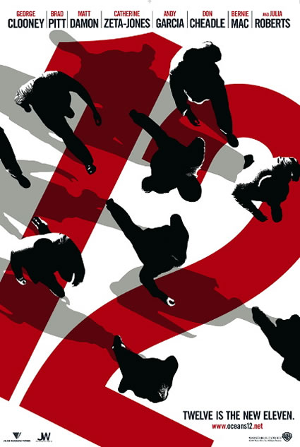
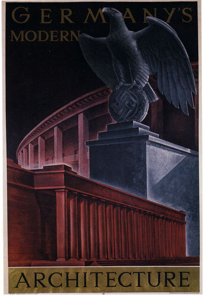
This compositing of visuals, collected below, reach to the evil substrate and the “enlightened” new design, capture some sense of the time period, the marketing stylings of the chronology and the reflections of the banned Bauhaus movement — striding away from Gothic vocabulary to a refreshed international stylistic force. Even Soderbergh’s Ocean’s 12, included in the mix, could add to the measure of the marketing assertion for this storytelling promotion.
My role, in connecting with Dennis — comprised these outcomes, for marketing visualizations:
Modernist.
Bold.
Canted.
Shadowed.
Powerful.
Dimensional.
Layered.
In asking, what might these suggest — I’d offer the following. Showing these treatments, from the era (and one from the present) suggests a possible line of thinking in visualization for marketing the story.
Tune into the time, find the resonance in the place, the integration shall be: the context, the construct. Build from there. Here’s where I’d go, to represent direction — the story, told.
Classic geometries, juxtaposed:
Modernist / disciplined geometry:
Type, overlaid, dimensionally:
Power profiles / abstractions:
Clean sweep, angled presentation:
An imaginative spin, in view, in shadow, in simplicity – Bauhaus, exemplified:
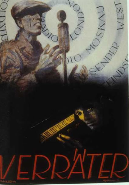
A textured field — radiant, darkly resonant, tinted yet humanized. The good, told — the bad, hidden in the dark.
The darkening shadow, fulfilled — classical tourism, with a blackened substrate:

My work there, my conversations with the CMO, United Artists, was about opening, strategic gestures and interpretations — where would you go, in designing / marketing the conceptions of this film? “You’ve read the script, now what?”
Starting there, stopping there. And in the end, the timing for the shooting and ultimate launch kept drifting — and I slipped out of the scene. But left my recommendations on the table.
Too late. For me. And surely, in the telling of the tale, for von Stauffenberg.
TSG | Beverly Hills
Fascinating and detailed history of German typography filled with insight. German was my language in college but all of this was new to me. I had no idea that san serif type originated in Germany. Who would have thought it based on the long standing German preference for what my college professors called “black letter” which is apparently what “Fraktur” is.