Paramount | Marvel imagery files ©2008
Notes on the history of the Iron Man brand, the evolution of identity and how it comes to be.
There’s a certain conception of brand design in motion pictures. And the point is that cinema represents inherently stories that move, visually.
MOVIES. They are alive in that the imagination is framed — live and living on screen, with motion and sound. That’s the key difference. Televised applications apply, of course. But the dimensionality of these sensed combinations are that they are telling the story in sound and motion, idealized and ideated in unfolding vision. They do a lot of work to tell a story in the context of at least two senses — sound, and sight. There’s a lot more, of course, as to how this actually happens.
It’s all about how the story is framed — how it’s visually built – first in the storyline, then in how that story is created as a grouping of storyboarded / production design images, and how that is finally managed, in production design and the holistic visualization in film (read blog: http://blog.girvin.com/?p=1073).
But still, there’s something very unique to the premise of exploring identity in film design.
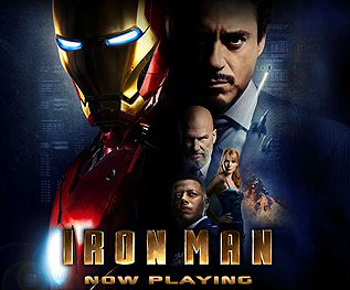
Films are brands — I’ve been working, along with various teams at Girvin and the client motion picture studios, as well as directors and talent, on exploring how a film can be compressed into the smallest visual space of a poster, an image — an identity.
Paramount | Marvel imagery files ©2008
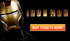
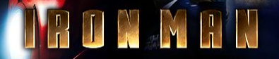
The logo is the first element — the teaser, that begins the release. And when, in the end, the film closes — the logo completes the string of connection — from the opening production team caps, the set design engineering drawings, the versions for the opening launch into the market, the character of the one sheet campaign and broadsides to the final closing ads at the tail end of the run — the logo exemplifies the brand.
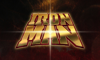
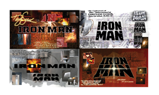
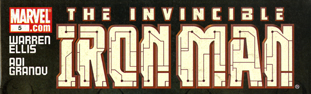
A quick side bar — this campaign was begun by EVP | Theatrical advertising for Paramount — but this is Marvel‘s first film. Girvin’s role – the firm — and Girvin’s role, the person, was to look at possible paths for identity development. We did a lot, literally, in the form of a kind of journaled, hand scribed and engineered book of concepts — and what we’d searched out was the history — from the Girvin collection, as well as from other sources. This grouping led to where the film went in the end: note the tall capital letter treatment (bottom / orange) from the logo history file at the bottom of this assemblage:

And, where the solution netted out dimensionally:
Paramount | Marvel imagery files ©2008.
This treatment was art directed by Josh Greenstein, after Nancy Goliger passed the assignment, internally at Paramount Studios, to him.
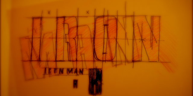
Girvin preliminary tracings | NYC office Spring | Summer 2006
And for Girvin — and motion picture titling design — the idea of illustrating the spirit of a motion picture story is a long running presence that creatively extends back decades to 1978-9, working for Francis Ford Coppola on the titling design submissions for Apocalypse Now. In the beginning, back then, I didn’t know what I was doing — I merely submitted designs, oftentimes original art, un-copied, unnumbered, unreferenced. But after a time, working with the motion picture studios and theatrical advertising agencies, I learned a great deal about what works, what sells, what doesn’t. And, perhaps, that you can influence trend by creating a new framing of ideas. I designed to listen, listened to design. I designed to tell stories. And Girvin, the firm, over time, became a kind of renegade design consultant, for titling, identity art development, illustrations and symbols (like the eye of A Series of Unfortunate Events) as well as theatrical production art.
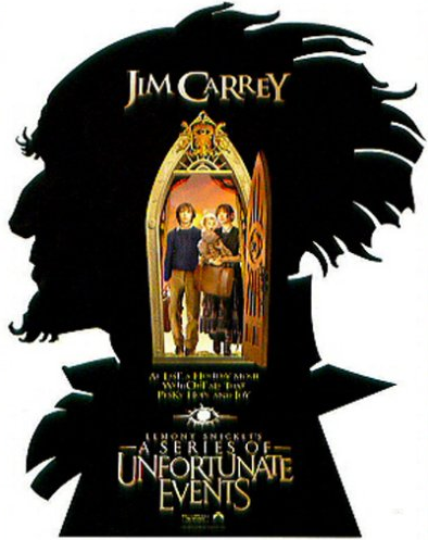
Paramount | imagery files ©2004 (the eye that started the project is above the type)
In further exploring the history of the identity development — and the present state branding of Iron Man — there’s an extensive back story of literally decades of personality development that’s been tied to the idea of Tony Stark (more on that below), his broken and fragile heart, the conflicted nature of his existence and experience — and what drives him anew, to another level of human explication – the spinning of the soul in a new genre of humanity. Nice story.
Girvin | Iron Man logo design journal pages:
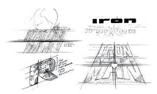
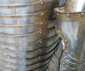
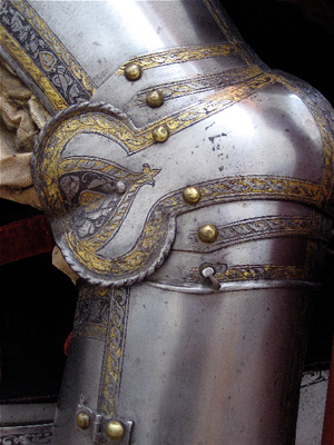
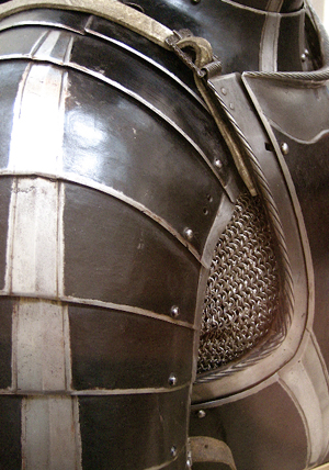
Aside from the opening Marvel and comics research work, what inspired those pages? Understanding metal, armor and light in reflection on these materials. Where, there?
The Metropolitan Museum of Art:

But let’s go back, explore more. There’s an intriguing history, over the course of the last several decades, in the explication of the conflicted spirit of the man of iron.
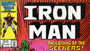
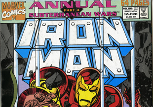
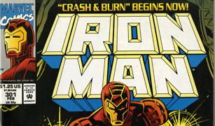
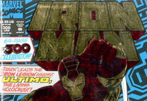
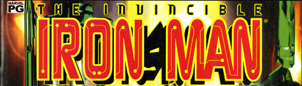
Here’s a running exploration of the history of the Iron Man brand:
Here’s the launch identity for the brand, May 1968:
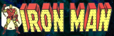
This is the only image of the earliest identity I could find, noted above. And, like where things went, it was a matter of exploring the sheathing of steel, the iron amalgam as the driver of the story personality and human (super) human presence.
Interestingly enough, in terms of current brand management standards, there are deviations in play:
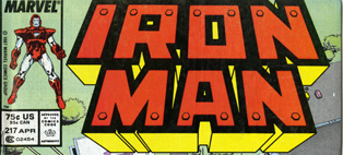


Will need to work on that.
What’s your take away? How solid, the brand identity, of Iron Man?
tsg
—-
D.logs:
http://blog.girvin.com/
https://tim.girvin.com/index.php