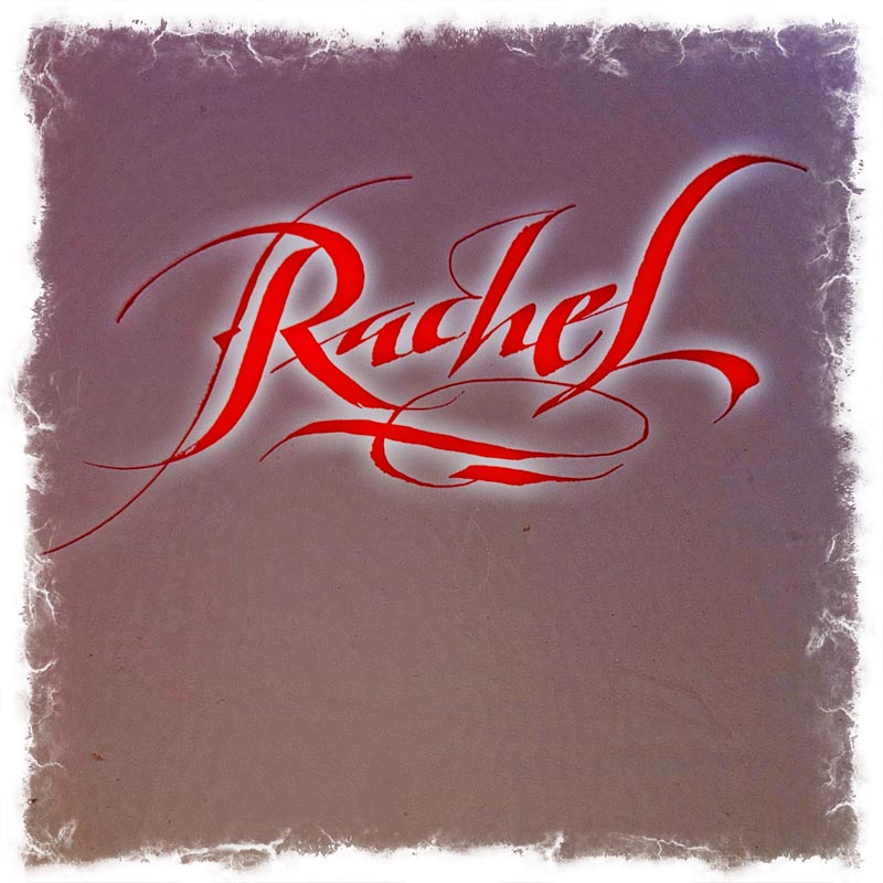
Above, speaking of scripts, a Girvin stylistic expression: a broadly splayed opening capital, a hairline accentuation, a strike stroke from the opening character in its initiation, a bounced baseline and jumped x-height, an unexpected ligature, widely varied pen angles, with a hooked tail flourish and double-ruled underflourish to nest the mark.
I started my career as a sign-painter, calligrapher, tattoo-designer, motorcycle pin-striper—this was in my beginnings, my first business license—in 1973.
I’d do murals, college event banners, calligraphic treatments of poems, 1%-for-Arts fund-related work, limited edition folios of writers and illustrators—prayer books for chapels, framed work, journal-related art work and books, broadsides
and projects as a letterpress apprentice.
Then, though I was hardly trained, [and never was] as a graphic designer—I did everything by hand—logo work, stationeries, business cards, brochures, banners and signage—all handmade renderings, everything: all hand-crafted.
I made a portfolio of work, back in
the beginnings, that was completely invented.
Every exemplar was a push towards the ideal—doing something that didn’t exist—except in my portfolio. I took my “book” to NYC and met with design shops, art directors, editors, advertising agencies and their “art buyers” and corporate brand shops. I met, and showed my work to Herb Lubalin, Massimo Vignelli, Tom Carnase, Milton Glaser, Ed Benguiat, and others in NYC. Also Chicago, Dallas, LA—boosted with international advertising and other promotions, coupled with art representatives in Manhattan, Dallas, San Francisco, Chicago and Seattle.
Then someone asked me to design a book—a complex text, no illustrations, just thousands of words, I’d never done that before. But “yes, I could do that,” and did.
I submitted a template on tracing paper that specified all details, points, kerning, leading—with marginalia in notations from the small title, main title, to the pagination, numeration, chapter treatments and text on page—with fonts, small caps and numerals.
Meanwhile—at the Evergreen State College, I was studying paleography—drawing every script from 1000 BCE to 1800 CE—integrating history and cultural impacts in the synchrony of letterforms and time. This idea of time and the history of writing we’ve identified in some other blogs—particularly to motion picture design packages that we’ve developed.
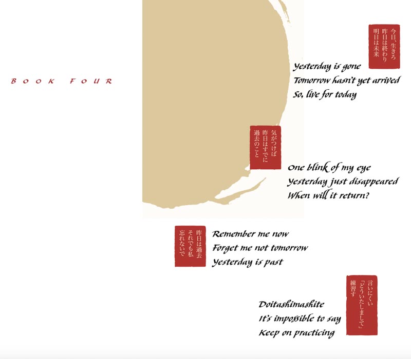
Speaking of book design, I was asked to produce a four volume collection for Scott Oki, with hundreds of haiku—we settled on the notion of a custom font for the entire set,
which we named Scotto. This set after the Nirvana project.
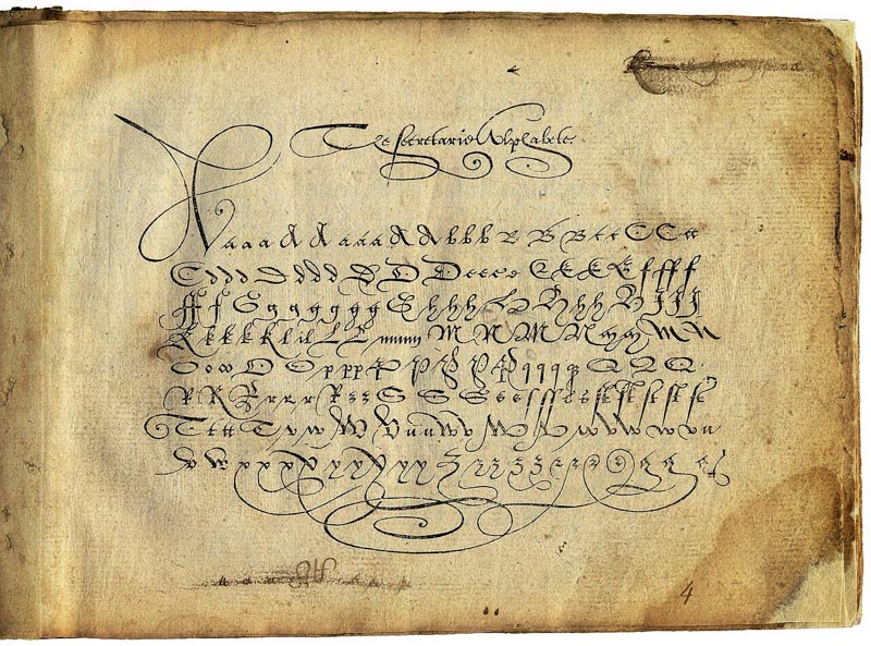
1570 printed exemplar of the hand
For this grouping, I chose a script type that had sufficient weight for legibility, but had a kind of cursive swing and rhythm that spoke to a Japanese aesthetic—this invention was founded on a 16th century script, called Littera Bastarda—an offspring of the classically inspired calligraphy of the Italian Renaissance. It’s compact, fast-moving, so to speak, and lends itself to a comfortable read.
In a series of studies, I worked out the character and scale of the weighting,
drawing with a broad-edged tool. Once I had the weight—I built a ruling system for a bounce in the baseline, as well as the jump of the x and y heights of the letters. As usual, I broke the rules of these measures, particularly dancing the lines
to create a handcrafted cadence.
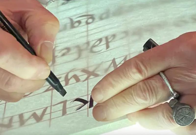
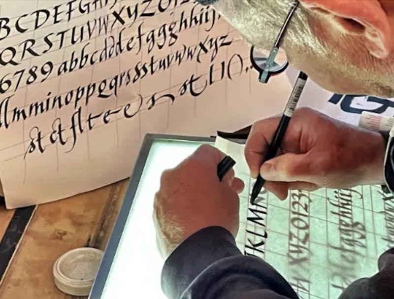
It was James Hayes, the calligrapher, that taught me the method of using successive tracing overlays, and underlayment, to continue to perfect an approach.
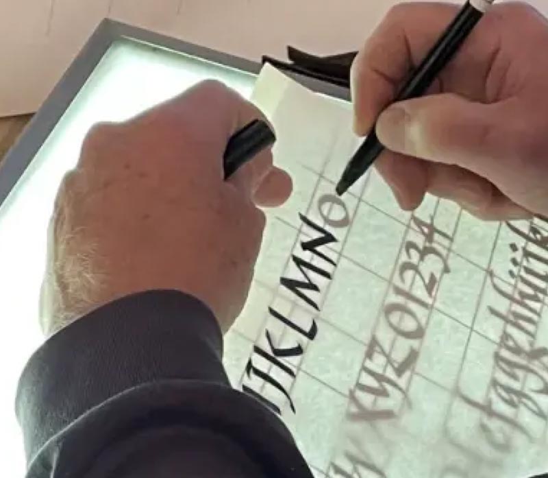
This led to this grouping—note the bounce against the baseline, as well as jumping the x-height and ascender scale. While this overview of the entire font set, including ligatures, flourishes, finishes and various punctuation and diacritical marks.
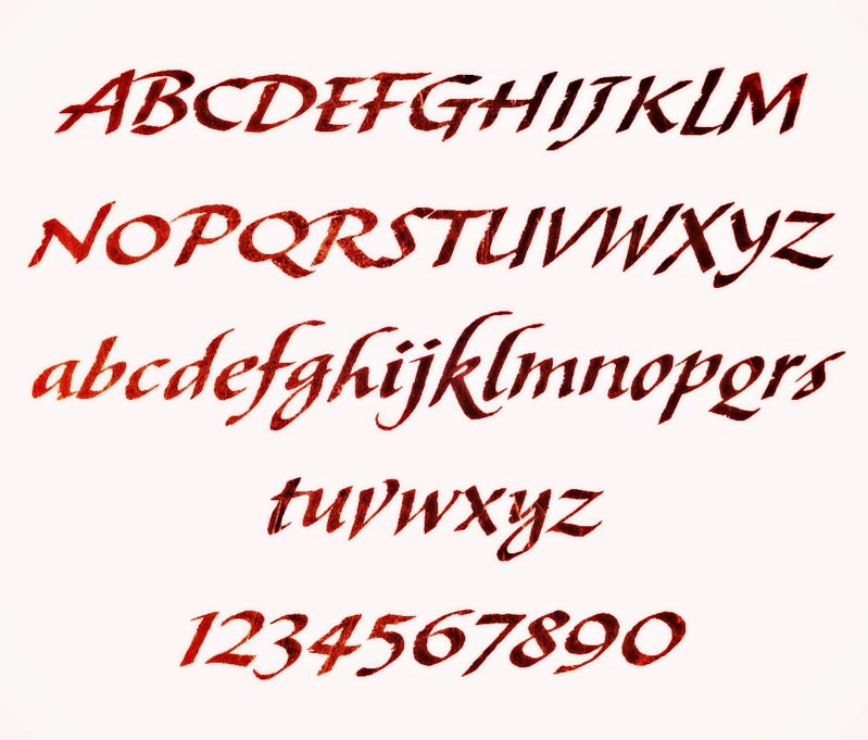
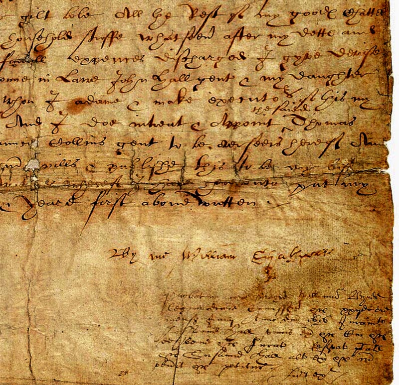
Obviously, this is more disciplined, as a font, than, say, hand of William Shakespeare, 1616. But you can see the similarity of intention—mine was drawn with a broad-edged tool, his with a pointed split-tipped stylus.
The pages, and an lead-in opener.
The font in play, above, keystroked by our team, digitally built
in collaboration with Monotype.
Coincidentally, I’d referenced this script type
in another exemplar, particularly to—
if you can imagine it—the Game of Thrones.
Thanks to
the man.
Every Journey Begins
With a Single Move.
Tim
We help
––––––––––––––––––––––––––––––––––––––––––––
GIRVIN | Strategic Brands
Digital | Built environments by Osean | Dining Design | Theatrical Branding
We build projects in strategy | story | naming | messaging | print
identity | built environments | packaging
social media | websites | interactive