Brand experiences that are designed to holistically speak product strategy, merchandising & manifestation
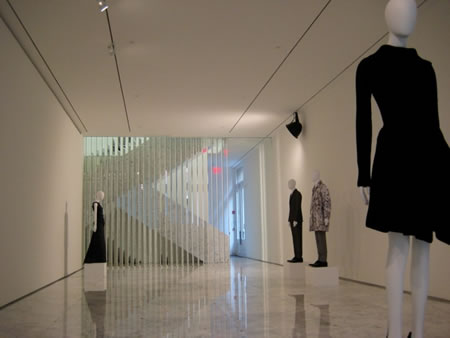
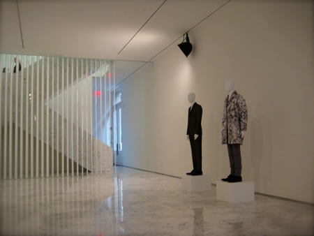
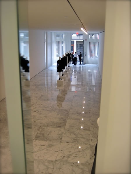
Apple comes to mind. We have commented. It might be projected that some brands offer merchandise, particularly in the fashion retail experience, that are designed in discrete contrast to the nature of their offerings. Jil Sander, for example, offers a space that aligns perfectly with the discipline of her design — sharp, crisply defined details that speak the same language as her textural vocabulary — as these images shot at her Soho location, just off Crosby, NYC.
But another strategy might link to other characteristics of brand, and place, and product alignments. What of brands that offer other distinctions, in style and presence? Where the space is completely aligned to displaying the brand in all its enthusiasms — two examples come to mind.
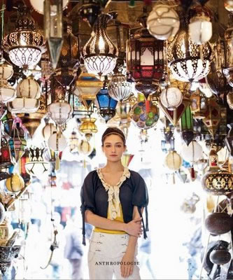
Anthropologie, for one — and we’ve written about that retail conception, as wildly unbridled as can be imagined.
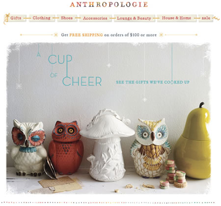
There — story, love, world study, and explorations of the mythic layering of textiles, ceramics, objects and hardware and house goods find themselves in the store’s design and layered in the skin of all the products.

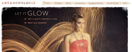
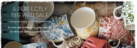
These elements of brand design find themselves in site and merchandising product detailing, as well. It’s hand hewn — stitched, distressed and hand colored. The stores fit the merchandise; the merchandise — its very personality fits the core components of how the stores work, look and feel — right to the very texture and eccentric gatherings of store materials, and — literally, the store materials that are offered for sale.
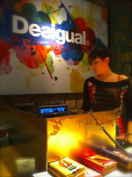
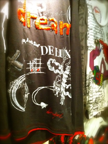
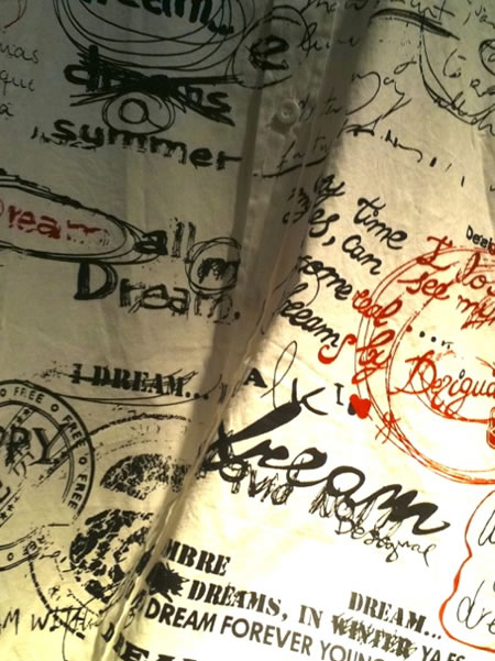
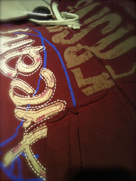
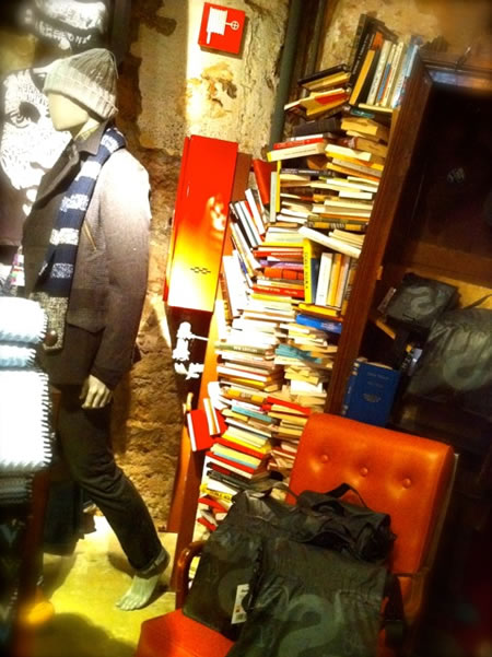
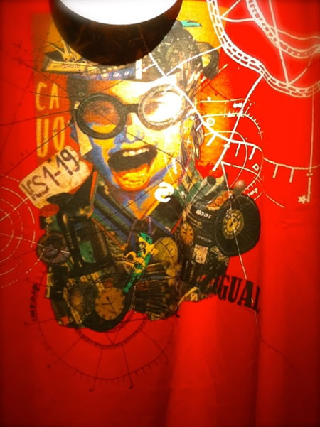
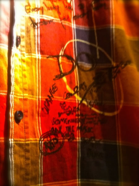
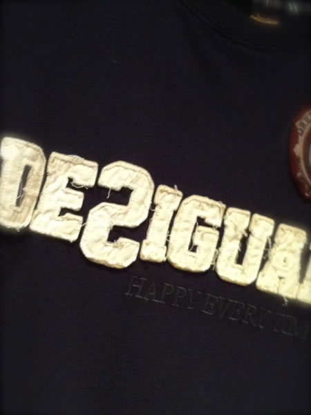
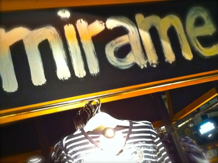
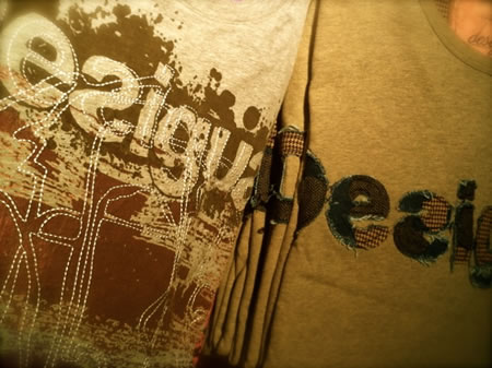
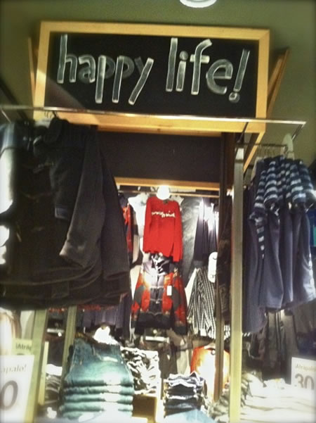
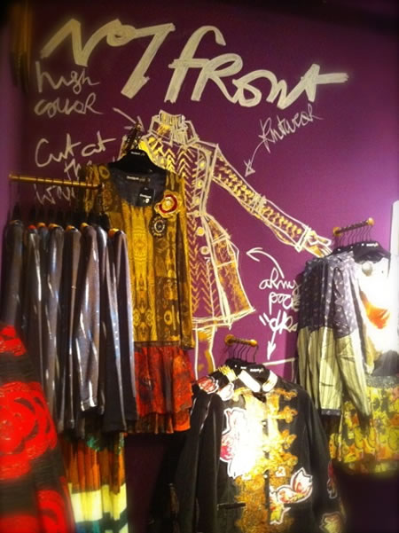
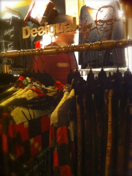
These characteristics can find themselves even more explicitly arrayed in the experience of Spanish brand: Desigual. I spent time in stores in Spain and was struck by the balance between the story, and the telling of product and the nature of the stores themselves. Imagery, below — tells that story, shot with an iPhone.
Girvin b a r c e l o n a
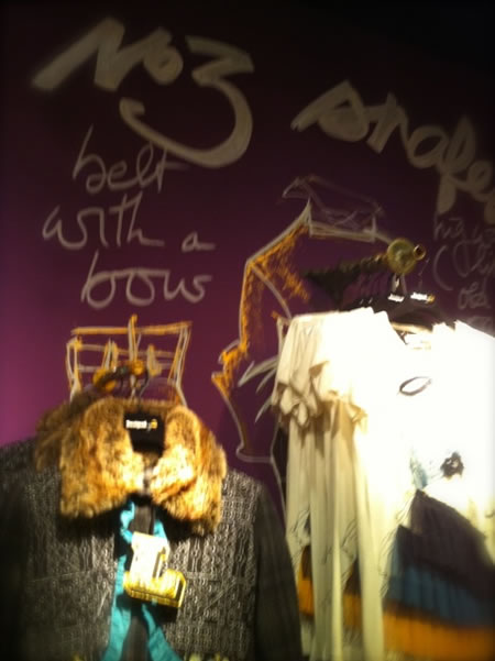
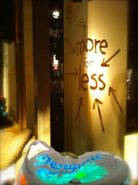
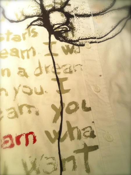
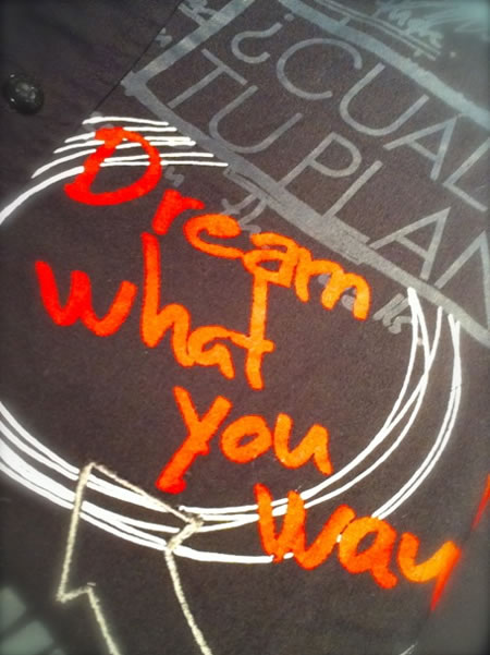
Note, for example, the link between the merchandising signing and the detailing of products themselves — handwritten, hand touched, hand made — all. And, the brand itself has that legacy — it’s human touched.
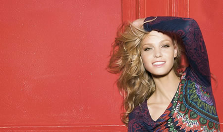
The site as well, extending horizontally, appears to be painted by hand — it links up, emotionally to the drafted character of every part of the graphical detailing of the brand.
Wall graphics, scribbled by hand.
Girvin b a r c e l o n a
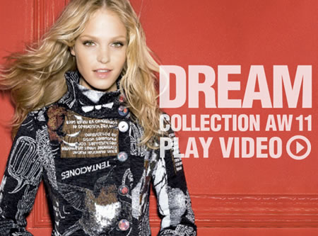
Dream — the message of the product, the campaign, the bigger theme.
Girvin b a r c e l o n a
Girvin b a r c e l o n a
Girvin b a r c e l o n a
Girvin b a r c e l o n a
A mixing design languages and product expressions: place and production, conceptually synced.
Girvin b a r c e l o n a
What is compelling in place making lies in the notion of vibe — as a person comes into an environment, sounds, light, presentation, procession come into being as a holistic rippling of context.
Looking at retail, I’m looking for these alignments, the alliances of meaning and place, experience and expression, storytelling and the listener.
Desigual, Anthropologie, and surely others are exploring these mysterious, human sensation and centric ways that people embrace and share the power of a thoughtful brand — one with the depth of magic and wonder. People get that, hold that, embrace that as a sentiment — something to be shared:
“come here, this is my place — I love it.” According to Yankelovich, brands with meaning will be that trend: 2011 / 2012.
t i m
–––
BUILDING LOVE BRANDS
Unforgettable magnetism + enchantment
AUDIENCE ENGAGEMENT:
http://bit.ly/h9kJdW
