Meanings and signing.
A Signing — Meaning.
Signs that Mean.
By Meaning, the Signing.
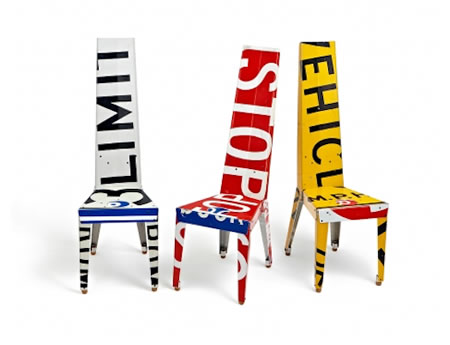
Signage as the wayfinding of furniture.
––––
A friend sent me a string of images —
no reference to who, where, what, from.
I apologize for not having the complete credits,
but I’ll hope to offer that gesture in closing.
But the gesture here is less about the specific provenance, but more to the notion of finding a way and the meaning of getting somewhere.
Even if it means sitting down.
A beginning: first off, go here.
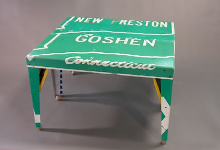
What I’m actually fascinated by is the actual way of the way, found.
How, really, do you get from one place to another, and if you’re finding a way, when do you know if you’re really there.
A frequenter of big places with lots of signs, I do get lost — but understanding the thinking and the placement of signing solutions — what’s the message, what’s being told directionally and how is that articulated? I can usually figure it out, even if there’s no english to be found, anywhere.
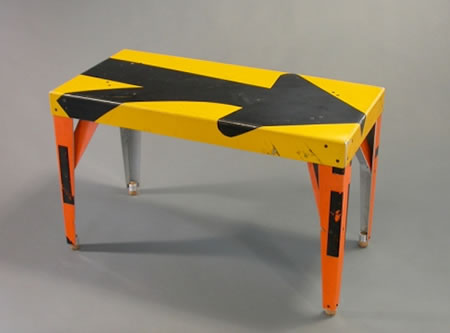
But I’m curious about the anti-way. The idea that signing could be something that isn’t about mass channeling of millions of people, striding around (getting lost, getting found) but that it could be more to an artful assembly — signing that could be about what is known, seen, experienced in the context of place, magic and mystery. Looking around, these days, the notion of wayfounding — the foundation of crowd management is ever crucial. But it’s boring.
I’ve been in:
hospitals
research laboratories
big buildings with thousands of people
buildings with only hundreds of people
small buildings, with a dozen people
campuses
corporate echelons
hotels —
and the solutions are invariably about sameness.
There’s an intelligence to the idea of a building having a manageable plan — but better still, could be a system that is (and is not) a system.
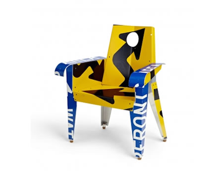
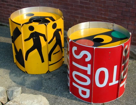
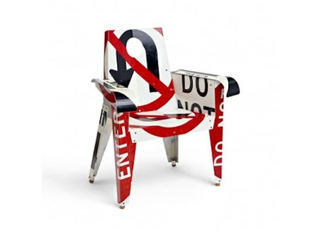
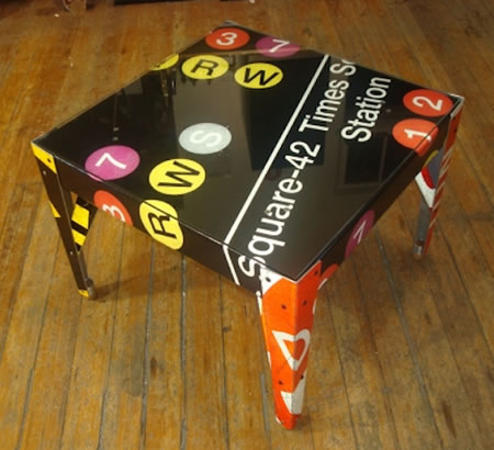
Which is why this work, chairs, tables, etc., that newly gather the assembly of ideas and messages of placement are inventively instructive.
Sure, they’re seats. But — going backwards, what if they could be signs?
I’ve written in the past about the anti-signing personal signing solutions of
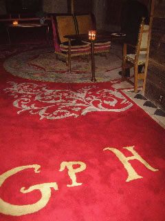
The Gramercy.
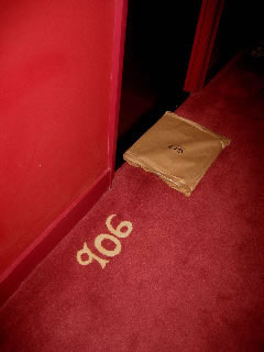
Or Ace.
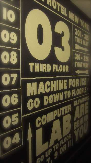
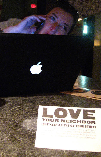
Or Cooper.

To Schrager’s Gramercy (and Julian Schnabel’s art direction) — the Ace, and Alex Calderwood’s visioning; or Morphosis and Pentagram — a remarkable sign (and art/intellect) alignment of design invention there’s an interplay that’s managed, but it’s unexpected. Where the sign is the message, but it’s also the art (fullness) that helps people not only sense the founding of way, but as well, the wayfinding of locality.
“If I can find a way, can a way find me?”
“I can found a way, but will a way be found?”
In some earlier work, we talked about the idea of building brands, and branding buildings. The idea was that — if one considers brand as fire (we do) then there’s a kind of soul that is resident in that character, buildings, holding people — have a presence. There could be a story that links the very spirit of those within, the nature of the architecture, the use of the materials — that intertwines them. So like Boris Bally’s industrial reconfiguring — and use transformations — inventive interpretations emerge.
More hand. More art. More touch.
Buildings that have touch — they become unforgettable experiences.
TIM | CYPRESS ISLAND, SAN JUAN COUNTY
…..
GIRVIN | IMAGINATION + PLACE
DESIGNING ENVIRONMENTS:
PLACES | RETAIL | RESTAURANTS
http://bit.ly/i7b7EN