The concept of the interval: the use of space in design
I think about what is presence.
And I consider, what is absence?
What is here — easily seen; and what is next?
What is the interval?
What converts moment to momentum?
One wind driven day, I was painting with master sumi-ye painter, George Tsutakawa. He, master; me, student. We were painting on the shore of the ocean – drawing with brush and ink-ground stone; and as the wind ripping around us, sipping saké, crows slipped through the air like black ribbons.
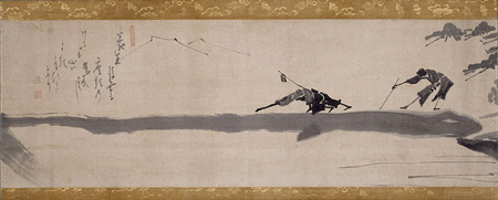
He said, “it’s never about what is drawn, in the painting, but rather what is not — is the gap of the stroke — the space left bare that is the most important.”
One might consider the idea of place and the page, or the screen — isn’t it so that the real presence of design might emerge where there is nothing: the area left untouched?

Hakuin Ekaku, 2 Blind Men Crossing Log Bridge, Edo 1760s
To the Japanese sentiment, the idea of ma is far more complex; and even describing it might be considered bewildering. Like other Japanese sentiments — to reference shibui, wa, iki, wabi-sabi, yugen — each of them are layered in meaning, poetic treatments and legendary representations. The principle lies in the spirit of a contemplative reflection on the issues of experience — and the sensitivity of how that might be studied, designed and sensed. And in many of these aesthetic notions, there are — in most — centuries of evolution and commentary. Iki is a more recent character (only 300 years old) — a sense of originality and direct, simplistically refined “stylishness.”
But what of Ma — while not specifically an aesthetic sentience — it is a philosophy of the experience of place — and the thinking design of this sensibility. According to a document from Columbia, ma — a “Japanese spatial concept is experienced progressively through intervals of spatial designation. In Japanese, ma — the word for space — suggests interval. It is best described as a consciousness of place, not in the sense of an enclosed three-dimensional entity, but rather the simultaneous awareness of form and non-form deriving from an intensification of vision.
Ma is not something that is created by compositional elements; it is the thing that takes place in the imagination of the human who experiences these elements. Therefore ma can be defined as “experiential place understood with emphasis on interval.” It’s described as the natural distance between two or more things — or the space in the movement between posts, screens, or the interval sequencing of such phenomena.
How that might relate to the nature of experience design strategy will be about the sequencing of how people sense places that are made.
Working with master educator, calligrapher, art historian and theorist, Lloyd Reynolds, at Reed College, we talked about the idea of the spatial interval, the sense of respite in the layering of how people see and sense a place — “like the breadth of a sidewalk that allows a building to breathe, or the nature of a ritualized movement in a cathedral — where the procession is designed to give “space” to the nature of that experience” the edges are purified. Ma, that sensitivity can be found as a profound expression in the retreat from the clutter — the intentional guidance from one way of seeing, one sight to another, a line of visioning from one way of seeing, that will lend itself to another portal of seeing.
I might offer that the concept has relevance to just about everything we do, in the nature of brand, story, concept, positioning and the understanding of space — opening — and place. The drawn letter, the created design — a screen, a pathway, an object; what space, what absence, in presence, allows it to thrive in the sight and touch of our sense of being.
t i m
–––
L O V E B R A N D S