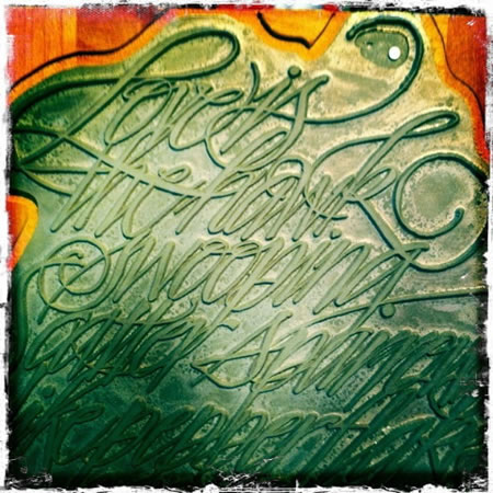
The impressed letterform: elegance, beauty, sensuality
At the beginnings of my career, I’d studied with a letterpress jobber — first in Denver, then an old Linotype operator and finally in Olympia, at the Evergreen State College. I’d count that time as critical, the hands on application of thinking, designing, to the arrangement of little metal punched bits that — in reverse — form the letter’s impressions in the stock.
Interestingly, none of these job associations were paid, they were study opportunities only, and neither of them related to the higher arts that I’d experienced later in Offenbach, at Klingspor, or in my connection with Herman Zapf, in Darmstadt or the fine printer family of William & Sebastian Carter and the Rampant Lion Press. But they taught me about the basics of letterpress work, and acting as a jobber, it was less about design and more about doing the work of others — clients that would bring their stationery, business cards or business receipts along for a quick and cheap run. Back then, letterpress was dying — it was vanishing; old Vandercook‘s we’re being cast out.
What transpired however was learning more about the absolute craft of letterpress as a very delicate disposition — where the layering of the typographic lines could bespeak the most refined typographic restraint. Spending time with Will Carter, I learned about the principles of entirely functional principles of design and discipline, in printing consistently on the highest quality papers, either mould made or handmade. It wasn’t about being too erudite, but rather straightforwardly practical — and in that, refined.
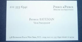
I was giving a talk about the symbolic geometry of a book design, Jan Tschichold and the legacies of medieval and renaissance design — and perhaps how that might be applied to design systems for corporate identity — and someone offered the business card comparison of the film, Bret Easton’s “American Psycho” and the investment bankers’ character discussions about each of their cards.
It goes something like this:
“New card.”

“What do you think?
Whoa-ho. Very nice.
Look at that. Picked them up from the printer’s yesterday.
Good coloring. That’s bone.
And the lettering is something called Silian Rail.
It’s very cool, Bateman, but that’s nothing. Look at this.
That is really nice.
Eggshell with Romalian type. What do you think ?
Nice.
Jesus. That is really super. How’da nitwit like you get so tasteful?
I can’t believe that Bryce…
prefers Van Patten’s card to mine.
But wait. You ain’t seen nothin’ yet.
Raised lettering, pale nimbus… white.
Impressive. Very nice.
Hmm.
Let’s see Paul Allen’s card.
Look at that subtle off-white coloring.
There’s a vast amount of discussion about Patrick Bateman’s card, as well as the design, fonts, paper color “bone” — and the little cinematic segment has been viewed nearly 1.75 million times. What does that say?
The impression, literally — of the letterpressed (or engraved) treatment of a message has a greater impact. Even in the ludicrous nature of their sharing, there’s still something added in the object that might be made by hand — assembled text, metal type — that is roller inked and stamped into the block.
That interest is resurging. There are dozens of letterpress printers coming back to NYC — many of them young entrepreneurs, and others that have been printing letterpress since the “Truman Administration.” The idea of creating customized design solutions that live in the place of imprinted hand made letterpress work caught the attention of the New York Times, which perked my interest. Penelope Green notes this telling:
“In May, Mrs. John L. Strong, the 80-year-old luxury stationer favored by the Duchess of Windsor, Pat Nixon and Anna Wintour, was shuttered, a victim of the economy and an overly ambitious business plan that called for expansion. Some worried that its demise was the death knell of the hand-written, hand-engraved note, and that thereafter all correspondence would be digital, no longer composed at one’s desk at home, but in that weird placeless zone known as “Sent from my iPhone.”
But for stationery fiends like Ms. Kargman, as well as for social aspirants — the real-life counterparts to the characters in her novels — what are still called “social papers” are thriving, in spite of, or perhaps because of, the prevailing digital culture.
A clarification is in order: real “social papers” are not boxed cards with your initial from your corner stationer. Social papers are made with hand-cut dies, a universe of fonts and stock in shades like creamy ecru, tobacco or artichoke, to name a few of the offerings at the Printery.”
In Seattle and Portland, there are plenty of others, bringing on the come back. Speaking at a recent event, connecting with a millipede of millennials, almost none of them had business cards. But all marveled at mine. Surely many will be going out to explore that idea — maybe a true return to the gesture of the calling card — and the making of that object as a case study for personal identity.
To the depth of letter press design, the printing of type embedded, or electronically engraved by digital media (then impressed on a proofing press), the ink is cleaved to the stock — an embedment; it’s about the nature of sensuality in expressed experience — that is: “here’s a card of “me,” that speaks to who I am, what I believe in,” its weight, touch, character…even its scent. Ever smell a card? There’s a scent to paper and ink — and that will be another day, another blog. But the idea of the card, the stationery, the printing impressment of human connection is a reach to the layering of experience. As a calling card, there’s a statement. In the art of the lettered impression, the sensuality of experienced touch, sight and heard texture, the perfume of ink and stock, embraces the ideal of the personal intimacy of introduction.
Tim | Vancouver, British Columbia
….
GIRVIN | THE TYPOGRAPHY OF IDENTITY
EXPERIENCE DESIGN | THE STRATEGY OF THE FONT
the reels:http://www.youtube.com/user/GIRVIN888
girvin blogs:
http://blog.girvin.com/
https://tim.girvin.com/index.php
girvin profiles and communities:
TED: http://www.ted.com/index.php/profiles/view/id/825
Behance: http://www.behance.net/GIRVIN-Branding
Flickr: http://www.flickr.com/photos/tgirvin/
Alltop network: http://my.alltop.com/TGirvin
Google: http://www.google.com/profiles/timgirvin
LinkedIn: http://www.linkedin.com/in/timgirvin
Facebook: http://www.facebook.com/people/Tim-Girvin/644114347
Facebook Page: http://www.facebook.com/pages/Seattle-WA/GIRVIN/91069489624
Twitter: http://twitter.com/tgirvin
