The evolving legacy of type design — the honor of the MOMA typographic collection
Customized type design: the big screen, the building, the book.
“Typefaces — the building blocks of information printed or displayed onscreen—are design in and of themselves, even before they are used.”
Paola Antonelli, MoMA
AS A TYPE DESIGNER, THERE ARE LEVELS OF EXPERIENCE. Big. Medium. Little. Are the typefaces to be used dynamically large scaled? Or more conventionally applied in median sized applications? Or in the book — textually massed? Girvin’s experience in type design is almost always related to a project. From designing fonts for broadcast design and titling, to creating typography for building signing. Or using customized fonts for book design — another independent and delicate application.
The markings of the alphabet, 3,000 years running back into the mists of time, and the evolutions continue. In all, it’s about reading and perception — the gathering of insight, in the layering of messages, the deepening of recalled experience. The story trails. The mastery of the art is long reaching — trailing back in the filtering of time — for centuries. Type is drawing the language of the mind. The designing of the tracings of the alphabet is the geometry of imagination.
What about the idea of awarding typographic excellence, in the design halls of the Museum of Modern Art. Friend Stuart Balcomb pointed out this emergence. There is a strategy — type being what it is, the center point of messaging; it’s at the heart of how people gather content. So why not, to the nature of design of this key path to the mind? Architecture, product design, other forms of experience — truly, the nature of typography speaks to another fundamental attribute of sensation and connection. Read on. Paola Antonelli, the Senior Curator, Department of Architecture and Design, notes that “MoMA has just acquired 23 digital typefaces for its Architecture and Design Collection. Some are of everyday use, like Verdana; others are familiar characters in our world, like Gotham, which was used in President Obama’s election campaign, or OCR-A, which we can find at the bottom of any product’s bar code; and others are still less common, but exquisitely resonant, like Walker or Template Gothic.
Helped by a panel of expert advisors that included graphic design critics, designers, and historians, we based our decisions on the same criteria—ranging from aesthetics to historical relevancy, from functionality to social significance, from technological ingenuity to economy—that we use when evaluating objects. We paid particular attention to the synthesis of goals, means, and elegance that we always seek in modern design.
This first selection of 23 typefaces represent a new branch in our collection tree. They are all digital or designed with a foresight of the scope of the digital revolution, and they all significantly respond to the technological advancements occurring in the second half of the twentieth century. Each is a milestone in the history of typography. These newly acquired typefaces will all be on display in Standard Deviations, an installation of the contemporary design galleries opening March 2 on the third floor.”
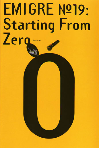
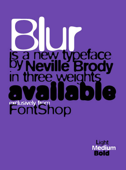
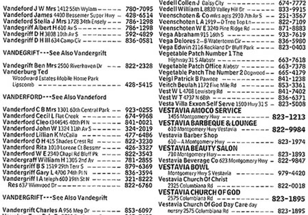
The types that are selected range from the trendy to the supremely utilitarian. Here are the visuals for a grouping of the acquired fonts for the museum archives:
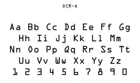
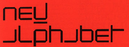
The 23 acquired typefaces are:
• American Type Founders OCR-A (1966)
• Wim Crouwel New Alphabet (1967)
• Matthew Carter Bell Centennial (1976-78)
• Matthew Carter ITC Galliard (1978)
• Erik Spiekermann FF Meta (1984-1991)
• Zuzana Licko Oakland (1985)
• Jeffery Keedy Keedy Sans (1991)
• Erik van Blokland and Just van Rossum FF Beowolf (1990)
• Barry Deck Template Gothic (1990)
• P. Scott Makela Dead History (1990)
• Jonathan Hoefler HTF Didot (1991)
• Neville Brody FF Blur (1992)
• Jonathan Barnbrook Mason (1992)
• Matthew Carter Mantinia (1993)
• Tobias Frere-Jones Interstate (1993-95)
• Matthew Carter Big Caslon (1994)
• Albert-Jan Pool FF DIN (1995)
• Matthew Carter Walker (1995)
• Matthew Carter Verdana (1996)
• Jonathan Hoefler and Tobias Frere-Jones Mercury (1996)
• Matthew Carter Miller (1997)
• Jonathan Hoefler & Tobias Frere-Jones Retina (1999)
• Jonathan Hoefler & Tobias Frere-Jones Gotham (2000)
There are foundations — the geometry, a basic stroking of the vertical, the I, the curve, the O. The point lies in the character of how these delineations — literally, the lining, the striking strokes of attributes — it is these details that the alphabet thrives and brings words, sentences and seeing to life. Explore more, as you will.
To designing a font — start with the first stroke of being: the tall vertical of the I — serifed, or not, radiused or sharpened. And the structuring of the O, this swings the nature of the curved character of any alphabet. Therein, the compositing of these strokes will define the visual strategy of the alpha, and the beta.
Beauty, in message, drawn.
T I M
–––––
BRAND IDENTITY AND TYPOGRAPHIC DESIGN: AVATAR
the reels:http://www.youtube.com/user/GIRVIN888
girvin blogs:
http://blog.girvin.com/
https://tim.girvin.com/index.php
girvin profiles and communities:
TED: http://www.ted.com/index.php/profiles/view/id/825
Behance: http://www.behance.net/GIRVIN-Branding
Flickr: http://www.flickr.com/photos/tgirvin/
Google: http://www.google.com/profiles/timgirvin
LinkedIn: http://www.linkedin.com/in/timgirvin
Facebook: http://www.facebook.com/people/Tim-Girvin/644114347
Facebook Page: http://www.facebook.com/pages/Seattle-WA/GIRVIN/91069489624
Twitter: http://twitter.com/tgirvin