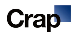
There’s a point to referencing the concept of the one week old logo — one might be, “really, who cares?” There is a challenge in web culture that prevails — cynicism. If there’s a point of pot-shot taking, why not make it cynical — it’s so hard to be brutally honest, anyway. Online helps. You’re not there, any way. Note this intonation, for example:
Tom R.
“Gap, or the experts at their Agency and PR company, should have anticipated a backlash. The (anti-) Social Media universe if full of bloated opinions (mine included thank you very much) and a perpetual stream of “I know better than you do.”
It’s about as sophisticated as Kindergarten.
If GAP want to remake their logo, replace all their signage and business cards, and employ a bunch of people (during a Recession G-D-it), it should be their right to go out there and give it a shot, without pre-release backlash-for-the-sake-of-backlash.
We live in a rude culture. The tools at our disposal make us even ruder.
So, in that vein, to everyone who feels chuft with themselves for slamming a corporation and putting a bunch of people out of work. Screw all of ya.
Really, who gives a flying-F what their Logo is. How about continued unemployment. Continued wars. Continued poverty. Continued failing education.
Again, screw everyone who thought the Gap-logo thing matters.”
There are two points: one — people actually having a conversation about a logo (just how many tweets might’ve been; two, people actually having a rebellious (and connected) point of view about their brand. One would offer, it’s better for there being a conversation, than not. It’s fascinating how people use their time, even when it might be wrapped around my profession (and no, Girvin didn’t design this logo.)
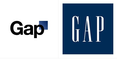
Being a logo designer (as part of my job) working with teams, brand managers, committees, executives, families, it’s a hard unspooling of strategy and spirit to define the nature of brand in typographic expression. Indeed, there can be a lot of detailing — hopefully implied — in the nature of a brand mark. What then, would the new logo say that the old one didn’t. More modern. Less soul. Better value. Less elegant? Cheaper? More industrial?
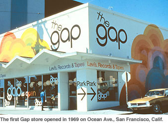
At an earlier design conference, the Stanford Conference on Design, I’d met with Harry Murphy, a key player in the Californian design scene some decades back. Harry’s work then was solid, spot on to the notion of the “generation gap” — an opening retail playing on that division with a then hip intention. God forbid that anyone consider the challenges of time in looking at work that they’re designing now, and how that might be interpreted, tomorrow.
Still, there’s issue with strategy and evolution, and identity clearly pins the notation that there’s a plan behind change. The point would be, has it been asked for — is there something in the audience that suggests that there is disdain for the visualizations of brand in story in relationship to community? The logo that Harry designed, perhaps a customized wheeling of circles worked well in capturing the intention of the time. Add his early store concept, the cleanliness of his design strategy, the visualizations of the bubbled rainbow wall graphics and you’ve got a holistic telling. Site, shown:
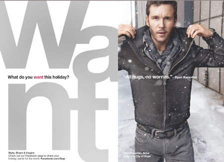
The link to 1969, as a point of memory, might be worth examining, since this is a current campaign foundation — that content is spelled out, thematically, store wide. The point might be — how to make that hipper; if there’s an energy or strategic storytelling link to the past (and that people get that, like that, want that) — it’s online, to their flowing field concept of the 1969 timeline.

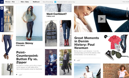
Similar to Burberry, noted and studied by an earlier blog The Art of the Trench:
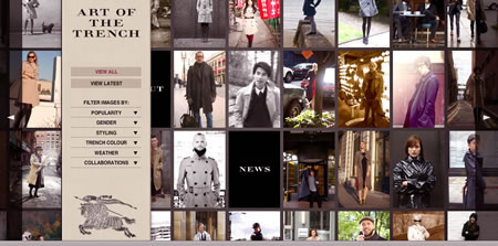
This field is about history, community engagement. Burberry runs back in time more than a century. Gap’s only decades old.
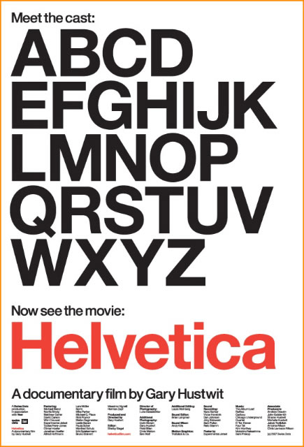
But that’s a long reach — the intention is about reaching to the past, then it might be wise to build a strategy that actually does link to the beginning. Still, the notion of using Helvetica, a profoundly beautiful font (though rarely used by me, except redrawn) as a logo for a fashion brand is tough to swallow. It’s a hard story to tell, given the blank character of its persona.
Actually, interestingly, the outcry might’ve offered more to the boosting of the brand community in unleashing messaging — one, to another, to another, and reflecting back. Marka Hansen did the right thing, reaching out immediately:
“Last week, we moved to address the feedback and began exploring how we could tap into all of the passion. Ultimately, we’ve learned just how much energy there is around our brand. All roads were leading us back to the blue box, so we’ve made the decision not to use the new logo on gap.com any further.
“At Gap brand, our customers have always come first. We’ve been listening to and watching all of the comments this past week. We heard them say over and over again they are passionate about our blue box logo, and they want it back. So we’ve made the decision to do just that – we will bring it back across all channels.
“In the meantime, the website will go back to our iconic blue box logo and, for Holiday, we’ll turn our blue box red for our seasonal campaign.
“We’ve learned a lot in this process. And we are clear that we did not go about this in the right way. We recognize that we missed the opportunity to engage with the online community. This wasn’t the right project at the right time for crowd sourcing.
“There may be a time to evolve our logo, but if and when that time comes, we’ll handle it in a different way.”
But the real test is what did this say about the Gap, their strategic revelation. When it comes to it, how many logos in the retail spectrum are really amazing — yet, still, how many are distinguished enough to really be cherished by consumers? Being the brand, the mark, they have enormous value. Ones that we know have this status, that we’ve either worked on or have relationships with:
A family:

A legacy:

A man:

A heritage:
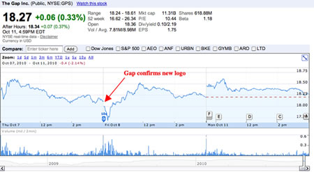
What Marka points out, powerfully, is the power of the Gap brand (logo) to those that are willing to fight for it. Passion is an asset — and this challenge might very well have empowered the Gap positioning, aside from the day drop in the crowd mind of valuation.
The character of a typographic treatment in empowering — in the mind of the consumer — the ideals of that relationship is a multifaceted challenge; potent retail logos must say a great deal — they can imply legacy, modernity, trend, persistent innovation, solidity; each component of expression should be driven by strategic intention.
t i m | new york city
–––
BUILDING BRANDS THAT ARE LOVED:
https://www.girvin.com/blog/?cat=8
the reels:http://www.youtube.com/user/GIRVIN888
girvin blogs:
http://blog.girvin.com/
https://tim.girvin.com/index.php
girvin profiles and communities:
TED: http://www.ted.com/index.php/profiles/view/id/825
Behance: http://www.behance.net/GIRVIN-Branding
Flickr: http://www.flickr.com/photos/tgirvin/
Google: http://www.google.com/profiles/timgirvin
LinkedIn: http://www.linkedin.com/in/timgirvin
Facebook: http://www.facebook.com/people/Tim-Girvin/644114347
Facebook Page: http://www.facebook.com/pages/Seattle-WA/GIRVIN/91069489624
Twitter: http://twitter.com/tgirvin