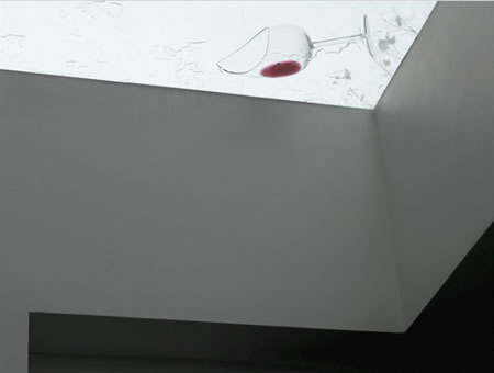
Image: Matthew Donaldson | Nowness collection
The combination of strategy, designed experience, architecture, the holistic label of loving the story of wine.
Over time, it’s been possible for Girvin to work on dozens of wine brands, as consultants in story, strategy, messaging and visualizations.
The intensity of the packaging, as tiny as it is, tells a layering of experience that is complex and vital — in the smallest of labeling real estate exposures. Wines have a story, that narrative lies in the notion of place, experience and expertise, weather, light, soil, legend, the guidance of the grower, the mastery of the winemaker. That story, that layering is complicated — and, for the most part, the more significant the authenticity, the more resonant the brand. The story extends, the legacy expands, the nurturing of community resonates — the rippling goes outwardly.
Like the scent of a fine vintage, the curing of the barrels, the long tinting of the color, the beauty of the taste — in looking back at the framing of experiences, working with wines, there are groupings of stories that frame the beginnings, the middle of a career, the latter explorations. All rich, that outpouring — and the sharing of stories on story, tellings on narrative, legends that keep going on. To each, a recollection.
I was thinking about that idea of space — the making of place in relationship to the complex alchemy of wine, wine making — the packaging of holistic experience. Two ranges come to mind. Working in Canada, with increasing frequency – there’s a two-fold reconnection. Speaking with Anthony von Mandl, the CEO of Mark Anthony Brands, a powerhouse group of beverage producers, distributors and product developers, his development of the concept of his Mission Hill winery is — in the folio of his many projects — the penultimate gesture of linking sensualist “placement” and the experiencer’s exposure to viticultural realm. It’s taking a dream — and building it.
The dream is the art of wine-making; and creating an extraordinary place to sense it.
And wine, of course, is wholly an sensualist gathering — the touch: the mouth feel, the sight: colorations; the scent: the waft of age.
What of sound? There — the squeak of the cork, the flow – the swirl. It’s all there.
But in the context of the built space all of these sensations become “placement” — the sense of environment in place that is holistically founded. Spin round, that swirl of scents and senses and the visitor is contained.
I offer two contrasts then, one to friend von Mandl, and another Girvin friend — childhood buddy Tom Kundig (both of us having spent childhoods in Spokane, stories there.) And the other, to Lord Norman Foster. Yes, there’s a connection there as well, Foster Partners, Seattle (and Girvin).
There’s a distinct link, between the idea of the creation of a place that builds a brand; reflectively — brands that are built | building brands | brands that are buildings. We’ve talked about these in varying interpretations, more to explore.
There are two contrasting revelations — and two stylistic expressions, each — touching on the interpretations of the experience of wine, making, beauty and the integration of experience. One offers a positioning that is almost spiritual in construct — a kind of monasterial reflection on the sanctity of the experience, while another is so modernist that it nearly blasts off, as a bunker of viticultural experience. Notes, below.
From Olson Kundig’s site reference: “Situated on a prominent hill rising above the floor of the Okanagan Valley, the Mission Hill Winery is a 120,000-square-foot complex of buildings designed to transform the visitor. As visitors pass through the welcoming entry arches, they enter a world dedicated to wine. A Wine Education Center, with a small theater, anchors the experience of each visitor. An outdoor loggia, amphitheater and vineyard terrace provide breathtaking views of the lake and valley below. A 12-story bell tower is the focal point of the courtyard. The design, consciously serene, eschews festival-like architecture in favor of a timeless, monastic quality.” And the imagery from the OK site:
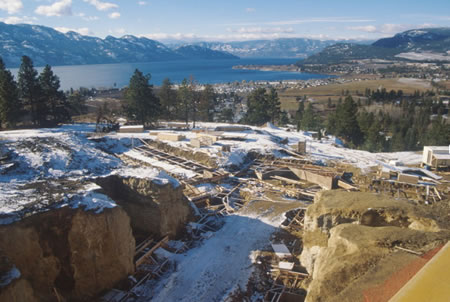
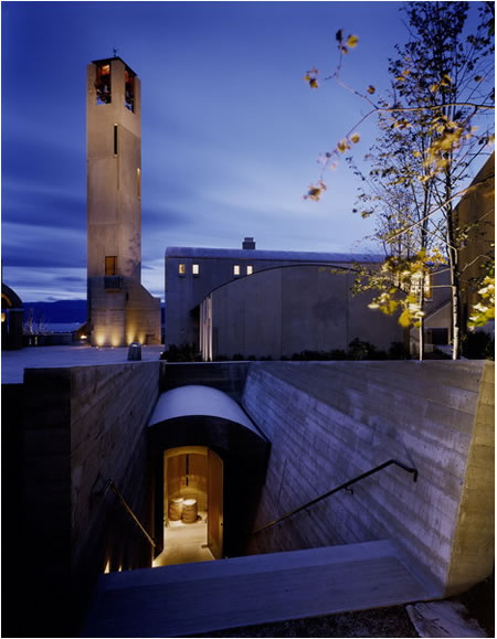
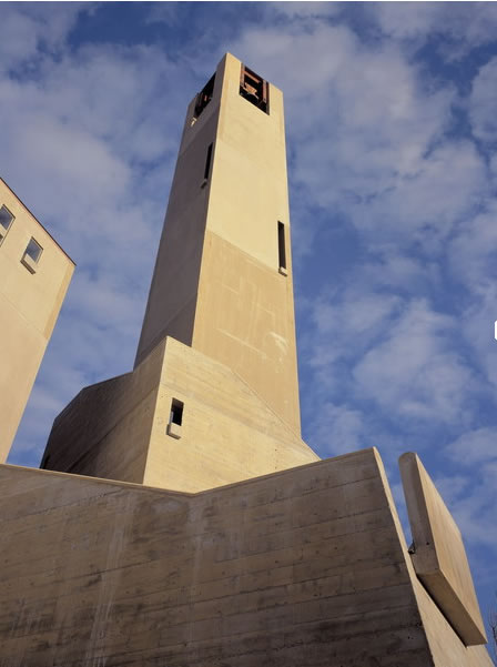
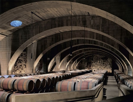
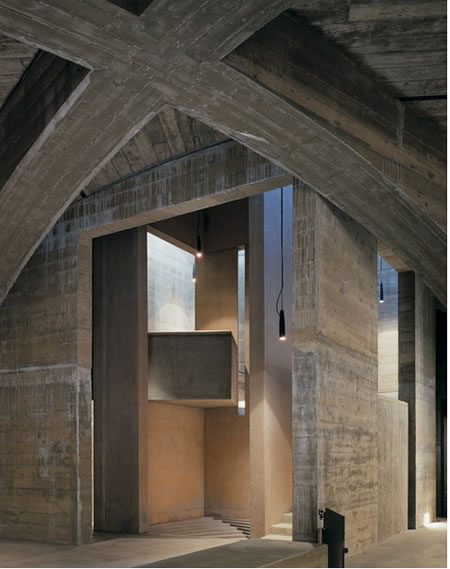
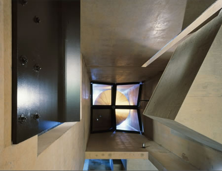
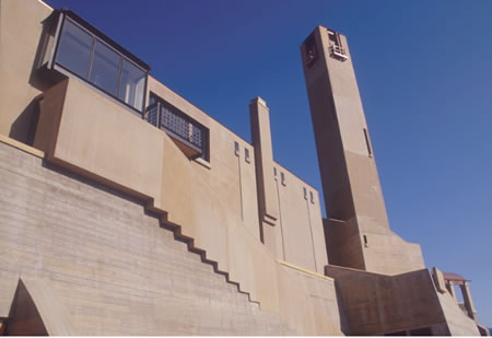
Photography by Paul Warchol Images are from Olson Kundig’s website
Learn more about Mission Hills here.
Foster+Partners takes a different cant, directed in the visioning of Norman Foster’s powerhouse view of wine, modernism and sustainable consciousness. Rather than monasterial in tone, this newly created field captivates a different sensibility.

Sir Foster | Foster+Partners website
According to Arup’s overview of Lord Norman Foster’s new Portia winery, dated 19 Nov 2010 —
“A brand new wine manufacturing facility, Portia Wineries in Burgos, Spain, is now open.
Located in the heart of the Ribera del Duero, Spain, it is the first wine project that architect Norman Foster has designed for Faustino winery group.
The 12,500m2 facility has a production capacity of one million bottles a year, and counted on Arup´s services in sustainability, electrical engineering, structural engineering, facilities design and façade engineering.
The design, which integrates seamlessly with the natural landscape, facilitates the wine manufacturing process and reduces the visual impact and energy demand of the building. The building takes the shape of a clover, inspired by the three main production stages – fermentation in steel casks, ageing in wood barrels and ageing in the bottle.
Inclusion in the landscape
The Portia Wineries building is designed to take advantage of the slope of the land. Grapes are unloaded by trucks on the upper deck, and gravity is used to move the grapes inside the building, maximising efficiency and minimising damage to the pulp.
Photovoltaic cells have been incorporated into the roof, and the recycled concrete structure uses thermal inertia to help control the indoor temperature, reducing energy demand.
The exterior walls are lined with large panels of Cor-Ten oxidised steel which give the building its distinctive colour. The third wing incorporates large volumes of stainless steel in the form of fermentation casks, referring to the building’s function.”
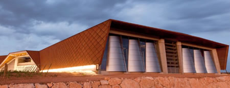
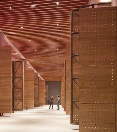
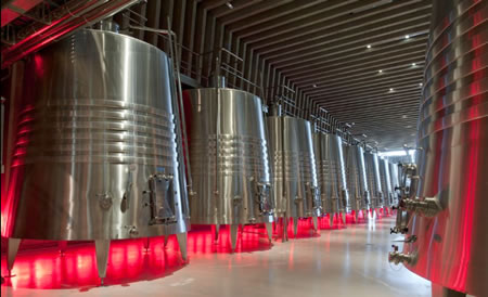
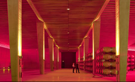
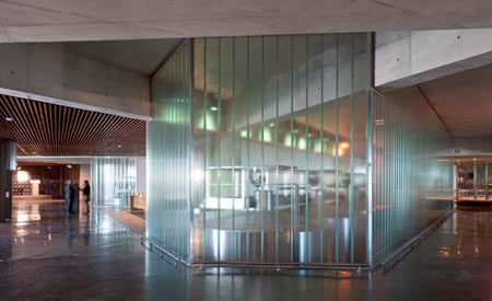
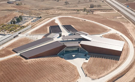
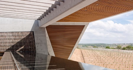
Imagery from Foster+Partners
More on the story, here. Lord Foster said: “Bodegas Portia is our first winery, so we had no preconceptions about how it should work. It was an opportunity to start from first principles – to examine the different stages of wine production and to try to create the ideal conditions for them to unfold. The wine was the starting point, as well as the beautiful setting in Ribera del Duero. Using materials that draw on the region’s winemaking traditions, with public spaces open to the landscape, will enhance the visitor experience.”
You might comment, surely there are more extraordinary stories about winery design. Here are (Napa) more references and the top ten most extraordinary winery architectural projects in the world. Explore the links, for more.
What I find compelling is the notion of place, designed, as celebration. Then of course, the celebration has a different take to the nature of being in that place. Whether slicked concrete, polished and formed to precision or the roughened woods of a hand-made rendering, to each — their own; to each, there: owned.
I can recall the varying experiences of places that celebrate the object — and this might be where these series of recollections find themselves in the power of reflecting memory. You go back — and discover again, in that vessel of memory, something miraculous in the moment of being. There.
T I M
–––––
DESIGNING PLACES FOR BRANDS, MEMORIES AND HOLISTIC EXPERIENCE
the reels:http://www.youtube.com/user/GIRVIN888
girvin blogs:
http://blog.girvin.com/
https://tim.girvin.com/index.php
girvin profiles and communities:
TED: http://www.ted.com/index.php/profiles/view/id/825
Behance: http://www.behance.net/GIRVIN-Branding
Flickr: http://www.flickr.com/photos/tgirvin/
Google: http://www.google.com/profiles/timgirvin
LinkedIn: http://www.linkedin.com/in/timgirvin
Facebook: http://www.facebook.com/people/Tim-Girvin/644114347
Facebook Page: http://www.facebook.com/pages/Seattle-WA/GIRVIN/91069489624
Twitter: http://twitter.com/tgirvin