YSL, American Eagle, New Era Customization and the Interpretations of the Crowd.
What about brands that are your brand? Make your own world:
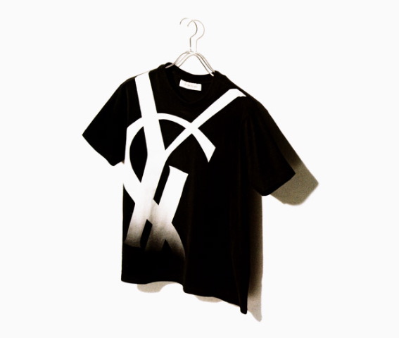
Working at Yves Saint Laurent, I can recall a conversation about either oui or non — the idea of more big YSL logo merchandise? It was a go, in the end.
FASHION REVIEW
YSL Hugs the Logo
By CATHY HORYN
Published: October 6, 2007
PARIS, Oct. 5 — “The frenzy of the fashion world seemed to bring Stefano Pilati to a Zen crawl at Yves Saint Laurent, while it made Karl Lagerfeld see stars and stripes — and inevitably, dollar signs — at Chanel.
Mr. Pilati’s collection for Saint Laurent was beautiful and simple, though its sharp minimalist turn may confound people. He said before the show that he wanted to look at the house’s iconography — the classic blazer, the pleated trousers, that rich jolt of color. He also took on the YSL logo, designed in 1963 by Cassandre, using it as an abstract pattern for prints, for mirrored brooches or to emboss a glossy black trench coat.”
The logo, which I’ve had the chance to know well, is a beautiful thing, and a fascinating legacy in the figurehead of design that created it — there’s a story there, as well — with a tragic conclusion.
But when is the logo too much? During the ups and downs of identity applications and the nature of crowd control — who’s loving it? Who’s not? And how much? What’s the story, who cares?
The point to the nature of brand iconography and clothing is a mixed bag, and working as a designer in that market environment — creating content for retail merchandising / brand storytelling — I know that place (UnionBay, Bloomingdale’s, Generra, Neiman Marcus, Brooks Brothers, Harvey Nichols, Seibu) well. It does have to do with relationships — how do people relate to the brand?
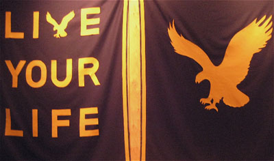
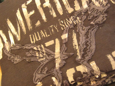
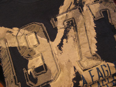
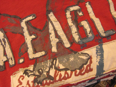
In the case of American Eagle, working with their executive team, it was about the evolutions of their raptor — what does it mean, what does it stand for, who cares about it, and what variations could be extended to branding applications?
GIRVIN | NYC
There are, in the midst, many in play already. But that might be the point: If you like the gear, but tire of the brandmark, then how do you get the logo off? Or buy elsewhere?
Donna Alberico for The New York Times
By JON CARAMANICA
Published: February 3, 2010
“I HAVE no problem with the guy riding a horse while wielding a mallet. The crocodile is a gimme, as is the tiger. I can stomach the dangling sheep and the equestrian knight. On a weak day, I can tolerate the crow. I won’t even entertain the idea of the skull.
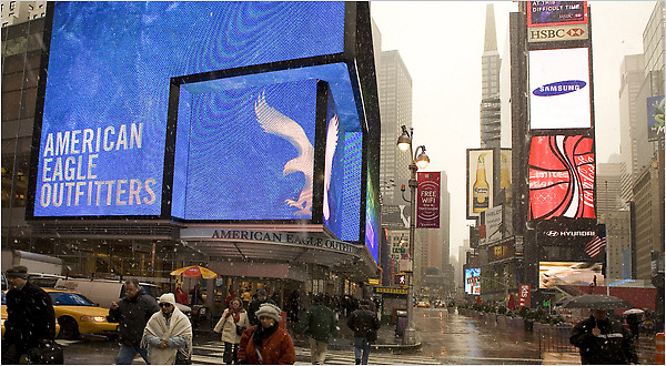
And creativity, too, which explains why I recently spent several minutes in the basement dressing room of American Eagle Outfitters in Times Square, examining the breast pocket of a blue gingham oxford, strategizing ways to dislodge the eagle logo from its perch. Wow, it was stitched tight.
Taking up barely a square inch on the left side of the chest of a shirt, an insignia can scream much more loudly than the remaining yard of fabric it’s not attached to. And, yes, it matters. Style is as much perception as intent; a careful outfit can be undone by one small misstep. From a distance, the emblems may all look the same, but historically, the eagle has been a weak substitute for the other animals of the kingdom. It came on clothes manufactured for instant sloppiness, deliberately ratty polo shirts that were ready for the charity pile while still on the rack, and cargo pants with distended pockets that looked as if a frat-hippie had already worn them to a couple of Bonnaroos.”
An alternative emerges, to the personalized masses — creating brands that are made: by you.
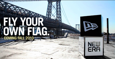
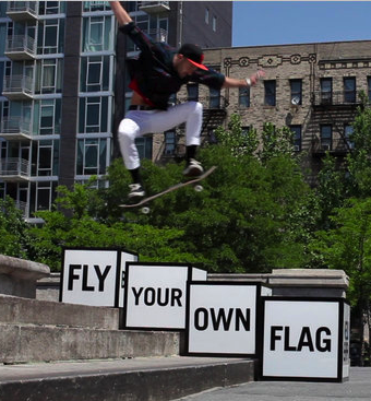
Fly your own, New Era’s customization of personal gear:
The concept of expressing yourself is an emerging crowdshout. To Stuart Elliott’s notations, “exhortations by advertisers to express individuality — by, oddly enough, consuming mass-market products — have grown louder.” To the reference of how mass consumer channels are becoming a wellspring of individualized of “niche streams is a campaign to be announced by the cap maker New Era, which carries the theme “Fly your own flag.” The campaign, by a New York agency named Brooklyn Brothers, salutes” the concept of their audience relationships to become “flag bearers,” new found, self-starting achievers who stride to their own rhythm.
He continues, “In print and online ads, consumers will be urged to “Start your own movement,” “Raise your own game,” “Blaze your own trail,” “Create your own world,” “Sing your own song” and “Make your own grand entrance” — just about everything except “Be your own brand” — which, interestingly enough, is what the movement is all about: boost your own brand, make your own statement, customize as you will.
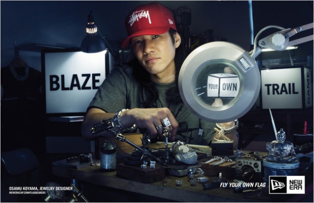
New Era Caps promotional announcement imagery.
“The authenticity our product has won on the field of play,” according to Christopher Kock, the CEO of New Era Cap Company, based in Buffalo, NY. “It’s about building credibility as a global lifestyle brand,” with the legacy of the group being primarily “a headwear brand for 90 years” and offering clothing and accessories brand for the last half decade. New Era has researched its audiences “to figure out how many varieties” of headgear it rings into their registers. And the sheer variety — customers like hats which are theirs and theirs alone — Mr. Koch said, considering “the sheer volume of custom orders,” that number of individualized sales opportunities could be “in the billions.” Go to the New Era Web site to explore more — dozens of variations expand in flavors ranging from intergalactic to metallic cotton, classic canvas cotton to hunter’s plaids, multiplied by complicated logo configurations and color treatments. Who’s minding the brand? You are!
The idea of the logo that’s just the way you want it might be another string in the exploration of logogear — “it’s the brand that I like, but it’s applied just how I like it — like no one else, either!” That might spell intriguing challenges for identity designers that like to create complex rule books of design realizations and disciplines.
Being in the business of identity and brand design management strategy, there’s an edge to be explored — that starts at the top, the key legacy elements in the heritage of the brand story, that then filter out a dizzying sub-array of appropriate variants whose numbers might reside in the stars…
Tim
––––
Exploring brand strategy for fashion:
Girvin blogs and experience design | https://www.girvin.com/blog/?s=fashion
Exploring the heart of human experience.
And telling the stories of their revelation: | https://www.girvin.com/blog/?tag=storytelling
the reels: http://www.youtube.com/user/GIRVIN888
girvin blogs:
http://blog.girvin.com/
https://tim.girvin.com/index.php
girvin profiles and communities:
TED: http://www.ted.com/index.php/profiles/view/id/825
Behance: http://www.behance.net/GIRVIN-Branding
Flickr: http://www.flickr.com/photos/tgirvin/
Google: http://www.google.com/profiles/timgirvin
LinkedIn: http://www.linkedin.com/in/timgirvin
Facebook: http://www.facebook.com/people/Tim-Girvin/644114347
Facebook Page: http://www.facebook.com/pages/Seattle-WA/GIRVIN/91069489624
Twitter: http://twitter.com/tgirvin
