Speaking with colleagues, people have asked — “you seem to know something about what’s going on at Starbucks; but really, who’s doing the work?”
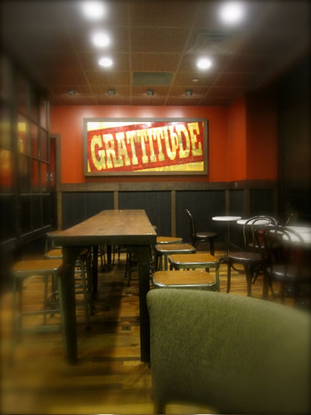
I just talk to people — being the perpetually curious type. And I ask questions. It’s not like I’m a constant design or brand consultant to Starbucks. And like anyone exploring the idea of retail experience design, you look and what’s happening and document it. Write about it. Like Starbucks going home, store one, Pike Place — find the heart of where you began and go back to it. Home.
Really, the only thing that I ever did at Starbucks was work on a concept that never went anywhere. Joe, the diner concept, more than a decade ago – “explore the archetype of the American diner, find the heart and make one for us.” We tried. Never went anywhere. Whatever works, in the exploration of new ideas, does not always remain in light — surely not the first time.
I was out looking, with another friend of mine, scouting locations for new retail in NYC — and came across this new installation which might be presumed to be a good replicant for the detailing of one of the core design concepts in development — and rolling out, in sequence, worldwide; there are more than one — and stylistically they’re aligned in strategy — but tactically they unfold in different “bents” on the seminal ideas of sustainable responsiveness. So who did that store / story?
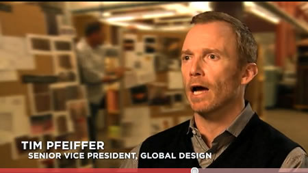
This shop is an interesting expansion – graphics, merchandising, visualizations, detailing. This shop, in Soho, might be one of the best. I’m thinking that this person, Tim Pfeiffer, could be behind it. And speaking with him, he is the one, design leader and stylist visionary to build out that proposition in a manner that layers the character of the installed experience. Speaking with him, that’s the heart of the manner — “it’s not about just the structure, or the details, or the merchandising, but it is all of them — it’s about how they’re layered.”
Here’s a touch on the designed details:
layering
active clutter
dimensionality
brilliance (color)
fixturing
details (materials)
(and by the way, I was told not to take this picture…)
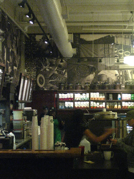
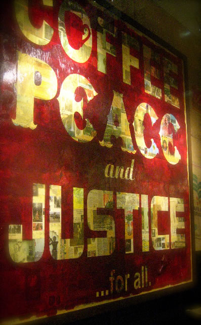
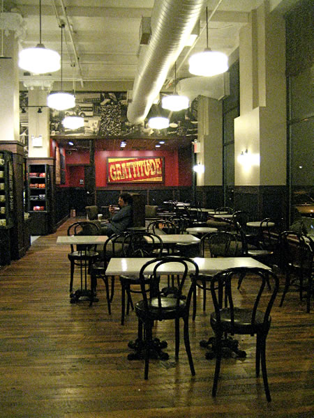
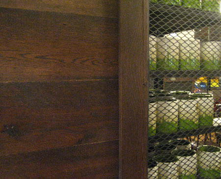
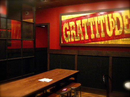
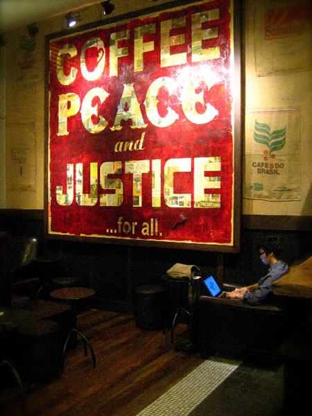
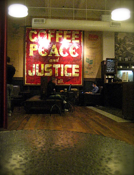
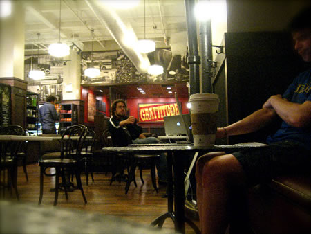
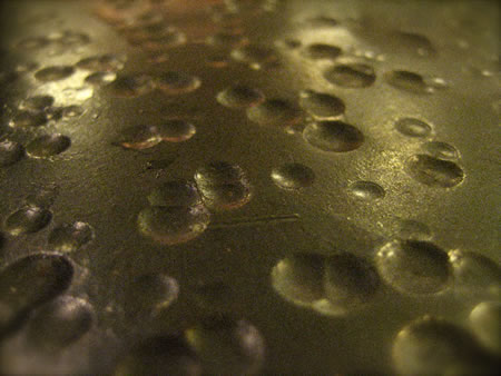
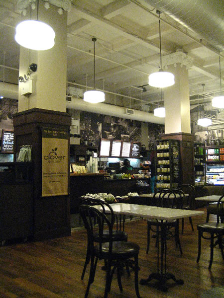
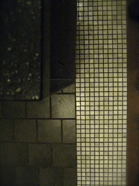
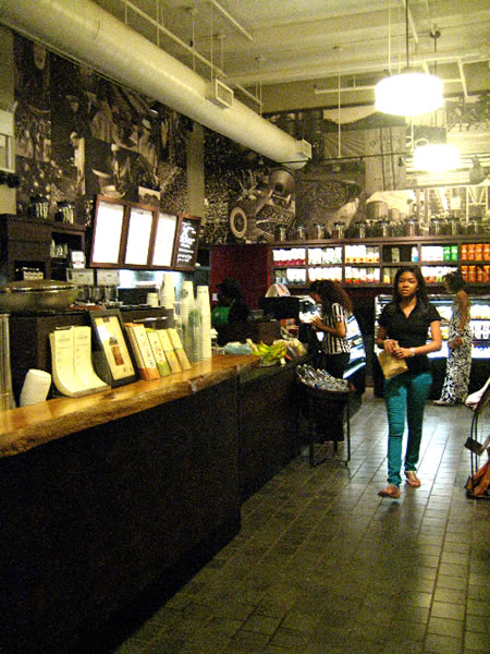
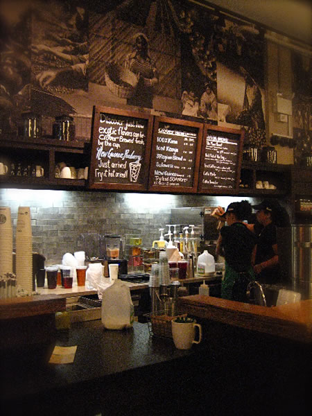
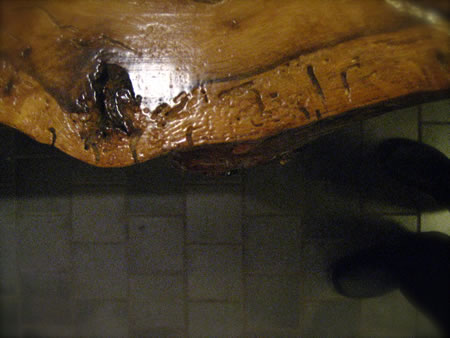
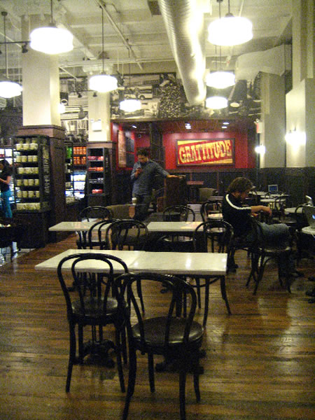
What I like about this space is that it feels natural — it’s authentically fitting into what’s been there. And what’s in play, now. It’s recalling the sense of earlier place — and overlaying something new, for now and in the future. Somehow, it’s layering on a Starbucks story in a particularly careful, thoughtfully detailed manner. And it feels like it’s been there for a long time.
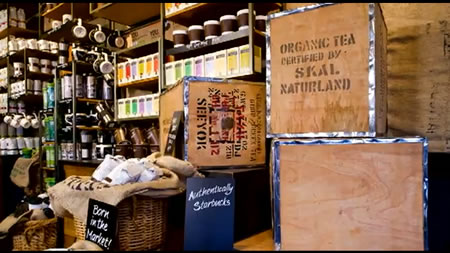
Once the merchandising is in play — the talent is next, (“excuse me sir, but you can’t take pictures here…”) coupled with the product expression. Presuming care in the orchestration of all these elements, the experiencer has something unforgettable in mind.
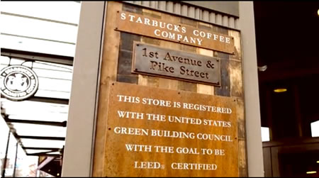
The challenge that Starbucks has lies in the global installation of a program that is extraordinarily ambitious. The sustainability register alone is something powerful — on many levels — but difficult to manifest in such an array.
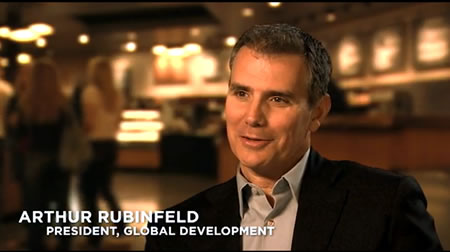
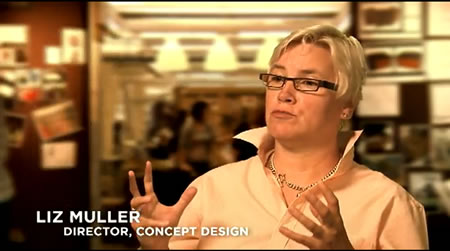
With the leadership of author and retail strategist Arthur Rubinfeld, along with the opening explorations and planning empowerment of Liz Muller, gathered with dozens of others (including friend Dawn Clark) the potentials are luminous.
I’ll be watching.
Tim
….
GIRVIN | B R A N D S T O R I E S
E X P E R I E N C E + D E S I G N + M E M O R Y
the reels: http://www.youtube.com/user/GIRVIN888
girvin blogs:
http://blog.girvin.com/
https://tim.girvin.com/index.php
girvin profiles and communities:
TED: http://www.ted.com/index.php/profiles/view/id/825
Behance: http://www.behance.net/GIRVIN-Branding
Flickr: http://www.flickr.com/photos/tgirvin/
Google: http://www.google.com/profiles/timgirvin
LinkedIn: http://www.linkedin.com/in/timgirvin
Facebook: http://www.facebook.com/people/Tim-Girvin/644114347
Facebook Page: http://www.facebook.com/pages/Seattle-WA/GIRVIN/91069489624
Twitter: http://twitter.com/tgirvin