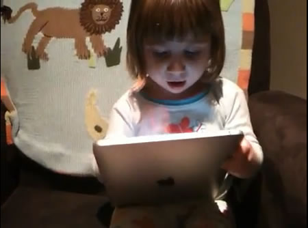
I can remember when my daughter Madeleine, during the 1980’s, first encountered our first Macintosh computer. Just like that — the above. Interface, holistically, can be enrapturing.
It’s becoming hard not to write about Apple. The love of the brand — and yes, I know there are some of you out there that don’t — is becoming nearly ubiquitous. A friend of mine, designer architect Dawn Clark, new global VP | store design at Starbucks mentioned that, at a recent global department store retail conference that she attended in NYC, nearly every single CEO that spoke about new directions in retail experience and the presence and challenges of the market, Apple was consistently mentioned. Why — one would ask — might this be the case? In a downturned economy, Apple’s polish shines lustrously. Those facts are obvious, even aside from the fact that their valuation has now outstripped Microsoft. And I’m sure that Microsoft is talking about Apple, if not copying them. We’ve noted that as well.
There are reasons for success that are likely being studied by hundreds of consultants around the globe, if not thousands, but much of Apple is walled in a veil of intentional secrecy. Of course there’s a good reason for that, too, given the prostitution of Apple principles in dozens of other imitative solutions. But you can’t stop the frenetic power of Steve Jobs to drive to innovation results — and much of that visionary imagining comes from him. He’s the one that’s pushing the hardest. According to some, that’s his style — in my discussions with dozens of people that have worked there — to either engage with teams or to terrorize them. You can’t be there if you don’t live there.
Being there — at Apple — myself, I’d proffer that it was less about cruelty and more about passionate commitment.
But then again, that’s a Girvin characteristic, so we can all relate.
Apple holistic interface
I’ve written earlier about the idea of iPad interface, but this blog is partially about that, and partially about holistic brand interface. There are two compelling shifts to note — one, experience in terms of store design and merchandising, and the other might be the easy-to-experiment modeling for Apple working environments. They’re conjoined.
In earlier writings on iPad developments, the mix of childish metaphors, the finger-painting character is an attractive evolution; it’s getting down to basics. In working as a designer — and a calligrapher / teacher — I’ve learned about the conception of the progressive evolution of the movements of the hand through 3,000 years of movement and tuning — each gesture for the forming of the alphabet being one of increasing perfection to ascribe, literally, the alphabetic and gestural structure of that time. For all the earlier work on the concept of the mouse/cursor, the idea of simplifying that interstitial link between human and action in the tip of the finger is both profound and entirely archetypal. It’s how we point out and draw things, represent ideas. It’s simple because Apple is “simply principled” — but they surely didn’t invent it. What they did innovate was the idea of holistic finger tip interface, that using a finger, or a grouping of fingers, could do the job of the “cursor-based” drag and drop draw motif of human connection to hardware and screen — and actionable results.
That’s child’s play. But that can be taken to other significant levels of displayed revelation of experience — like drawing. Fabulous renditions of drawing, iPhone-wise, we’ve explored. But there’s an expansion here, illustratively noted in the intimacy of the current viral campaign spreading out there for iPad. And the intimate campaign “re-thinking your relationship to a computer lives in the notion of this positioning — sit, as you will, relax, explore, and work.
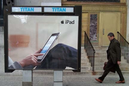
Ever note how the entire campaign is thematically built on completely redirecting the concept of how one might use a computer? Relax and do it.
Child’s play interface and Apple
That extends to the child-like connections to understanding how it works, even page turning — or for that matter — turning it on, or putting “things” away. The viral sequencing shows up like this:
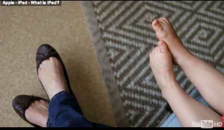
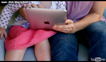
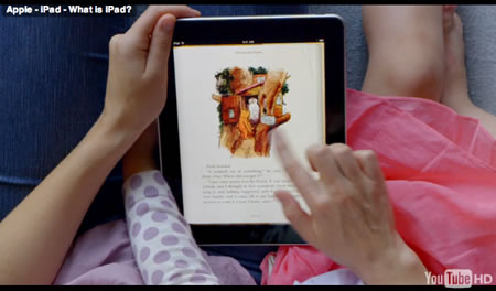
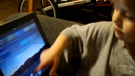
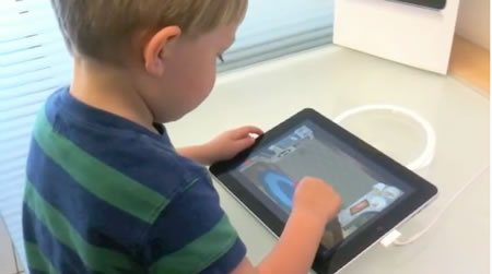
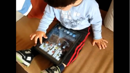
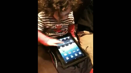
There’s some expanded exploration on this front. Michael Learmonth offers some compelling, personal evidence on that front in a recent Advertising Age overview of his familial experience and the iPad. “Anyone who has watched a child pick up an iPad has seen something amazing and maybe a little eerie. Kids too young to use a computer or TV remote or even read are using the device innately, chubby hands flying over the screen, leaving smudges as they go. And in the process, they may just be reshaping media.” There are a string of videos rather excited parents releasing their iPad to their children. Some enthusiasm echoed on both sides, of course. And some guidance, as well. Speaking of viral, this one’s been seen by nearly 1,000,000 viewers. Evangelism is in order — parent to offspring.
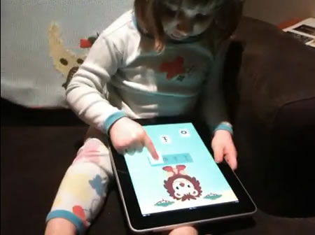
Some others (it’s kind of addictive watching children interact) from 2 year olds to infants.
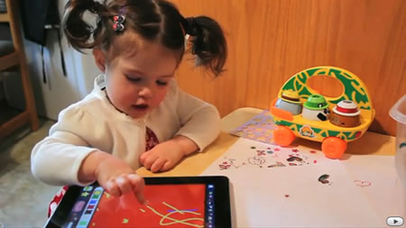
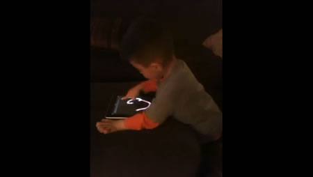
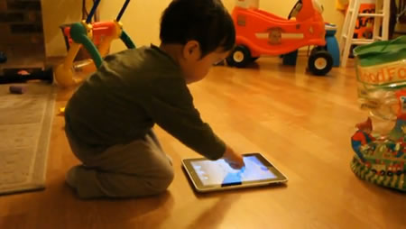
And some babies.
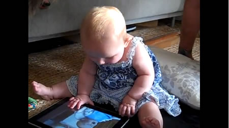
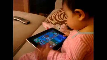
Once you see one, dozens of videos emerge. There’s a trend, showing. Parents showing off the attentiveness of their children. Being addicted Apple evangelists, they infect their family.
“Many of these kids are accustomed to touch screens since their parents have been using iPhones and iPads as child-entertainment devices for a few years now, but even kids who have never laid hands on an i-anything can pick it up, as a 3-year-old named Everett did when Ad Age handed him one last week. And like most adults, he didn’t want to give it back.” Ask the media for more about a toddler’s explorations of iPad. And the change that it will represent.
“With video-on-demand and DVRs in close to 50% of American homes, not to mention broadband-connected computers, children under 10 are truly baffled by media they don’t control. While they’re used to hitting “play” when they want to watch something, the iPad takes interactivity with media to a different plane.”
“The ramifications for programming and advertising are far more significant than anyone inside the current ecosystem is prepared or equipped to address,” wrote Outrigger Media chief Mike Henry in a post after watching his son Carson, 18 months, master the iPad and then try to touch a standard computer screen. “It really feels like a machine that is responding to their needs as opposed to something they have to work through,” said Ben Grimley, senior director-online ventures at PBS. “A whole generation will grow up expecting that experience.”
The salient point is change in action, which inherently relates to how media will be designed and expressed to relationships, reviewing the article, as well as a string of attached references, supports the contention that the iPad will be the standard of advancing the nature of the interactive experience — and how brands communicate to their communities. To youthful transitioning, AdAge defines this as a generational shift, the “On-Demand generation.” In a query, recalling when touch screen interface didn’t exist, it’s not something that kids of the present tense even comprehend. “Welcome to the On-Demand Generation: tweens, teens and young adults who expect to get the content they want, when they want it and where they want it. Their Ad Age Insights white paper explores media habits, the devices they are using, and their expectations to help you adopt the smartest strategies for reaching them.” Explore the link, for more. And, on an added note, explore this overview on kids, devices and posture (from “attention” blogger, Linda Stone.)
Retail experience design and the iPad lesson.
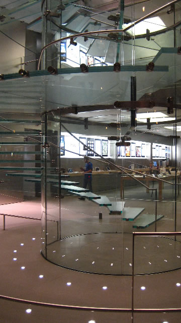
This attribute is just emerging, but being in NYC this past week, there are trends that are just being grasped, that might indeed come from Apple’s instruction. There’s a strategy in embracing experiential links between the concepts of materials that are used in products, and how that can be manifested in retail design. Even years ago, at the launch of Apple flagship, 5th & Central Park South, materials application and details bring a strong link to the present: iPad.
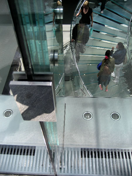

Glass, aluminum and details (Tim Girvin)
Apple has a knack for creating holistic marketing presence, even owning the larger marketing of billboards, for example, in distinctly defined proximity to their stores – the story is simple and they own its integration, as noted below in their NYC Chelsea store. The legendary luxury positioning of Apple retail — commanding as much as $5,000.00 per square foot spread sales beats out Louis Vuitton at 5th and 57th, in the same city.
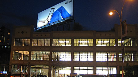
Apple Store (and billboard) Chelsea
Other trenders are exploring that integration — at least to the use of Apple technology in-store. According to Natalie Zmuda, Advertising Age retail writer, earlier this year noted that “industry executives believe the device could have a major impact on everything from retailers’ catalogs to e-commerce to enhancing the in-store experience.”
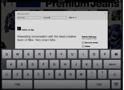
It’s not a fast track adoption, but it’s moving, as she notes, “few retailers have embraced the new Apple device even though many already have iPhone apps. Gap, Gilt.com and eBay are among the retail brands that have created iPad applications, while Puma is expected to add iPads to its stores late this year.” The applications are showing that, according to Chris Davey, senior VP at SapientNitro, (Target, JCPenney, Barnes & Noble and Foot Locker among its retail clients) “For first movers, they’re going to provide a higher level of service, or perceived service, than those that don’t offer this kind of capability. It’s a connected experience for those who want to promote a multichannel presence or a higher degree of service in their stores.” Check out Gap.
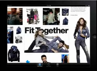
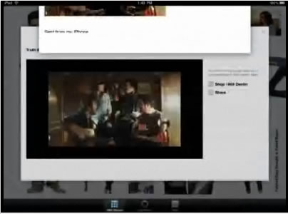
Dawn Clark, who went to explore the outrageously hip retail shop AllSaints Spitalfields,

in NYC, noted that iPads were already in play.
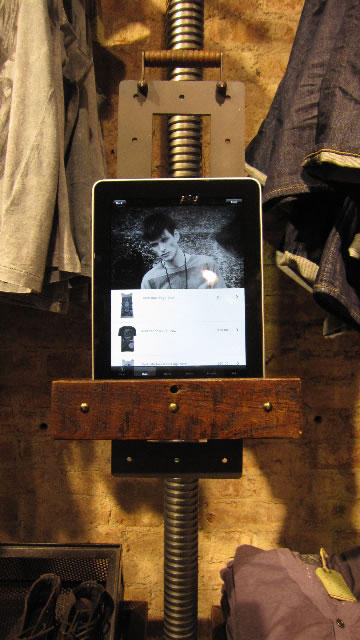
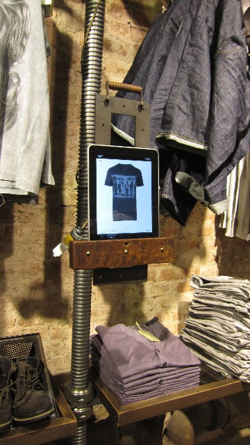
Photos by Dawn Clark, AIA LEED ap
The clear point, to all the examinations, is that sliding interactivity — ease and hip speed of exploration and access are increasingly the norm — everything is changing. Yet everything is the same. There’s a story to be told (Gap’s iPad application is largely about just that, exploring storytelling [1969] in the context of the history of the brand — and all the cool things that might be associated with it. And sliding the page to see the content — from the big paged modeling of entire fields of content that could be seen and explored (as opposed to the confines of a mere book or catalog, suggest that the whole touch of the finger (for 4,000 years) as a tracing guide is getting back to the very touch of humanity. And the other point, to human connection and sensational perception, is about the quality of integration.
If you are telling a story, narrate it wholly – and it will be unforgettable.
tsg
….
GIRVIN | S E A T T L E+N E W Y O R K C I T Y +T O K Y O
ON APPLE.
ON STEVE JOBS.
ON STORYTELLING.
the reels: http://www.youtube.com/user/GIRVIN888
girvin blogs:
http://blog.girvin.com/
https://tim.girvin.com/index.php
girvin profiles and communities:
TED: http://www.ted.com/index.php/profiles/view/id/825
Behance: http://www.behance.net/GIRVIN-Branding
Flickr: http://www.flickr.com/photos/tgirvin/
Google: http://www.google.com/profiles/timgirvin
LinkedIn: http://www.linkedin.com/in/timgirvin
Facebook: http://www.facebook.com/people/Tim-Girvin/644114347
Facebook Page: http://www.facebook.com/pages/Seattle-WA/GIRVIN/91069489624
Twitter: http://twitter.com/tgirvin