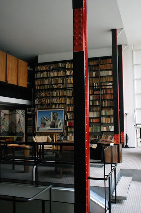
Pierre Chareau’s Maison de Verre
Considering a design inspiration based on mid-20th century industrial aesthetic
In studying the design ethos of Starbucks retail design, I came into learning more about their strategy in a series of meetings working with another client who was exploring the idea of a product alliance — building product and interior offerings for applications of their brand, based on probiotic foods.
Starbucks reused marble counter tops.
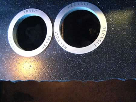
Meeting with Tim Pfeiffer, as well as Arthur Rubinfeld, and Liz Muller, I learned more about the tiered nature of their design “pillars,” groupings of design principles, all wrapped in the strategy of building sustainably empowered, localized plans of place-making. I attended the openings, as a blogger, for all the new store innovations — and have noted them successively (see the footer blog links at the end of this study.)
Starbucks recycled place.
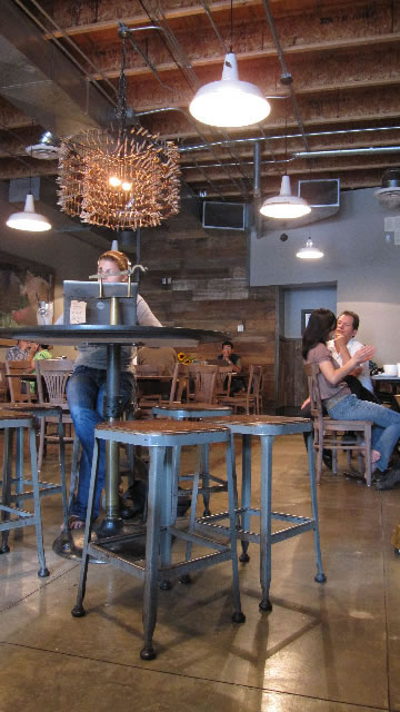
One conversation took me back decades. You might know about Peter Miller — and Peter Miller Books. If you’re a designer, you should know about him — the best bookstore there is, for in-depth absorption of ideas about all aspects of trend ranging design, as well as out of print classics that he’s personally culled. Explore more, with a direct link to him.
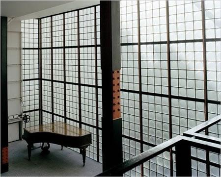
Chareau’s Glass (Verre) House.
But it was decades ago that we first connected — and early on, I was (as he’s noted) vastly fascinated by global retail and interior design. A tome on the work of Pierre Chareau was an early acquisition and it brought me to a new sensibility about the legacy of this extraordinarily visionary designer. Perhaps, in some manners, there are other links that harken further in my experiences, like the early days of mentoring by Harold Balazs, or his teachings expanding the industrial and material vocabulary of friend, architect Tom Kundig. Tom, too, was called upon to explore the possibilities of design vocabularies for Starbucks retail.
Chareau’s shelving system.
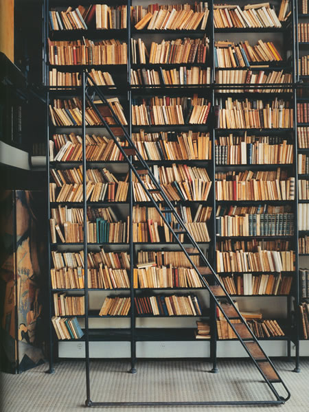
Interestingly, to the concepts of authenticity and inspiration, Rubinfeld referenced — during a talk together about the design strategies — the spirit of Chareau’s ideas and material languages. But, in a way, the idea of linking to the deeper past, the innovations of Pierre Chareau’s surprisingly inventive sense of industrial materiality lies at the heart of the reuse and exposure of the underpinnings of the propped sense of place that is the most compelling.
Pierre Chareau (August 4, 1883 – August 24, 1950) was a French architect and designer, and in the context of our discussion, is credited for building the first house in France made of steel and glass, the Maison de Verre. Chareau was born in Le Havre, France. He went to the École nationale supérieure des Beaux-Arts in Paris by the time he was 17. According to the brief overview in Wikipedia, his designs were “noted for their complex nature.” He was member of Congrès International d’Architecture Moderne.
Maison de Verre exterior
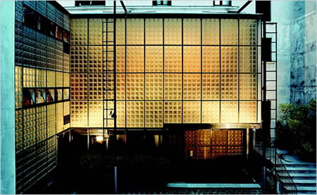
I might comment that the real spirit of Chareau’s work was less about the complex, but more about the simple, imbued — one might say — with the spirit of iron zen: reaching into the heart of hard working materials that are revealed, rather than hidden. This, in itself, created an “age” of design.
The Maison de Verre had a pervasive and successively profound impact on generations of architects who were seeking to free themselves from the rigid orthodoxies of mainstream Modernism, according to Nicolai Ouroussoff, the NYTimes. “Richard Rogers, a designer with Renzo Piano of the 1976 Pompidou Center, with its exposed tubes and bright colors, was captivated by the house when he first saw it in the early 1960s. A quarter-century later architects like Ben van Berkel would visit to try to decipher the uncannily fluid relationship between the house’s spaces for work and play, for public and private life.”
Having been honored to actually stay in the house, as a guest of the current owner and renovator of the property, Robert Rubin, Ouroussoff continues: “No house in France better reflects the magical promise of 20th-century architecture than the Maison de Verre. Tucked behind the solemn porte-cochere of a traditional French residence on Rue Saint-Guillaume, a quiet street in a wealthy Left Bank neighborhood, the 1932 house designed by Pierre Chareau challenges our assumptions about the nature of Modernism. For architects it represents the road not taken: a lyrical machine whose theatricality is the antithesis of the dry functionalist aesthetic that reigned through much of the 20th century.
Rubin himself is a fascinating individual — and one might suggest that his acquisition of “the Glass House” would be a disastrous denigration of a delicate landmark in design and pre-WWII french cultural architecture. Quite the contrary, “after buying the house, he embarked on a painstaking renovation of its intricate — and for its time, ingenious — mechanical systems. He enlisted a corps of architectural historians and graduate students to decipher its secrets. With the first phase of the renovation completed, he plans to open it up eventually for limited tours.
Rubin’s clarity of intention and the careful intervention of his systemic analysis and creative care is substantial — his loving devotion to the house and its historical particulars, he has emerged as a role model for those who seek to preserve an architectural relic without turning it into a mausoleum. An ever present and compelling drive to explore industrial objects eventually led him to the works of Modernist architects like Jean Prouvé (and Chareau), whose creations were elaborate Machine Age fantasies.
Approaching his new fascination with architecture (as opposed to an earlier compulsion with antique cars “with history”) with the zeal of a scholar, Mr. Rubin went back to school, at Columbia University’s graduate school of architecture at the age of 48, in 2001. He worked as a teaching assistant for Kenneth Frampton, the architectural historian who wrote a celebrated textbook on 20th-century Modernism.
The concept of the house as a kind of elaborate mechanism reminds me as well of the work of Jean Nouvel, who has developed marvelous places that seemingly gear themselves to an environment — one of the profoundest characters of Chareau’s design strategies. The Glass House is an exquisite machine. “Chareau worked closely with Louis Dalbet, a talented ironworker, and the house’s detailing has as much in common with centuries-old craft traditions as with the efficiency of the 20th-century assembly line. Big curved perforated metal screens at the bottom of the entry stair rotate to shut the apartment off from the office below. A rolling ladder set along the salon bookcase is fabricated from a single piece of steel pipe and inlayed with wood. The glistening brass window casements at the back of the house are assembled from the window panels of a passenger train.”
Starbucks composite furniture materials.
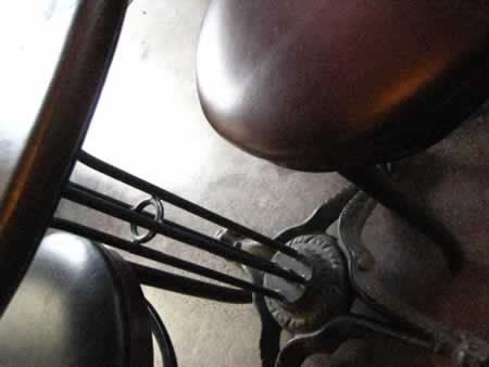
These details, of gathering materials and linking them to re-use, salvage, and sustainable return lie at the heart of Rubinfeld’s visioning, as well as the implementations of Tim Pfeiffer’s merchandising strategies and the planning creative and coordination of Liz Muller’s efforts.
Tim Pfeiffer’s cold-rolled steel merchandising.
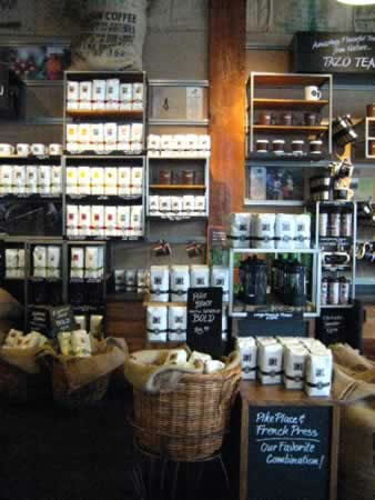
Rolling these strategies (Chareau, regionalism, sustainable re-use, industrial materials) out will be a labor of concentrated focus and attention to detail, as well as, to a recent conversation with Dawn Clark, AIA LEED® AP, something that will have to be practiced authentically in every region in the world to be adhering to the code of the new brand ethos in retail design practice for Starbucks. The idea of inspiration is not holistically defined — Chareau’s work isn’t the focus of “everything” that they do — it’s surely a broad interpretation.
But there are alignments that speak, reaching back in time, that warm some spark to the reference. While there is no Pierre Chareau “style,” perhaps there are tints that can be found. Chareau DNA…
Still, Chareau changed my own life, in design thinking, ranging back now 30 years since my first exposure.
Starbucks “farm” furniture re-use.
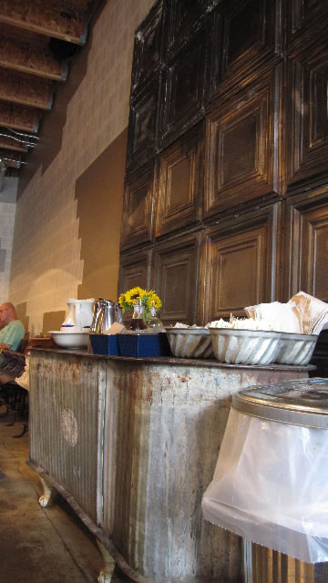
Industrial zen.
tsg
….
Exploring the Starbucks brand retail design strategy:
https://www.girvin.com/blog/?s=starbucks
Glass house video:
http://www.youtube.com/watch?v=mIZUTC3ng6o
the reels: http://www.youtube.com/user/GIRVIN888
girvin blogs:
http://blog.girvin.com/
https://tim.girvin.com/index.php
girvin profiles and communities:
TED: http://www.ted.com/index.php/profiles/view/id/825
Behance: http://www.behance.net/GIRVIN-Branding
Flickr: http://www.flickr.com/photos/tgirvin/
Google: http://www.google.com/profiles/timgirvin
LinkedIn: http://www.linkedin.com/in/timgirvin
Facebook: http://www.facebook.com/people/Tim-Girvin/644114347
Facebook Page: http://www.facebook.com/pages/Seattle-WA/GIRVIN/91069489624
Twitter: http://twitter.com/tgirvin