The architecture of type
“The map is not the territory.
Shaping context & connection is an act of architecture.
A new form of space requires a new form of architecture.
Space made of information requires information architecture. “
Alfred Korzybski
http://en.wikipedia.org/wiki/Alfred_Korzybski
Working with a friend of mine, Larry Rouch, a designer, I’d created a identity program and type face for a restaurant project together. There really wasn’t a budget for doing that, but we did it anyway.
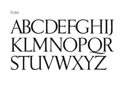
Some years after that, working with Jon Runstad, we’d created a design program for 1201 Third Avenue — and again, I’d framed the idea of creating a font for the building, designed by Kohn Pedersen Fox. The principle was classical — but not something conventionally available; instead a design that was supremely classical, offering details from the design of the building features.
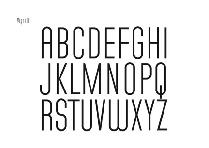
Working with Massimo Vignelli and Michael Bierut, we created another font, for another building project.
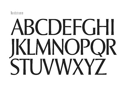
For the Nordstrom family, we created the identity treatment for all signing in the stores, packaging and print applications.
The idea of building customized fonts isn’t new, in fact creating highly specialized alphabetic applications has been part of the designer’s ethos for hundreds if not thousands of years – the shape and form of the alphabet being closely aligned with the character of the place that is being made. Studying signing from around the world, inscriptional character speaks to framing form within form. A friend pointed out another’s exploration of a single titling treatment for a building, truly aligned to the character of the place. James Puckett, as pointed out to me by friend Stuart Balcomb, It’s an interesting legacy, of working backwards from the concept of the signing that is already in place, then reformed into font development solutions. Still, interesting, the concept of working through the relationship between architecture and typographic design, for in a manner, they are already aligned, the quality of space, the striking nature of the stroke of a letter being inextricably linked to the concept of the drawing of a letter.
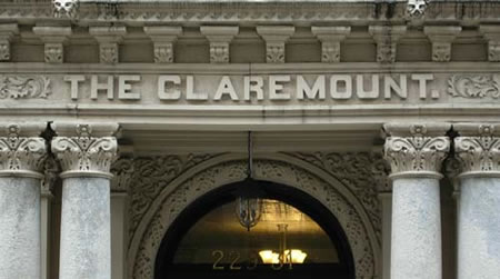

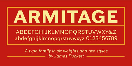
I recall, for example, these lines by Paul Standard, which bridges the sweeping arc of design — both to architecture and the gesture to the letterform design, each — a kind of “building form.”
“Geometry can produce legible letter but art alone makes them beautiful.
Art begins where geometry ends, and imparts to letters a character
transcending mere measurement.”
Paul Standard, 1947
www.smith.edu/libraries/libs/rarebook/
“Typography is two-dimensional architecture, based on experience and
imagination, and guided by rules and readability. And this is the purpose
of typography: The arrangement of design elements within a given structure should allow the reader to easily focus on the message, without slowing down the speed of his reading. “
Hermann Zapf (1918-)
http://en.wikipedia.org/wiki/Hermann_Zapf
“When it comes to contruction documents, then you have to design by computer, because the procedure is mathematical, is digital. You are still a craftman, except that your tool is getting more sharp. Architecture is the most imposing art, but in the end it’s about beauty, it’s about truth, and it is unattainable ! We don’t impose a personal stamp ; we may impose our skill our coherence. I love lightness; transparency is coherence. We have a sense of inadequacy, when you are just about to grab the vision you have, you face an immense gap, you find that you arms are too short. You only understand when the building is finished. A new building, even if it is beautiful it needs time. Even a classic at its time it was modern, modernity is a funny concept, you don’t really know what is good what is wrong. This is the problem of architecture, it is rational, but it is also very much about intuition. Intuition when you are young it has not been informed by experience, that is why hands are so important, to metabolize, so it seems the gesture of the hands are closer to intuition than to the brain. Every place has a little genius ! The building is a presence… They sing only when they have a soul. Still, poetry lasts more than a stone. “
Renzo Piano (1937-)
http://en.wikipedia.org/wiki/Renzo_Piano
“The letters of the alphabet, the characters of a typeface,
are building blocks. Besides being symbols to construct a written
language, they can be used to compose any visual impression imaginable.
To me, typography is the visual arrangement of letterforms and symbols.
Its style creates identity. If the composition contains coherent
content, this visual identity will convey the message in a distinct
and original way. A new expression. A new impression. A new corner
of the mind is opened. How exciting !”
Max Kisman (1953-)
www.typotheque.com/articles/max_kisman_graphic_designer
.
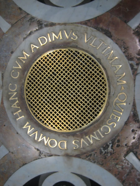
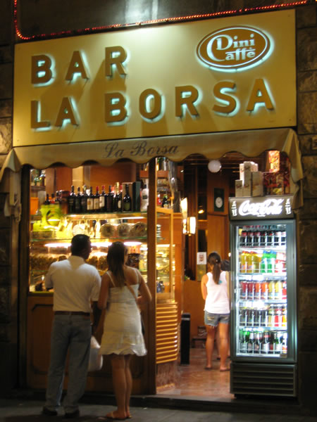
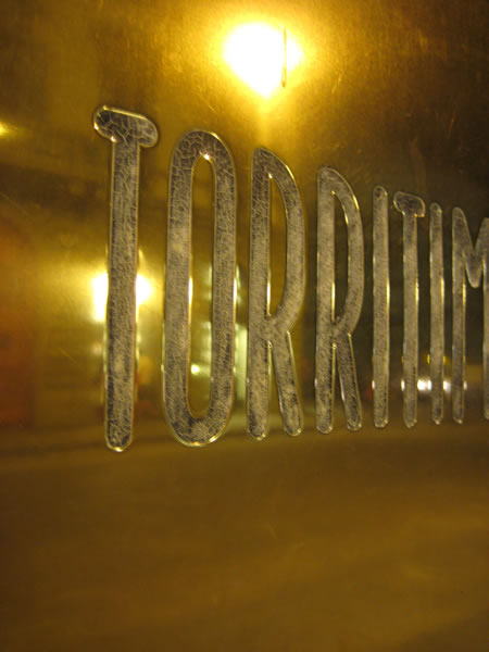
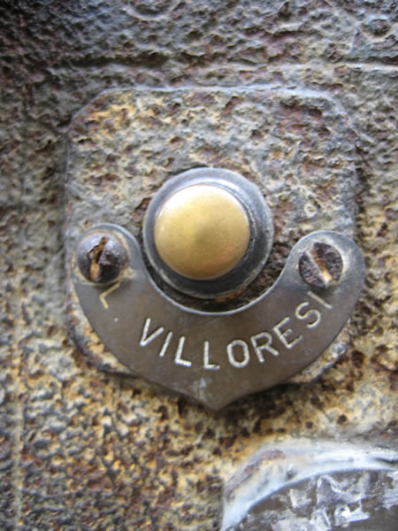
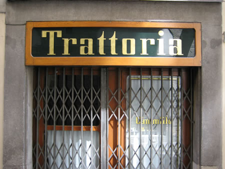
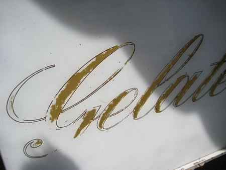
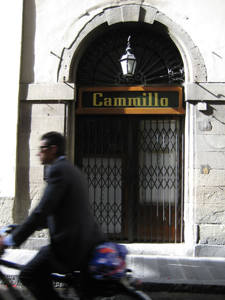
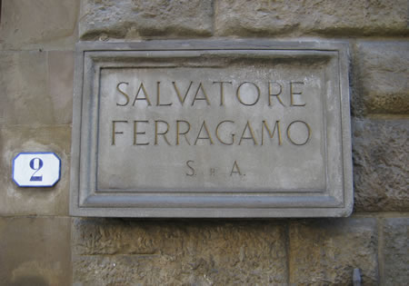
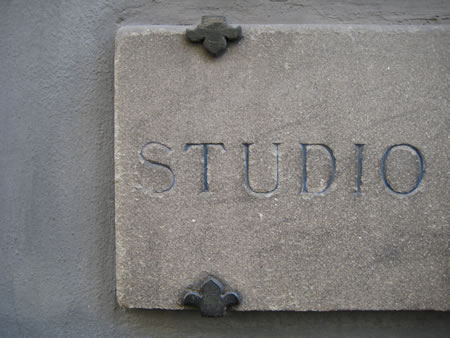
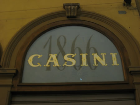
Speaking of this fascination, a quick gallery of interpretations from my travels, letters speaking to brands, to shape, to form and the shape of content, this collection – Firenze:
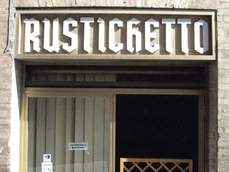
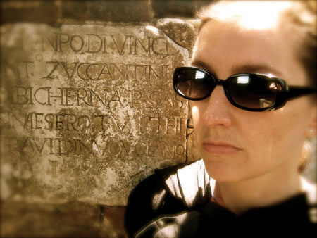
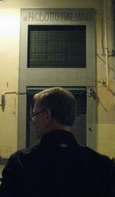
tsg
….
Exploring the architecture and signing design:
https://www.girvin.com/blog/modernist-type-design-signing-messaging-and-way-finding/
the reels: http://www.youtube.com/user/GIRVIN888
girvin blogs:
https://www.girvin.com/blog
https://tim.girvin.com/index.php
girvin profiles and communities:
TED: http://www.ted.com/index.php/profiles/view/id/825
Behance: http://www.behance.net/GIRVIN-Branding
Flickr: http://www.flickr.com/photos/tgirvin/
Google: http://www.google.com/profiles/timgirvin
LinkedIn: http://www.linkedin.com/in/timgirvin
Facebook: http://www.facebook.com/people/Tim-Girvin/644114347
Facebook Page: http://www.facebook.com/pages/Seattle-WA/GIRVIN/91069489624
Twitter: http://twitter.com/tgirvin