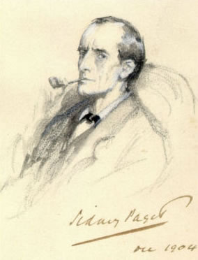
The sense of time in brand: chronology, palaeography and theatrical accuracy.
There are a grouping of writers that explore the concepts of typographic design and motion pictures. I’m one. While the notion of typographic precision, in design, is some what of a targeted proposition in Girvin’s work on identity, in working in motion pictures, the concept of aligning stylistic intention to chronological precision is somewhat of a gestural positioning. Indiana Jones, for example. Not perfect. That is, you can’t always expect that producers and directors will presume that doing everything, literally by the book, will fly in the exhilarated styling of motion picture identity design — especially when it comes to the conceptions of theatrical advertising.
One might presume that in the context of set and production design, precise explication of period is the constant rigor of the production designer. Working with many production designers, over many years, many films, I’ve found that this is partially the case. But as well, it’s a matter of design being typically theatrical, that design is pushed histrionically to another level of visioning. It’s simply not just the design alone, but the added details – the mud and blood, the steel and rust, the wood, polish and glistening rot that add dimensionally to the spirit of the film — the scene, seen.
In studying the current production design of Guy Ritchie’s Sherlock Holmes, his visual love of lavishly sprayed “style” is all over the film. Walking back in the range of earlier films that he’s done, the conceptions of stylistic presentation, production values and cinematic luster are always robust — Snatch, rough; Lock Stock, brutish; LayerCake, crisp; Rockn, glaring. I admire, as well, his wildly splayed way of looking at movement — and action — and story in the construct not only of his willingness to treat titling as a dynamic exercise in the vitality of storytelling, but as well the wild swagger of his characters — both the literal antagonists, as well as the oft-times meek protagonists, caught in the foul jaws of the criminal grapple.
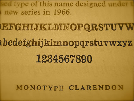
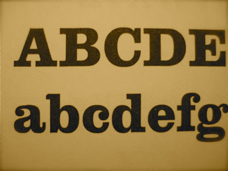
When I saw the one sheet designs for Ritchie’s Holmes, that were created by ConceptArts, the theatrical advertising agency in LA, I wondered about the link between the one sheets and the production design. That opening sequence to the entry of the film’s storytelling links, literally, to the signing of “Baker Street”, the legendary address of Sherlock Holmes. And I was also curious about the veracity of the Holmesian positioning as a later 19th century sleuth, and the use of that font. The truth stands, given that the origin of the font, slings further back in time than that. The curved serif wedges of Clarendon, are set in the proposition of an earlier time — mid 19th century, a common font for print titling and poster applications from the Victorian era, in fact, decades before the meerschaum pipe wafted smoke in the meditation of Holmes’ borderline madness. Given the wild ornate character of much of victorian type design, Clarendon is a clean and simply expressed font; it’s honest and straightforward, without artifice.
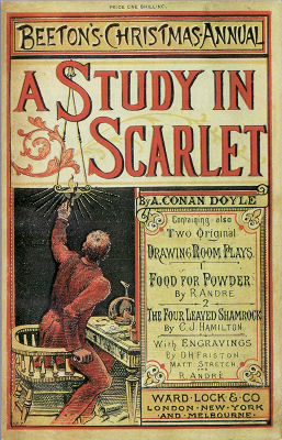
Looking back, however, the concept of depicting Holmes’ adventures in a popular trade jacket dress spoke nothing of smart forensics, and civil, even scholarly design, but rather a kind of hand-drawn and lurid adventuring. A summary collection, for example, capped with Conan Doyle’s “A Study in Scarlet” is awash with ornamentation and horror vacui approaches to type. Charming, 1887.
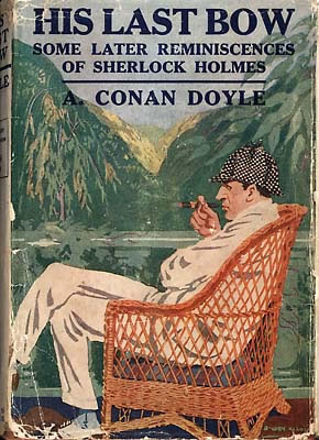
A later, 1910 closing memento speaks to a quieter era of jacket design in the Holmesian tradition — here using a typographic design language that speaks to an evolution of the Clarendon structure — Cheltenham.
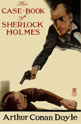
The 1927 treatment below actually reaches back to a kind of victorian styling that suggests the woodblock fonts and illustrations of William Nicholson and some of his alphabetic interpretations of London street life, letter by letter — stylized roman fonts mixed with eccentric cursive scripts.
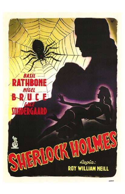
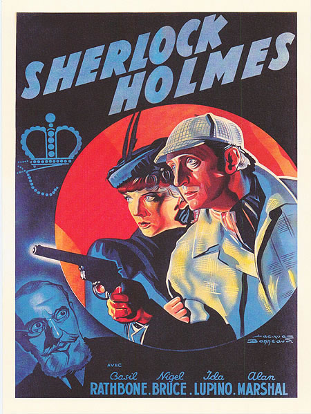
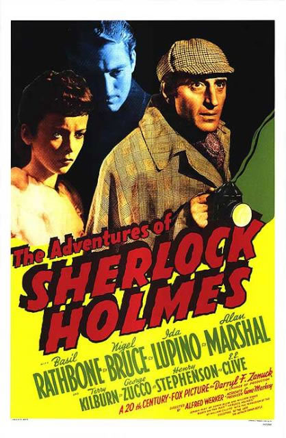
The run between the written period of Arthur Conan Doyle’s storytelling on Holmes and the move to the pre-WWII movie production era, springs to entirely brash, matinee font treatments, mostly drawn by hand, captivating the dime-paying audience, just before the brink of European war time disaster. These first groupings represent offerings all from 1939.
Gruesome brush fonts, canted, with deco credits.
Italicized “adventure” titling with script and romans intermixed in the credit fonts.
Adventure sprawling main title fonts, wavering in fear, with deco-styled, modernist fonts for the actor credits.
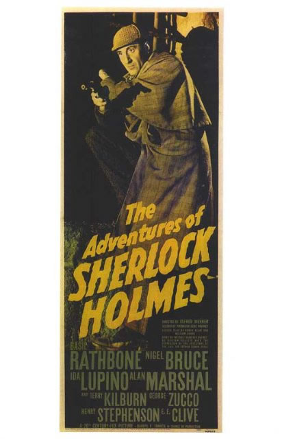
And the tall matinee standee presentation (of the above) — drama at nearly standing height — a slightly more unified branding presentation of the one sheet:
More American positioning — splayed and arched fonts, outlined and slip-shadowed, from the years 1942 and 1943, shown below:
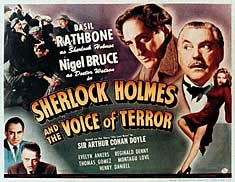
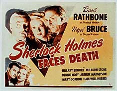
The point to all of this is more about the nature of the chronological relevance — one, to the lead in use of Clarendon — shown in the juxtaposition of font and the Concept Arts poster campaign.
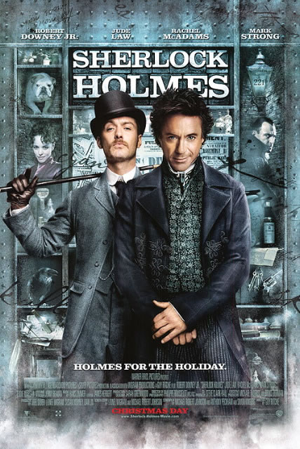
Here, the main logo that draws us into the street signing:
And the font that sets the time: Clarendon.
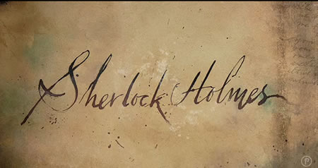
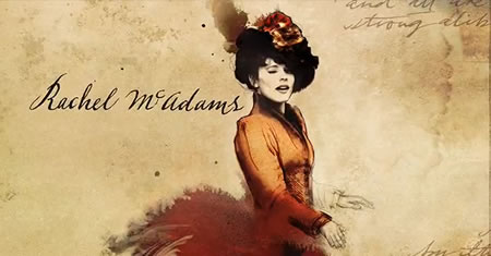
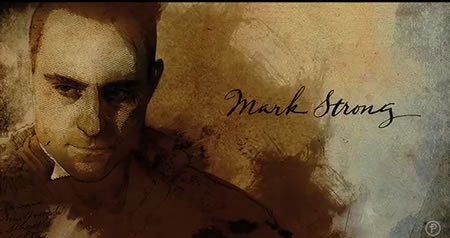
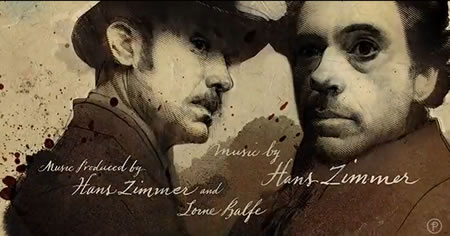
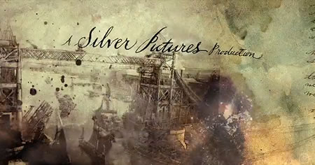
There’s a beginning (to the film) and there’s an end. While the main titles draw us from the stone streets to the poured iron signing of the film’s location, the end titles by Prologue Films show the sequence in mimetic closure. One to another, actor to scene, story to telling seen, wrapping as a kind of parade of action — a not uncommon positioning for Ritchie’s inventive sense of graphics. as an almost graphic novel approach to added visualizations.
A Spencerian engraved calligraphy as a master’s exemplar, late 1800s.
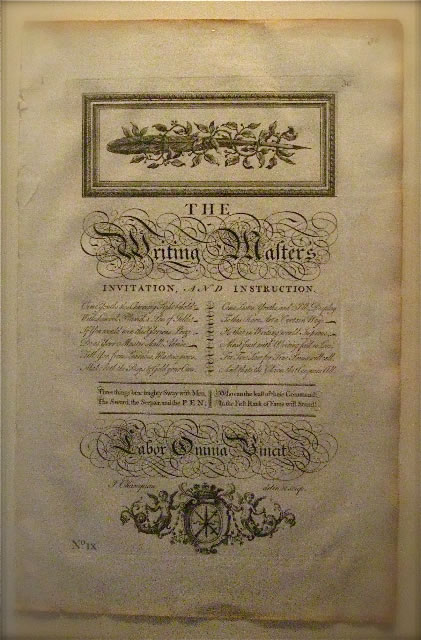
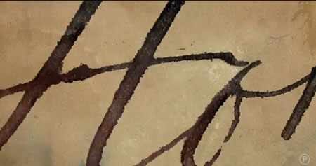
And finally, you might consider as well, Kyle Cooper’s more thoughtful jump from Spencerian scripts (as shown above in a page from a master reference book) – truly an invention of the Victorian age — into the closing credits. Speaking of palaeographic accuracy, this work might actually be the closer to timely targeting. The split pen, metal-splayed pen work, coupled with a treatment of sketchy classical drawing of the Victorian period, a time when being educated not only included comely calligraphy and handwritten eloquence but as well, the ability to draw. Beautiful swings and movements, calligraphy, washed and illustrative, like an art in the making, a journal newly scribbled and water-colored on the fly. What I savor about this work is the nature of the draw of the wash, the spatter of the pigments, the split of the flung ink, balanced with the draught skill of the holder — loose, quick, yet finely articulated dimensionality, even if a traced-over rendering — there’s life there.
tsg | newark, nj
….
Brands | love | movies | humans
the reels: http://www.youtube.com/user/GIRVIN888
girvin blogs:
http://blog.girvin.com/
https://tim.girvin.com/index.php
girvin profiles and communities:
TED: http://www.ted.com/index.php/profiles/view/id/825
Behance: http://www.behance.net/GIRVIN-Branding
Flickr: http://www.flickr.com/photos/tgirvin/
Google: http://www.google.com/profiles/timgirvin
LinkedIn: http://www.linkedin.com/in/timgirvin
Facebook: http://www.facebook.com/people/Tim-Girvin/644114347
Twitter: http://twitter.com/tgirvin