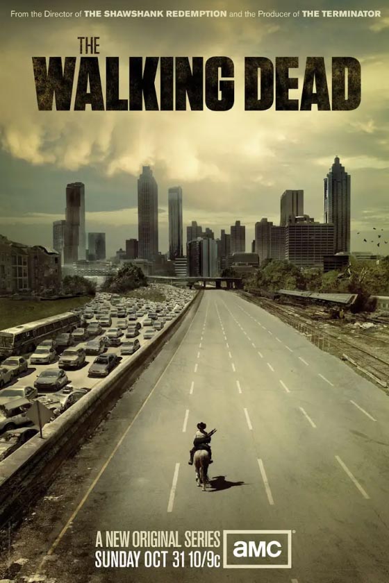
Some observations on the strategy of illustrative brand identity transitioning.
I know this is a reach for many of you—as a watcher of the series— but it’s the season, so a reference: happy halloween.
Perhaps also likely, you wouldn’t be caught “dead” watching
any part of this type of storytelling.
I study it more in the construct of theatrical brand management, transitioning art
from series to series expansion, as a point of distinction and narrative variance.
I was actually first exposed to the Walking Dead premise through Frank Darabont, the founding director of this series—through some of his other work—and secondly, the fact that it was being shot in Atlanta, right near where I was working on IHG and Holiday Inn, in Atlanta. We were working on
restaurant design programs for IHG properties in Atlanta suburbs.
As everyone who’s worked with me on motion picture-related work [and this is commentary, we didn’t design this grouping of evolutionary narrative identity shifts,] a number of our historical projects, there’s invariably a cross-over from one media form to another—like graphic novels to TV series, to motion pictures. This series is a complex franchise and, as a designer, I’m always studying the details of titling treatments—like our series work on Kelsey Grammer’s Boss, for example. Or Iron Man‘s evolutions. It comes down to responsive design for online power, design for billboards, design for print packages,
and, in everything, design for the main title.
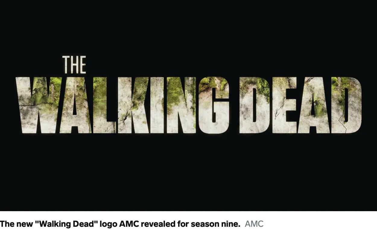
To reference the scale of the varied narratives—examine Season 9s logoed evolution: the “greening” logo—while earlier treatments focused on a progressive degeneration, the disintegration of society and the presumed dissolution of the world at large. This latter rendering evolves to a greener world—vegetation and concrete—an uplift, transitioning renewal,
the momentum of new potentials for protagonist survival:
You can see more of the expansive character of the storytelling in this Wiki overview on the television series:
Lists of The Walking Dead (franchise) episodes
“Six television series make up The Walking Dead franchise: The Walking Dead, Fear the Walking Dead, World Beyond, Tales of the Walking Dead, Dead City, and Daryl Dixon. All series in total amount to 319 episodes across 24 seasons of television.”
Studying the logo sequencing is—as I’ve blogged many times—
a point of key study for me and other GIRVINists.
As in:
Season 1
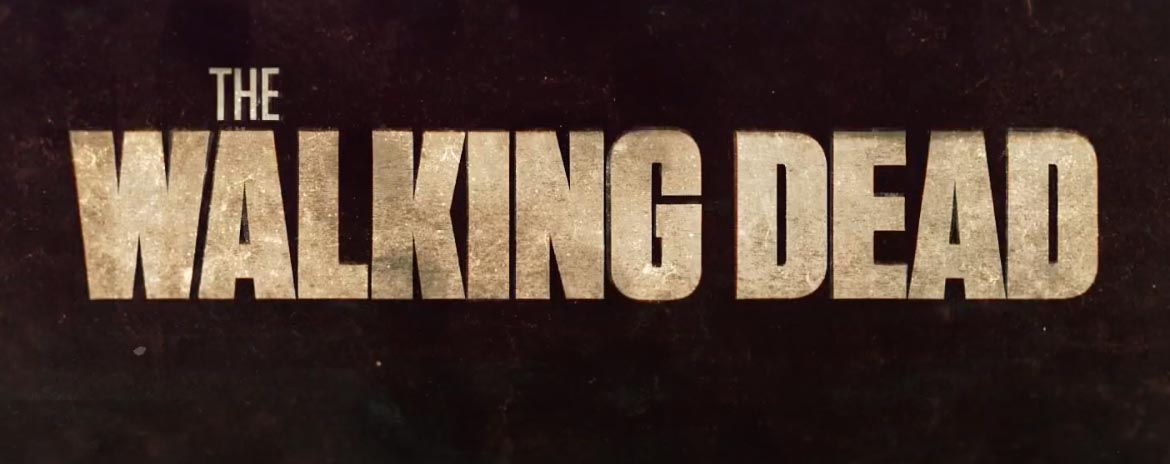
The original branding team that built this identity strategy was constructed around a robust font system, as in Tungsten—compacted, it can be varied—as the design strategists note—which is tactically smart, to evince different thematic treatments [remember the design strategy of “The Last of Us.”] in the sequence of narrative experiences. We’re using the same strategy in Flow-branding, to my tactical planning.
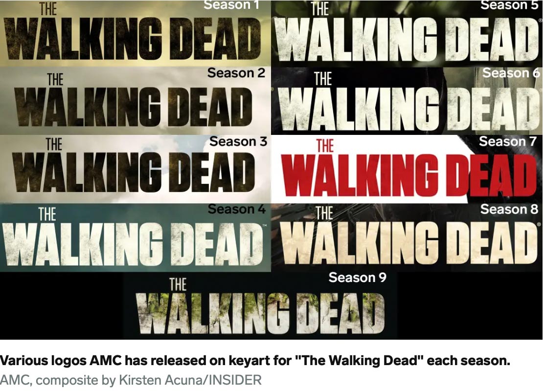
There’s a powerful strategy in storytelling the TWD narrative—the intermixture of post apocalyptic personality management, the ever-present challenges of Zombie control, and the warding-off of other less than desirable non-Zombies. And, of course, a design strategy that allows for evolution—that, as the storytelling treatment evolves, so too, the identity—stylistic implications are embedded.
You can see that sequence here—all seasons, the evolution of the identity history.
Here are some added
applications for review:
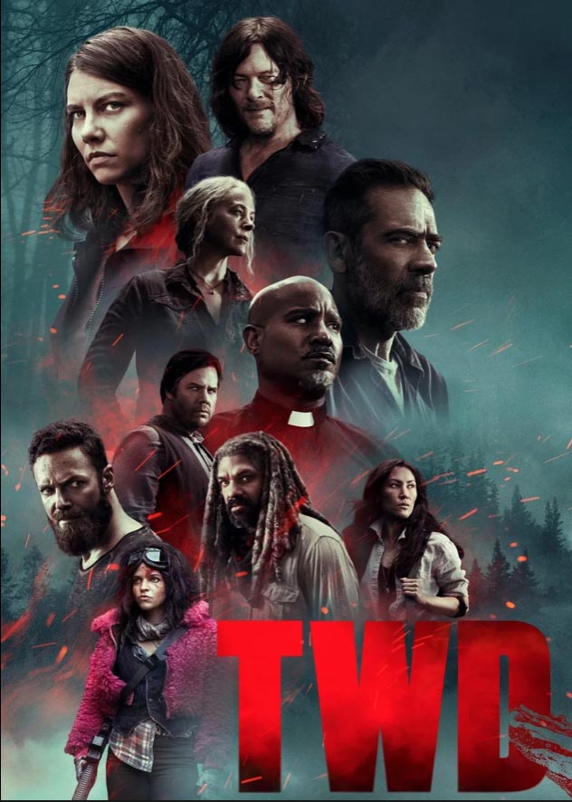
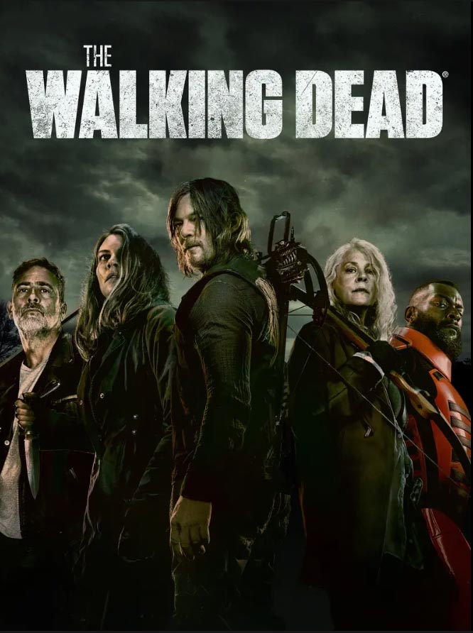
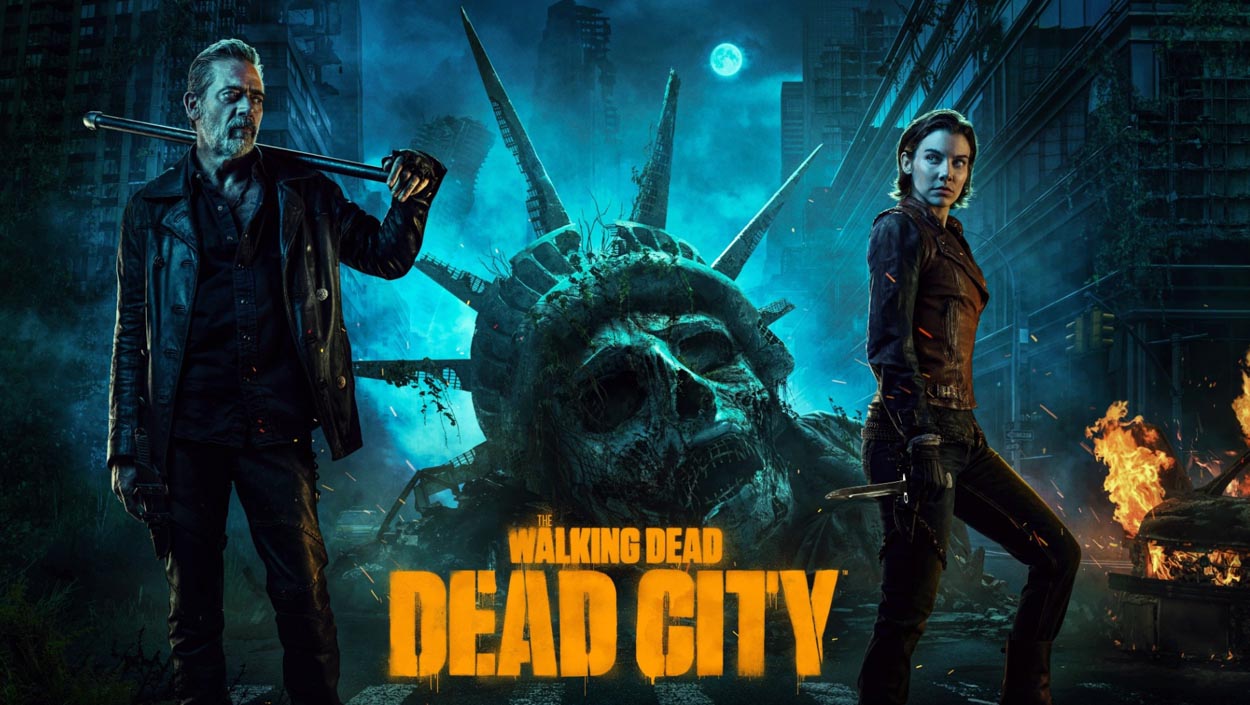
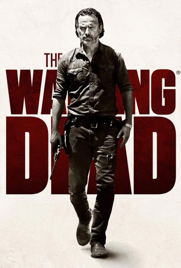
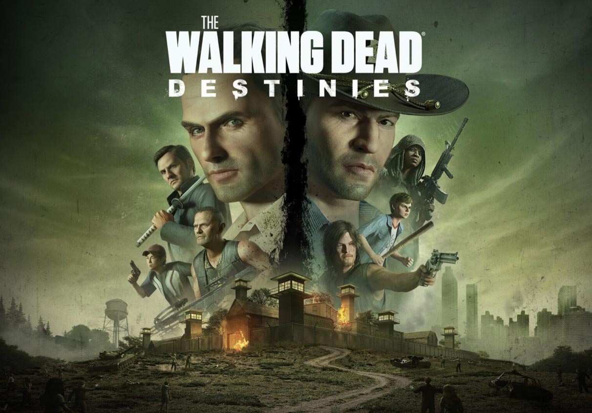
Some characters—like Darryl, below—have prolonged staying power. He was pitched by Darabont as a roving improviser, a slightly bad dude that knows how to get things done. Trustworthy, sort of. Now his, as well as others in the series, have their own separate narratives.
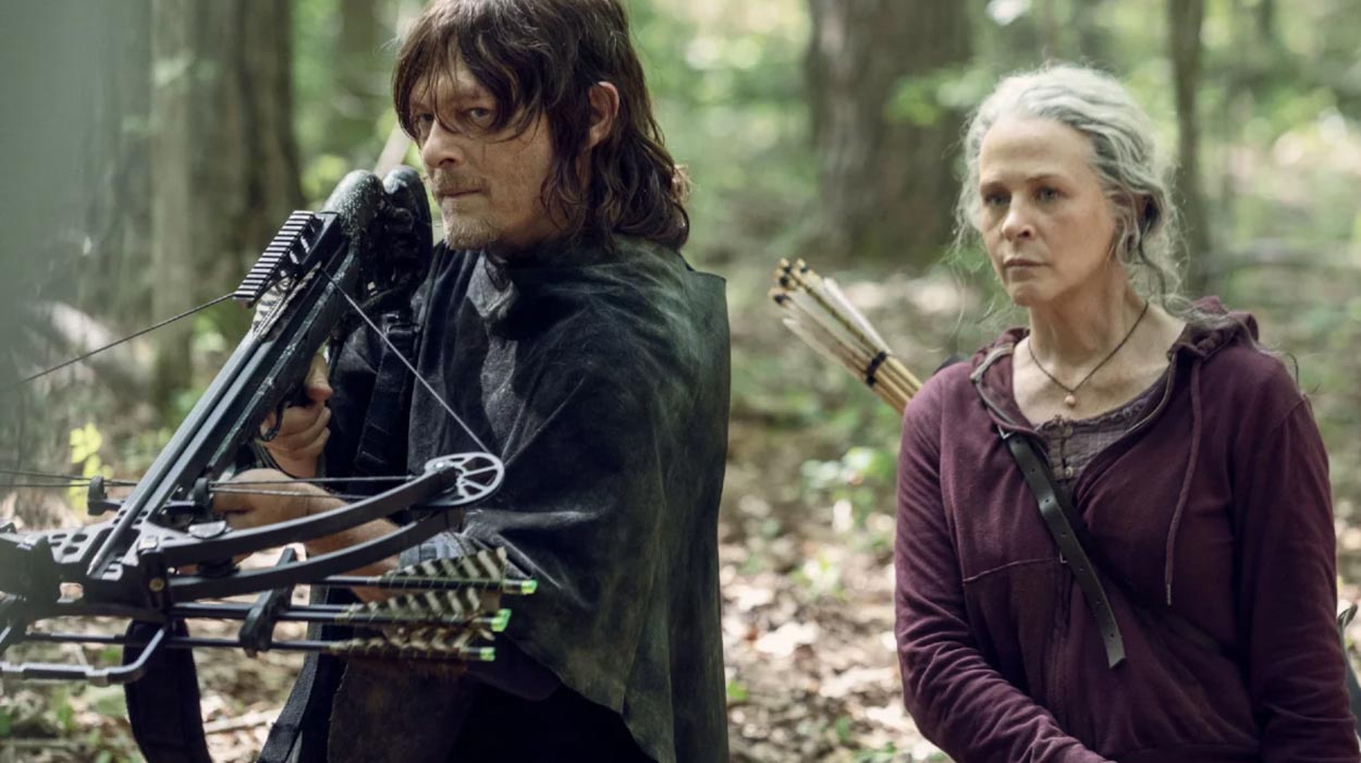
That character, above, led to a spin-out—in yet another expansion on the franchise—this design treatment spins to another discrete detailing—a completely different stylistic bent, which, in character, is perhaps in keeping with Darryl’s personality. As a designer, it’s what brought me back to the series, as in:
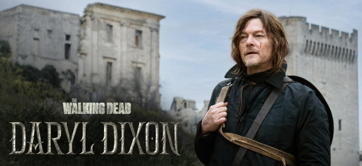
All images AMC+
When you think about it, the design packaging for series you’ve explored—
what’s a brand design package that you find memorable?
And what about GIRVIN, the spirit of Halloween and horror?
We have a lot of history, GIRVIN’s horror story.
Happy to
Everything.
Projects in strategy | story | naming | messaging | print |
identity | built environments | packaging |
social media | websites | interactive
––––––––––––––––––––
Tim | GIRVIN | Strategic Brands | Seattle, NY, Bay Area, Tokyo
digital | built environments by Osean | theatrical branding
waves | art | talismanika™