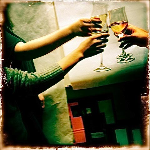
GIRVIN’s 50 years old—speaking of finely-aged, so we have history, and it runs back to wines that we’ve produced ourselves, gifted wines and wine brands we’ve built for enterprises in the US, Asia and Canada.
Wines are, as everyone knows, particularly challenging marketing encapsulations—they have a small real estate in their labeling characteristics—they’re represented in small shelf space. They are vastly arrayed in conventional supermarket experiences—100s of bottles—as well as convenience stores, pharmacies, and upscale wine merchants.
You can find them in monster shelving architectures in mega bottle superstores, and specialized gourmet environments—as well as wineries and onsite viticultural experiences, tasting rooms and regional collectives for wine-related culinary possibilities.
In this, the nature of wine is a complex tiering of experientiality—taste and scent, food pairings, sight, the palette, the distinction of its color on shelf—ownable distinguishment, the touch of a label, the heft of a bottle, the associated glassware with each wine type—the cultivation, grape characteristics and the soil, the tending and detailing of the vine care.
If one thinks about the brand storytelling that is exemplified in front and back panel narratives—what does the label say, and what, too, is the story with the back panel? That would be reflectively layering in the characteristics of the vine-care, the winemaker, family and tradition, the tale of the terroir, notes on the seasonal outcomes, winemaker observations and details of production.
The tiering of the storytelling of the label would be in:
the presence of the brand—as in—how “brand first” the label hierarchy would be—in some instances, restrained and recessive, in others, a louder, more insistently present call to customer recognition.
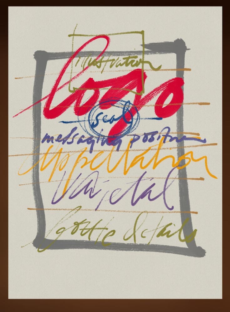
A quick sketch, as below, would layer that content as in: logo scaling—loud, moderate or restrained, illustrative content, seal or brand logo compression, messaging or positioning content, appellation, varietal, bottling and volume details. Seems pretty obvious, but add in the interplay of color, font size, typographical detailing, strategic stylistic framing [what’s the story, who’s telling it, who’s listening, what’s it look—and sound—like, and most crucially, who cares?]
HANDCRAFT AUSTRALIA | STANTON & KILLEEN
My first label was, in fact, an exemplar of the above modeling—this was for a 148-year-old Australian family vineyard operation—as they put it, “owned and managed by mother-daughter team Wendy and Natasha Killeen,” built on wool production, agriculture, and now “focusing on alternative Portuguese varieties, flavoursome Rutherglen red wine, and continuing S&K’s long tradition of award-winning Muscats Topaques, Tawnys and Vintage Fortifieds.”
The goal inside this brand effort was developing a labeling that was nearly monetary—as in, like: currency. To their take, an expensive product with a money-like label, to their farmer-founded brand strategy.
Made sense to me.
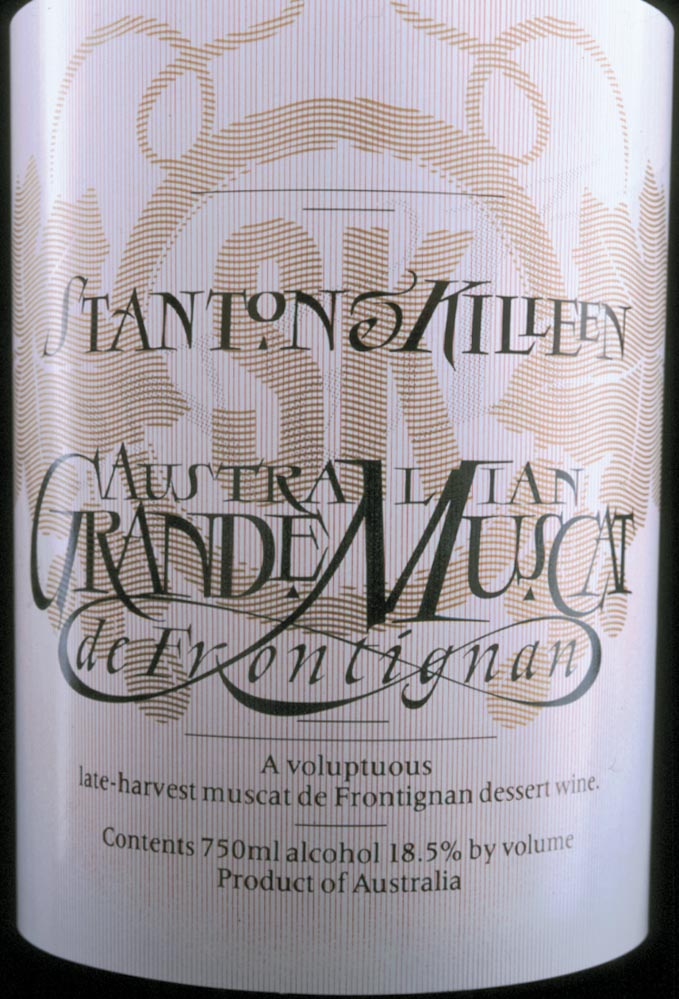
There’s a double-gradated, double-flipped, intertwined, vertical tapering rule system with a horizontal moire wavering cross-patterning overlay, with a golden-tinted substrate. Here, obviously, the appellation is above, the compression of the logo, the seal, is a substrate—the entire label is hand-crafted and a massively complex presswork.
AN OPENING FORAY | SUSAN ROACH AND SIMI WINERY
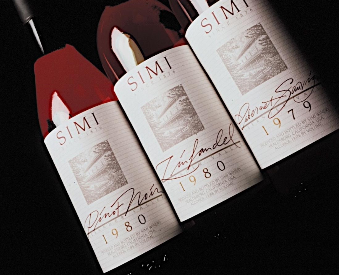
For Susan, the ask was, “these are fine wines, but they are modern, sleek and forward-thinking people—can you help me create something smooth”? Designed craft modernism.
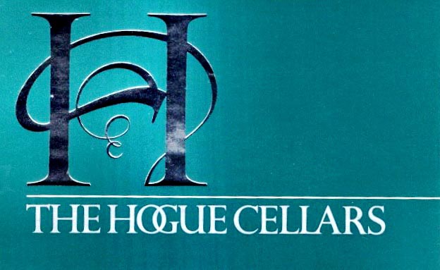
HOGUE HEAVEN | FAMILY BESPOKE BRANDING
I got a call from a farmer in Eastern Washington, Mike Hogue—he flew over in his own plane, actually—he flew it over, himself, landed at Boeing Field; and, one time, overflew the landing strip. He flew over for presentation review meetings, every couple of weeks—our team-up strategy, a strikingly unique device / identity cluster, an ownable palette, a bespoke-typographical system built with customized GIRVIN fonts, and a monogram—
the corkscrew of the vine tendril.
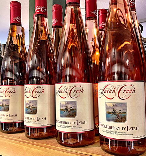
CONWAY’S BIRDS | THE FLIGHTS OF LATAH CREEK
I got another call, in a reach-out from Spokane, my earlier hometown and the residence of my parents, in this instance, from Mike [+Ellena] Conway, the vintners and founders of the brand, Latah Creek. There was a brand design formulary of memorable distinction—PNW game fowl,
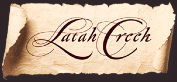
and a handcrafted, letter-spaced
script logotypography created in 1982,
still in play today.
HARRY ALHADEFF | WASHINGTON HILLS
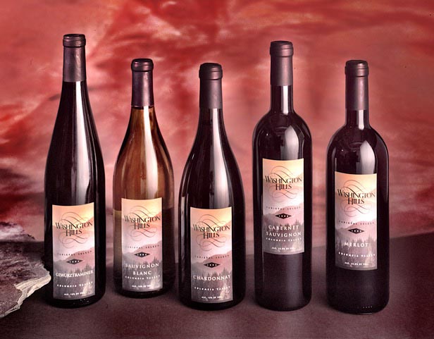
We worked extensively with the Alhadeff clan, on building-related projects, horse racing design promotions and our food conceptions for Victor Alhadeff—the Briazz program, among other projects.
For Harry, we designed a string of labels for Washington Hills.
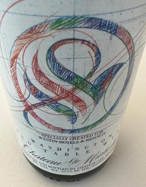
WESTIN WISDOM | CUSTOMIZED ART SIGNATURES
FOR FAMED F&B DIRECTOR JACQUES BOURGEOIS
Working on a string of projects for C-circle leadership
at Western International Hotels, then Westin Hotels & Resorts,
we were asked to create an art label, as an at-table
and in-room hospitality amenity. Hand-crafted
in full color, with pencils.
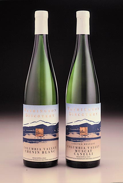
THE CASCADE MOUNTAINSCAPE | WASHINGTON DISCOVERY
Working with the Maletis Beverage clan,
we created a brushdrawn Cascade Foothills illustrative substrate—
and a tiny, stamp-like foil inset—and a split foundation gradation.
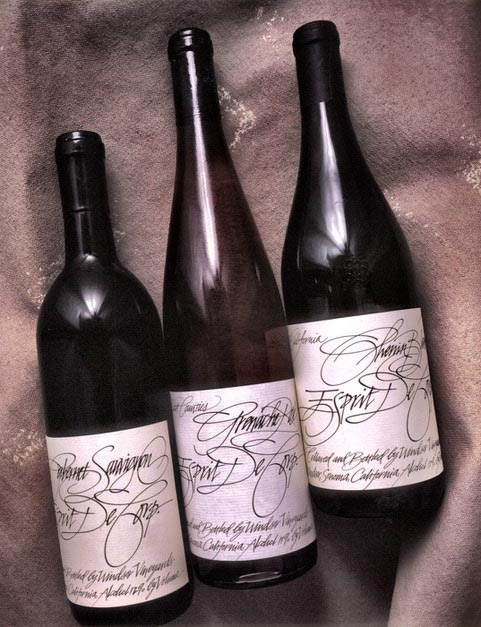
JOHN CASADO AND THE TOMPKINS | GIFT WINES FROM
THE ESPRIT BRAND FOUNDERS | SAN FRANCISCO
Working with design luminary, John Casado of San Francisco, he’d asked for help with a completely handrawn labels series, as gifts from Doug and Susie Tompkins, the founders of Esprit, San Francisco.
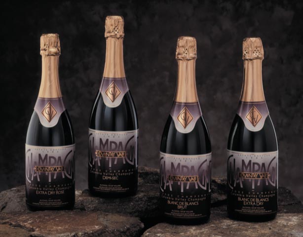
STRUCTURED DYNAMISM | CUSTOM FONTWORK FOR COVENTRY VALE
For a reach-out from Coventry Vale—“let’s do a traditional champagne, but livelier—
and in an entirely new ideas about color?”
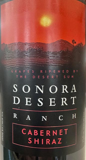
CANADIAN CLASS | INNOVATIONS FOR MARK ANTHONY | VANCOUVER
Speaking with CEO Anthony von Mandl and his team, the question emerges “could you innovate and invent the theme of a desert-related brand expression at shelf?” “Sure, we’ll call it Sonoma Desert Ranch.”
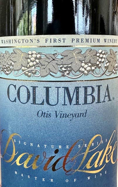
GLOBAL MASTERY RENOVATED | A COLUMBIA REBUILD FOR
WORLD WINE MASTER DAVID LAKE
What does it take to be a master? A kind of perfected taste, nose
and wine-making experience to be among a handful of the
most knowledgeable wine experts in the world.
There are few and far between—and we continue
to lament David’s passage.
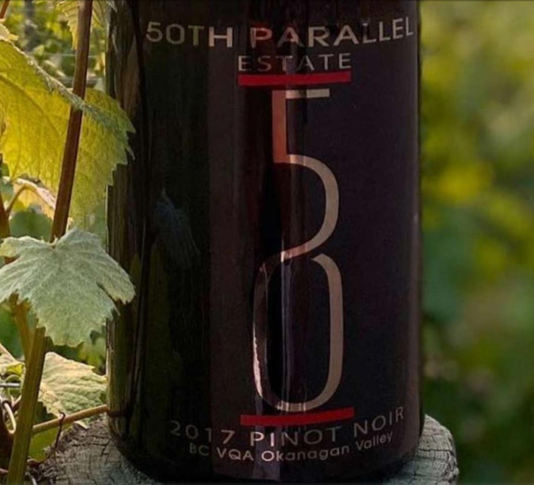
THE CANADIAN OKANAGAN | BEYOND THE 5OTH PARALLEL
Working with Curtis and Sheri-Lee Turner-Krouzel, we wove a brand language that founded a tapestry of applicability in experience strategy and embedded identity expression.
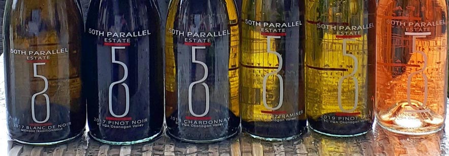
For the winery, taste never tires.
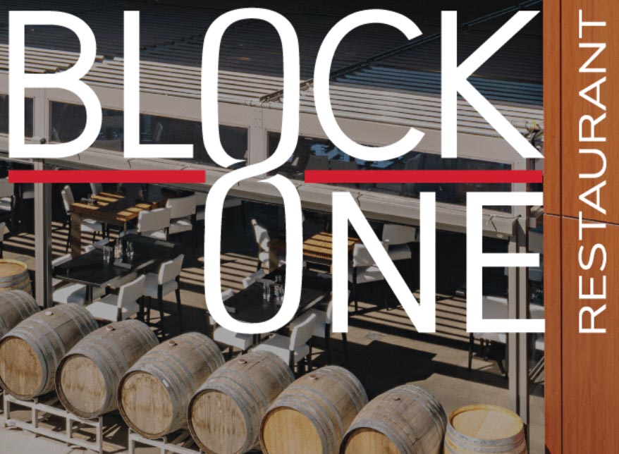
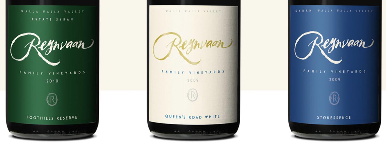
WORKSHOPPING WONDERMENT |
THE REYNVAAN COLLECTION | WALLA WALLA
Working with the Reynvaan Clan—workshopping, teams-up,
all-hands on, in a familial exploration of brand—BrandQuesting® we gathered the spirit
of Reynvaan, their dreams and visioning. We flew over from Seattle in a tiny plane, piloted by a
GIRVINist; we drew ideas in-situ, on the spot, summarized the experience,
recommendations and rolled onwards, Reynvaan.
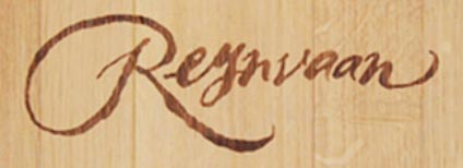
And barrel branded.
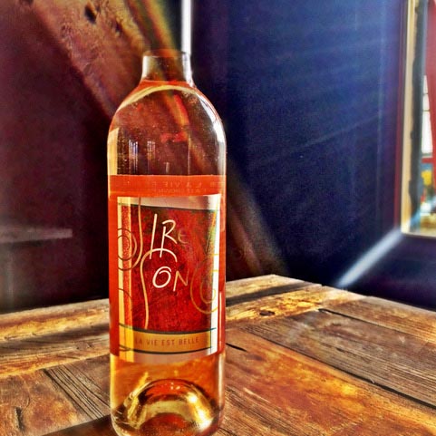
SINGING THE SONG | BRAND SYNTHESIS IN SITU, ON SHELF
We have a long—and relatively unknown history—with the founders of
Siren Song Winery & Vineyard Estate, Holly and Kevin Brown, earlier in a string of high-tech startups. I have, at the least, six email addresses for Kevin, in each of our earlier engagements—
Symform, VoteHere, Ontain, Visio and finally the monster launch of Tableau.
In all, I stay in touch.
Really, for years.
And years.
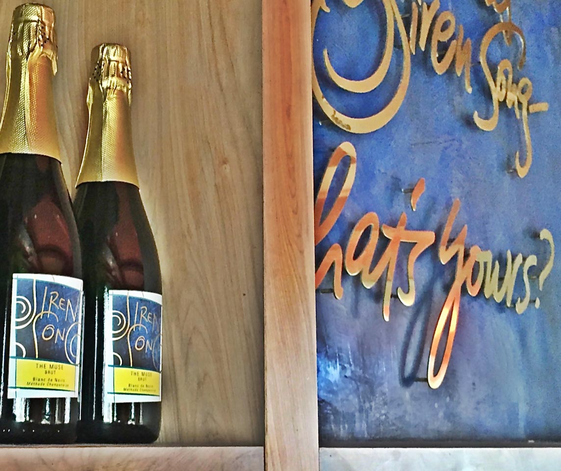
And still singing the song of the Siren—know well, our call.
Wine’s an experience—it’s an on-shelf rhythm,
it’s a holistic play of synæsthetic engagements—
it is the scent, the taste, the color, the touch, the sound.
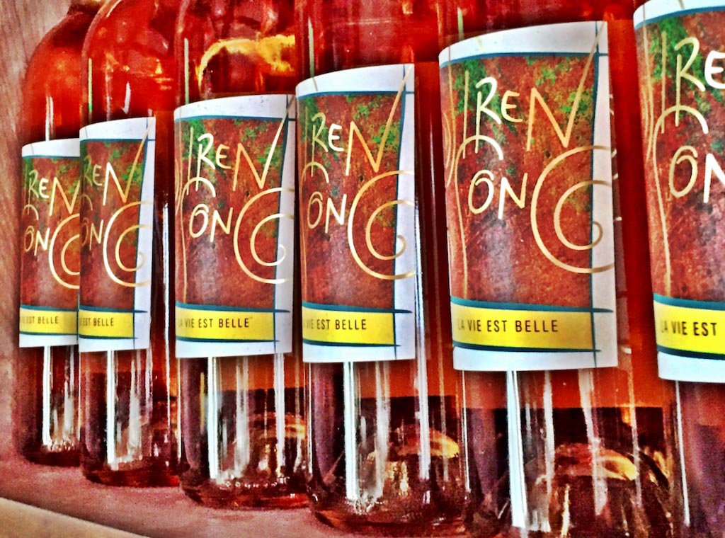
For Siren Song, we engaged with Holly and Kevin on brand strategy, using our hands-on BrandQuest® approach, in the early phases of construction at the Siren Song site, partnered on creating the interiors, specialized colors for walls—and labels—and supported them in the launch of the brand story.
Everyone has a Siren Song—and yours?
Curious about BrandQuest®, Siren Song Experience design, or the
Reynvaan Family Vineyards workshopping story, GIRVIN’s work on 50th Parallel Winery.
In the beginning, and the end,
every wine bottle must be filled.
Then emptied.
And then
filled, yet again.
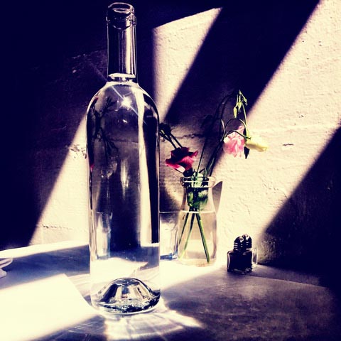
Thinking back, what’s your favorite wine journey?
Drop a note.
TSG | Copalis Beach, WA
––––––––––––––––––––
wishing well
Tim
GIRVIN | Strategic Brands
digital | built environments by Osean | theatrical branding
waves | art | talismanika™
Projects in strategy | story | naming | messaging | print |
identity | built environments | packaging |
social media | websites | interactive.