The Patterning of a Place, Storytelling Symbols in Space
Culturally, any explorer of the world’s architecture will sense and see symbolic dimensions expressed in how places are designed—a cathedral would be an obvious journey-making in symbolic expressions. It might be in the very plan of its arrangement. Like this examination of the geometric thinking in the design of Notre-Dame de Chartres, a 13th century cathedral—located in its eponymous site, Centre-Val-de-Loire region, France.
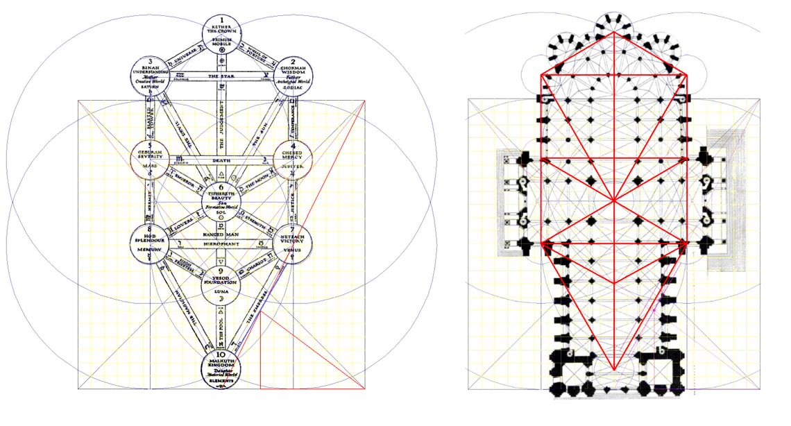
The construction of this edifice spanned several hundred years—but the principles of its plan adhered to an inherently symbolic cruciform structure. As medieval scholar, Otto von Simpson defines it, in his “The Gothic Cathedral”seeks to “understand Gothic architecture as an image, more precisely, as the representation of supernatural reality. To those who designed the cathedrals, as to their contemporaries who worshipped in them, this symbolic aspect or function of sacred architecture overshadowed all others.” To the long movement of the nave—there, in the central vista, a horizon along the columnar passage to the seat of the cathedra—a graphical patterning. This one has import—a classical representation of the maze, an interpretation of the labyrinth. Of course, as everyone knows, the notion of a maze is an a-mazement, it’s a place of the acknowledgment of journey, a wanderer wondering.
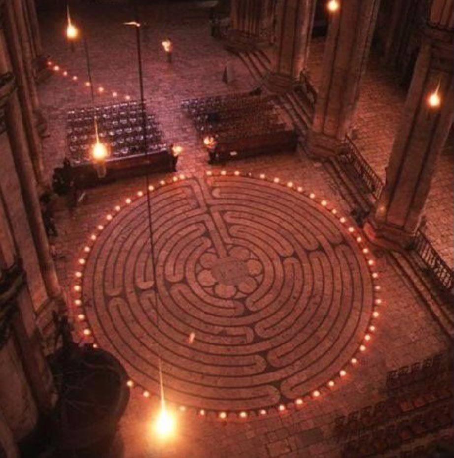
Adding a graphical expression of journeying movement—a-maze—deepen the tiers of experience strategy: amazement—if one could call it that: UE. More so, it was about the power of the sensate storytelling and the contexts of intentional meaning in place. Entering the place—the expanse of the wanderer looms out before the visitor, a vast spectacle of spiritual presence—a building of astonishing interior presence. In an edifice like this, it’s a supernatural expression—over-natural, shown, too, in this patterning in the floor at another cathedral, La cathédrale d’Amiens, France.
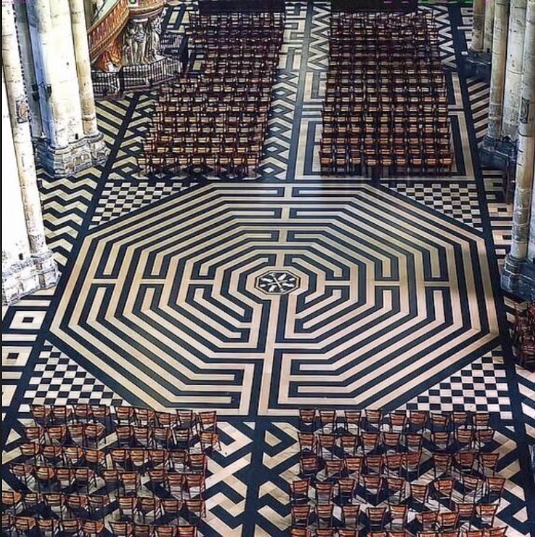
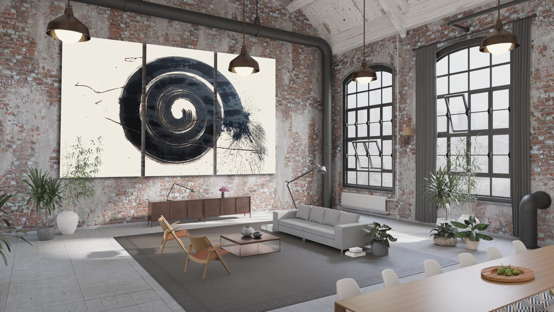
I take the labyrinth as a deeper stride—actually as a whorl, drawn with a giant brush, mounted as a patterning and a statement to the experiencer.
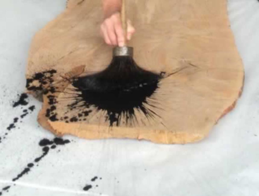
The idea for this type of graphical explication comes in a triple collaboration—in one, an earlier brush-drawn demonstration on industrially-harvested timber at Meyer-Wells, live-drawn on cleaved slabs from fallen lumber.
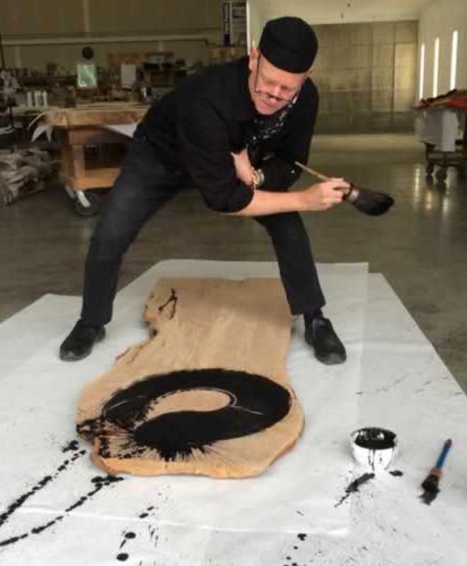
The second collaborator, Coriander, a craftsman group of bespoke built furniture options and installations, custom cabinetry, and upholstered items. In this collaboration, we’re looking at graphical expressions in placemaking—as shown here.
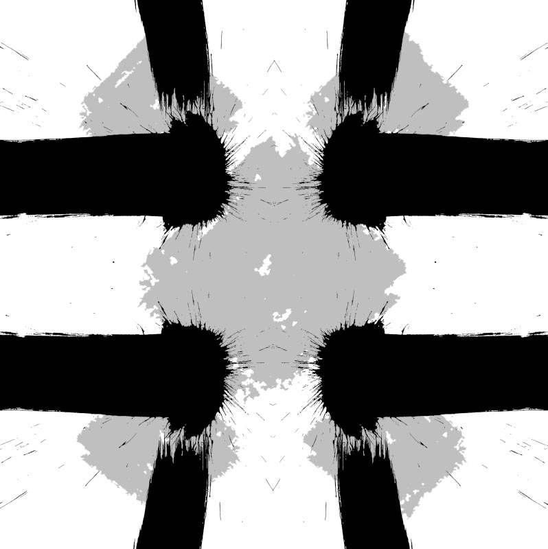
The triangle, for example, as I’d referenced in our earlier discussion on The Designers’s Grimoire, our collection of symbolic devices—points to a pathway: it’s getting somewhere to the observer—it’s the lookout’s watch to the next pathway, go someplace—but too, there are palimpsest watermarks of other symbols which act as added storytelling to a crossroads-question of choice-making, as well as a giant containment stroke—circle-out and in, the enso.
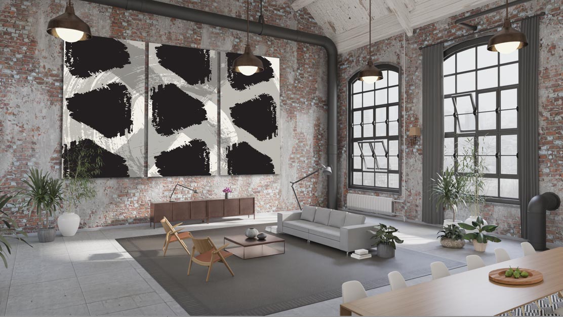
Those symbols can be broken out as simple graphics.
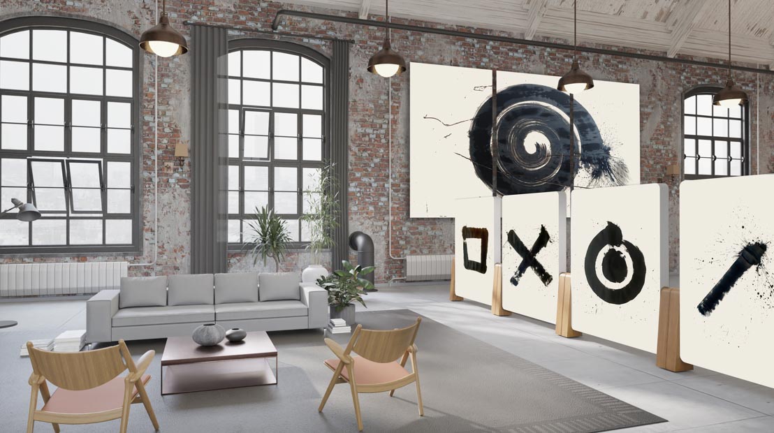
That visual graphical packaging could paneled, as shown,
but adding tiered patterning, as underlays, pattern on pattern.
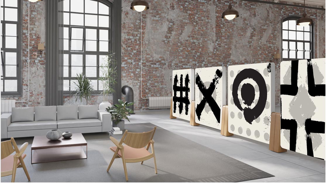
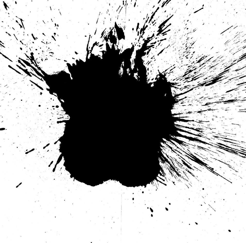
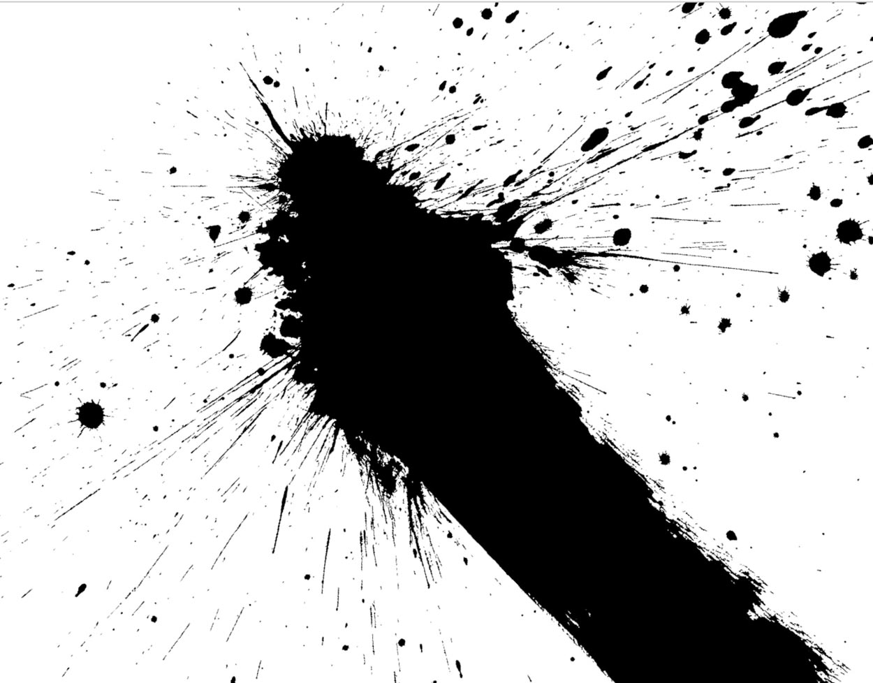
That backs up to that symbolic pattern language—as in the sequence I’d referenced—that would be: the spark of the beginning, the brushstroke of the nothing to the everything. There was nothing. And then there is a plane, a field of recognized planarity, there is a perception of field, it’s not “no-thing,”
it’s some-thing, the spark of wild beginnings.
A line points in a direction—
it sets a sense of dimensionality and spatial recognition.
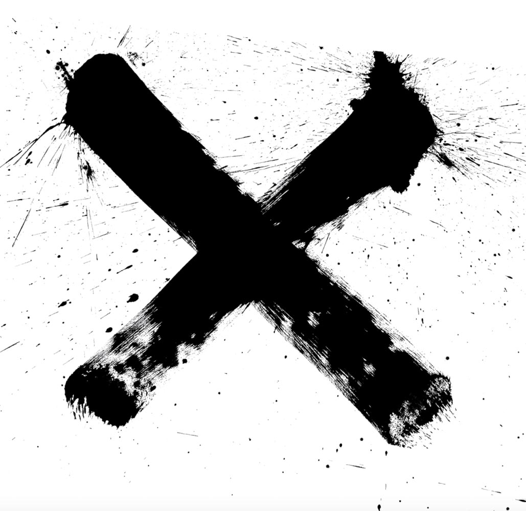
That leads to another tier of spatial character—the X, which is the plane for one, to another, it’s dimensional—it’s skyward, it’s earthward, it’s north, south, east and west. The X is the rune for gebo, which is “gift.” But it’s a map, to one place—yours, the choice. Which way, from here?
That can be another intertwinement, the loom of planes,
the tiers of patterning, the warp, the weft.

What was there, could be a patterning on the stroke and what is not the stroke—the square, which is containment. Any patterning is about what is and what is not—
what is seen, what is drawn, and what is
not drawn, it’s how the “seeing” is.
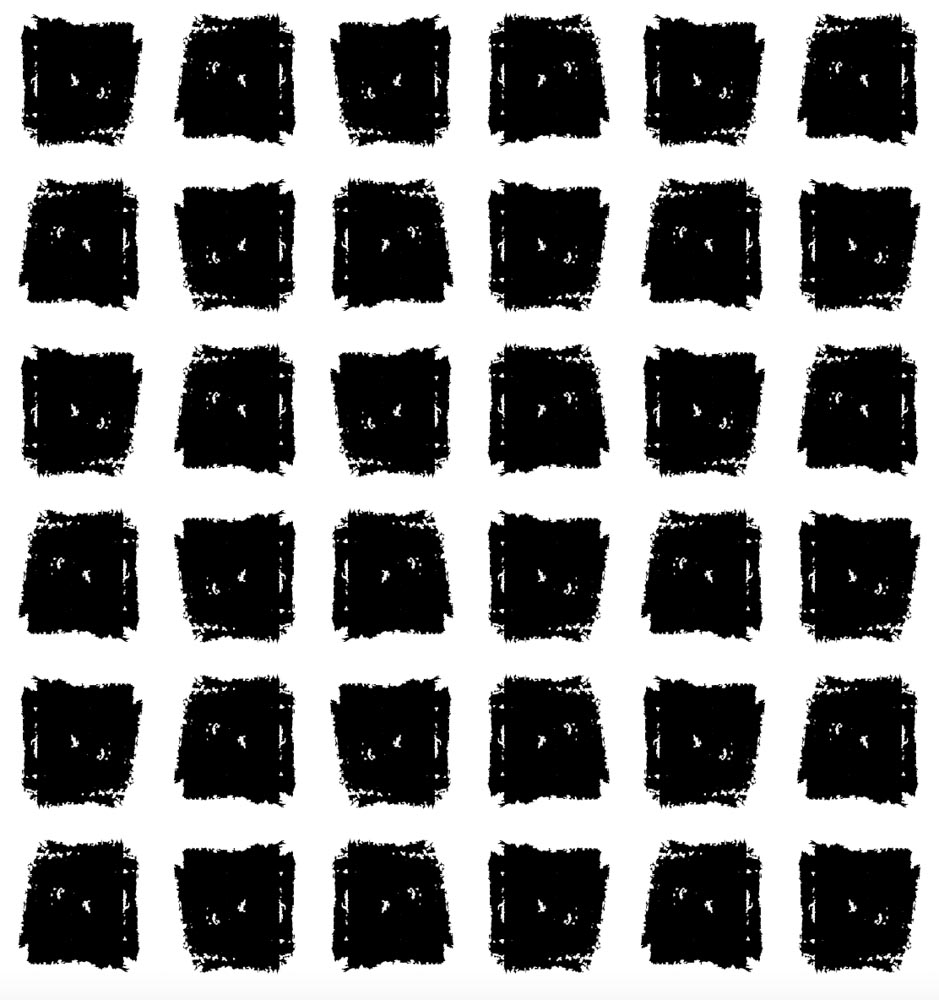
What there is, what there isn’t. That which is marked, and the place-between.
It’s been said that understanding is really “inner-standing,” as in
a knowledge set which is “knowing what stands between,” closer in, one knows more.
You see the stroke, and you see the white and unmarked place.
There’s the square in black and the square in white.
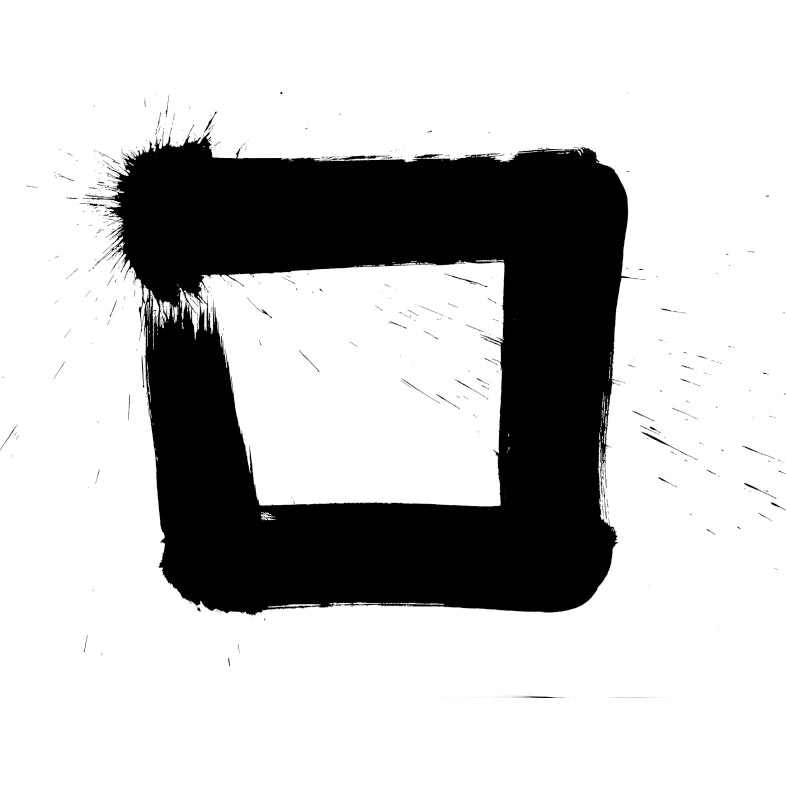
Stroke on stroke, palimpsest-watermarked, containment, opening. In this manner, there can be a patterned storytelling that draws one into a place, that could be a portal to another. When I think about patterning—and journey-making into places, I’m curious about the messaging of how these expressions come to an experiencer. Could be subtle, or dramatic, whispering or loud.
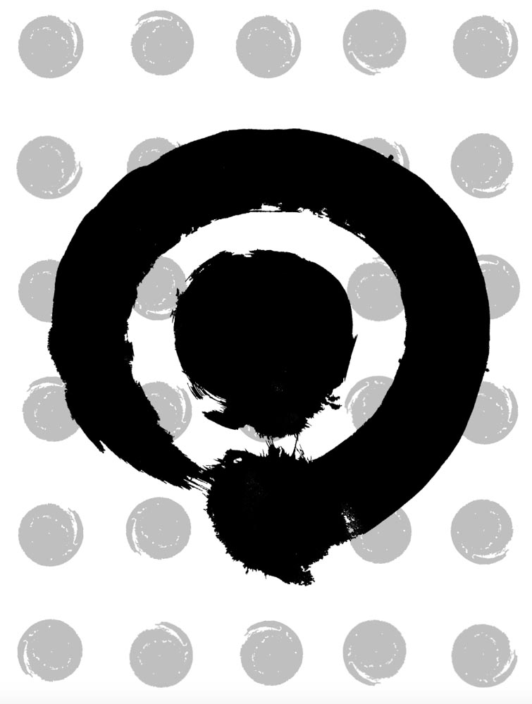
The circle round, patterning and the bullseye—
this softer storytelling speaks to the place-making
of a serene pathway, contained and “held”—
it’s a holding, a reach around, an
embrace or grasp.
Rather than abstraction, could you look at messaging?
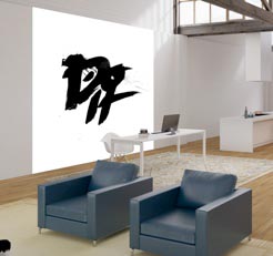
This graphical patterning, now alphabetic could manifest the voice of a team, the narrative or key positioning of a brand, a shout-out to premise, promise and expressive storytelling. That would be another form of a graphic patterning. If people can’t read symbolic abstractions and place-making sigils, could they be words, as a talismanic shout-out?
This is what we are, who we are, what we stand for—
this is why we’re here.
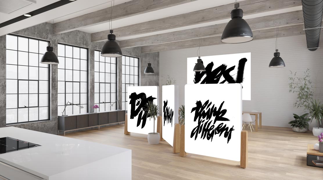
Perhaps a high-minded corporate statement could
be balanced in a broader, living-oriented affirmation?
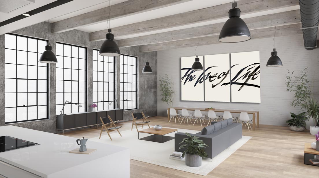
The core message here lies in two factors: one, the symbolic notion of a patterning language that speaks to a psychic place-making orientation that leads experiencers into a journey of reflection, contemplation and presence in the context of a place. And two, using graphical messaging as a way to call-out principles in action, premises of leadership, employee wisdom and the voices of engagement. Working in the context of panel-related built environments, there is fluency and resiliency to continuously evolve messaging and design treatments for experience.
For me, that comes out to deepening journey-making and environmental experience in a manner that storytelling is told, noted and embraced in the stride to make one’s way into the dazzlement of an environment.
To a built, patterned expression, I’ve named these details as Talismanika™—there’s a booklet Designer’s Grimoire that you can order from Gabrielle Girvin <ggirvin@girvin.com>.
Or reach to me to learn more—girvin@girvin.com—and how this thinking might be applied to your brand, projects or environments.
GIRVIN’s notes on
brand patterning,
And patterning in architecture,
and Brandcode®.
Brandspirit® patterning language built into brands and products and
Tim Girvin | Patterning, the design of the Matrix and his talk at the Future in Review conference [FiRe].
Projects in strategy | story | naming | messaging | print |
identity | built environments | packaging |
social media | websites | interactive.
––––––––––––––––––––
wishing well
Tim
GIRVIN | Strategic Brands
digital | built environments by Osean | theatrical branding
waves | art | talismanika™
