In the legacy of design thinking, there is a contemplation that the most perfected solutions are mechanically drafted, that is, the theory of rightful proportion lies in the principles of geometry as found in cosmical solutions, its marvelous symmetry and structure.
Astronomical and geographical—universe-related mapping, intertwining as a harmonic lineage, as the arc of time.
Curves, straight lines, waves, and measurement—harmony.
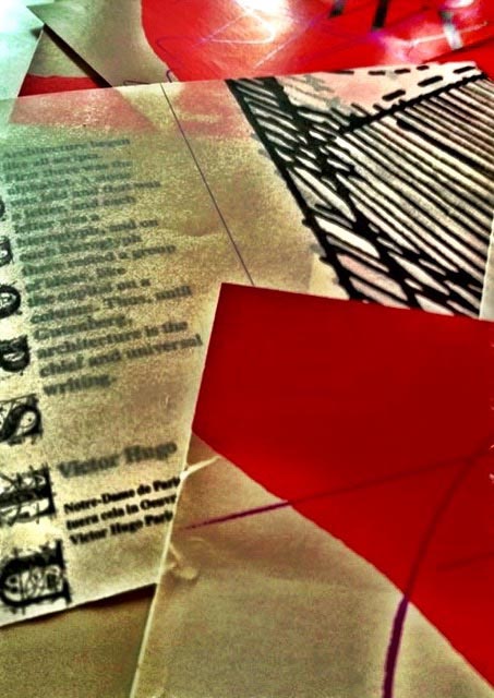
In the history of architecture [which, according to Victor Hugo [Notre Dame de Paris,] “began like all scripts,” as we’ve noted earlier, the art of building finds its roots in metaphysical interpretations of the universe—that is, the line of the horizon, the arc of the sky, and, back in the ancient days, the compass-marked foursquare of the earth. This has been further defined in the phrasing, “the circle of heaven and the square of earth.”
The squared circle, the circle in the square.
The symbolism of the place, made,
and the design thinking that creates it.
During college, I studied this at length, and built-out a study manuscript on cosmography, all handmade—and still in my possession.
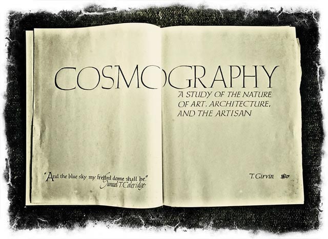
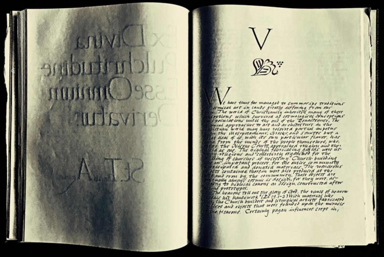
Internal pages look like this—and again, the book’s design was built on a medieval theory of classical formality in geometric perspective.
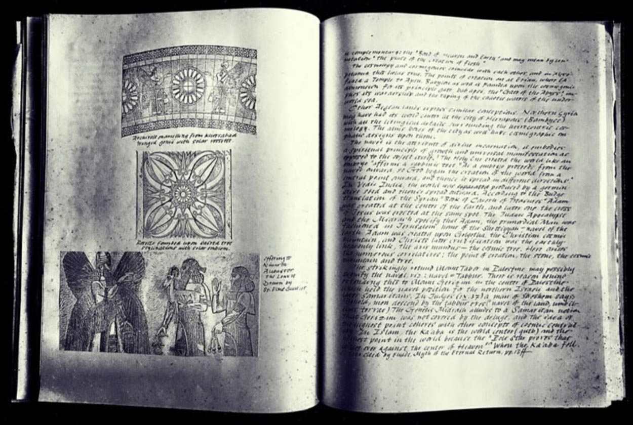
I created a central thread—a substrate geometry—and then built on that, page over page, drawn with ink and metal, edged pen tools that I cut and sharpened myself.
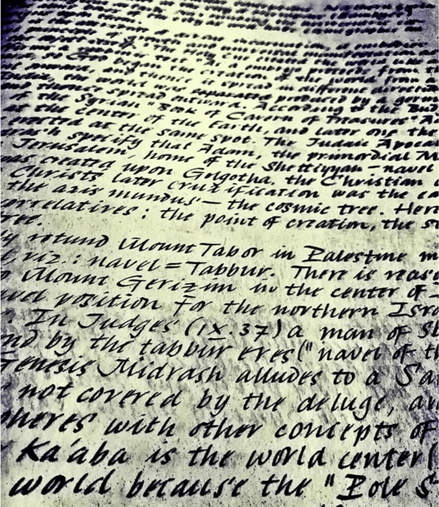
In a series of geometric measurements, I created snapping lines that centered alignments, page on page.
The meditation here is that everything has its own patterning—its own delineative, expressionistic brandcode®—which we’ve interpreted as a spherical expressive language, or brand patterning in our current work in architecture and brand design. There’s a visible vocabulary—a code—that ranges from messaging, imagery expressions, sound, scent, touch, and taste.
What to this idea of measurement?
For us, that would be walking into the meaning of the etymon—the true name of the thing—and, as Doug Harper has organized, his research shows an alignment with the earth—even more anciently rooted in the idea that perfected measuring is somehow deeper, farther reaching into the history of humankind and the earth. As he notes, in this string—from the most recent, to 5000 years ago: “early 14c., also gemetrie, gemetry, from Old French geometrie (12c., Modern French géométrie), from Latin geometria, from Greek geometria “measurement of earth or land; geometry,” from combining form of gē “earth, land” (see Gaia) + -metria “a measuring of” (see -metry). Old English used eorðcræft “earth-craft” as a loan-translation of Latin geometria.”
How could this be applied
to active principles in design?
For this project, Matriarch, we embedded geometric thinking into the modeling of the boxed packaging,
as well as the structure of the box and the badging of the logo-typography. So too, M, the 13th letter,
represents its own kind of geometric mystery—but that tactical contemplation can, if brand-relevant,
be aligned to the design thinking.

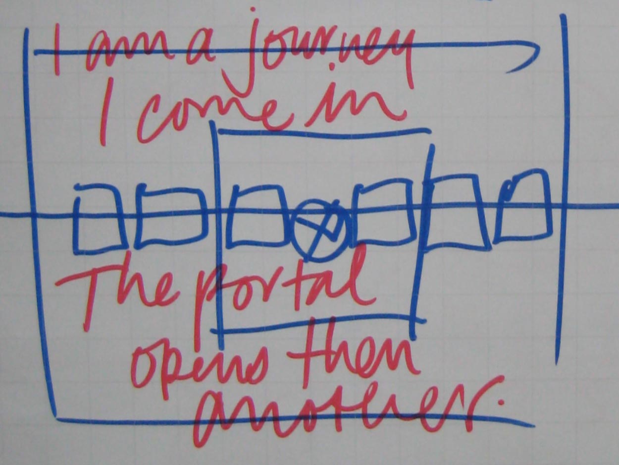
Geometry is a pathway,
a symbolic portal—
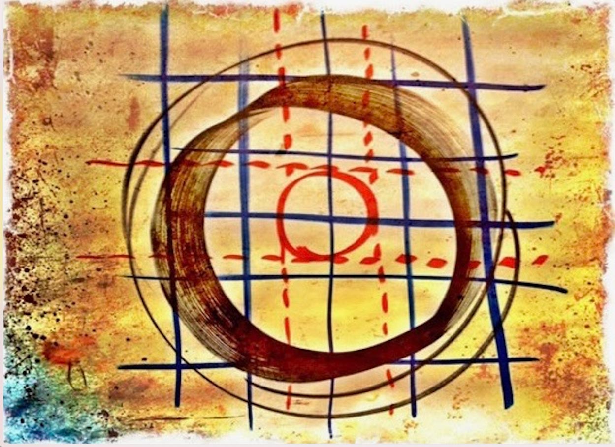
–it marks a line [curve, arc, line, point.]
As we evidenced in
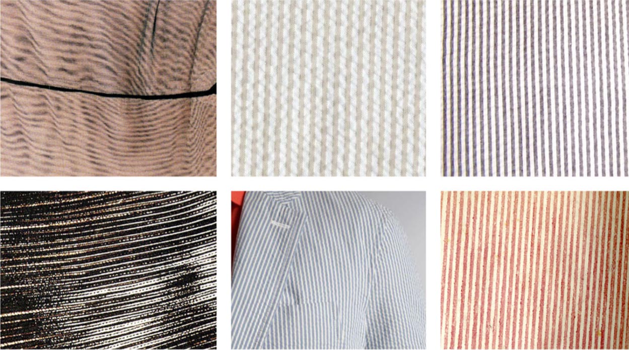
a project with Dawn A. Clark, AIA LEED AP. In this instance, a floor-wide metaphor of chalk-lined, tailor-marking system
of merchandising rethinking.

Make a mark to
move merchandise.

This is evidenced in other geometric design linguistics, part of our project conceptualizations and explorations for Nordstrom Irvine, CA.
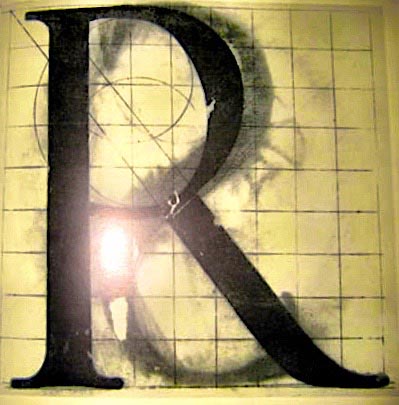
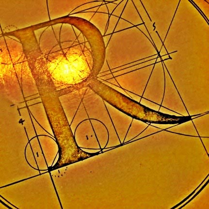
Earlier I’d seen the classical renderings of the most perfected letters of the epigraphy of the Imperial Roman monuments.
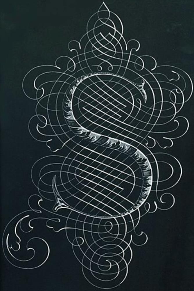
During the Renaissance, geometry was a way of storytelling Imperial Roman perfection—rendered here [1526-1601] by Giovan Francesco Cresci’s—Il Perfetto Scrittore [1570], as below—interpretations. The letters would suggest that such perfection could only been produced by compass, triangle and rule.
 g
g
In my own studies of letterforms—and their design thinking, I did, in a manner, offer a wilder interpretation of geometric interpolations of font design strategy. But I applied it as an afterthought, a manifestation of principles, not drawing the letter with geometry.
But rather, post-design, geometric romanticism.
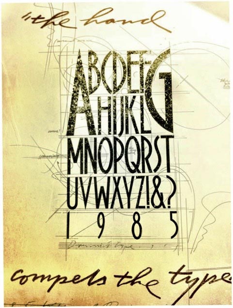
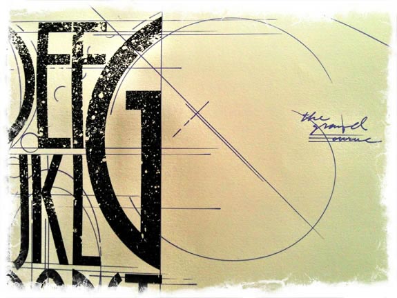
That extemporaneous rendering reaches back to an earlier interpretation, in a two-sided shopping bag for Bloomingdale’s, now in
the Collection at the Smithsonian, among others.
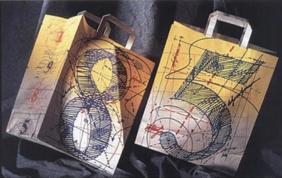
In the layering—understory in palimpsest, base-ground and overstory—the geometry plays, literally, as a storytelling of the energy of the art, as a drawing, over-drawing—taking static forms and bringing an energy with them. Also, again, the type is first, then the geometric interpretations are an expansion on the statically resolute font renderings.
They’re quiet, the geometries are not.
Perhaps that’s the spirit of geometry—it’s alive.
Thinking about the spiritual perspectives of marking, mapping, energy, symbolic pathways—you could go back, as I did, here:
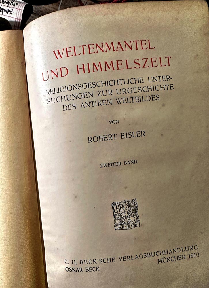
In English, walk around here.
Looking forward
Wishing well & onwards with the journey
Tim Girvin | Principal, Founder and Chief Creative Officer,
GIRVIN | Strategic Branding & Design
www.girvin.com
S I T V I S V O B I S C U M
MCMLXXVI
IBI FUNDATA
Follow Us:
Facebook LinkedIn Instagram Behance
OSEAN STUDIOS
B R A N D + A R C H I T E C T U R E | OSEAN
A collaborative partnership with GIRVIN’s teams.
