MOTION PICTURE BRAND DESIGN | MACABRE, MONSTROUS, HORRIFIC | STRATEGIC DESIGN FOR THE TWINGE OF TERROR
According to a high school buddy, now a Emmy-winning screen writer, horror is the new “it”—at least to his take, that’s what he’s focusing on. He writes with a legacy of screen writing with David Lynch, along with an incisive wending inside the scary tales-spinning of ChannelZero—an innovative format unto itself, more to a Borges-like labyrinth of fear.
When you think about horror—or anything scare-producing, you might be looking at two pathways.
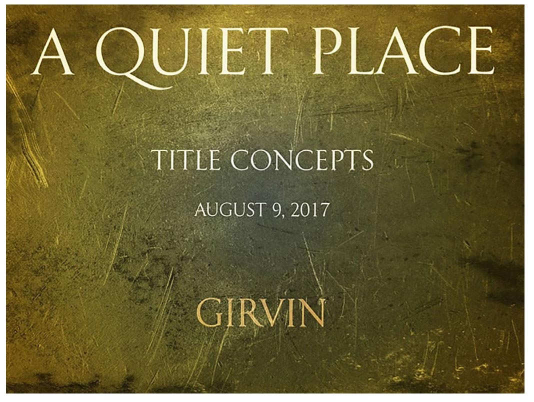
One is a calmer and more serene rendering—for example, like our renderings of “A Quiet Place.”
With a team at GIRVIN, some horror movie savants—as well as typographers, calligraphers and lettering aficionados—we talked about the question: how do you build-out that design strategy?
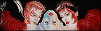
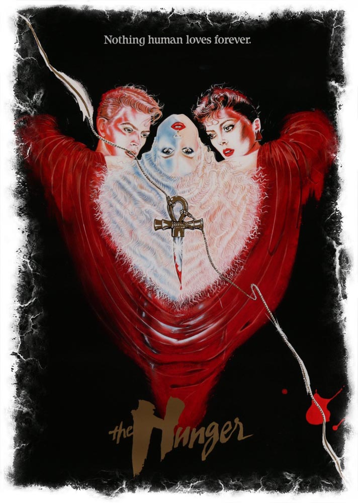
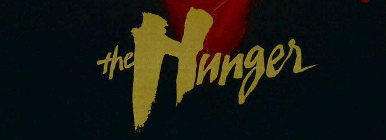
For one, at the header of the blog, “The Hunger” was a design solution that was looking for a fashionable reach-out to the likes of Catherine Deneuve and David Bowie, given Tony Scott’s artful rendering of the direction and cinematography. Sexualized, but bold enough to carry the upscale visual character of the film—“and make it different, something surprising,” according to Tony Scott’s design direction, something “unlike anything else out there.”
That came to:
If you think about monster movies, horror films or simply plain scary entertainment, invariably it moves into these two aforementioned categories—austere or illustrative. So, for example, Harley Peyton’s narrative-winding around Channel Zero is just tweaked, slightly—but still classically founded.

While Shudder, the horror channel, is based on a combinant strategy—classical, san-serif typography with a dithered tweak.

What’s the design strategy in creating brands around the horrific? Shudder is all-out hyper-horror—so pushing the edge is appropriate.
Our work ranges to aligning the marketing of the storytelling with distinct memorability. If there’s something to remember about a cinematic production, that would be actors, core imagery, marketing language and how they intertwine.
But what in that marketing is unforgettable?
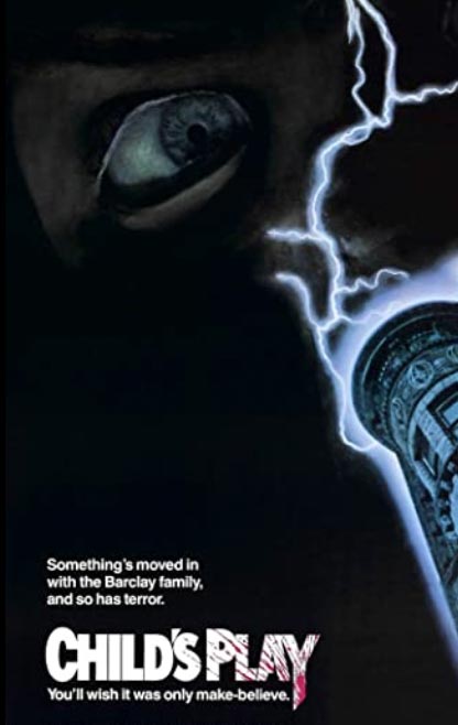
Childsplay, which we designed at the beginning of the franchise, launch one—the idea was to look at an identity strategy that could be, as well, a product—as in a packaged good, a box that Chucky comes in. That font rendering lies in a customized redraw of a Futura. Adorned with the horrific.
Outlined, conveniently, by Wikipedia.
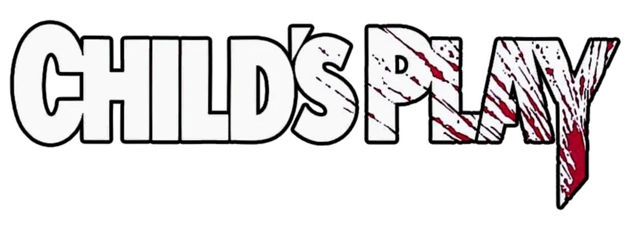
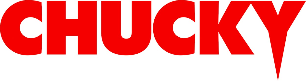
Which set the pace, later, for Chucky’s œuvre.
Designing a logo for a scary film: the principles would suggest
a tactical plan to design for memory, distinction, discretion?
Write a creative brief for that?
We call it: soul strategy—“what’s the spirit behind this enterprise?”
Brandstory—
there’s a link between flame of brand, and the torch that it carries as a story. And if it’s on fire, it lasts.
Thinking about—for example—a memorable film—surely you recall the story line; and likely you can recollect the actors, the sets, the production design. But too, likely, you remember the…
Name— the nomenclature can be a distinct recalling for any brand experiencer—and being “on brand”
And the outcomes in print and hybrid media—
memorable print, which translates horizontally to digital, both intertwine.
It might be said that horror lives in the dark side, the eldritch gloom—which, for a journeyer, sees the creeping gnarl, the crab-clawed creature; and horror howls of the spattered and splattered, it screams of the unnatural—indeed, the supernatural.
Anyone that knows me is well familiar with my history in the study of etymology—and the root of things.
That takes me immediately to the etymon of
horror.
From whence does it come?
Horror comes from, literally horror, the Latin word, which voices “dread, veneration, or a religious awe.” The Latin verb horrore which speaks straight to the physical manifestations of fear:
“bristling with fright,
shuddering from the fear-filled.”
What that offers is, perhaps,
the foundation for
a creative brief:
“gnarly,
thorned,
prickly,
scarred,
scratched
and roughened.”
This gathering plays to something of that spirit, from a GIRVIN brochure—
perhaps more to a mix, including drama and adventure.
All, illustrative, however.
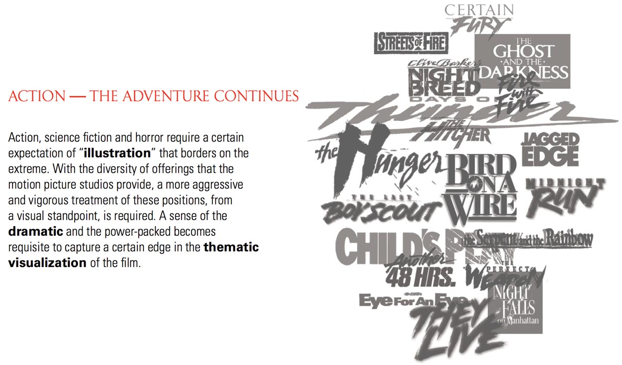
For the most part, the horror movie logos we’ve done have something of that spirit,
as in another etymological bridge: the Sanskrit harsate, “bristles” — as in “hedgehog” and the most ancient roots, of the linguistic nexus of the Proto Indo European languages, the so-called P.I.E formations —
“a ruffling of feathers”
as in the hackles of fear.
Literally:
hair-raising.
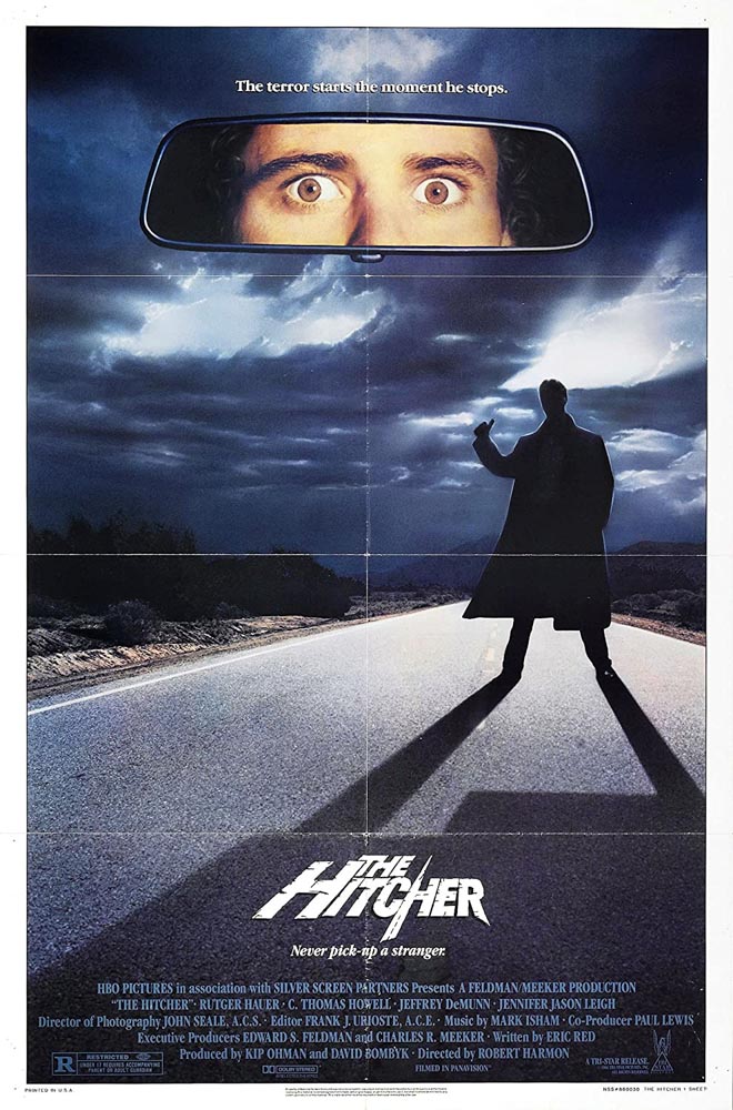
Fear stretches out, all along the highway.
All of these concept arts speak to what might be the
adjectival build of a creative executional strategy:
“shuddering, bristling, scarred and racked with fearful demeanor.”
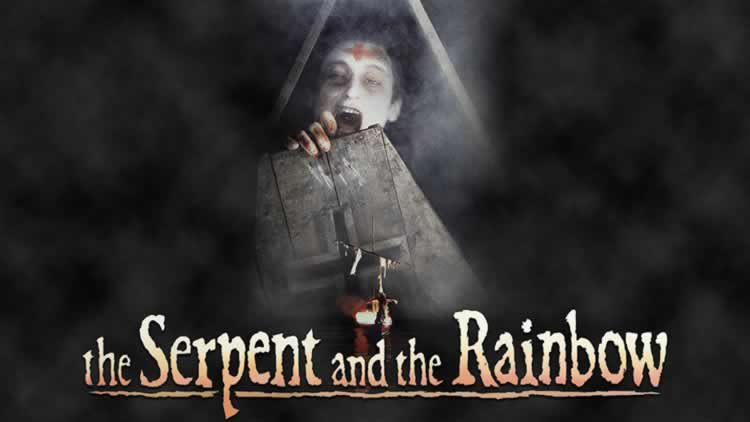
There might be deep fear in the construct of the living dead as identified in the anthropological study and later film adaptation by Wade Davis, a Canadian friend and scholar that I met with earlier, long past the time that I designed the identity for “the Serpent and the Rainbow.”
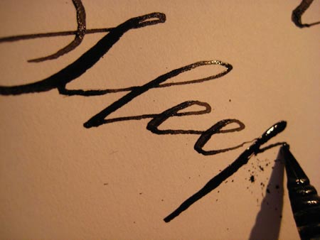
Below, a roughened font, hand-drawn in emulative inspiration of elder, post-revolutionary, American old style, woodcut and letterpress typefaces.
Davis studied the use of toxins that produce somnific characteristics in the Caribbean as a form of so-called zombification—it was his theory that the state of “living death” was actually originated in paralytic fish toxins that caused paralysis. If you’re interested, explore Wade’s alma mater overview—in Harvard Magazine.
And I have history with Wade, psychotropics and his professor at Harvard, Richard Evans Schultes, recounted here.
Other dreadful designs?
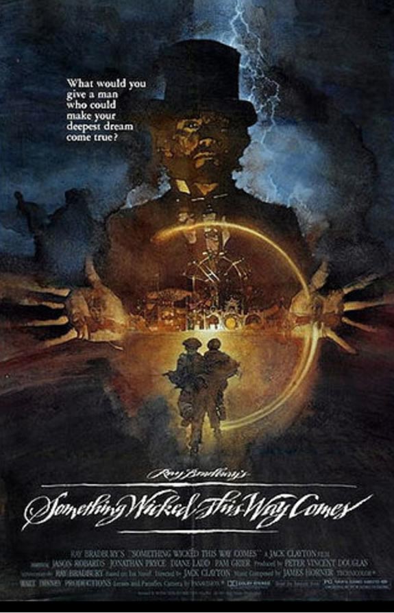
For Ray Bradbury, something wicked—scratched with a steel pen in 1983:
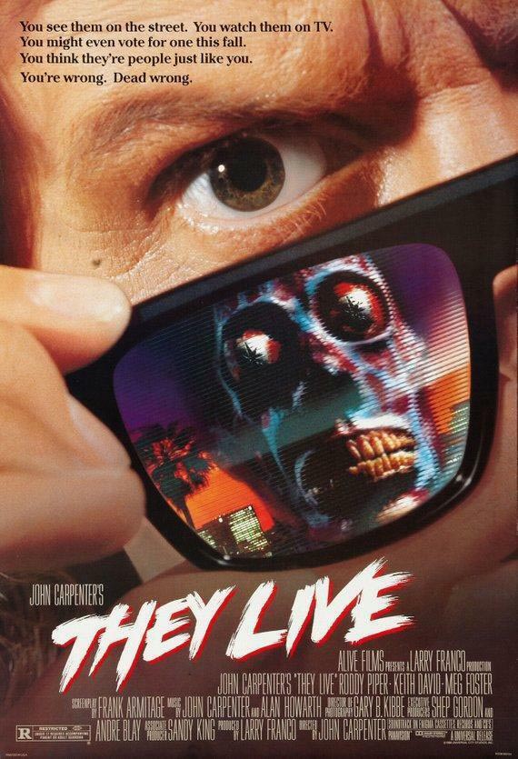
For John Carpenter and Universal [1988]
fear drawn with a toothbrush:
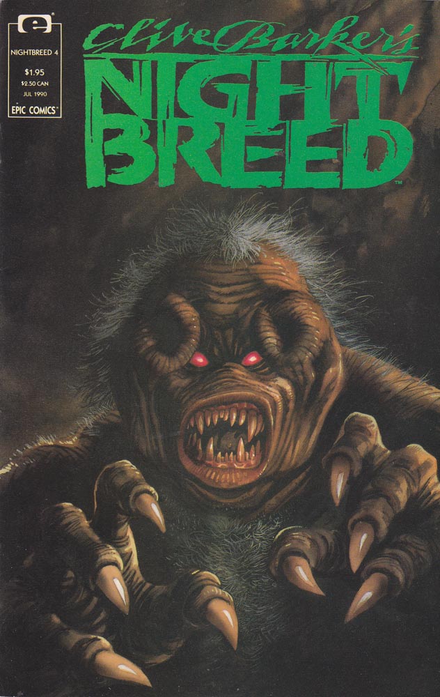
I got a call from Clive Barker, about a correspondence with him on “The Books of Blood,” we met up for breakfast at the Alexis,
downtown Seattle, to talk about another effort—which, after breakfast, became:
And this was revived in a later comic iteration, Clive’s newly tuned
rendering, 1990:
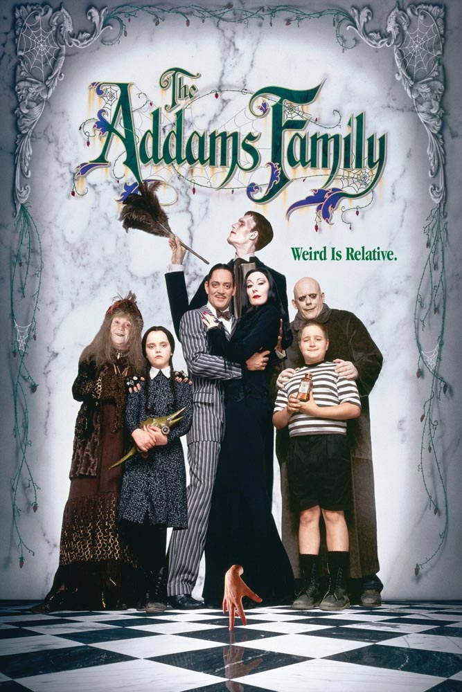
For Barry Sonnenfeld and Paramount, 1991:
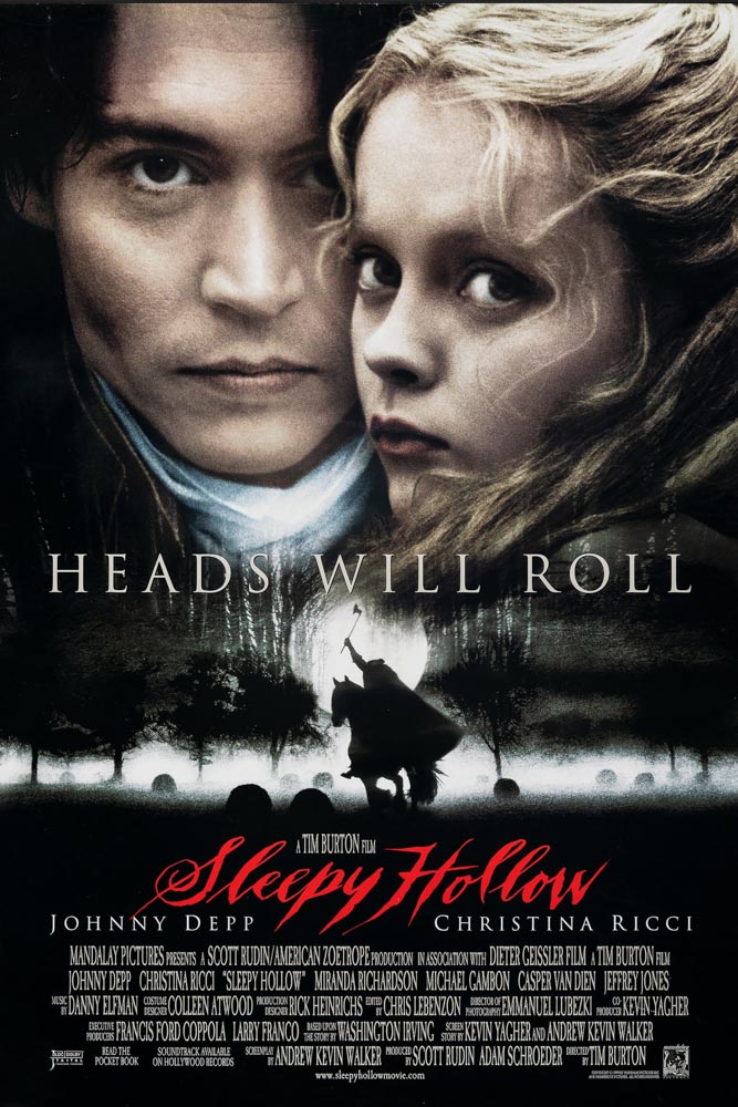
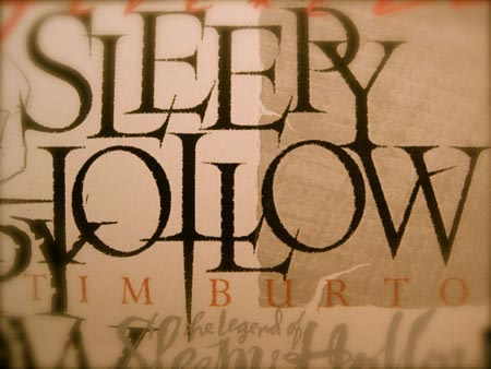
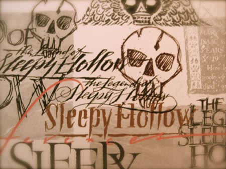
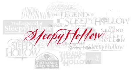
For Tim Burton, 1999, Paramount Studios.
There is something to that scarier telling of ghosts, mists, skulls,
memories of the dead and those that linger.
And the draft of the creepy,
black-blooded, spattered
strokes of fear.
Okay, what about family-appropriate dreadfulness?
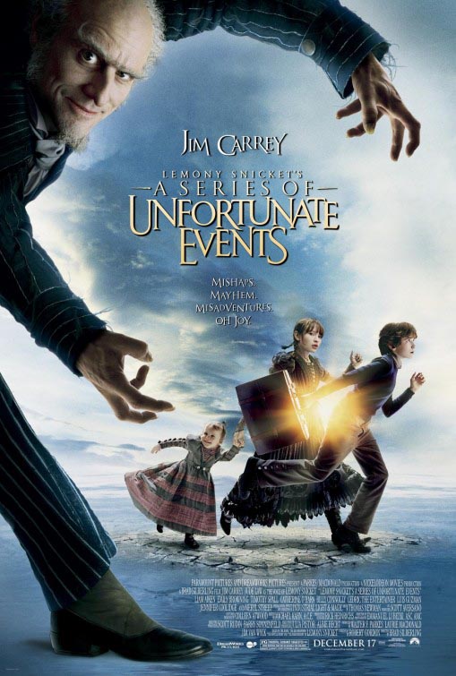
Something truly unfortunate, I’d imagine—a kind of warped classical customized font rendering—serene, then jumbled in the spirit of Lemony Snicket.
Some GIRVIN storytelling and
gatherings on the frightening—happily, hallowe’en:
GIRVIN’s COLLECTION ON BALCOMB’S SCREAM
Tim | OseanOccult | Copalis Beach, WA
…..
G I R V I N | DESIGNING MOVIES
THEATRICAL BRANDING + ENTERTAINMENT
IMAGINATION: AND THE TOOLS TO MAKE IT HAPPEN