Second Nature
The Challenge
Mix Signals
Kar’s wanted to realign their position to communicate their authentic, all-natural roots and dedication to instinctively good snacking across all of their snack brands, and breathe new life into their Second Nature Snacks packaging for better shelf presence and an updated look.
The Solution
Golden opportunutty
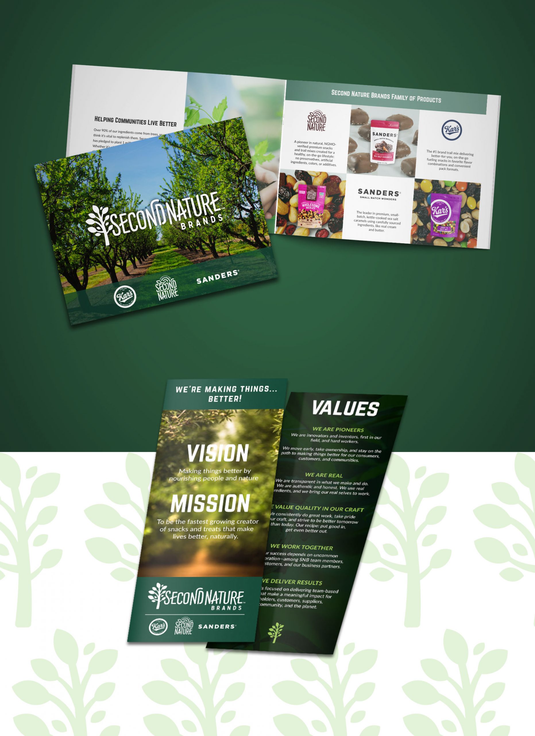
For a more natural realignment and positioning, Kar’s shifted its focus and redefined their brand nomenclature so that their overarching brand became Second Nature Brands. Under this umbrella would be Kar’s, Sanders, and Second Nature Snacks. We helped redefine the brand story, strategy, and positioning, as well as came up with the new brand identity.
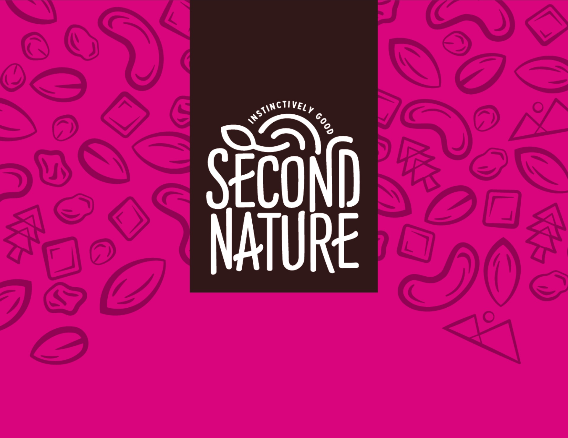
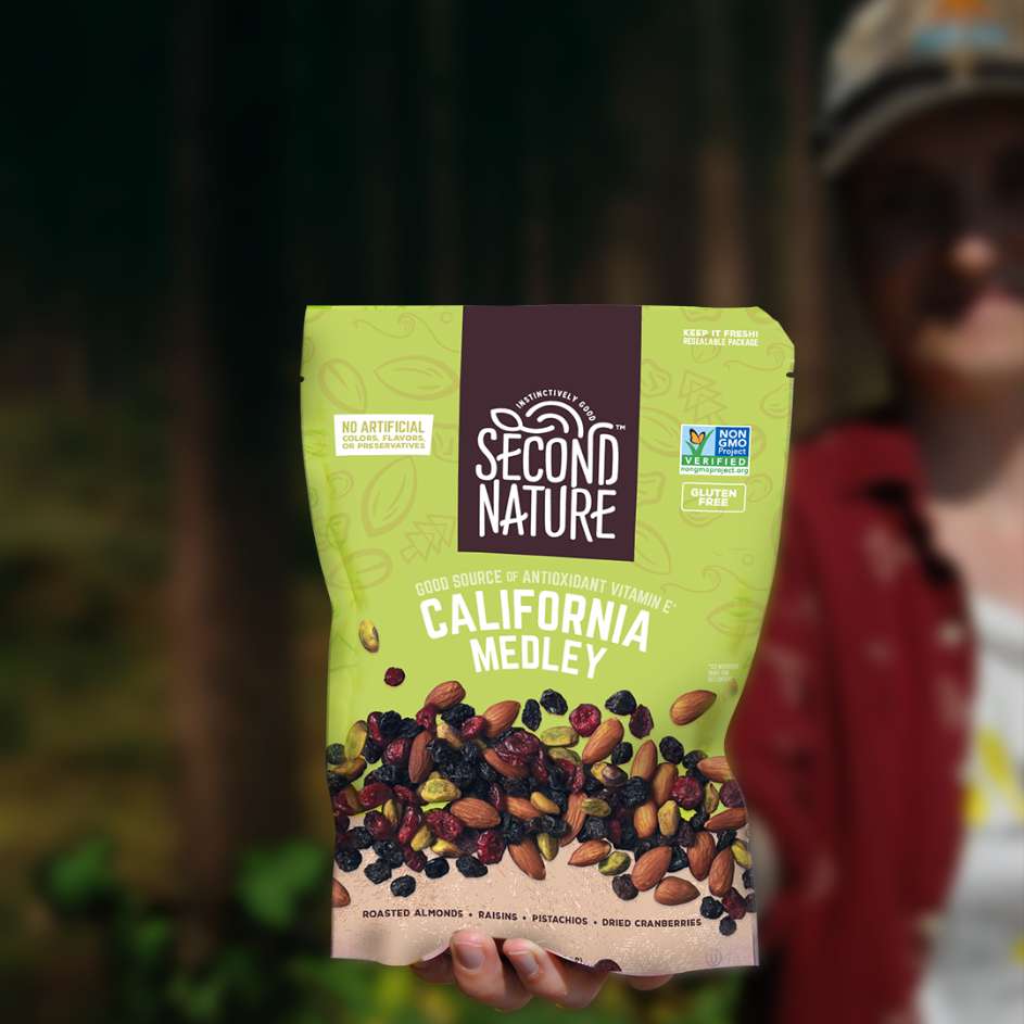
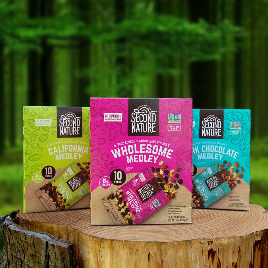
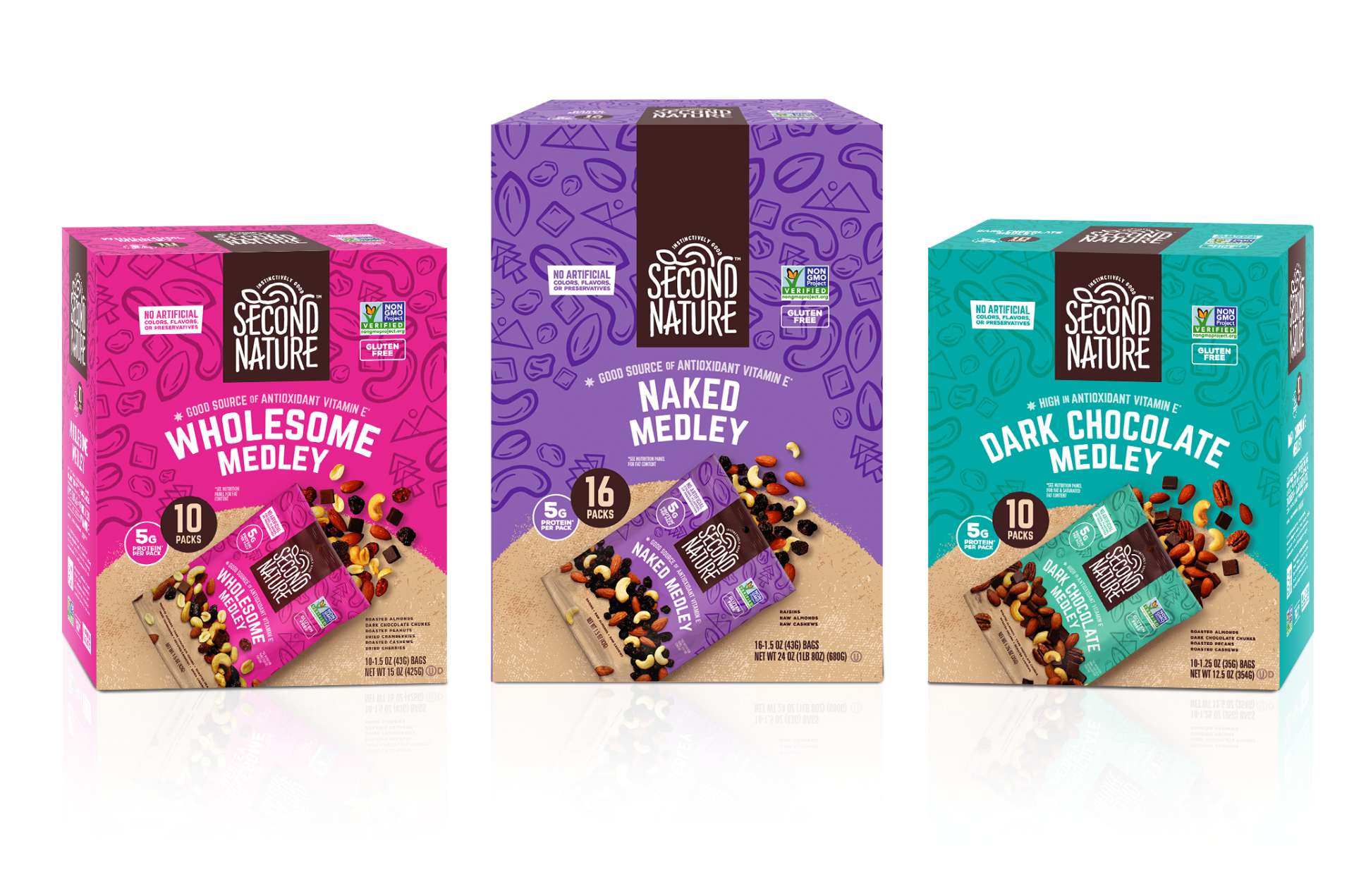
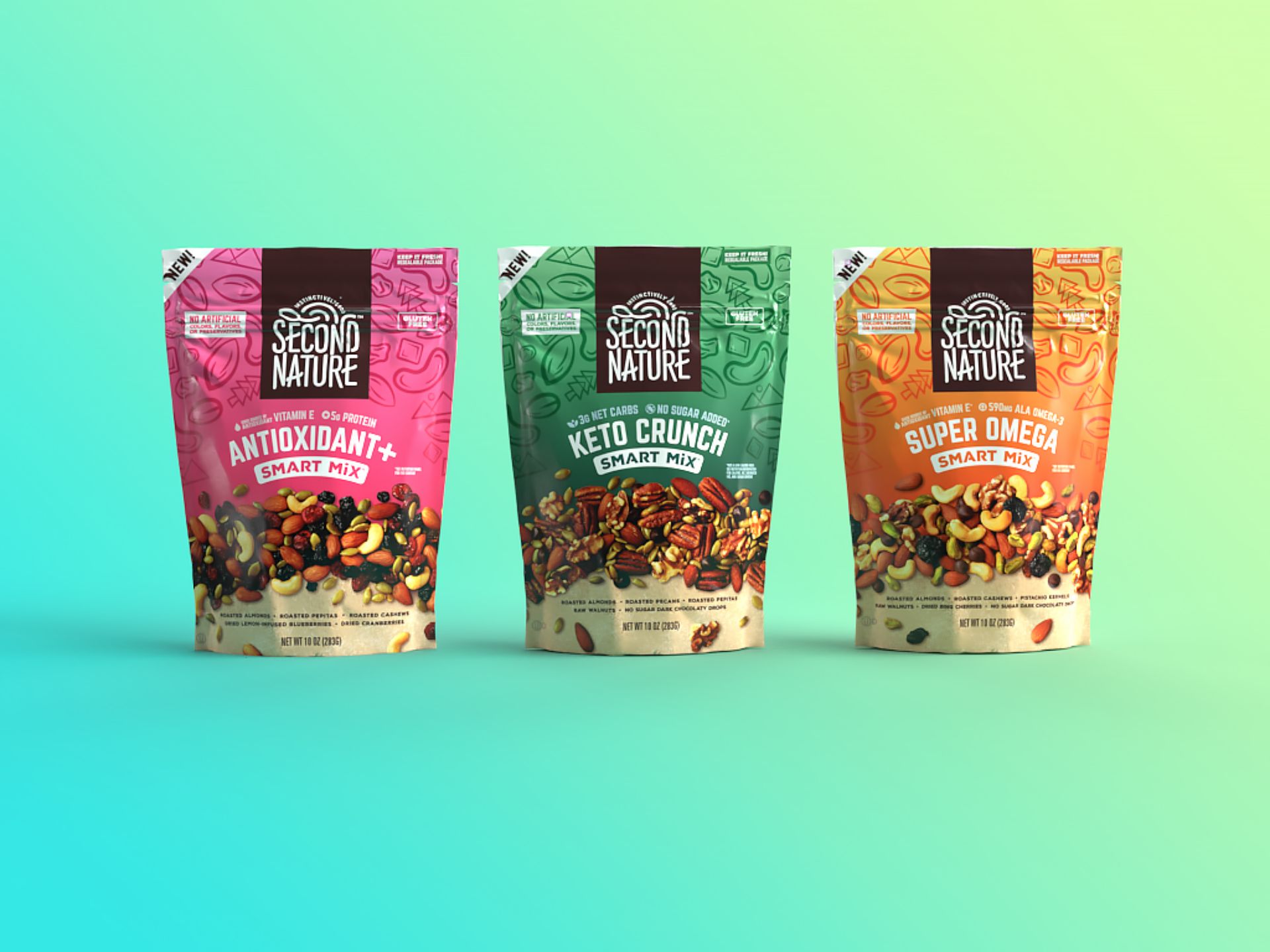
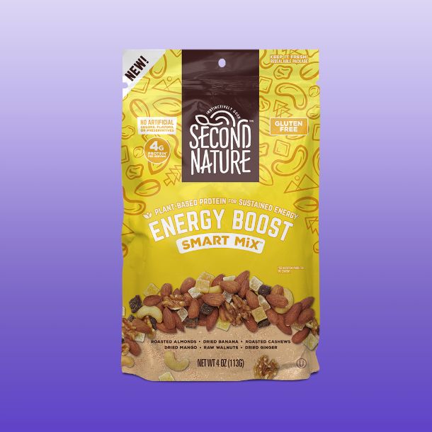
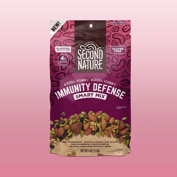
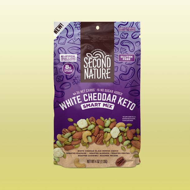
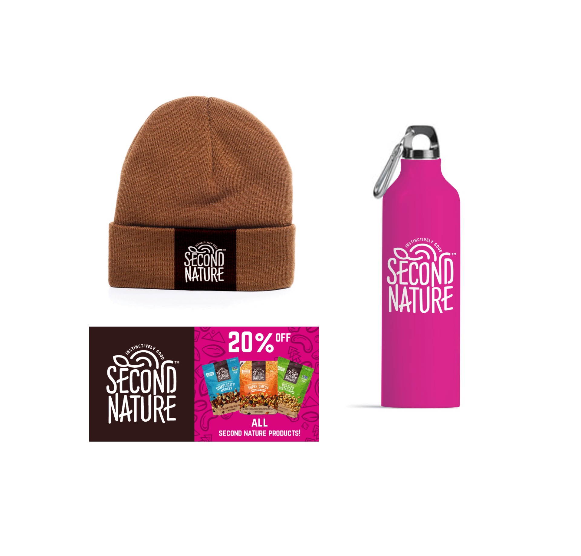
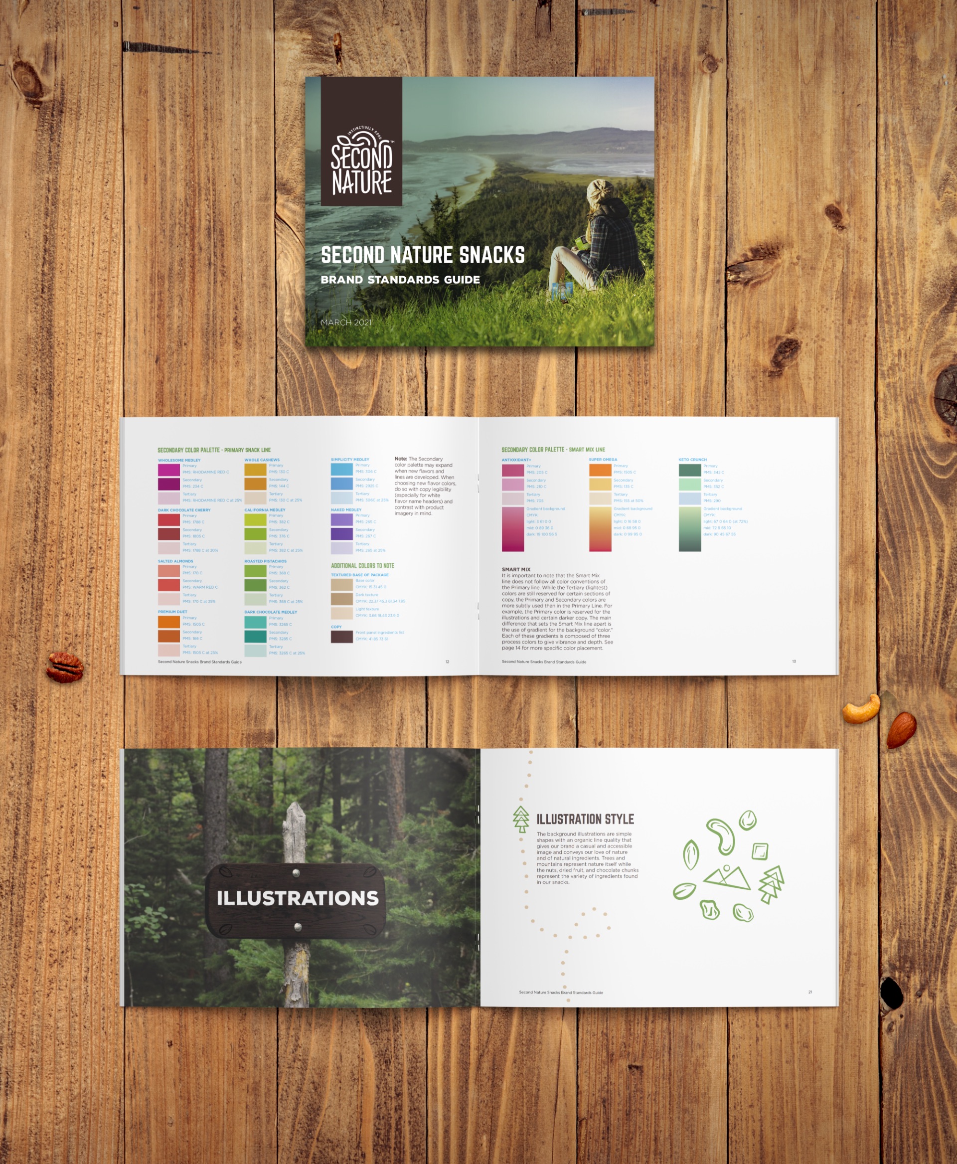
From there, we focused on the flagship brand, Second Nature Snacks. We started by updating the identity while keeping true to their roots for brand recognizability, and then expanded on the brand language—including patterning and illustration, color palette, product photography and layout, and even the tagline—all to communicate the natural energy and instinctively good and good-for-you snacks that Second Nature Snacks provides and stands for.

Nut-Tacular
We simplified and updated the background shapes to be more ingredient-focused with nods to natural environments (trees and mountains). These illustrations bring a subtle energy to the brand that, along with the bright colors of each flavor and line, conveys the natural energy that this casual-snacking brand prides itself on.
The Second Nature brown is used consistently for brand recognizability and each line and product sports its own bright color palette for flavor recognizability.

Testimonial
“
I’ve had a chance to circulate and share the brand guide with the team and we are extremely happy with where we netted out! We can update our brand messaging and standards and any new products we roll out!”