EXPLORING INDUSTRIAL DESIGN AND ENTERTAINMENT — HOW IS A STORY DESIGNED?
Do you even know about this show?
—
[Image above from Netflix]
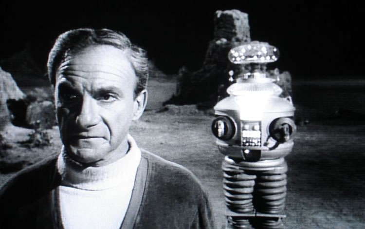
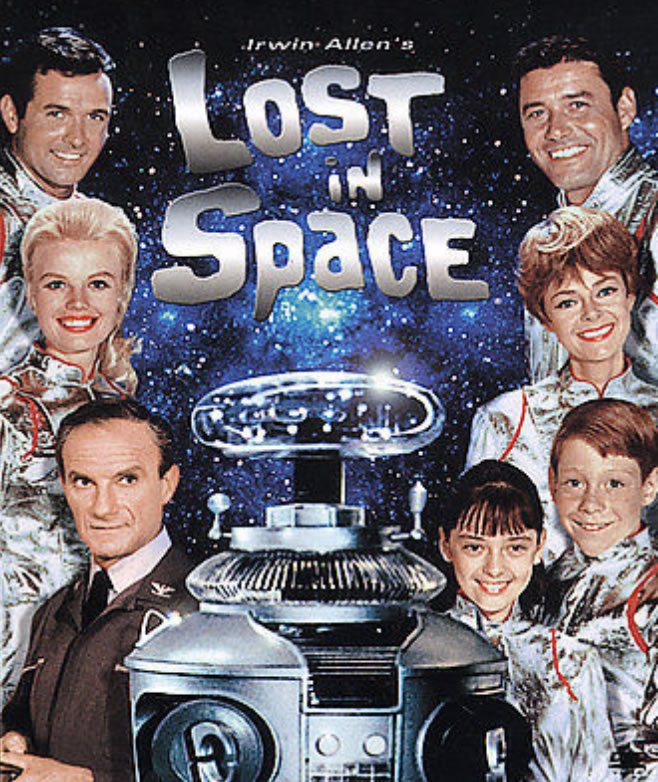
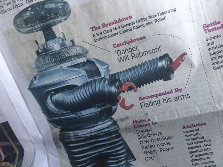
You’re probably too young to even recall it, but when I was younger, “Danger, Danger, Will Robinson,” was one of my favorites lines.
Especially when I was doing something dangerous.
And my name’s not Will, or Robinson.
But I liked the idea of a big robotic, sensing protector.
As evidenced in a string of other explorations, I am particularly curious about is the production and industrial design of television productions and films.
Like, really — who designed that?
Like, how did that set happen for Prometheus, what was the visioning of that set production design for that film?
It might be said that the foundational premise of “Lost In Space” ties inherently to the original telling of “Swiss Family Robinson,” which has
seen a wide array of geographical and entertainment spin-offs.
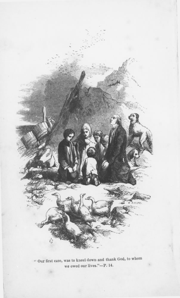
Image from the original, 1812, The Swiss Family Robinson [Der Schweizerische Robinson.] But the extraterrestrial rendering of this narrative lies with Irwin Allen, who managed a stellar career as a producer of a bounty of sci-fi television and cinematic entertainment properties.
Most would hardly recall these movies or television shows, but Allen started as a magazine editor, radio showman and then ad agency owner before he entered film production in the 50s, winning an Academy Award in 1953.
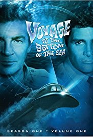
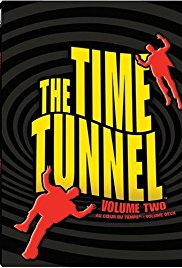
Studying production design?
That would be a set, a building, an interior,
geological and geographic features, vehicles,
aircraft, spacecraft and…robots.
I’ve walked this path before — writing about industrial, interior and architectural design and intertwined brand strategy and a string of examinations in stitching context, experientiality* in design detailing using
production design as a identity strategy.
Can you tell a story
in place design?
Storytelling narrative in place-making and world creation.
What of the design of the arc of a storyline plot and the design of what it looks like?
Storytelling design, design storytelling.
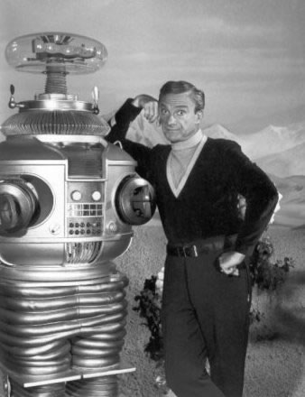
I’d offer, for one, that the original industrial and
production design of Robby the robot,
which found its presence on not only the original “space family Robinson,” the Robinsons of “Lost In Space,”
as well as the sci-fi-classic,
“Forbidden Planet,” was designed by Robert Kinoshita,
who died at 100 years of age, two years ago.
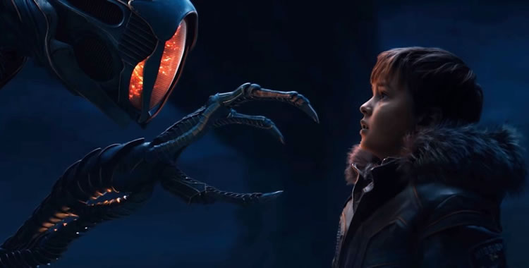
Netflix has rebooted the series in a lavishly detailed rendering of a new “lost world,” as well as all the incipient hardware to get there.
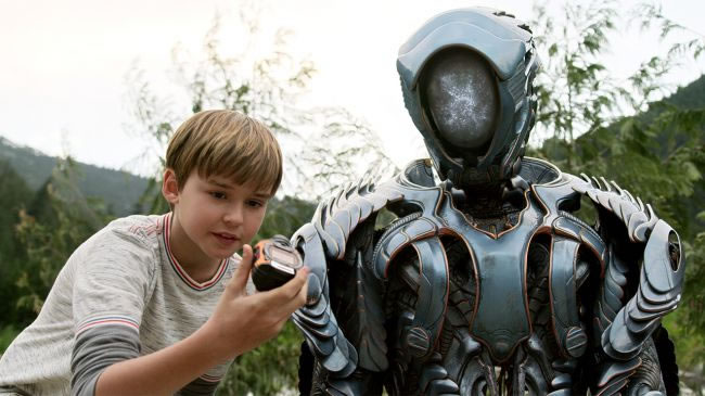
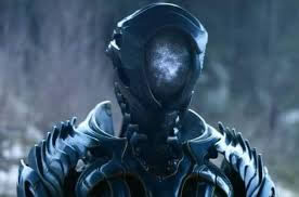
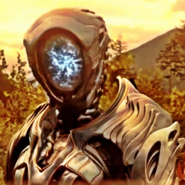
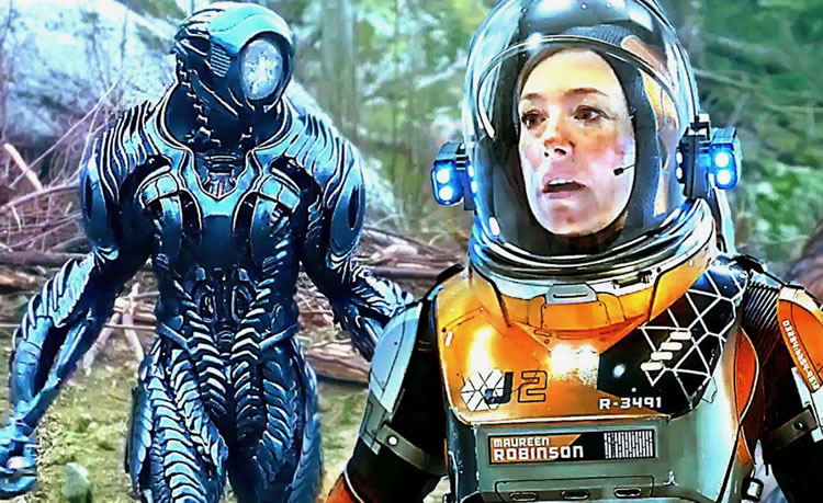
I focused on the robot.
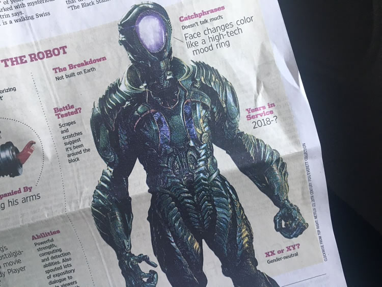
It is, below, unlike the Robby renderings, not of an earthly background, so it’s styled and built differently, the reconfigurations are quite imaginatively detailed.
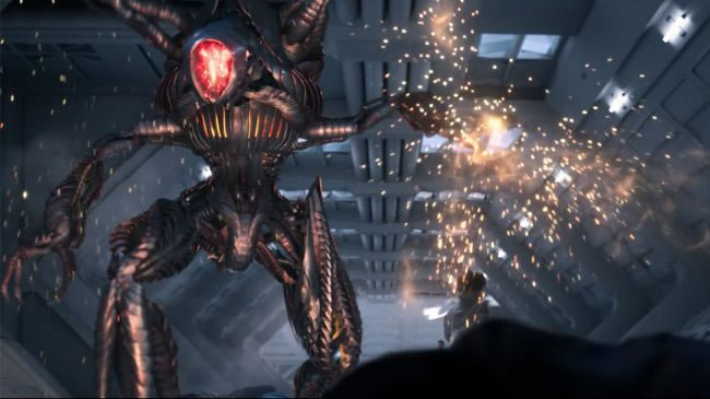
More like arthropoda.
And expansively flailing,
not unlike an insect approaching flight,
legs outreaching.
The story has matching layers of complexity and complicity, pushed further. Like the nefarious “Doc,” Dr. Smith who stowed himself aboard the spacecraft, there is another insidious “Dr. Smith” who implies all manner of goodwill but is still conniving to kill everyone else off on the venture.
The Hollywood Reporter and Netflix have a point of view,
to cyclical return and all-ages adventuring.
The Hollywood Reporter, this version of the show “takes its cues from the original series and centers on the Robinson family, who is forced to come together in a time of crisis. Stranded light years from their intended destination, they find themselves battling a strange new alien environment and also their own personal demons.”
“The original series so deftly captured both drama and comedy, and that made it very appealing to a broad audience. The current creative team’s reimagining of the series for Netflix is sure to appeal to both fans who fondly remember the original and to create a new generation of enthusiasts around the world,” said Cindy Holland, the VP of original programming at Netflix.
That creative team includes showrunner Zack Estrin (Prison Break) and writers Matt Sazama and Burk Sharpless (the new Power Rangers movie, Gods of Egypt, Last Witch Hunter). Neil Marshall (The Descent, Game of Thrones) will direct some of the series.
Lost in Space will be a family drama, a scifi adventure, and Netflix is calling it “a survival story for the ages.”
Still, back to the robot.
My quest was who designed that?
The production designer,
Ross Dempster, and his comments are:
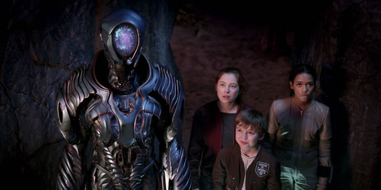
Courtesy of Netflix
Everybody was wondering: “Seriously, what is up with the robot?” Production designer Ross Dempster revealed how, in this version, the robot isn’t a bona fide member of the Robinson crew that turns on the family after being infected by a virus, as he was in the original series and 1997 film. This time, it’s an alien the Robinsons find after they get, you know, lost in space. Dempster said they went through several designs, both mechanical and humanoid, before coming up with the current version. It’s mostly a new design, but it includes subtle nods to the original creation; for example, there’s the robot’s face, which changes color from blue to red.
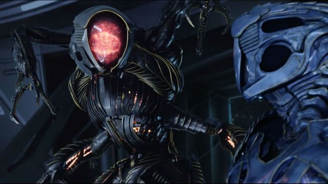
Courtesy of Netflix
“It came about trying to give it a little bit of a nod to the original design, which had these flashing lights behind this dome of glass,” Dempster said. “So, this was our fresh take on that.”
Courtesy of Netflix
While Dempster wouldn’t say why the robot’s face changes color (though it seems like it’s to indicate its mood), he did emphasize how their robot wasn’t “made by man,” and is in fact another species. However, it’s still a machine, which leaves the question of who built it… especially considering how closer inspection of the robot suit showed it has a reference number on its chest.
Courtesy of Netflix
“I wanted to ensure that we had a machine, not a creature,” Dempster said. “He’s all at once a weapon, a traveler with ancient wisdom, [and] the Iron Giant protector.”
In any examination of production design and brand, it’s a holistic journey and it’s fascinating to note Dempster’s observations on his design thinking, plying interior strategy to the environmental characteristics of the Pacific Northwest, as well as his renderings of interior design principles for the vessels. See these interview notes, by Yvonne Villarreal from the LATimes.
Well, with the spaceship, I mean, we’ve got a family who are very much like any family that’s out there today. The parents are going through a divorce. There’s multiple older relationships and stepchildren and just the whole gamut of the everyday family. This is their home. This ship that they’re going to be on is their home. How can you represent the home? It literally started around the kitchen table.
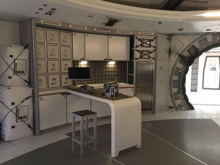
If you look at the design, the very center of the design and the set is a table where the whole family fits around. We see it in our first episode. It’s where they meet. It’s where they plan. It’s where they eat. It’s all about how that family operates together. I wanted it to feel like this was a modern home. You have the center hub of the kitchen and where everybody meets. Everything else started off of that.
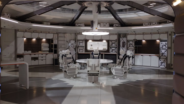
As for their actual home on Earth, it was about just trying to imagine a future. We went for a very modern design in our location choice and just … again, didn’t go too far with that so that it felt recognizable. We’re only supposed to be a short period ahead of where we are now. It was trying to stay in keeping with that.
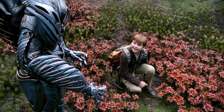
Max Jenkins is Will Robinson in the new “Lost in Space.” Netflix
The series was shot in Vancouver. For the scenes that weren’t shot on a sound stage, how did the geography of the area bring texture to the landscape shots?
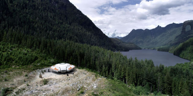
Quite a lot. It’s quite the look of the Pacific Northwest from Washington, Oregon upward, it starts to have a very significant look. We wanted to make that different and feel like another world. My pitch was to embrace what we have, and just turn up the volume on it a little bit. OK, it looks fairly rain forest-like. Let’s embrace that. We can’t change it. There’s no point in trying to make it look like something it can’t be. Let’s just imagine Earth on steroids. Trees that just did incredibly different things, but still basing them on the realities of what’s here.
I was looking at root structures of existing plants and trees. Then I just blew them up a thousand times bigger and exaggerated things. Again, sticking with things that we have on Earth as a basis for it just so people could believe and fall into this world easily.
What was the smallest detail you found yourself thinking about for a show like this?
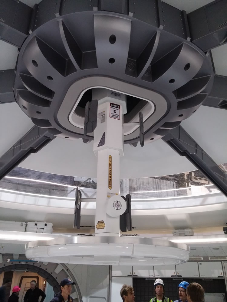
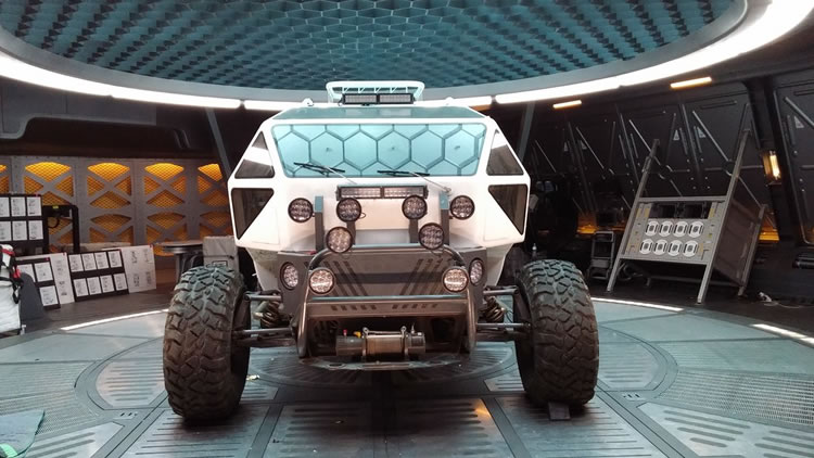
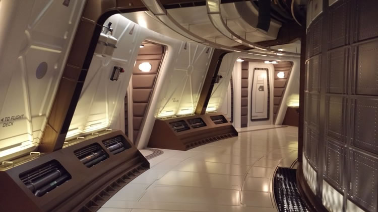
Images above from rossdempster.com
Every single one of them. Pretty much every corner of the landscape, every corner of interior there was something that we’d gone to the ends of the earth to really get the details right. Interior [of the] ship, it’s down to material choices, how they’re going to react under certain lights, certain textures, materials. I want things to look like a modern space station where you can see metals, and you understand what they’re made of.
Then in the landscapes, we have plants that ended up right behind somebody’s head, and they have to hold up and still look different. It’s pretty hard to recreate nature. You have to make very careful choices. For example, when I was talking about root structures earlier, I turned something that is, on Earth, smaller than your pinky finger, and instead took a texture that you can see really close up on that and blew them up to the size of a tree trunk. What you get from that is it just completely changes your interpretation of what you’re looking at. You get new surfaces.
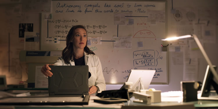
Molly Parker is Maureen Robinson in the new “Lost in Space.” Netflix
What’s it like updating something that’s been part of people’s childhoods?
Well, I may have been a bit naughty on that because although I’ve seen the show when I was a kid and seen all the reruns, I didn’t look back at it. I haven’t seen it in years. I wanted to look at it with fresh eyes, so I didn’t look at the show for the longest time and just wanted to explore and see where it would go. I think it worked.
Ironically, as it turns out, when I did look back at some of the designs, there were some strange correlations where it looks like I might have been influenced by [the original series] subliminally 20-odd years ago.
For example, I was driving around the lot, and I was trying to think about what one of the panel designs would be around our corridors and what kind of pattern might be on it. I happened to see this giant water cooler, turned upside down, it wasn’t even filling the right way up. It had this really cool pressed metal panel pattern on the bottom of it. I just robbed the pattern. I thought it was a very good stylistic thing. Then it turns out if you look back at the panels that were in the original “Lost in Space” ship, they look like I just thought, “Oh, I’ll do a modern version of that.” They’re very similar.
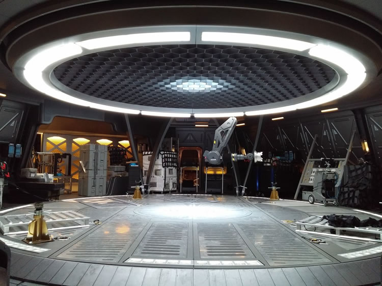
Even our hub design has these domed ceilings, and then there’s support structures. That’s another thing that turned out to be a total coincidence because I deliberately didn’t look back at the show, but then it ended up being reminiscent of it anyway. It was kind of cool. I liked that.
How would you say your job has changed in the past few years because of things like visual effects or digital extensions?
You have a whole other aspect that normally you would be thinking of in hard scenery. Now you’re thinking of it in a digital world that is intangible at that particular moment. It’s just an extra thing.
You have to have your goal as a designer and understand how digital effects are going to work and what works, ultimately. There’s lots of bad effects that get done. Sometimes it’s a budget constraint, but sometimes it’s a bad planning thing. You need good people working together, and we were lucky enough. That’s what we had.
Also check out Travis Clark‘s interview with Matt Sazama and Burk Sharpless, writers and executive producers on the reboot. To their take, the robot is the heartful metaphor at the heart of the story. This, then, the dive on my exploration — design thinking on that allegory of alien design that found its way into an array of seamless expressions. I’ve been exploring the design of this part of the production [which, up to this point, I’ve never actually found out who designed it, anywhere.]
Business Insider captures that alignment,
the robot’s relevance:
Sazama:
The robot needed to be as compelling a character as the rest of the Robinsons. What does it mean to encounter something that’s alien? That’s the science-fiction part of the show. How do you communicate with it and how do you relate with it? The question of season 1 is, “What is the robot?” For us, the robot embodies the show: How to relate to something that’s different, something that’s dangerous but could also save your life. And what you’re looking at was an extraordinary project that involved a lot of designers and a lot of artists who were extraordinary technical craftsmen.
The robot’s face was the one design element that we wanted to carry over from the original show, with the clear face and twinkling lights. We felt like that was a way that our new robot feels like the old robot, and the face was an abstract constellation of stars that would give you an emotional response to it.
I look further into the legacy of Dempster’s rendering of many of the scene designs, from his own site.
As a holist, a person that thinks about the seamlessness of brand, passion, storytelling, and integrated brand-place-making, the holistic synesthesia of how that could be designed, “set” and experienced is a fascinating proposition.
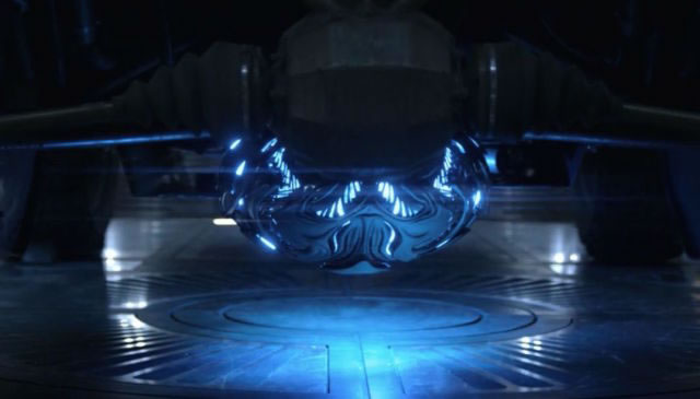
The soul of the story,
could that be the nameless alien?
And then, to that telling,
how would they style him?
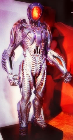
Allegorically, the destructor and protector,
the savior and the abandoner,
the prescient and the silent.
And who would do that?
Details matter.
As we all know,
people notice the small stuff.
And I keep going there.
T I M | Seattle Waterfront Studios
…..
G I R V I N / DESIGNING MOVIES
THEATRICAL BRANDING + ENTERTAINMENT
IMAGINATION: AND THE TOOLS TO MAKE IT HAPPEN
goo.gl/BsoZ6y
Movie Storytelling design: goo.gl/XCBQps
*Experientiality: As a state of holistic experience.
Experiential is a patterned word, founded on the same premise as “inferential.”
Experientiality, while it might be presumed by some as a fabrication, is a studied condition.

As always, the insight and depth of your stories intrigue and expand. Brilliant!
Thanks Joanne, appreciated. It’s that drive to curiosity, I just can’t stop that compulsion. If it’s there, I have to learn about it.
I absolutely love this new lost in space series, I was only 16 years old when I saw the Lost in space movie in 1998, but as a space/sci-fi fenatic since I can remember I just cant get enough of it. You did a great job and hope and pray there are more seasons to come. Lastly, the chariot J4 and J11 are officially my add to fantasy vehicle list. Can you give a lil info on the concept and the designer on them please. Take care and God Bless.
Nicholas meza
Phoenix , Az.