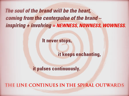
The spiral of brand experience design: Girvin’s red thread of connective analyses
The Analysis of the Concept of Place Making and Food Design
Working for years on the propositions of food experience — from luxury dining to kiosk service, fast casual to white tablecloth, Girvin’s legacy of searching for the engagement tools for guests, builds a certain set of tools in analyzing the success of brand storytelling and experiential relationships in dining design. Fast casual, here — this case study in play — sets the foundation for consideration. There’s a distinction, between the conceptions of fast casual and QSR — quick serve. And the processing suggests dollars spent, interior character and brand environment.
Foundational rules of the dining experience strategy — QSR, fast casual, or upscale potential environments
The basic rules of the road apply across the field of experience planning
• Food will be, and always will be: everything. Without great food, the restaurant will be building an audience of unstable relationships. The community won’t be connected.
• Sequences of action — the real procession, walking in, being served, leaving happy — this is fundamental, but oftentimes ignored. How does that work?
• The core standards of the connection between the team and guest is another proposition. How was that sequence managed — what’s the greeting, what’s the differentiation, what is, where is, the sincerity?
• Care — who cares, really? The idea of care is a permeation that needs to stretch everywhere in the experience planning — but how is it managed?
• The sense of place — so much of fast casual (which might be anything from a Starbucks to Chipotle relates to pricing and time — budgeting per serve are roughly $7.50 — 11.00. The items can be less, but the potential looks for multiple turns in the day.
How might this be analyzed? Sequentially. In our expertise, the idea of sorting process and moments could be synchronized to a step by step, instant to instant, the dance of the practice. And practice, it is — makes perfect.
In analyzing literally dozens of fast casual experiences, there are learnings:
• Brand is crucial — it’s obvious what this place is. Considered and comprehensive?
• Story is comprehensible — tell the consumer, fast, what the story is.
• Process is fluent — you can get into the place, through the server line and orders shall be resolved efficiently.
• If they can stay, how long — timing the sequence, for stay, for work, the third place, respite, meal and out, drink and connect. Has this been designed?
• The market — knowing your market, the competition thoroughly, who’s winning and how they are evolving. Asking this question — are you up to speed?
Defining questions — and setting the path
We define: establishing Brand benchmarks will establish consistency and clarity, which is important in times of growth, when money is being spent and decisions are crucial. A consistent Brand, coupled with individual location distinction, appears stronger to consumers and investors, ensuring confidence to buy.
EXTENDING THE BRAND FOUNDATION: CORPORATE BUSINESS PAPERS
Standardized system for all corporate documents including: business card, letterhead, #10 envelope, large size envelope, mailing label and forms such as invoices and Word templates for letterhead. Building digital forms for email is another cohesion to brand lineage.
WHAT’S IN FRONT SHOULD BE CONSISTENT: BACK OF HOUSE COLLATERAL
Employee schedule, employment application, inventory and other applicable forms.
BEING A HOLISTIC MESSAGE: MEDIA KIT*
Brochure, delivery system, designed one-sheets.
LINKING CONTENT AND TRAINING TOOLS: EMPLOYEE TRAINING MATERIALS*
New trainee folder, unique welcome gift, “For a Friend” coupon. Designed one-sheets w/ training information. Brochures and overview.
*Could be combined into one kit.
INTEGRATION OF STYLISTIC INTENT: BRAND STYLE GUIDE
The Brand style guide is a manual for creative and marketing professionals, including vendors, for optimal consistency across a variety of applications. This guide includes configuration and exact specifications for use of the Brand Identity, including “do’s and don’t’s”; use of color and specifications;
type hierarchy and layout guidelines; guidelines for additional elements such as graphic and photographic styles. An expected deliverable is a reference manual in book and digital form.
OWNING THE LOOK: ILLUSTRATION STYLE
An expected scope of work includes analyzing current and previous illustration styles and defining a consistent style that is most suitable to the Brand, reasonably moderate in budgeting and adaptable to various illustrators.
UNDERSTANDING THE MINDSET: THE REASONING FOR INVOLVEMENT
A few of the core reasons why a consumer goes out to eat:
Hungry (for new or reliably predictable experiences)
There is nothing to eat in the house (speed and convenience)
It’s routine (the habitual relationship)
Going with others (an ongoing action)
Meeting others (the nexus)
THE RUDIMENTS OF ANALYSES
It’s important to bear in mind that the process for sequencing brand experience is one of complex detailing — these graphical discussions merely pinpoint the opening arcs of each phase of study. There are myriad points of connection to a community relationship and they’re not only inside the walls of the enterprise, but to the employees and their families, and the importance of the surrounding community.
|
––––––––––––––––––––––––––––––––– A PRELIMINARY STRATEGIC OVERVIEW Creating a cartography or mapping of restaurant experiences — the complexity of engagements is a good foundational checklist — designing this as a kind of gathering of all the possibilities of encounters, perceptions and points of brand management builds the basic layer for how to see what potentials there could be in any study, for any type of restaurant. For this grid, our fast casual circling — the red thread of brand embracement — the centerpoint of the symbolic allegory is a “burger” icon (for the basic offering of one client relationship that used this methodology.) 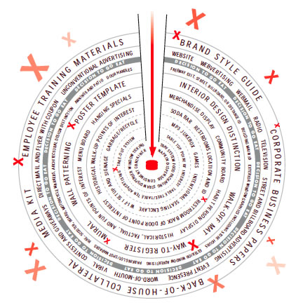 CONSIDERING THE STAGGERING OF EXPERIENCE TOUCHPOINTS The process of connecting, or disconnecting with guests is made on many layers of contact — break one and you might break them all. One grand experience can be quickly dispelled in a break of the rightful sequence of attracting actions. It’s always that challenge, attention must be paid to the intention of the brand and its offering.  THE EQUATION OF GOODNESS We’ve explored the idea of goodness — this reaches to the notion of good experiences, but as well the value of the guest relationship and finally how that equates to the community — doing right, doing good is a one on one experience, as well as one — your brand — to community. 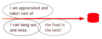 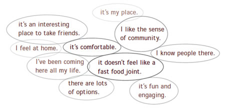 X MARKS THE TOUCHPOINT In this sequence of images, the idea of the touchpoint is something that is defined as the x – marking the spot of the sequence of connections in procession — the literal process for how guests encounter the presence of your brand. Brand presence, to Girvin’s thinking, relates to “being present,” awakened and alive — vitally “on.”  THE PROCESS OF ENGAGEMENT Engagement, embracement, envelopment in the brand experience is something that isn’t just inside the doors — it can begin blocks away as messaging potentials present themselves. Each one of these “ripples in the ring” should be considered — point: signing, point: drivethrough, point: standard, point: entry, point: merchandising and window messaging. All synchronous — casually observed by the guest in transition, but powerful in its holistic mechanism. 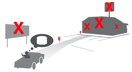 THE ENTRY SEQUENCING The entry is the beginnings of the close encounter, team members come into proximity, small messaging begins to build, as well as enlarged layers of storytelling. Everything that the brand does is about telling a story — greater, or smaller, a detail in the movement of the guest into the closest proximal relationship to brand place. Everything is a story — and the question relates: “what’s your story — and how will you be telling it?”  THE INTERNAL PROCESSION Lines happen — volume suggests action, so the play of the line and parlaying that as a decision making process will be important. But will this sequencing might be only about storytelling the product, or building the layering of the brand experience — in that storytelling. While classic fast casual strategy mostly suggests raw product portrayal, there are other potentials — history, heritage imagery, ideals and attributes, community involvement, vendors and relationships — the scene could be rife with additives. Build strategically, that sequence — think Disney, Universal Studios or other entertainments. Small, or large, the messaging can count — especially if people are waiting. 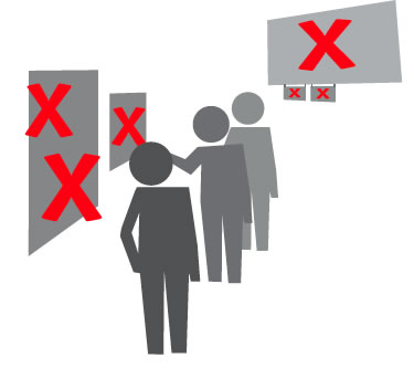 THE COUNTER ENCOUNTER The propositions of face to face connectivity are priceless — and they can account for the win, or the lose, of the entire relationship. Anyone who’s ever had an experience in a restaurant, inside or out, employee or guest will know this intimately. If this could be won — and practiced happily — everyone succeeds. But that’s only part (and a very significant part) of the engagement — more messaging ensues and the dramatic, powerfully accessible, comprehensibly appetizing this process is, the better. In our experience, the notion of dramatic photography isn’t the only measure of success — fast clarity, careful messaging and explanation is just as vital. 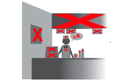 INTERNAL CIRCULATION Up and about, guests circulate — what is the expanse of the brand storytelling? Experience counts just before, and just after the meal — exploring the place, there can be added layers of messaging to build on the depth of the story. People will read if you can offer dimensionality of brand storytelling and layering. It’s not the same old — it’s a song witih different melodies — catching the drift of the tune builds expansiveness of experience detailing.  THE SENSE OF THE TABLE A sight for hungry eyes — food, packaged, branded messaging, storytelling on the wrap, table amendments — each can offer the touch of another point of envelopment. That point — the “containment” is the same as embracement — the guest is enveloped in the meal, the taste, scent, sight, touch, sound of that prize — it’s why they are fundamentally here. 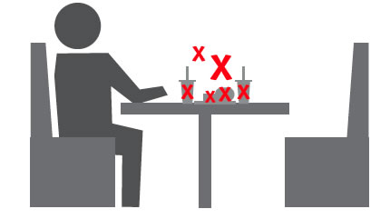 ANALYZING THE GATHERING OF POTENTIALS As noted in the beginnings, the positives and negatives of the experience can be shining wonders to grand times — any moment, potentially disarmed by a wayward, brand “off” encounter. It all adds up, or down — it’s up to the management of the brand to make it sing.  THE CLOSURE What’s the good bye?  THE SOUL OF PLACE In the opening imagery, we offered the notion of the red thread of experience layering — but any brand will start with the soul of its foundation — that could be the visioning of the founder, or it could be a team envisioned dream. But the soulful nature of any proposition shall speak to the potency of nurturing the cult and enculturation of those values. There needs to be a tenet of intention, which builds attention and catalyzes attraction. 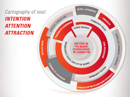
|
TIM | Danny Meyer’s Shake Shack, Madison Park, NYC
––––
CREATING BRANDS THAT ARE LOVED:
http://bit.ly/h9kJdW
the reels:http://www.youtube.com/user/GIRVIN888
girvin blogs:
http://blog.girvin.com/
https://tim.girvin.com/index.php
girvin profiles and communities:
TED: http://www.ted.com/index.php/profiles/view/id/825
Behance: http://www.behance.net/GIRVIN-Branding
Flickr: http://www.flickr.com/photos/tgirvin/
Alltop network: http://my.alltop.com/TGirvin
Google: http://www.google.com/profiles/timgirvin
LinkedIn: http://www.linkedin.com/in/timgirvin
Facebook: http://www.facebook.com/tim.girvin
Facebook Page: http://www.facebook.com/girvindesign
Twitter: http://twitter.com/tgirvin