A return to the spirit of store one.
I’ve worked in the Seattle coffee brewing experience for several decades. And all the while, I’ve been a lover of coffee — and the coffee sensate experience.
There are two favorites for me. One, coffee made, “cowboy style”, in Java. There’s a density and cinnamon edge to that which is truly remarkable. Another, in Firenze, a quadro-macchiato, is another savored experience, while listening to the bells tolling in the great square, in the heart of that city. There are surely others. But those two come to mind.
Learning from working with roasters and café savants, while spinning the stories and visualizations of their brands, I’ve learned how to inhale the scent and taste of coffee. And finally, as a lover of fragranced wafts of pro fuma, the dark coffee scent note in the vocabulary of perfume, a deeper, woodier hint, like that of tobacco, oud wood, tonka bean, vetiver is another collection of sensuality that I find titillating.
Coffee love and lore runs deep in my veins.
And during that selfsame time, it’s taken me from working on creating Jimmy Stewart’s Stewart Brothers Coffee collaborating on the first store — and story, in Post Alley, in the memorable Pike Place Market along with then budding designer, (and childhood connection for me in Spokane)
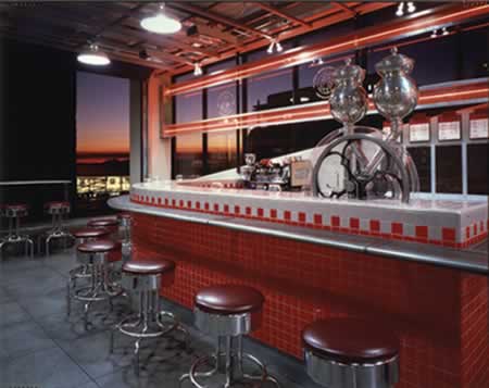
Tom Kundig — a new entry in the architecural firm that I’d been creating retail design with — Olson Walker. That firm went on to blazing national, and international design prominence, as Olson Sundberg Kundig and Allen. I created the design package for them, as well. We’d designed a monogram treatment for the opening brand positioning — for everything from Jimmy’s brilliantly red (their corporate palette that we’d created) Mercedes antique coupe, to the coffee cups and interiors.
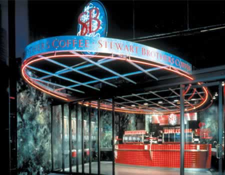
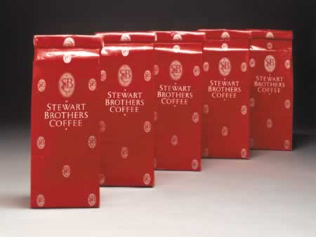
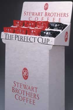
Stewart Brothers — due to an infringement settlement (another company called Stewart Brothers that was offering product that “related” to coffee, and eliciting possible consumer confusion) became, with our supporting recommendation, Seattle’s Best Coffee.
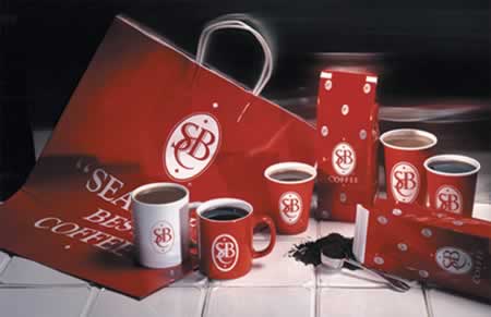
We took that look and feel, as well as the pervasive sense of storytelling that Jimmy so cherished in the legacy of his brand, to multiple locations.
There are others:
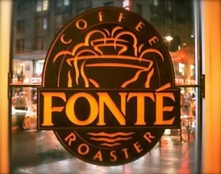
We also worked with Paul Odom, on creating the Café Fonté brand — building out the character of that brand under his roasting expertise and aesthetic leadership — and creating retail concepts in his first real store — and storied — presence in Chicago.
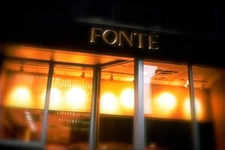
Sorry that the pictures aren’t better — they are what they are…
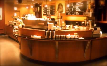
Each of these retailers was searching for a way to tell a story, and even back in the 80s and 90s, we were working on building brand storytelling into virtually everything that we’d created for our clients around the country, and for that matter, the world. And, from heart, and strategy, and storytelling — we built imagery to support that connection — and embracement — in community. Brands grew; and our stories continued to evolve with them.
Sometime back, a couple of years ago, I’d commented about Starbuck’s need to return to their heart, Store one, Pike Place Market. And I can recall that day, with Howard Schultz, speaking outside the store, to a group of investors. And it was his launch story — and the beginning to the concretion of his dream, after other, manifold developments, explorations and transitions.
Working with another brand partner, an international food group, I’d partnered on the creation of a concept that would be potentially integrated into an emerging store conception — and working in tandem with Starbucks — we needed to know more about what that concept was. Linking up with Arthur Rubinfeld, we explored, along with his design team, and Liz Mueller, a series of examinations of archetypes. I’d call them archetypes, not prototypes, since Arthur’s strategy was to reach into the psyche of various consumers, as well as the heart of the brand, to evince a new Starbucks community and spirituality; it was surely about design language, but more so to newly explore relationships, and what might be defined as the most desirable character of presence, in place-making, for re-stitching guest connectedness.
Here are the outcomes for one grouping of conceptual expressions. That is — this is the first concept prototype of what might be, potentially down the line, a series of new retail dimensions.
A draped entry
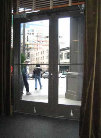
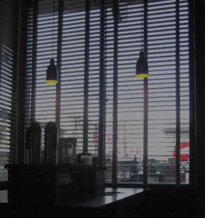
A darker, cozier interior presence, with a view to Pike Street
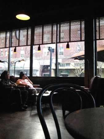
The wood, laid bare — sand blasted columns and concrete base
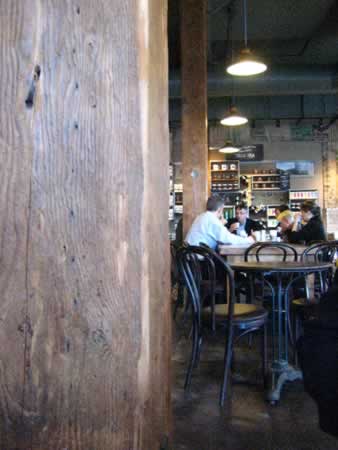
Wabi sabi
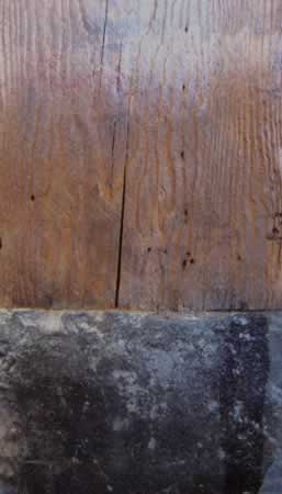
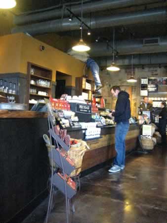
The entry sales procession — beginning in the aft of the store
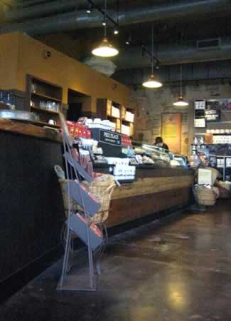
Concrete floors and remade café furniture
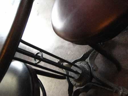
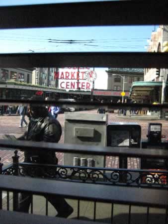
Wooden venetian blinds, with a view to the south, Pike Place Market signing
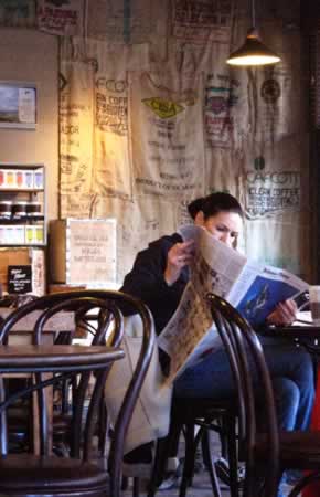
The rear, art coffee story installations
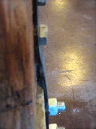
Construction details, shown
The sequence, shown (and, tuning the installations)
Layered panel expressions
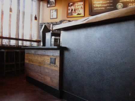
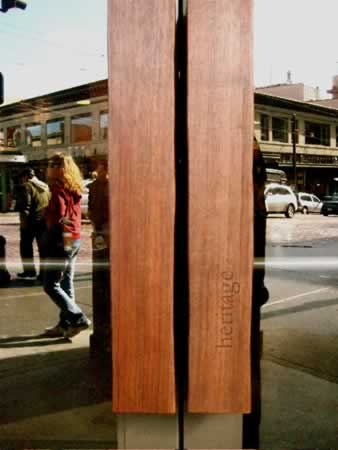
The flow of the wood, naturally expressed
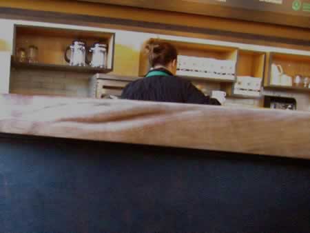
Broken edged marble installations
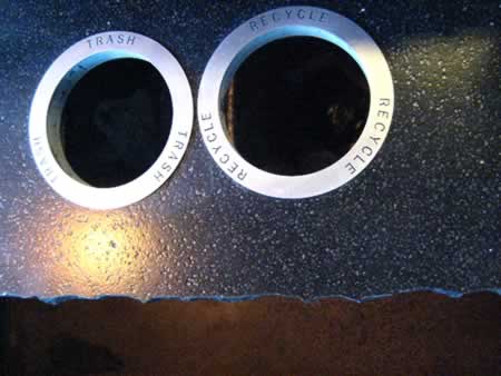
A proud badge of commitment
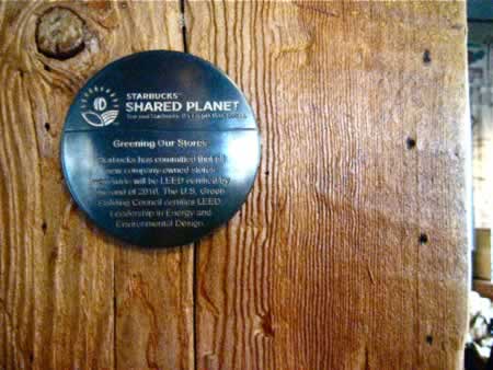
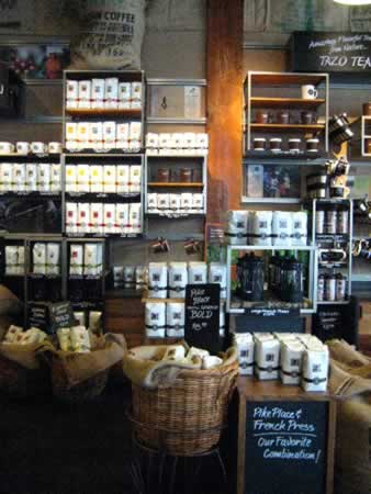
Merchandising, cold rolled steel modular planning
Long tables, a la Pain Quotidien
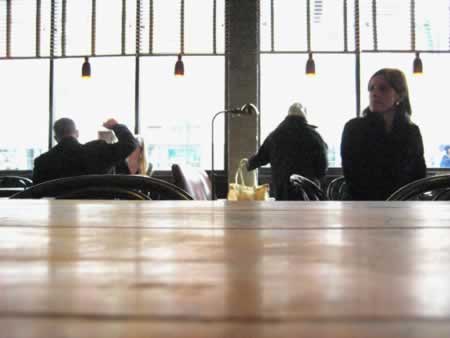
Marked, messaged surfaces (the long table)
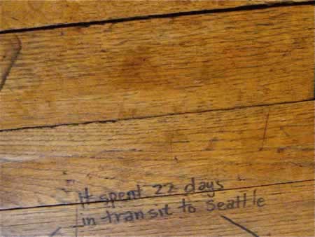
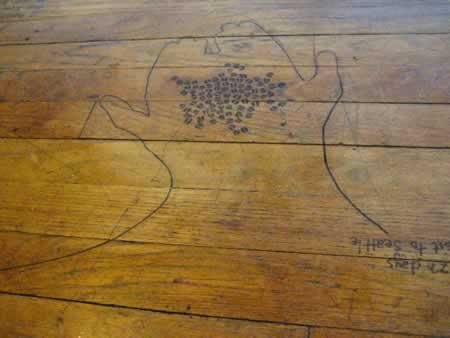
Rear wall merchandising calligraphy
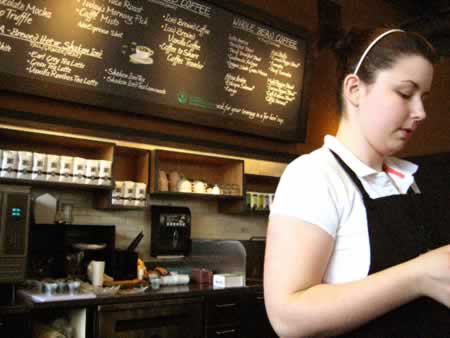
A design vocabulary
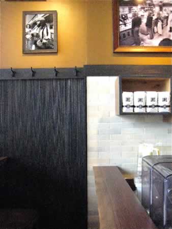
Concrete tinting

Art, merchandised
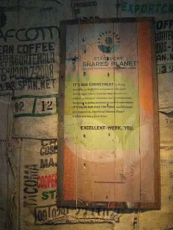
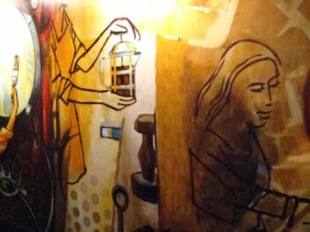
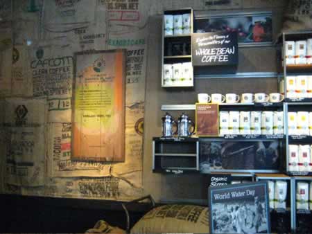
Steel, detailed
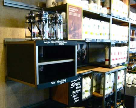
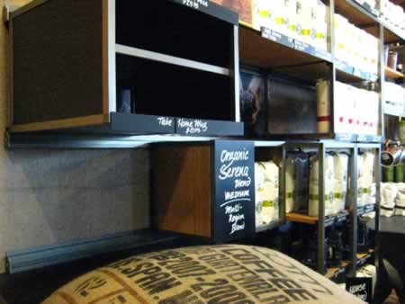
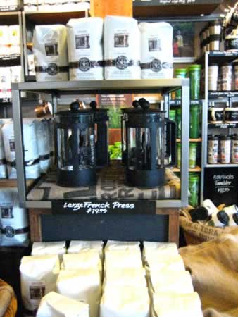
Exterior vocabulary, darkened
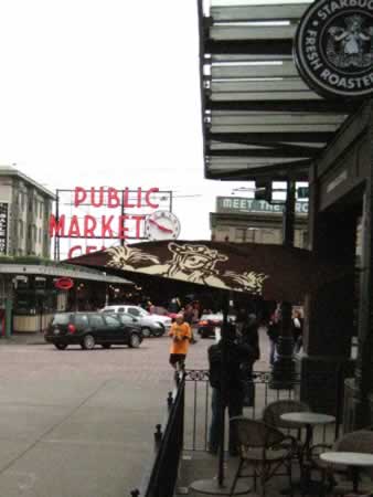
What I’d offer is the idea of returning to the brand heart, as I’d referenced in earlier blog notes, that it’s always getting back to the center of impression — where the founder’s found foundation, the original visioning of the dream, and what telling will resonate in a new manner, to the wandering audience. If there’s a story to be told, how do you tell it — hold to the heart, the truth, the true story, and the viewer will be newly drawn to the captivation of the telling. My tale-spin, to reference, from a couple of years back — “Starbucks, go home, get back to store, to story, one.”
They did.
What’s your take on this?
tsg
—-
Exploring coffee + community | from NYC
A view to the world, the heritage of store one, recounted in place, made.
