Designing Magic: The Draft of the Letter as the Quest for Mystery
Everyone knows that occult really means hidden.
But in that, one might surmise that the Cult of the Occult
would be nothing more than the quest for the hidden.
I probably live there,
in more ways than one.
In one manner, the journey of GIRVIN, and Girvin, has been about the quest for that further, and as yet unexplored territory a realm of mystery, yet as much a realm of a place of newness, the land of curiosity — and the wowness of newly seen scene in spectacle. That is what we look for — journey, story, woeness.
And in the second, since I was a child, the nature of mystery and the mystical has sparked my mind — and to that, my team, the deeper mystery of the work that we all do is part of that journey of discovering.
And, as we all know, to discover is literally — to take the lid off, to remove the cover. In the quest for the soul of the brand, the reaching in — the deep — what will happen is an uncovering; and what lies
there is the truth.
Truth lives in the dark,
as well as the light.
In contemplating
the making of marks, the design of monograms and devices
that badge
the psyche of a brand,
it becomes something more than just design thinking.
More difficult — as a challenge, it’s an emotional capture —
it’s a shining, a set of strokes
that come from mind and human hand,
that run deep in
the psychical place
of emotional context.
Feeling is movement —
e-motion isn’t constructed of
engineered stillness; it’s alive.
To align the humanness with
the ability to illustrate, which is — in itself,
a kind of light-bearing,
a shining,
a lustration.
As a designer, as a brand strategist,
that’s where you go —
listen,
contemplate,
see broadly —
ponder systemic meaning,
code and gene diversified in
the
link from mind to hand.
And you draw it out.
But what does that drawing mean.
Literally, to draw it out — to capture that electricity of imagining.
That’s what you draw.
And that, in
the interpretation of others that have come and gone before, is:
It’s portal making;
it’s transformational,
it’s trans-sensate.
That is the
sign,
the sigil,
the signal,
the signature.
We’ve talked long about the meaning of this string of words.
Each makes one, but what do they know of it,
the language of the signature.
Your sign[ing] — from the gripped ferrule on the sign-writer’s brush,
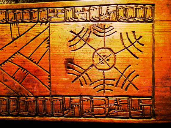
to the cut runic sorcerer’s icons
to the strategically empowered corporate identity,
thoughtfully customer pleasing packaging;
it all comes back
to that one thing.
The mark,
the letter,
the sign and those who sign it.
Who they are, what they stand for, what they are.
And in that state: what they shall be.
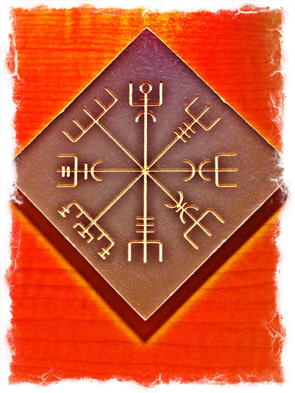
The Vegvisir,
Icelandic guidance sigil
Tim | Pike Place Studios
The Strategy of Holism | Restaurant Experience Design
TouchPoints, Storytelling and Guest Engagement
See the Restaurant Point Conference Keynote:
http://bit.ly/1ndy9bv