An examination of conceptions of branding environments for storytelling in contextual community.
Case study: Oakley.
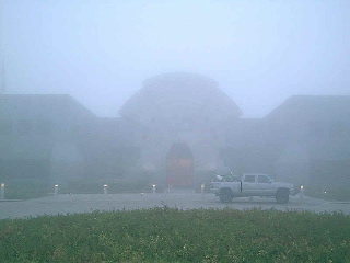
American Hurrah | Oakley
Girvin backgrounder:
I believe that people understand brand comprehensively in place.
Over the last 20 years, Girvin has been working in the space of creating branded environments. That might be conceptual, like our work for Yves Saint Laurent (https://www.girvin.com/blog/yves-saint-laurent-st-sulpice-paris/), or functional, like our partnership with Callison Architecture on finding brand story in patterning applications for retail (www.girvin.com/documents/sogo.pdf).
Or a grouping of explorations that you can find here: https://www.girvin.com/clients.
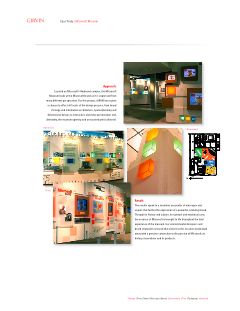
Even corporate museums can be defined as a form of brand architecture: https://www.girvin.com/clients (click on Microsoft Museum).
Our teams have worked, as well, on restaurants, hospitality spaces, shop in shop, interactive kiosks (micro branded environments) and other built programs designed to express brand in place. Enough about us.
Personally, historically, I have worked with architects for more than 30 years. I grew up in a neighborhood of architects, so the leaning to understanding how architecture works in creating a sense of place came very early.
Let’s start by exploring the idea of definition. Wikipedia offers:
Branded environments extend the experience of an organization or company’s brand, or distinguishing characteristics as expressed in names, symbols and designs, to the design of interior or exterior settings. Components of a branded environment can include finish materials, environmental graphics, way-finding devices and signage and identity systems. Creators of branded environments leverage the effect of the physical structure and organization of space to help deliver their clients’ identity attributes, personality and key messages.
The creation of branded environments grew out of a movement within the practice of interior design in the early 1990’s that recognized that brand equity, or the perceived value in the identifying brand characteristics of an organization, could be applied to three-dimensional environments.
The practice of designing branded environments is often a research-driven effort led by an interior designer or architect, and may include a multi-disciplinary team of strategic consultants, brand development experts, marketing and communications consultants, and graphic designers. Particularly effective for retail,[1] museum and exhibit design, branded environments can support the success of many organizational types, from corporate to institutional and educational. The designed environment can reflect or express the attributes of a community or the competitive advantages of a company’s product or service.
Benefits of a branded environment can include improved brand position and communication, better customer recognition, differentiation from competitors and higher perceived value from investors.[2] Internally, benefits may include higher employee satisfaction and retention, increased productivity, and better understanding of an organization’s mission, vision and values. (Bibliographic references below)
We believe that any brand, as a holistic enterprise, needs to offer coherent expression in built space. That sense of holism, component elements building to a whole — integrated experience — seems a natural proposition, yet interestingly enough, there are plenty of existing, long standing references that do not elicit a connection between brand thinking and built environment. These companies seem pretty smart — but there’s a big break between concept and ideation – and branded execution in space. These contrary edifices that suggest nothing of what goes on in the interiors.
IBM | Somers campus, NY
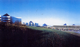
Kraft | Northfield Campus, IL
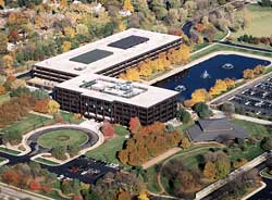
Soulless, too. And, to these, and many others, I’ve been there.
It’s not worth exploring more — it’s pretty obvious that there’s a legacy of creating campuses or building expressions that don’t, really, communicate anything about the aesthetic of the brand. I can offer United Airlines (Oakbrook, IL); Kellogg’s, (Minneapolis, MN); Hershey, (Hershey, PA); (new) Apple Computer, (Cupertino, CA); Microsoft, (Redmond,WA) and countless others simply don’t say much of anything about brand vision. Sure, they’re pretty, but what’s the point? They’re largely containment devices. And I suppose that there’s something to that strategy — get ’em in there (and out of there) as quickly and as inexpensively as possible.
Whatever the scale of the brand — efforts should be made to create story in spatial experience. The added sensate brand management renderings of scent, sound, touch, taste — these are enriching attributes of enclosure and experience. They, too, are important.
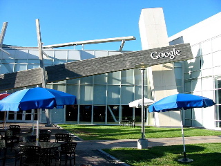
But looking around, there is more to explore. How to tell a brand story dynamically in the context of space, place and presence — and I’m not talking about bold logo applications. For while this campus entry rendering of Google is interesting, (right — there’s a logo on there) I’m not sure really what is says about the brand. The juxtaposition of the contrasting beam works seems like confusion and distraction, rather than the heart of one of the most powerful search tools ever known.
Maybe it’s a retrofit?
But what about architecture telling the story — in conceptual application?
NBBJ, an international design firm that makes its headquarters in Seattle, takes on a different stride — while the brand identity, per se, might be unseen, or minimal, there are conceptual references that are remarkable, each building speaking to a kind of corporate articulation that is emanating from the very genetics of the brand spirit.
Novartis, San Diego, CA

Wellcome Trust Sanger Institute, Cambridgeshire, UK
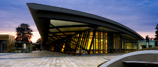
Telenor, Oslo, Norway
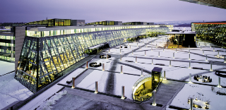
Samsun World Gymnasium, Incheon, Korea
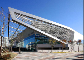
Reebok, Canton, MA

McConnell Foundation, Redding, CA
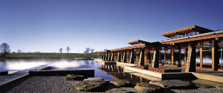
In these projects, there’s a balance to the context of design, brand, story and experience expression. There’s a depth of thinking in finding the truth of brand culture — and creating an integrated, built expression of these attributes. I leave it to NBBJ for explication — on their finding the metaphors that link truth to culture, story to architecture in these buildings. You can find more at www.nbbj.com.
I’m looking for expansions on that statement, that grouping of ideas — how can they be best tied together. What’s the thread? And there have been other inquisitive references that I’ve examined on the alignment of these messages: space, place, story. From Starbucks to Gucci, from James Carpenter to Tom Ford, from Apple Stores to YSL.
Here:
http://blog.girvin.com/?p=324
http://blog.girvin.com/?p=343
https://www.girvin.com/blog/apple-as-luxury-brand/
https://www.girvin.com/blog/finding-the-heart-and-soul-of-starbucks/
https://www.girvin.com/blog/frida-giannini-gucci-nyc-strategic-retail-designer/
https://www.girvin.com/blog/yves-saint-laurent-st-sulpice-paris/
I’m exploring this because I’m looking for answers. Who’s doing what to answer these questions — and who’s doing it right?
Here’s one take, to answer:
Oakley.

American Hurrah
“I always knew we would succeed. That comes from believing in what you’re doing, and striving to do it better than anyone thought possible.” Jim Jannard | Founder, Mad Scientist, Oakley
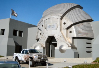
Oakley Interplanetary Headquarters
The building was designed by Colin Baden, president and chief creative officer of the company. Baden is, as well, one of the founding industrial designers for the company. Oakley was named for the dog of Jim Jannard, founder and chief executive officer. The symbology, the Oakley rendering, in the brand mark, is called the Icon. It’s the eye on everything.

And it, inherently, drives the spirit of everything that the company does — including the architecture, which is a kind of massive production design — it’s a set, a prop, for the brand. But think of prop as proposition — of attitude, ethos, invention and innovation. And while this might be seemingly excessive to many in the architectural community, it’s a prime example of principle driven by principal — Mr. Baden, who’s earned the moniker of the Mad Scientist, along with Jim Jannard, that together lead to the entry way — another world.
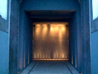
The design thinking is pervasive — and the marketing strategy, even working to forming the design of the products, extends deeply into the culture. Even the trading registration — the New York Stock Exchange: O O is the code. Eyes.
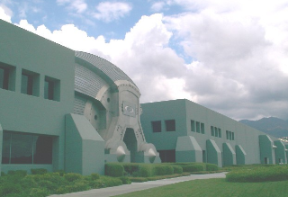
The design styling is surely fortress-like — and given the military nature of some of their product, it’s relevant: Oakley works with the U. S. military on both laser eye protection in assault eyewear and an alternative boot for the Elite Special Forces, in addition to the broad range of their consumer products.
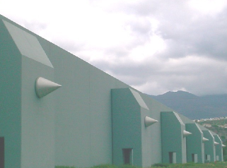
The site entrance:
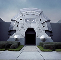
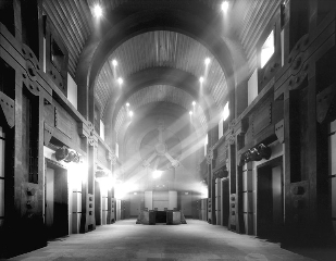
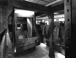
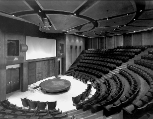
The space(s): It’s a place of reinforced blast walls, product torture chambers and the padded cells of mad science. Oakley’s design bunker is where inventions are conceived, developed, perfected and manufactured. In addition to the hidden catacombs of research labs and proving grounds, the architectural design of Oakley President Colin Baden includes a 400-seat amphitheater, and “absolutely no adult supervision.” Attitude, truth, invention, innovation. They’re all part of the design code — and marketing brand strategy — of the group.
These highly styled representations add to the sense of brand attitude:

They win! In the 2002 Winter Olympics in Salt Lake City, 150 athletes used Oakley products while earning 18 gold medals, 21 silver and 15 bronze.
Site visuals:
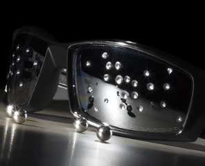
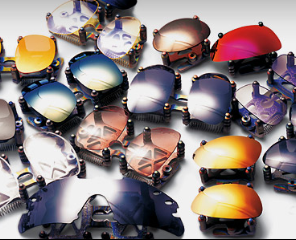
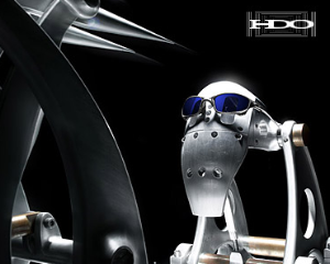
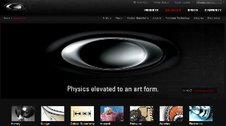

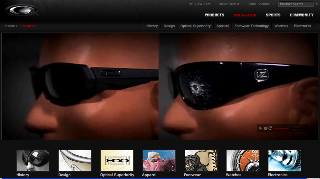

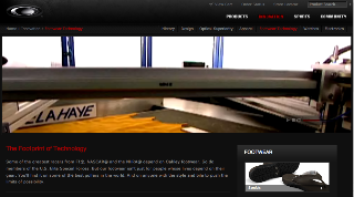
More facts for reference:

Tim Yue | Parking medallion
• All design links back to brand story — the Oakley brandcode®.
• The 400,000 square foot building on a forty acre site was constructed by Snyder-Langston of Irvine, California — development, construction management and general contracting services.
• The facility includes office, manufacturing, assembly and distribution areas, as well as an Oakley museum, gift shops, and heliport.
• Employee amenities include a NBA regulation basketball court, fitness center, full service cafeteria and a 450 seat auditorium.
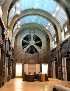
• The industrial lobby, shown in the interior views, 6,000 square feet and is capped by a forty foot high stainless steel cylindrical structure above the building’s entrance.
And yes, the fan works.
Red Dawn
Explorations on Oakley culture.
“If you’re going to do something, be brave and jump in, but do something meaningful.” Jim Jannard
http://www.jannard.com/index.html (personal site of the founder)
http://www.ispo-sportsdesign.com/history/forum/presenter.colin-baden.43.html (colin baden | design director @ volvodesignforum)
http://www.dvinfo.net/red/reddawn1.php (overview and fan site links)
http://www.wired.com/wired/archive/7.12/oakley_pr.html (wired innovation link)
http://www.youtube.com/watch?v=c_GL9XNjcBI&feature=related (eyewear testing video)
http://www.truckinweb.com/features/0511tr_2005_dodge_ram_oakley_custom/photo_03.html (oakley customized truck)
Red Dawn
Founding principal: principles —
A mad scientist named Jim Jannard began questioning the limits of industry standards. “No one believed my ideas,” said Jim. “No one would listen.” In 1975, he went into business for himself. Jim started Oakley with $300 and the simple idea of making products that work better and look better than anything else out there.
In his garage lab, Jim developed a new kind of motorcycle handgrip with a unique tread and a shape that fit the rider’s closed hand. “Everything in the world can and will be made better,” Jim told skeptics, “The only questions are, ‘when and by whom?’” Top pros took notice of the new design and its Unobtainium® material that actually increased grip with sweat.
For Jim, that meant challenging the limits of conventional thinking. His homespun company was struggling yet his next invention would become a mainstay in MX racing for 17 years. Jim created the O Frame® goggle with a lens curved in the perfect arc of a cylinder. Pros like Mark Barnett, Marty Smith, Johnny O‘Mara and Jeff Ward championed its clarity and wide peripheral view.
Jim went back to his lab and started reinventing sunglasses for sports. Few believed it could be done successfully, and most thought the industry’s big companies could not be challenged. Jim used innovations from his previous inventions to create “Eyeshades®,” a design that began an evolution of eyewear from generic accessory to vital equipment.
The first world-class competitor to approach the company was Greg LeMond, who became a three-time winner of the Tour de France. Other pros like Scott Tinley, Mark Allen and Lance Armstrong demanded the performance and protection offered by Eyeshades®.
Decades of innovation brought new product technologies, blends of science and art that have been awarded more than 540 patents worldwide. Today, Jannard’s brand has become the mark of excellence and the solution to challenges facing those who cannot compromise on performance.
“Inventions wrapped in art. Oakley was founded on that idea, and it still defines us.” Jim Jannard
1. Martin and Guerin, The Interior Design Body of Knowledge, 2005 Edition.
2. Herman Miller, Inc. Three-dimensional branding: Using space as the medium for the message.
Tim Girvin | Decatur Island Studio
girvin.com