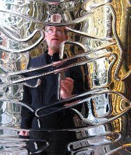
For a number of years, I’ve been exploring the idea of patterning in design. Patterning in brand, patterning in architecture, patterned treatments in art.
That ranges from the idea of using layering — and pattern — as a kind of subdued code in branded applications: like labeled packaging, repeating the design as a recognized form beneath the overall creative image; or taking the design of a brand and using the form of patterning as a way to express a conception of marketing message — in a building, a floor, a glass application, metal treatments.
Here — and here:
https://www.girvin.com/blog/40-bond-street-of-glass-skins/
https://www.girvin.com/blog/40-bond-ian-schrager-brand-architectural-patterning-12207/
https://www.girvin.com/blog/herzog-de-meuron-the-birds-nest-designing-for-real/
And while we’ve done this type of application — something that might be seen as rather decorative — for decades, the point is that this form of design thinking is now finding itself increasingly expressed in architecture.
One of my earlier references was to Herzog & De Meuron. Edwin Heathcote has responded to this overview, in the Financial Times, as: “Ian Schrager’s new SoHo condominium development, 40 Bond, uses ornament as a kind of barrier but also as a hoarding. The New York building’s Swiss architects, Herzog and De Meuron, reflect on the heavily glazed iron and glass construction of the surrounding industrial buildings and lofts but the most striking thing about the structure is its extraordinary, squiggly cast metal fence.”
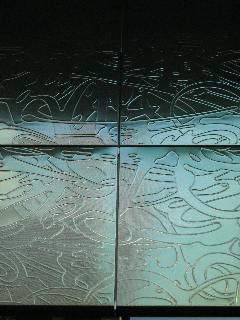
And curiously, this added direct expression from the architects themselves:
“It is based on New York graffiti and on tags and, as those are the signatures of the artists, this is the signature of the building.”
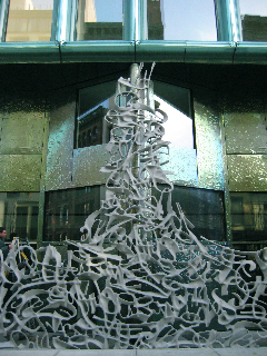
“In reinterpreting an almost forgotten architectural element, Herzog and De Meuron found a way of distinguishing the building, of involving it aesthetically in the public realm while also signifying separation from it. Just as the complex structure of their “Bird’s Nest” Olympic stadium in Beijing becomes the architecture, a web of convoluted though internally consistent structural members, so what appears here as ornamentation serves a functional role.” Edwin Heathcote

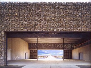
And, as well, I’d referenced the idea of the stone arrangements of the Dominus Winery being yet another expression of the idea of patterned expression of context — the very stones of the rocky vineyard.
Edwin Heathcote, The Financial Times, London — opens his exploration of pattern — or decoration — in architecture with the quotation of Adolf Loos, architect and designer, who had spoken of his idea that decoration represented a kind of ascetic primitivism:
“In a highly productive nation ornament is no longer a natural product of its culture and therefore represents a backwardness or even a degenerative tendency.” AL | 1908 | Ornament and Crime.
Ludwig Mies van der Rohe’s “Less is more”, a phrase that became the focus of minimalist design principles, defining modernism now well into its third century. These reflections, perhaps all a kind of reaction against the waning of an earlier profoundly decorative phase in the history of design — the arts and crafts movement of the Victorian era. For the latter part of the 1800s — expressed in the exemplar of John Ruskin, architect, draftsman, arts and crafts theorist — “I believe the right question to ask, respecting all ornament, is simply this; was it done with enjoyment, was the carver happy while he was about it?” And William Morris, master craftsman, movement leader, a comrade in principle, offered “I love art, and I love history, but it is living art and living history that I love. It is in the interest of living art and living history that I oppose so-called restoration. What history can there be in a building bedaubed with ornament, which cannot at the best be anything but a hopeless and lifeless imitation of the hope and vigor of the earlier world?” And that, living in a world devoid of ornament or beauty, there was: “if you want a golden rule that will fit everything, this is it: Have nothing in your houses that you do not know to be useful or believe to be beautiful.” Of course, what’s beautiful? What is a place bedaubed, as opposed to something newly designed, in replication of earlier principles of design — a kind of horror vacui of patterned context and scrolled overlay. What is the theoretical bridge between functional, the decorative, the minimialist reserve?
But the Miesian disciplines of “those pure, white walls, those plate glass windows, that multiple schizophrenia between the white cube of the modern art gallery, the industrial chic of the loft and the modernist villa have stayed resolutely with us”, according to Heathcote’s analyses.
There have been those that retain the character of modernist collisions with the decorative field — Robert Venturi, for one: “When modern architects righteously abandoned ornament on buildings,” he wrote, “they unconsciously designed buildings that were ornament.”
In describing a sense of place, there has been expressions of the street that have moved from the outside to the inside — the beleaguering of graffiti massed walls that now are becoming art hung in galleries. And isn’t this a form of decorative expression? The street, in — the decoration, without? https://tim.girvin.com/?p=429 Is not the decorative street wise rendering, linked into architecture, a potential — even interactively?
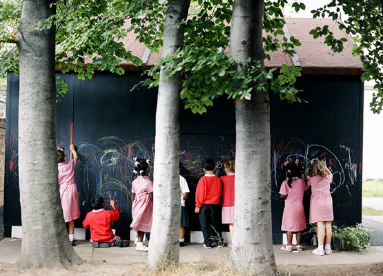
Simultaneously, developers and housebuilders remain committed to advancing a kind of “blend of suburban, sub-vernacular replete with mass-produced historical details from fanlights to coach-lamps with a stick-on early modernism for city-centre apartments.” But the notion of decoration in innovative context can be profoundly humanizing, if well done, thoughtfully orchestrated and meaningfully expounded in place.
Others resist the movement to sterility — London-based FAT (Fashion Architecture Taste) http://www.fashionarchitecturetaste.com/
grasp ornament as an inherent attribute of architecture. Fat is a London based practice run by Sean Griffiths, Charles Holland and Sam Jacob. Established in 1995, Fat has developed a broad approach to architecture. Early work included a series of seminal interior projects and art projects. Their work is distinctively decorative, and the 2004 Blue House, London remains an award winning addition to their premise:
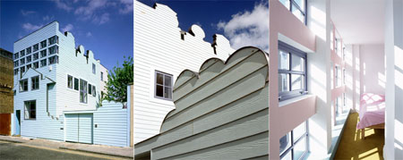
Heathcote, the architectural writer, loves this house –“partner Sean Griffith’s own house, an extra ordinary, toy-like construction in pale blue in London’s deepest East End. It is the only building in the UK capital that makes me smile every single time I pass it. It stands somewhere between a child’s drawing, a bodged doll’s house and a dream image, a ship-lapped structure adorned with cut-out profiles of clouds and gables, with a faux façade pinned on its surreal two dimensional walls. It is as much of a picture as a building yet it is also resolutely a contemporary family home that asks questions about archetype, about symbols, familiarity and townscape.”
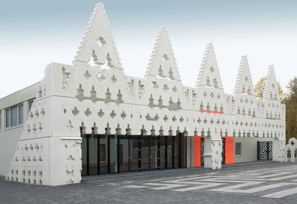
Other propositions, from FAT, are Sint Lucas:
Islington Square:

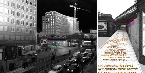
Waterloo Way, South Bank, London:
Partner Charles Holland: “The Loos argument is very interesting. As I understand it, he was saying that ornamentation was a waste of labour, effort and craft. With contemporary techniques and manufacturing it is possible to achieve a lot of complexity and intricacy with very little effort, so there’s a weird reversal of his argument.
“We [FAT] regard ornament less as a guilty pleasure and more as a communicative tool. There is traditionally a kind of puritanism in the UK, a rather macho approach in which engineering and high-tech appliqué is OK. It can all be justified in practical terms but I think we can look more critically now at a modernism in which the motifs of industry were applied to architecture to make it look modern, which in itself is a kind of ornamentation.”
AOC, http://www.theaoc.co.uk/, another architectural firm, is introducing pattern and decoration as a way of bridging theory and practice, architect and end-user.
Work, to reference (I’ve not been able to specifically identify these projects from their site):
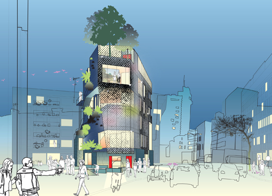
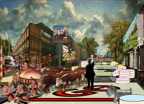
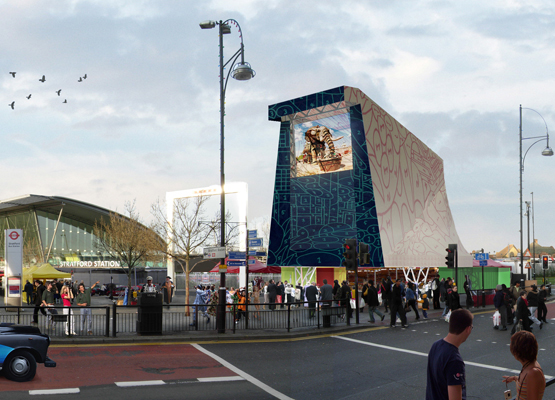
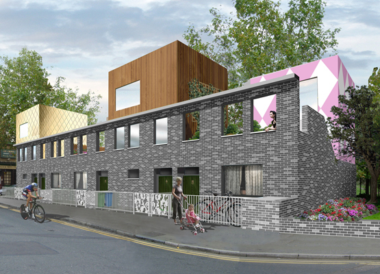
Their Crown Terrace scheme (above) in Elephant and Castle will exhibit a barrage of pattern and surprising colour. AOC’s Geoff Shearcroft says: “Ornamentation can suggest a way in for the users. It can provide a story, a coding. We were looking for a way of taking the flexibility and the DIY nature of a semi[-detached house] while allowing residents to adapt and decorate.”
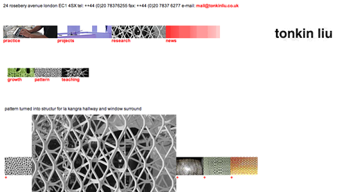
London architects Tonkin Liu study patterning as part of the design practice, their site:
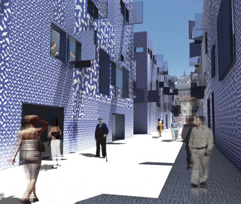
French architect Jean Nouvel | the Alcantara Mar:
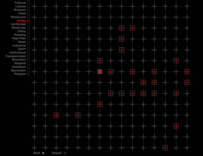
Actually, Nouvel’s site, in itself, is a kind of patterned language:
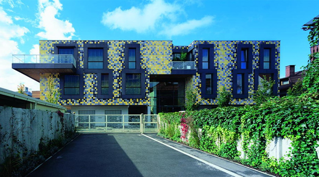
Slovene architects Sadar Vuga |Ljubljana:
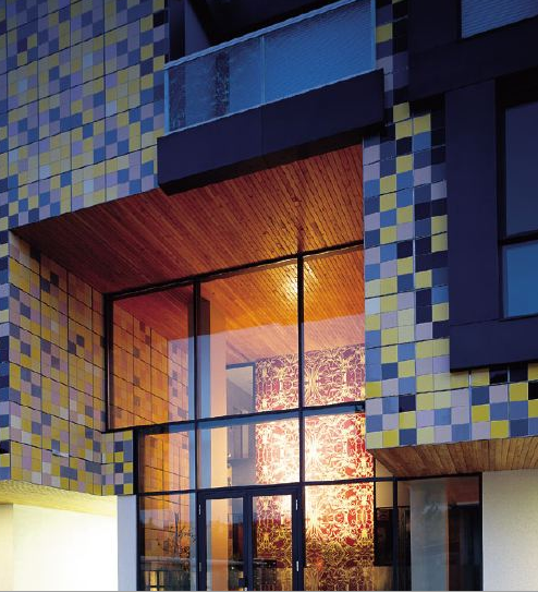
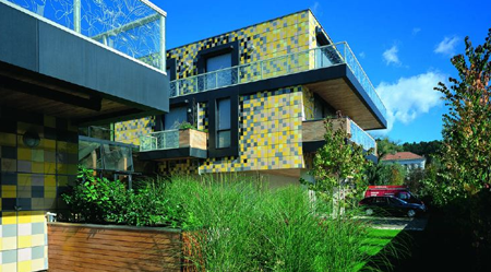
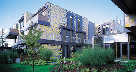
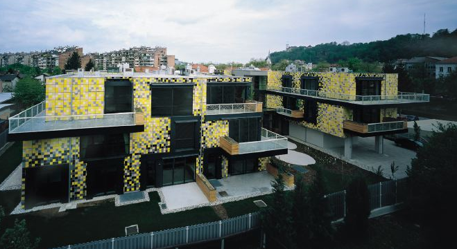
Evan Douglis | NYC: REptile-Haku Japanese Restaurant:
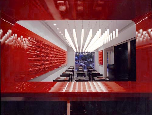
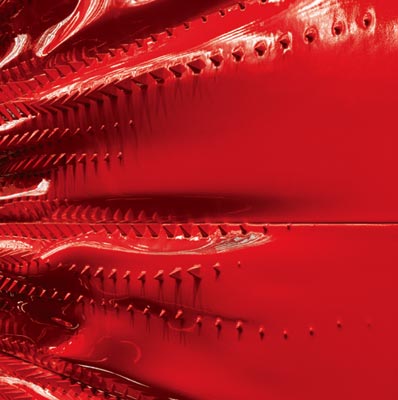
Evan’s exploration of CNC produced, digitally designed sculpture for interior applications:
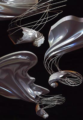
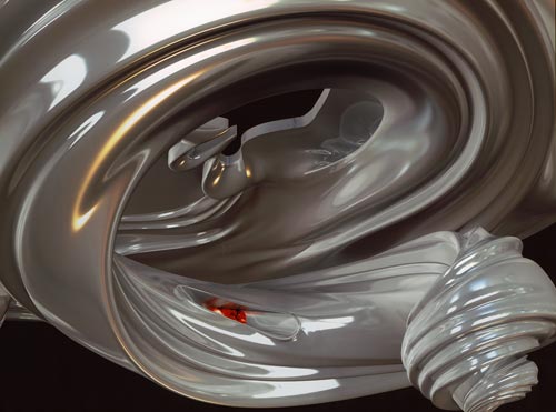
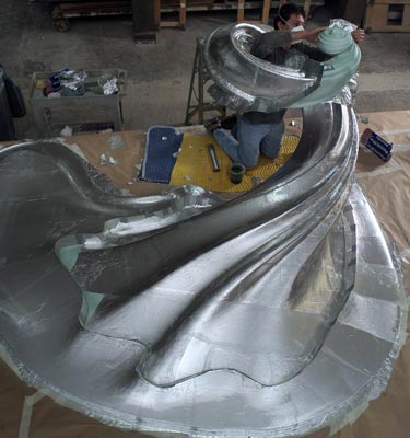

The concluding point might be — what’s the next step? A return to the Ruskinian principles of beauty in crafted application of pattern and decoration, or sticking with the applied slick character of modernist minimalism? Or both, conjoined? I’d offer the latter, that the sentiments of a cleanly designed presence can have the art fullness of human presence — in deed — like a way finding, a story, a way in — to place, that can be entrancing, captivating, community building — and ultimately, humanizing. Like a contrast to the stern resolutions of Rem Koolhaas‘ treatment of the generic city, this speaks to the measure of disciplined and imaginative design that bridges to human connections in the fullness of a visual story told.
Edwin Heathcote: “Whether we are about to enter a new age of applied tat or of thoughtfully integrated, intellectually substantial ornament is yet to be seen but ornament, a century after Loos’s great polemic, seems well on its way to decriminalisation.”
What about that? What’s your view?
tsg