Retail Brand Language: The Layering of Patterning.
The design language of brand patterning.
Brand patterning, psychic patterning — the hidden and the
obvious messaging of place-making and experience, designed.
I was watching some people in a place, and watching how they were looking at things.
I’m convinced that patterning — the both large scale and small patterning means more than is often noted in retail design planning. The first telling for me came in working for Michael Eisner on his Disney Insitute. We were tasked with brand development, reporting to the top at Disney; it was Eisner’s idea, so there was a lot of priority placed on how it all came together. Later, giving a talk about the process, two people came up to me to tell me their experiences — but more so to talk about the layering of details that they noticed — from approaching the site to the reception areas to getting to their rooms; to their take, there was a string in design thinking that evidenced itself in the subtlest ways. But it wasn’t the big, bold expressions, it was the evidence of the patterning of the brand language that created touch-points of guest engagement at every turn; not big and obvious, but delicately detailed, and in some instances, very small. Interestingly, it was these detailings that the visitors noticed.
That surprised me, silently spoken design storytelling to voice and deepen the brand experiencer’s sensitivity to place making. In studying environments I find myself in the whorl of examining the layering of impression-making in brand designed environments, from restaurants
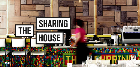
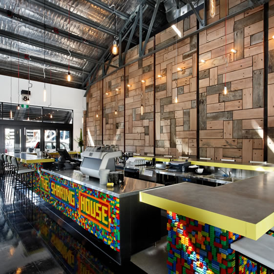
[as noted in the Melbourne, AU “Sharing House” above and below, shared by a Seattle restaurant consultant and Starbucks maven] to retail and store design.
The point of the compelling attributes of the brand patterning below might range from the Lego-like signing, to the wall treatments of cut-wall checker boarding to other details.
The eye gathers impressions, known or not consciously, that impart a storytelling that could speak to sensuality and robust experience, appetite, warmth and hospitality, or messaging and tiering of graphical patterns.
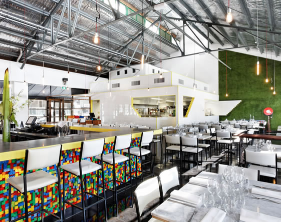
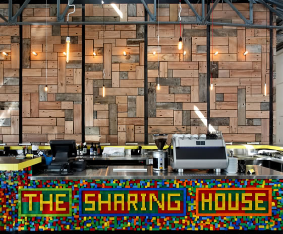
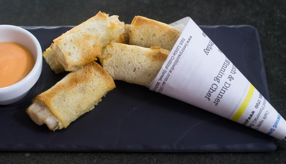

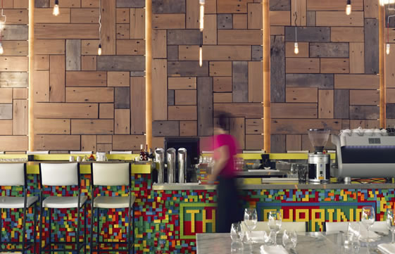
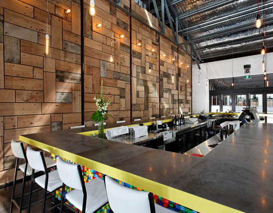
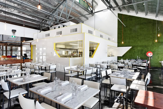

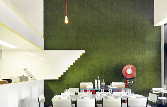
People perceive far more than most establishment owners know. They see things, and, psychically perceiving unconsciously or not — sense the vibe of place. Patterns, little notes and signing treatments, displays, merchandising arrangements — they all add up to a thoughtful patterning. With a symbolic design strategy, this can be allegorically profound — a fact not lost on guests.
Patterning – our lives in
an array of patterns.
We watch, and see them,
or we, and they, pass us by.
TIm | GIRVIN ISLAND STUDIOS
…..
G I R V I N | RETELLING RETAIL
DESIGNING THE STRATEGY OF SELLING :
BRAND STORYTELLING ENVIRONMENTS, EXPERIENCES = PLACES