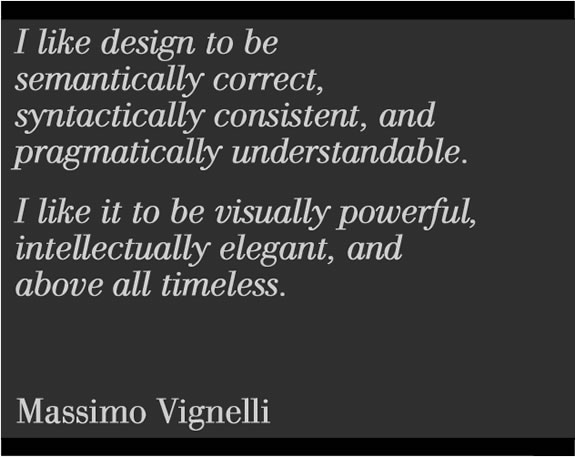
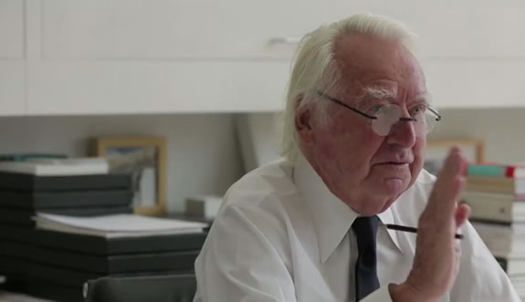
Richard Meier and
Massimo Vignelli [above]
When I was working in NYC, decades back, I’d linked to Richard Meier on the subject of typography and signing.
The selected font of study, designed by another classical alphabet scholar and typographic designer, the legend, Jan Tschichold,
the typeface was Sabon.
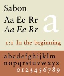
Later, in other design studies, I’d used this font, redrawn, dozens of times.
The point was the idea of the balance between supremely modernist design and classical intentions and readability.
During a later NYC period, I’d met with Massimo Vignelli — another design master.
Vignelli, a decade later became the consistent designer for all things Meier.
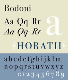
And the font styling shifted to another system, another design and font that was classically motivated, in the foundations of grand italian design, the 18th century master typographer Giambattista Bodoni, a designer, perhaps like Vignelli and Meier — seeking to revitalize classical disciplines of spacious design, “whiteness,” striking contrast in weight,
brevity and refined and carefully nurtured detail — brought forth to new modernity.
Like then, like now.
His font, books and design, for the time, were widely admired and emulated in a kind of systemic sharing of ideals — the modernism of “new face.”
In the sharing and focus,
I learned about
details.
White.
Black
and the
space
in
between.
b o d o n i

m e i e r

v i g n e l l i

Tim | NYC
—-
Girvin Cloudmind® | http://bit.ly/eToSYp
TEAM-BUILT STRATEGIC INNOVATION WORKSHOPS
Tim Girvin | P R I N C I P A L
